
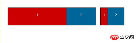
I can’t understand the following settings for item1 and item2 in the css code. I know that flex:1 2 200px;these three values correspond to flex-grow,## respectively. #flex-shrink,flex-basis, but I don’t know the intention of writing this
.item1{
    flex:1 2 200px;
    background:#c00;
}
.item2{
    flex:2 1 100px;
    background:#069;
}
html:
<p class="flex flex-300">
        <p class="item item1">1</p>
        <p class="item item2">2</p>
</p>
<p class="flex flex-150">
        <p class="item item1">1</p>
        <p class="item item2">2</p>
</p>
.flex{
        display:inline-flex;
        height:60px;
        margin:5px 5px 40px;
        border:1px solid #000;
        vertical-align: top;
    }
    .flex-300{
        width:300px;
    }
    .flex-150{
        width:80px;
    }
    .item{
        height:60px;
        text-align: center;
        line-height: 50px;
    }
    .item1{
        flex:1 2 200px;
        background:#c00;
    }
    .item2{
        flex:2 1 100px;
        background:#069;
    }
世界只因有你2017-06-12 09:26:28
As an analogy, for example, in a browser environment, when the browser is reduced, item1 and item2 will sink, and then the three p boxes will not be arranged side by side, but will be arranged vertically. When the browser interface becomes larger , they will float up and become arranged side by side.
