I built a cube using CSS3 and want to use the mouse to control the rotation of the cube (X-axis and Y-axis)
View page
The core code of rotation is probably like this:
    var box = $("#box"); //box是3D对像的容器;
    var option_n = 0.5; //灵敏度
    box.on('mousedown',function(e){
        if(e.button === 0){
            mouse_left(e);
            return false;
        }
    })
    function mouse_left(e){ //合并旋转值,有bug
        var x,y;
        var zb_b = [e.pageX,e.pageY];
        var oldt = box.css('transform');
        $(document).on('mousemove.dh',function(e){
            var zb_e = [e.pageX,e.pageY];
            y = ((zb_e[0] - zb_b[0]) * option_n);
            x = (-(zb_e[1] - zb_b[1]) * option_n);
            var transform = 'rotateY('+y+'deg)' +' rotateX('+x+'deg)';
            dom.css('transform',oldt + transform);
        }).on('mouseup.dh',function(e){
            $(document).off('mousemove.dh');
            $(document).off('mouseup.dh');
        })
    }
The problem that occurs is this. There is no problem in the first operation, but there will be problems later. The reason is that the rotation operation seems to rotate the entire coordinate axis, causing problems with subsequent rotations.
There is a "Mode Switch" button on the page. The effect after switching is what I want, but this implementation requires nesting two parent nodes for each rotation, and the parent nodes are rotated to achieve the effect. Yes, the DOM level will be very deep after multiple controls, which is definitely not possible.
Please give me some advice
某草草2017-06-10 09:50:42
http://runjs.cn/code/urduzcae
var transformChage = top.transformChage = function(dom,transform){
    var oldt = dom.css('transform');
    oldt = oldt == "none" ? "" : oldt+" ";
    dom.css('transform', transform + oldt)
}
Just change it to left.
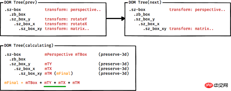
To understand this problem, you don’t need to know too much about matrices. You can treat matrix implementation as a black box and take a look at the matrix calculation order and the impact of parent-child matrices:
Calculate accumulated transformation matrix accumulated 3D transformation matrix
Starting from the identity matrix, for each element from the root element of the 3D rendering context (every element declared preseve-3d) to the current element:
Cumulative transformation matrix multiplied by the perspective matrix on its containing block
The cumulative transformation matrix is multiplied by the horizontal and vertical displacement matrix of the current block relative to its containing block
Cumulative transformation matrix multiplied by transformation matrix
Until the current element is calculated, the final cumulative transformation matrix is obtained.
——W3C CSS Transform WD: 6.1 3D Transform Rendering
What you need to pay attention to is step 3. According to this standard, if we want to make such a transformation, the left transformation is:

Of course, if you are interested in matrix implementation, I also briefly introduced it in "Transformation Matrix in the Front End". The core of this problem is that matrix multiplication does not comply with the commutative law of multiplication in most cases.