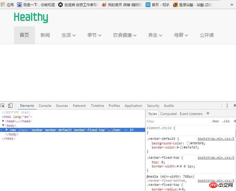
The whole problem is as shown in the picture. When the window is reduced to sm, the navigation bar becomes two lines. When the window is reduced to xs, it will be folded and hidden normally.
I just want to ask the master if he can fold the browser window directly when it is reduced to sm.
Please give me specific steps! Many thanks!
迷茫2017-06-05 11:14:46
Adjust the display attribute under the width that needs to be folded and hidden. The xs should be the width of 768px. When setting the minimum width of 768px, the display is none. If the width is less than 768px, normal folding and hiding will be achieved. I hope it can help you!
@media (min-width: 768px)
.navbar-toggle {
    display: none;
}