
Develop a simple small game. The size given in the design drawing is 640*1136. After rem adaptation, some mobile phones with small heights cannot display all the content, and the game cannot use scroll bars. What should I do? Thanks
漂亮男人2017-05-31 10:43:37
You can refer to the method in this project: https://wa.qq.com/xplan/earth...
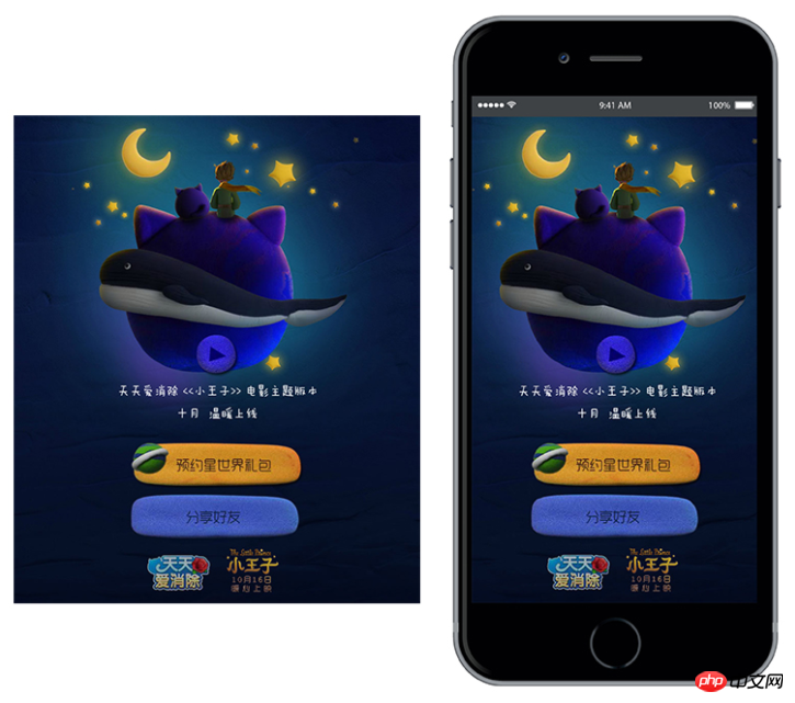
This project has a fixed area to display the earth, orbit, small hands, etc. How to ensure that they are in different sizes Are the relative positions the same?
His method is to layout in a fixed size area (375 * 600), and then scale this fixed area according to the screen size so that it is exactly contained by the screen.
I think your game can also use this method.
The picture below is an example of an area that ensures an inherent proportion at different sizes: 

In fact, when designing such a project, you cannot set the proportion too narrowly. If your proportion is set according to the proportion of iPhone 5, then there will be problems displaying it on other devices that are longer or wider than iPhone 5 (even if you use the above method) , you also need to fill the parts outside the area with color or background).
The example I saw before, this design drawing is basically square, which allows it to be displayed differently on devices of different sizes, but the key areas can be displayed.
習慣沉默2017-05-31 10:43:37
overflow, and then adjust the position of the scene according to the lens
