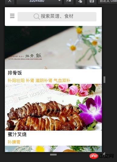
HTML structure
`<dl onclick="goDetail(1)" class="cookbook-list">
<dt class="cookbook-img">
<img src="http://s1.cdn.xiangha.com/cai...
</dt>
<dd class="cookbook-name">Pork Ribs Rice</dd>
<dd class="cookbook-des">tonifying yang, strengthening yang, nourishing yin, nourishing kidney, nourishing qi and blood</dd></dl>` # #
# #
.cookbook-list {
    display: block;
    height: 13.2rem;
}

.cookbook-list dt {
    width: 100%;
    height: 10rem;
    position: relative;
    overflow: hidden;
}
.cookbook-list img {
    width: 100%;

}仅有的幸福2017-05-31 10:42:06
Use percentage relationship, principle: p>img, where p label is relative positioning, height is a percentage, img uses absolute positioning to fill the parent object, the code is as follows:
/* 图片等比缩放 */
.scaling {
    background-color: #fafafa;
    font-size: 0;
    height: 0; // 去除高度
    position: relative;
}
.scaling > img {
    height: 100%;
    left: 0;
    position: absolute;
    top: 0;
    width: 100%;
}
/* 图片等比缩放 */
.scaling.scaling-4-3 {
    padding-bottom: 75%; /* (300/400)*100 (高度/宽度)*100 得出比例 */
}
The width is determined based on the actual width. Depending on your page, its width should be the screen width or the width of its parent container. If its parent is freely transformable, its height will be adjusted according to the proportional relationship. Scale proportionally.
巴扎黑2017-05-31 10:42:06
Load the image with a background
and then set
background-size:contain
background-repeat: no-repeat
我想大声告诉你2017-05-31 10:42:06
Page layout
<p style=“width: 100%; overflow: hidden”>
    <img style="width: 100%" src="images/1.jpg" >
</p>
The width of the parent element is determined by percentage or width. When img is processed to 100%, it will automatically fill the parent window. If used, please separate the css style