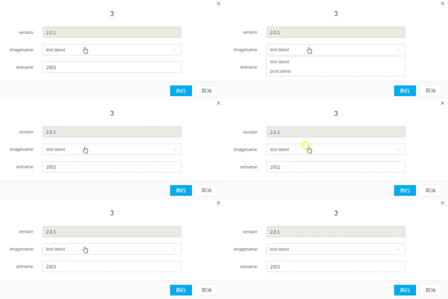
Just upload the gif:

Code:
stencil:
<template id="dropdown">
  <p class="dropdown" :class="[extClass, {'open': open}]">
    <p class="dropdown-wrapper" @click="open = !open">
      <input class="dropdown-selector" :value="currentItem.name" readonly="readonly">
      <i class="bk-icon icon-angle-down dropdown-icon"></i>
    </p>
    <transition name="toggle">
      <p class="dropdown-list" v-show="open">
        <ul>
          <li class="dropdown-list-item" v-for="(item, index) in list" @click="selectItem(index)">
            <p class="text">{{ item.name }}</p>
            <p class="tools" v-if="tools !== false">
              <i class="bk-icon icon-edit dropdown-list-icon" v-if="tools.edit" @click="editFn(index)"></i>
              <i class="bk-icon icon-close1 dropdown-list-icon" v-if="tools.del" @click="delFn(index)"></i>
            </p>
          </li>
          <li class="dropdown-list-item" v-if="hasCreateItem" @click="createFn">
            <p class="text">
              {{ createText }}
            </p>
          </li>
        </ul>
      </p>
    </transition>
  </p>
</template>
CSS:
  .toggle-enter-active,
  .toggle-leave-active{
    transition: transform .3s cubic-bezier(.23, 1, .23, 1), opacity .3s cubic-bezier(.23, 1, .23, 1);
    transform-origin: center top;
  }

  .toggle-enter,
  .toggle-leave-active{
    transform: translateZ(0) scaleY(0);
    opacity: 0;
  }

.dropdown{
    position: relative;
    width: 100%;
    &.open{
      border-color: #57a3f1;
      .dropdown-icon{
        transform: translateZ(0) rotate(180deg);
      }
    }
    &-icon{
      position: absolute;
      top: 13px;
      right: 10px;
      font-size: 12px;
      color: #d3d3d3;
      transition: transform linear .2s;
      /*backface-visibility: hidden;*/
    }
  }
Some irrelevant styles have been removed. It is now known that the transition effect of the small triangle on the right side of the drop-down box in Chrome causes the text to blur and jitter. If backface-visibility: hidden;# is added, ##, the text will not shake, but it will still be blurry. Under Firefox, the text will appear to be one pixel bold, but I think it is acceptable. On the contrary, this problem does not occur under IE9. . Ask God for guidance!
滿天的星座2017-05-24 11:37:53
The discovery is thanks to transform: translate(-50%, -50%)导致抖动和模糊,改成transform: translate3d(-50%, -50%, 0)会解决一部分问题,主要是transform:translateZ(0). But all the text is still blurry to a certain extent. I don’t know why? ?
----------------update-----------------
I have sorted out the code again. The current situation is like this. When The text will not shake if you give dialog-wrapper加上transform:translate3d(-50%, -50%, 0)的时候,文字不会抖动了,但是会模糊。如果给下拉框的小三角加上backface-visibility: hidden;, but it is still blurry. I'll take a look and write a simple demo to explain this problem better. . This problem often occurs in projects, and no suitable solution has been found. .