

PHP中文网2017-05-24 11:34:06
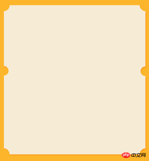
<!DOCTYPE html>
<html lang="en">
<head>
    <meta charset="UTF-8">
    <title>Document</title>
</head>
<body>
<style type="text/css">
 *,body{ margin: 0; padding: 0; background: #fff; border: none; }
 .bg{width: 500px; height: 500px; background: rgba(253,181,43,1); padding: 12px; }
 .bg .write_box{ width: 500px; height: 250px; position: relative;background: #fff; overflow: hidden; }
 .bg .write_box .round{ width: 40px; height: 40px; background: rgba(253,181,43,1); position:absolute;  border-radius: 100% }
 .bg .write_box .lft{ left: -20px;   }
 .bg .write_box .rgh{ right: -20px; }
 .bg .write_box .botm{ bottom: -20px; }
 .bg .write_box .tp{ top: -20px; }
</style>

    <p class="bg">
      <p class="write_box">
         <p class="round lft tp"></p>
         <p class="round rgh tp"></p>
         <p class="round lft botm"></p>
         <p class="round rgh botm"></p>
      </p>

      <p class="write_box">
         <p class="round lft tp"></p>
         <p class="round rgh tp"></p>
         <p class="round lft botm"></p>
         <p class="round rgh botm"></p>
      </p>
    </p>
</body>
</html>巴扎黑2017-05-24 11:34:06
Simply speaking, you need to achieve it through the border-radius of the circular p element and the overflow of the package. As for the deeper orange, it should be the shadow
習慣沉默2017-05-24 11:34:06
I'm really sorry, I have always used firefox, but I didn't expect it to be different between radial-gradientand chrome. It’s also because I don’t understand it well enough.
I have modified the link below again.
================
Using CSS3 variables to control the radius size, I can’t think of a simpler way for now
I’m going further and further down the road of not being downwardly incompatible...
DEMO-New
====================================
Please see the DEMO for details. It is a pure CSS3 implementation without adding additional tags. Although I feel that the scalability is not high, it should still be able to be put into production with continued improvement.
There is a lot more magic in CSS3. If you think about it more deeply, you will come up with many interesting functions. Just like the author of "CSS Revealed".
DEMO