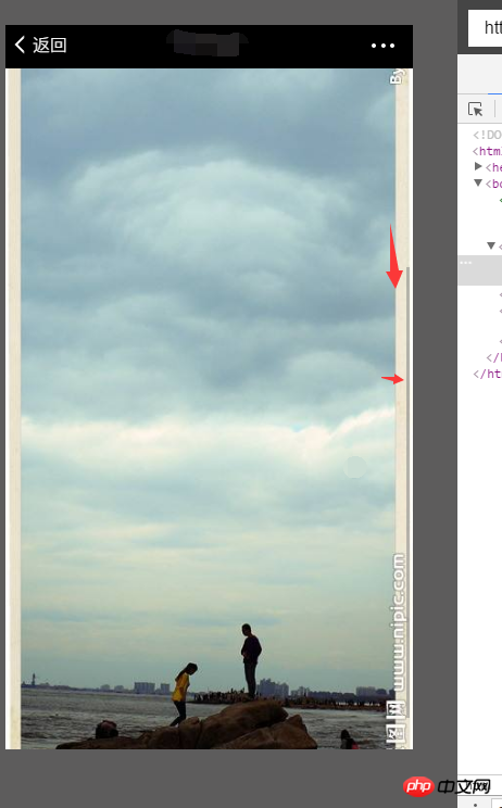
1. How to make the image aspect ratio on the mobile terminal adapt to the current full screen size of the mobile phone?
When the width is 100%, the height needs to be adaptive. When the height is 100%, the width needs to be adaptive.
In this way, the picture may exceed the current screen and a scroll bar will appear, which requires sliding to see it, or there will be a blank space and not fill the entire screen.
Because the current picture does not have the same color background, it cannot be achieved by filling the background. Is there a good picture size ratio that can achieve this requirement.
2.Code
.imgsrc img {
    width: 100%;
}
3. Effect

怪我咯2017-05-16 13:27:15
Based on the needs, it is recommended to set it through the background attribute of css;
The first step is to add a DOM element of the screen size;
Or set it directly on your imgsrc, provided that the size of imgsrc is the screen size;
Sec. Step 2: Set the CSS attribute of the element:
The first floor is talking about the following, which will not stretch the image;
Control the position of the image by adjusting the background-position attribute. I also recommend this way of writing:
    background-image: url('链接');
    background-size: cover;
    background-repeat: no-repeat;
    background-position: center;
The following method can fully display the image, but the background image will be stretched. If the screen is not locked, the image will be stretched severely when the screen is horizontal:
    background-image: url('链接');
    background-size: 100% 100%;
==================================================
Also If you are really obsessed with displaying the picture completely without stretching it, please provide a reference plan for the design:
After feathering the outline of the picture, add a background color, and then get the color value of the background color of the picture, in imgsrc or In the added DOM element, set the css attribute:
    background-color: white;// 拿到的图片背景色
    background-image: url('链接');
    background-size: 95%;  //可以写成固定值
    background-repeat: no-repeat;
background-position: center;给我你的怀抱2017-05-16 13:27:15
There are many ways to achieve it. Not to mention js calculation, <img> 标签可以用比较新的 object-fit: cover; attribute.
Or put the picture in the background, and then use background-size: cover; ,这种方式还可以通过百分比的 background-position to specify the focus, so that the focus can be kept visible.
PHP中文网2017-05-16 13:27:15
What do you mean by not having the same color background? Can you describe it more clearly?
曾经蜡笔没有小新2017-05-16 13:27:15
width: 100vw; height: 100vh; but not compatible with lower versions of ie