I’m a beginner, trying to make a responsive web page myself without using a framework.
However, there is a very bloody problem on mobile terminal!
are: home page, registration page.
The registration page has the same nav and footer parts as the homepage, so the html of the registration page first references the css of the homepage, and then the special css of the registration page.
The test includes the mobile phone simulation that comes with Chrome F12 and HUAWEI G7.
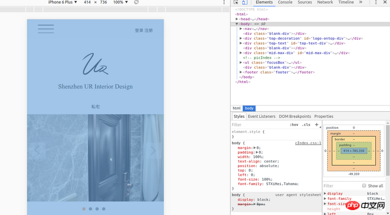
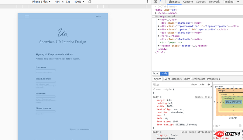
The following is a debugging screenshot of Chrome phone simulation: 
Homepage
Registration page
The most important part of the body is the width, and the others can also be seen in the picture.
body {
    width:100%;
}
You can see in the lower right corner that the resolution of the entire body of the second page is much larger. This is also the case on mobile phones. May I ask why this is?
阿神2017-05-16 13:23:30
<meta content="width=device-width,initial-scale=1.0,maximum-scale=1.0,user-scalable=no" name="viewport">