Enter/Leave & List Transitions
Table of Contents
Overview
Vue When inserting, updating, or removing the DOM, Provides many different ways to apply transition effects.
Includes the following tools:
Automatically apply classes in CSS transitions and animations
Can be used in conjunction with the Third-party CSS animation libraries, such as Animate.css
Use JavaScript in the transition hook function to directly operate the DOM
Can be used with third-party JavaScript animations Library, such as Velocity.js
Here, we will only talk about the transition of entering, leaving and list, you can also look at the next sectionManaging Transition States.
Single element/component transition
Vue provides transition's encapsulated component, you can add entry/leave transitions to any element or component in the following situations
Conditional rendering (using
v-if)Conditional display (using
v-show)Dynamic components
Component root node
Here is a typical example:
<div id="demo">
  <button v-on:click="show = !show">
    Toggle
  </button>
  <transition name="fade">
    <p v-if="show">hello</p>
  </transition>
</div>
new Vue({
  el: '#demo',
  data: {
    show: true
  }
})
.fade-enter-active, .fade-leave-active {
transition: opacity .5s;
}
.fade-enter, .fade-leave-to /* .fade-leave-active below version 2.1.8 */ {
opacity: 0;
}
When inserting or removing an element contained in a transition component , Vue will do the following processing:
1. Automatically sniff whether the target element has CSS transition or animation applied, and if so, add/delete the CSS class name at the appropriate time.
2. If the transition component provides JavaScript hook functions, these hook functions will be called at the appropriate time.
3. If no JavaScript hook is found and no CSS transition/animation is detected, DOM operations (insertion/deletion) are performed immediately in the next frame. (Note: This refers to the browser's frame-by-frame animation mechanism, which is different from Vue's nextTick concept)
Transition class name
During the transition of entering/leaving, there will be 6 class switches.
1. v-enter: Define the starting state of entering the transition. It takes effect before the element is inserted and is removed on the next frame after the element is inserted.
2. v-enter-active: Define the state when the entry transition takes effect. Applies throughout the transition, takes effect before the element is inserted, and removes after the transition/animation completes. This class can be used to define process times, delays and curve functions for entering transitions.
3. v-enter-to: Version 2.1.8 and above Define the end state of entering the transition. Takes effect the next frame after the element is inserted (at the same time v-enter is removed), and is removed after the transition/animation is complete.
4. v-leave: Define the starting state of the leave transition. It takes effect immediately when the leaving transition is triggered and is removed the next frame.
5. v-leave-active: Define the state when the leave transition takes effect. Applies throughout the exit transition, takes effect immediately when the exit transition is triggered, and removes after the transition/animation completes. This class can be used to define process times, delays and curve functions for exit transitions.
6. v-leave-to: Version 2.1.8 and above Define the end state of the leave transition. Takes effect the next frame after the leave transition is triggered (at the same time v-leave is removed), and is removed after the transition/animation completes.
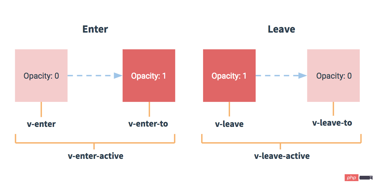
For the class names that are switched during the transition, if you use a <transition> without a name, thenv - is the default prefix for these class names. If you use <transition name="my-transition">, then v-enter will be replaced by my-transition-enter.
v-enter-active and v-leave-active can control different easing curves for entry/leave transitions, as shown in the following section.
CSS transition
Commonly used transitions use CSS transitions.
Here is a simple example:
<div id="example-1">
  <button @click="show = !show">
    Toggle render
  </button>
  <transition name="slide-fade">
    <p v-if="show">hello</p>
  </transition>
</div>
new Vue({
  el: '#example-1',
  data: {
    show: true
  }
})
/* 可以设置不同的进入和离开动画 */
/* 设置持续时间和动画函数 */
.slide-fade-enter-active {
transition: all .3s ease;
}
.slide-fade-leave-active {
transition: all .8s cubic-bezier(1.0, 0.5, 0.8, 1.0);
}
.slide-fade-enter, .slide-fade-leave-to
/* .slide-fade-leave-active for below version 2.1.8 */ {
transform: translateX(10px);
opacity: 0;
}
##CSS animation
CSS animation usage is the same as CSS transition. The difference is that in the animation, thev-enter class name will not be deleted immediately after the node is inserted into the DOM, but will be animationend Deleted when the event is triggered.
<div id="example-2">
  <button @click="show = !show">Toggle show</button>
  <transition name="bounce">
    <p v-if="show">Lorem ipsum dolor sit amet, consectetur adipiscing elit. Mauris facilisis enim libero, at lacinia diam fermentum id. Pellentesque habitant morbi tristique senectus et netus.</p>
  </transition>
</div>
new Vue({
  el: '#example-2',
  data: {
    show: true
  }
})
.bounce-enter-active {
animation: bounce-in .5s;
}
.bounce-leave-active {
animation: bounce-in .5s reverse;
}
@keyframes bounce-in {
0% {
transform: scale(0);
}
50% {
transform: scale(1.5);
}
100% {
transform: scale(1);
}
}Class name for custom transition
We can customize the transition class name through the following features:enter-class
enter-active-class
enter-to-class
(2.1.8 )-
leave-class
leave-active-class
leave-to -class
(2.1.8)
Animate.css Very useful when used together.
Example:<link href="https://cdn.jsdelivr.net/npm/animate.css@3.5.1" rel="stylesheet" type="text/css"> <div id="example-3"> <button @click="show = !show"> Toggle render </button> <transition name="custom-classes-transition" enter-active-class="animated tada" leave-active-class="animated bounceOutRight" > <p v-if="show">hello</p> </transition> </div>rrree

##Using transitions and animations simultaneously In order for Vue to know the completion of the transition, the corresponding event listener must be set. It can be
transitionend or animationend depending on the CSS rules applied to the element. If you use any of these, Vue can automatically recognize the type and set up the listener. However, in some scenarios, you need to set two transition animations for the same element at the same time. For example,
is triggered and completed quickly, while transition The effect is not over yet. In this case, you need to use the type attribute and set animation or transition to explicitly declare the type you want Vue to listen to.
Explicit transition duration
2.2.0 NewIn many cases, Vue can automatically determine the completion time of the transition effect. By default, Vue will wait for its first transitionend or animationend event on the root element of the transition effect. However, it's not possible to do this - for example, we could have a carefully choreographed series of transitions where some of the nested inner elements have delayed or longer transitions compared to the root element of the transition.
In this case you can customize an explicit transition duration (in milliseconds) using the duration property on the <transition> component:
new Vue({
  el: '#example-3',
  data: {
    show: true
  }
})
You can also customize the entry and exit durations:
<transition :duration="1000">...</transition>
##JavaScript Hooks
JavaScript hooks can be declared in attributes<transition :duration="{ enter: 500, leave: 800 }">...</transition><transition v-on:before-enter="beforeEnter" v-on:enter="enter" v-on:after-enter="afterEnter" v-on:enter-cancelled="enterCancelled" v-on:before-leave="beforeLeave" v-on:leave="leave" v-on:after-leave="afterLeave" v-on:leave-cancelled="leaveCancelled" > <!-- ... --> </transition>These hook functions can be used in conjunction with CSS
transitions/animations or alone.
When only using JavaScript to transition,must use done
for callbacks inenterandleave. Otherwise, they are called synchronously and the transition is completed immediately.
It is recommended to addA simple example using Velocity.js:v-bind:css="false"
to elements that only use JavaScript transitions, Vue will skip CSS detection. This also avoids the impact of CSS during transitions.
// ...
methods: {
  // --------
  // 进入中
  // --------
  beforeEnter: function (el) {
    // ...
  },
  // 当与 CSS 结合使用时
  // 回调函数 done 是可选的
  enter: function (el, done) {
    // ...
    done()
  },
  afterEnter: function (el) {
    // ...
  },
  enterCancelled: function (el) {
    // ...
  },
  // --------
  // 离开时
  // --------
  beforeLeave: function (el) {
    // ...
  },
  // 当与 CSS 结合使用时
  // 回调函数 done 是可选的
  leave: function (el, done) {
    // ...
    done()
  },
  afterLeave: function (el) {
    // ...
  },
  // leaveCancelled 只用于 v-show 中
  leaveCancelled: function (el) {
    // ...
  }
}
<!-- Velocity 和 jQuery.animate 的工作方式类似,也是用来实现 JavaScript 动画的一个很棒的选择 --> <script src="https://cdnjs.cloudflare.com/ajax/libs/velocity/1.2.3/velocity.min.js"></script> <div id="example-4"> <button @click="show = !show"> Toggle </button> <transition v-on:before-enter="beforeEnter" v-on:enter="enter" v-on:leave="leave" v-bind:css="false" > <p v-if="show"> Demo </p> </transition> </div>

##Initial The transition of rendering
You can set the transition of the node in the initial rendering through theappear
attributenew Vue({
el: '#example-4',
data: {
show: false
},
methods: {
beforeEnter: function (el) {
el.style.opacity = 0
el.style.transformOrigin = 'left'
},
enter: function (el, done) {
Velocity(el, { opacity: 1, fontSize: '1.4em' }, { duration: 300 })
Velocity(el, { fontSize: '1em' }, { complete: done })
},
leave: function (el, done) {
Velocity(el, { translateX: '15px', rotateZ: '50deg' }, { duration: 600 })
Velocity(el, { rotateZ: '100deg' }, { loop: 2 })
Velocity(el, {
rotateZ: '45deg',
translateY: '30px',
translateX: '30px',
opacity: 0
}, { complete: done })
}
}
})
<transition appear>
  <!-- ... -->
</transition>
Custom JavaScript hook:
<transition
  appear
  appear-class="custom-appear-class"
  appear-to-class="custom-appear-to-class" (2.1.8+)
  appear-active-class="custom-appear-active-class"
>
  <!-- ... -->
</transition>
In the above example, both the
appear attribute and the v-on:appear hook will be generated Initial rendering transition.
Transition of Multiple Elements##We will discuss
Multiple Components later Transition, for native tags you can use
v-if/v-else. The most common multi-label transition is a list and an element describing the message that the list is empty: <transition
appear
v-on:before-appear="customBeforeAppearHook"
v-on:appear="customAppearHook"
v-on:after-appear="customAfterAppearHook"
v-on:appear-cancelled="customAppearCancelledHook"
>
<!-- ... -->
</transition>
When there are elements with the same tag name switched, you need to set a unique value through the
keyattribute to mark them so that Vue can distinguish them, otherwise Vue will only Replace content inside the same tag. Even if it's not technically necessary, setting keys to multiple elements within a<transition>component is a better practice.
Example:
<transition>
  <table v-if="items.length > 0">
    <!-- ... -->
  </table>
  <p v-else>Sorry, no items found.</p>
</transition>
In some scenarios, you can also set different states for the key attribute of the same element insteadv- if and v-else, the above example can be rewritten as:
<transition>
  <button v-if="isEditing" key="save">
    Save
  </button>
  <button v-else key="edit">
    Edit
  </button>
</transition>
Transitions for multiple elements using multiple v-if can be rewritten Written as a single element transition with dynamic properties bound to it. For example:
<transition>
  <button v-bind:key="isEditing">
    {{ isEditing ? 'Save' : 'Edit' }}
  </button>
</transition>
can be rewritten as:
<transition>
  <button v-if="docState === 'saved'" key="saved">
    Edit
  </button>
  <button v-if="docState === 'edited'" key="edited">
    Save
  </button>
  <button v-if="docState === 'editing'" key="editing">
    Cancel
  </button>
</transition>
<transition>
  <button v-bind:key="docState">
    {{ buttonMessage }}
  </button>
</transition>
##Transition Mode
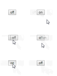
There is another problem here, try to click the following button:
<transition> - entry and exit occur simultaneously.


Transition mode
in-out
: The new element transitions first, and then the current element transitions away.out-in
: The current element transitions first, and then the new element transitions in.
out-in:
// ...
computed: {
  buttonMessage: function () {
    switch (this.docState) {
      case 'saved': return 'Edit'
      case 'edited': return 'Save'
      case 'editing': return 'Cancel'
    }
  }
}
in-out mode is not used very often, but it can still be useful for some slightly different transition effects.
Transition of multiple components
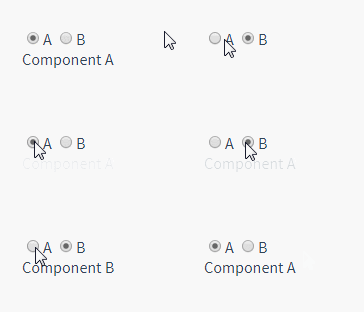
Transition of multiple components is much simpler - we don’t need to use the key attribute. Instead, we just need to use dynamic components:
<transition name="fade" mode="out-in">
  <!-- ... the buttons ... -->
</transition>
<transition name="component-fade" mode="out-in">
  <component v-bind:is="view"></component>
</transition>
new Vue({
  el: '#transition-components-demo',
  data: {
    view: 'v-a'
  },
  components: {
    'v-a': {
      template: '<div>Component A</div>'
    },
    'v-b': {
      template: '<div>Component B</div>'
    }
  }
})
##list Transition
So far, we have talked about transition:
- Single node
- Render one of multiple nodes at the same time
v-for? In this scenario, use the <transition-group> component. Before we dive into the example, let’s understand a few features about this component:
- Unlike
<transition>
, it will be rendered as a real element: Default For a<span>. You can also replace it with other elements using thetagattribute. Transition mode is not available because we no longer switch unique elements between each other.
- Internal elements
always require to provide a unique key
attribute value. - CSS transition classes will be applied to the inner elements, not the group/container itself.
##Entry/Leave Transition for ListNow let’s start with a For a simple example going in, the entry and exit transitions use the same CSS class names as before.
.component-fade-enter-active, .component-fade-leave-active {
  transition: opacity .3s ease;
}
.component-fade-enter, .component-fade-leave-to
/* .component-fade-leave-active for below version 2.1.8 */ {
  opacity: 0;
}
<div id="list-demo" class="demo">
<button v-on:click="add">Add</button>
<button v-on:click="remove">Remove</button>
<transition-group name="list" tag="p">
<span v-for="item in items" v-bind:key="item" class="list-item">
{{ item }}
</span>
</transition-group>
</div>new Vue({
el: '#list-demo',
data: {
items: [1,2,3,4,5,6,7,8,9],
nextNum: 10
},
methods: {
randomIndex: function () {
return Math.floor(Math.random() * this.items.length)
},
add: function () {
this.items.splice(this.randomIndex(), 0, this.nextNum++)
},
remove: function () {
this.items.splice(this.randomIndex(), 1)
},
}
})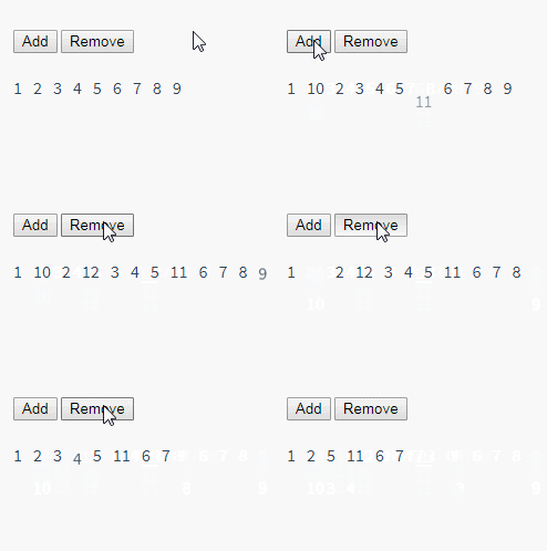 There is a problem with this example. When adding and removing elements, the surrounding elements will instantly move to their new layout positions instead of a smooth transition. , we will solve this problem below.
Sort transition of list
<transition-group> Component There is another special feature. Not only can you enter and leave animations, but you can also change positioning. To use this new feature just need to know about the new v-move feature, which will be applied during the process of changing the position of the element. Like the previous class name, the prefix can be customized through the name attribute, or it can be set manually through the move-class attribute.
is very useful for setting the switching timing and transition curve of the transition. You will see the following example: This looks amazing. Internally, Vue uses a simple animation queue called FLIP We combine the previously implemented example with this technology so that all changes in our list will have animated transitions. It should be noted that elements using FLIP transition cannot be set to FLIP animation can not only achieve single column transition, but also multi-dimensional grid can also transition : ##Staggered transitions for lists.list-item {
display: inline-block;
margin-right: 10px;
}
.list-enter-active, .list-leave-active {
transition: all 1s;
}
.list-enter, .list-leave-to
/* .list-leave-active for below version 2.1.8 */ {
opacity: 0;
transform: translateY(30px);
}<script src="https://cdnjs.cloudflare.com/ajax/libs/lodash.js/4.14.1/lodash.min.js"></script>
<div id="flip-list-demo" class="demo">
<button v-on:click="shuffle">Shuffle</button>
<transition-group name="flip-list" tag="ul">
<li v-for="item in items" v-bind:key="item">
{{ item }}
</li>
</transition-group>
</div>new Vue({
el: '#flip-list-demo',
data: {
items: [1,2,3,4,5,6,7,8,9]
},
methods: {
shuffle: function () {
this.items = _.shuffle(this.items)
}
}
})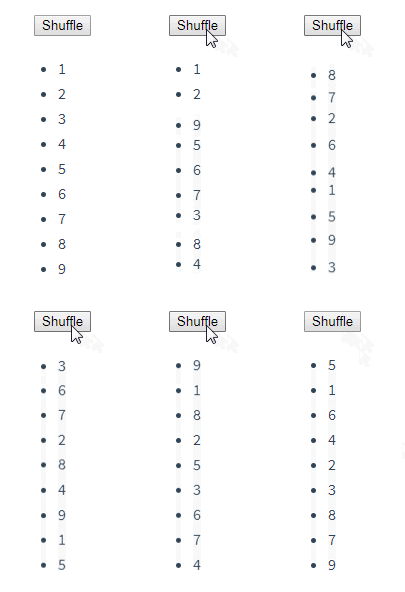
Use transforms to move elements from their previous positions. Smooth transitions to new locations. .flip-list-move {
transition: transform 1s;
}<script src="https://cdnjs.cloudflare.com/ajax/libs/lodash.js/4.14.1/lodash.min.js"></script>
<div id="list-complete-demo" class="demo">
<button v-on:click="shuffle">Shuffle</button>
<button v-on:click="add">Add</button>
<button v-on:click="remove">Remove</button>
<transition-group name="list-complete" tag="p">
<span
v-for="item in items"
v-bind:key="item"
class="list-complete-item"
>
{{ item }}
</span>
</transition-group>
</div>new Vue({
el: '#list-complete-demo',
data: {
items: [1,2,3,4,5,6,7,8,9],
nextNum: 10
},
methods: {
randomIndex: function () {
return Math.floor(Math.random() * this.items.length)
},
add: function () {
this.items.splice(this.randomIndex(), 0, this.nextNum++)
},
remove: function () {
this.items.splice(this.randomIndex(), 1)
},
shuffle: function () {
this.items = _.shuffle(this.items)
}
}
})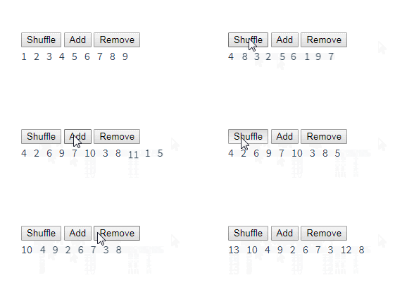
display: inline. As an alternative, you can set it to display: inline-block or place it in flex 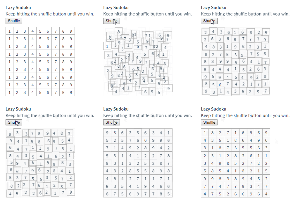
.list-complete-item {
transition: all 1s;
display: inline-block;
margin-right: 10px;
}
.list-complete-enter, .list-complete-leave-to
/* .list-complete-leave-active for below version 2.1.8 */ {
opacity: 0;
transform: translateY(30px);
}
.list-complete-leave-active {
position: absolute;
}<script src="https://cdnjs.cloudflare.com/ajax/libs/velocity/1.2.3/velocity.min.js"></script>
<div id="staggered-list-demo">
<input v-model="query">
<transition-group
name="staggered-fade"
tag="ul"
v-bind:css="false"
v-on:before-enter="beforeEnter"
v-on:enter="enter"
v-on:leave="leave"
>
<li
v-for="(item, index) in computedList"
v-bind:key="item.msg"
v-bind:data-index="index"
>{{ item.msg }}</li>
</transition-group>
</div>

##Reusable Transition
Transitions can be reused through Vue's component system. To create a reusable transition component, all you need to do is make<transition>
or <transition-group> as the root component and place any child components within it That's it.
Simple example using template:
new Vue({
  el: '#staggered-list-demo',
  data: {
    query: '',
    list: [
      { msg: 'Bruce Lee' },
      { msg: 'Jackie Chan' },
      { msg: 'Chuck Norris' },
      { msg: 'Jet Li' },
      { msg: 'Kung Fury' }
    ]
  },
  computed: {
    computedList: function () {
      var vm = this
      return this.list.filter(function (item) {
        return item.msg.toLowerCase().indexOf(vm.query.toLowerCase()) !== -1
      })
    }
  },
  methods: {
    beforeEnter: function (el) {
      el.style.opacity = 0
      el.style.height = 0
    },
    enter: function (el, done) {
      var delay = el.dataset.index * 150
      setTimeout(function () {
        Velocity(
          el,
          { opacity: 1, height: '1.6em' },
          { complete: done }
        )
      }, delay)
    },
    leave: function (el, done) {
      var delay = el.dataset.index * 150
      setTimeout(function () {
        Velocity(
          el,
          { opacity: 0, height: 0 },
          { complete: done }
        )
      }, delay)
    }
  }
})
Functional components are more suitable for completing this task: Vue.component('my-special-transition', {
template: '\
<transition\
name="very-special-transition"\
mode="out-in"\
v-on:before-enter="beforeEnter"\
v-on:after-enter="afterEnter"\
>\
<slot></slot>\
</transition>\
',
methods: {
beforeEnter: function (el) {
// ...
},
afterEnter: function (el) {
// ...
}
}
})
Dynamic Transition
Even transitions in Vue are data-driven! The most basic example of dynamic transition is binding dynamic values through thename
attribute.
Vue.component('my-special-transition', {
  functional: true,
  render: function (createElement, context) {
    var data = {
      props: {
        name: 'very-special-transition',
        mode: 'out-in'
      },
      on: {
        beforeEnter: function (el) {
          // ...
        },
        afterEnter: function (el) {
          // ...
        }
      }
    }
    return createElement('transition', data, context.children)
  }
})
This is useful when you want to switch between different transitions using Vue’s transition system to define CSS transitions/animations.
All transition properties can be dynamically bound, but we not only have properties that can be used, but also can obtain all data in the context through event hooks, because event hooks are all methods. This means that your JavaScript transitions will behave differently depending on the state of the component.
<transition v-bind:name="transitionName">
  <!-- ... -->
</transition>
rrree
Finally, the final solution to creating a dynamic transition is for the component to dynamically modify the previous transition by accepting props. As the old saying goes, the only limit is your imagination.


