Component Basics
Table of Contents
##Basic example
Here is a Vue Example of a component:// 定义一个名为 button-counter 的新组件
Vue.component('button-counter', {
data: function () {
return {
count: 0
}
},
template: '<button v-on:click="count++">You clicked me {{ count }} times.</button>'
})A component is a reusable Vue instance with a name:
<button-counter> in this example. We can use this component as a custom element in a Vue root instance created by new Vue: <div id="components-demo">
<button-counter></button-counter>
</div>
new Vue({ el: '#components-demo' })
 Because the component is Reused Vue instances, so they receive the same options as
, such as data, computed, watch, methods and life cycle hooks, etc. The only exceptions are root-instance-specific options like el.
Reuse of components
You can reuse components any number of times :<div id="components-demo"> <button-counter></button-counter> <button-counter></button-counter> <button-counter></button-counter> </div>
 Note that when the button is clicked, each component will maintain its
independently. Because every time you use a component, a new instance of it is created.
data## Must be a function When we define this <button-counter>
data does not directly provide an object like this:
data: {
  count: 0
}
Instead, a component's data option must be a function , so each instance can maintain a separate copy of the returned object:
data: function () {
  return {
    count: 0
  }
}
If Vue does not have this rule, clicking a button may affect all other instances like the following code:

##Organization of components
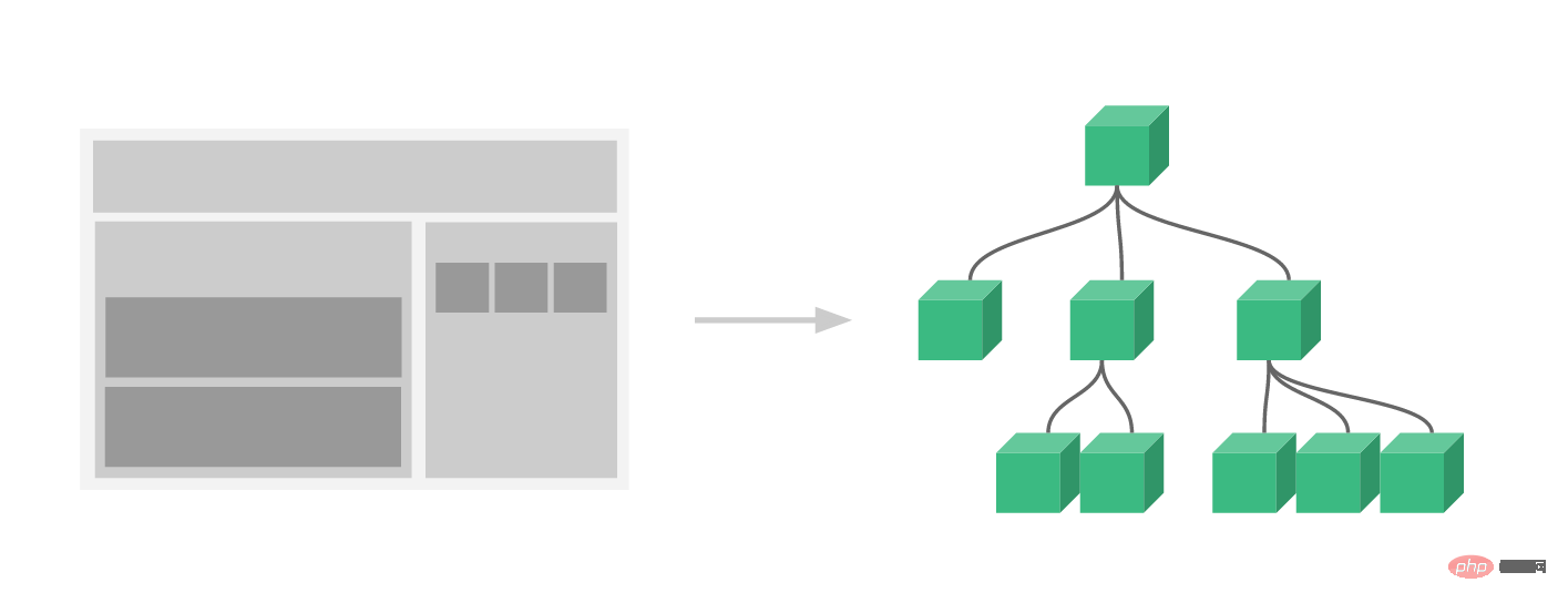
Usually an application will be organized in the form of a nested component tree:

global registration and local registration. So far, our components have only been globally registered through Vue.component:
Vue.component('my-component-name', {
  // ... options ...
})
Globally registered components can be used in anything after they are registered (through new Vue) The newly created Vue root instance is also included in the templates of all sub-components in its component tree.
Component registration Read it.
Passing data to child components through Props
Earlier, we mentioned Create a blog post component. The problem is that if you can't pass the data we want to display, such as the title or content of a blog post, to this component, it can't be used. This is where props come from. Props are some custom properties you can register on the component. When a value is passed to a prop attribute, it becomes a property of that component instance. To pass a title to the blog post component, we can include it in the list of props accepted by the component using a
props option:
Vue.component('blog-post', {
  props: ['title'],
  template: '<h3>{{ title }}</h3>'
})
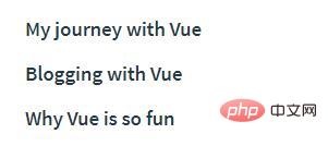
A component can have any number of props by default, Any value can be passed to any prop. In the above template, you will notice that we can access this value in the component instance, just like accessing the value in data. After a prop is registered, you can pass data in as a custom characteristic like this: <blog-post title="My journey with Vue"></blog-post> <blog-post title="Blogging with Vue"></blog-post> <blog-post title="Why Vue is so fun"></blog-post>

data:
new Vue({
  el: '#blog-post-demo',
  data: {
    posts: [
      { id: 1, title: 'My journey with Vue' },
      { id: 2, title: 'Blogging with Vue' },
      { id: 3, title: 'Why Vue is so fun' }
    ]
  }
})
and want to render a component for each blog post: <blog-post v-for="post in posts" v-bind:key="post.id" v-bind:title="post.title" ></blog-post>
As shown above, you will find that we can use v-bind to dynamically pass props. This is very useful when you don't know the specific content to be rendered at the beginning, such as getting a list of blog posts from an API.
So far, that’s about all you need to know about prop. If you finish reading this page and master its content, we will recommend you to come back and read prop over.
##Single root element
##When building a<blog-post> ;
component, your template will end up containing much more than just a title:
<h3>{{ title }}</h3>At the very least, you will include the body of the blog post:
<h3>{{ title }}</h3>
<div v-html="content"></div>
However, if you try to write this in a template, Vue will display an error and explain that
every component must have a single root element (each component must have only one root element). You can fix this problem by wrapping the content of the template in a parent element, for example: <div class="blog-post">
<h3>{{ title }}</h3>
<div v-html="content"></div>
</div> It seems that as the components become more and more complex, our blog posts not only need titles and content, but also Requires publication date, reviews, etc. Defining a prop for each relevant message can become cumbersome:
<blog-post
  v-for="post in posts"
  v-bind:key="post.id"
  v-bind:title="post.title"
  v-bind:content="post.content"
  v-bind:publishedAt="post.publishedAt"
  v-bind:comments="post.comments"
></blog-post>
So it’s time to refactor this
<blog-post> component to accept a Individual post prop: <blog-post
v-for="post in posts"
v-bind:key="post.id"
v-bind:post="post"
></blog-post>
Vue.component('blog-post', {
props: ['post'],
template: `
<div class="blog-post">
<h3>{{ post.title }}</h3>
<div v-html="post.content"></div>
</div>
`
})
template stringspostto make multi-line templates easier read. They are not supported under IE, so if you need to support IE without compiling (through tools like Babel or TypeScript), please use the breakline escape character instead.
Now, whenever you add a new property to the
object, it will automatically be available within <blog-post>.
Listening to subcomponent events
In our development<blog- post>
component, some of its functions may require us to communicate with the parent component. For example, we might introduce an auxiliary function to increase the font size of a blog post while keeping the rest of the page at the default font size.
In its parent component, we can support this functionality by adding a
data attribute: new Vue({
el: '#blog-posts-events-demo',
data: {
posts: [/* ... */],
postFontSize: 1
}
})
<div id="blog-posts-events-demo">
  <div :style="{ fontSize: postFontSize + 'em' }">
    <blog-post
      v-for="post in posts"
      v-bind:key="post.id"
      v-bind:post="post"
    ></blog-post>
  </div>
</div>
Now we add a button before the text of each blog post to enlarge the font size:
Vue.component('blog-post', {
  props: ['post'],
  template: `
    <div class="blog-post">
      <h3>{{ post.title }}</h3>
      <button>
        Enlarge text
      </button>
      <div v-html="post.content"></div>
    </div>
  `
})
The problem is that this button doesn't do anything:
<button>
  Enlarge text
</button>
When this button is clicked, we need to tell the parent component to enlarge the text of all blog posts. Fortunately, Vue instances provide a custom event system to solve this problem. The parent component can listen to any events of the child component instance through v-on just like handling native DOM events:
<blog-post
  ...
  v-on:enlarge-text="postFontSize += 0.1"
></blog-post>
At the same time, the child component can call the built-in $emit method and pass in the event name to trigger an event:
<button v-on:click="$emit('enlarge-text')">
  Enlarge text
</button>
With thisv-on:enlarge-text="postFontSize = 0.1" listener , the parent component will receive the event and update the value of postFontSize.

Use events to throw a value
Some It is useful to use an event to throw a specific value. For example, we might want the <blog-post> component to determine how much its text should be enlarged. At this time, you can use the second parameter of $emit to provide this value:
<button v-on:click="$emit('enlarge-text', 0.1)">
  Enlarge text
</button>
Then when listening to this event in the parent component, we can pass $event Access the value being thrown:
<blog-post
  ...
  v-on:enlarge-text="postFontSize += $event"
></blog-post>
Or, if the event handler is a method:
<blog-post
  ...
  v-on:enlarge-text="onEnlargeText"
></blog-post>
Then this value will be passed into this method as the first parameter :
methods: {
  onEnlargeText: function (enlargeAmount) {
    this.postFontSize += enlargeAmount
  }
}
Customize using v-model
on the component Events can also be used to create custom input components that support v-model. Remember:
<input v-model="searchText">
is equivalent to:
<input
  v-bind:value="searchText"
  v-on:input="searchText = $event.target.value"
>
When used on components, v-model will look like this:
<custom-input
  v-bind:value="searchText"
  v-on:input="searchText = $event"
></custom-input>
In order to make For it to work properly, the <input> within this component must:
have its
valueattribute bound to a variable named ## The #valueprop on- passes the new value through the custom
input
event when itsinputevent is triggered. Throw
Vue.component('custom-input', {
  props: ['value'],
  template: `
    <input
      v-bind:value="value"
      v-on:input="$emit('input', $event.target.value)"
    >
  `
})
Now v-model should be able to work perfectly on this component. :
<custom-input v-model="searchText"></custom-input>So far, that’s about all you need to know about component custom events. If you finish reading this page and master its content, we will recommend you to come back again
Custom event is read.
Distributing content through slots
Like HTML elements, we often need to A component passing content like this:
<alert-box>
  Something bad happened.
</alert-box>
might render something like this:

Fortunately, Vue’s custom <slot> element makes this very easy:
Vue.component('alert-box', {
  template: `
    <div class="demo-alert-box">
      <strong>Error!</strong>
      <slot></slot>
    </div>
  `
})
As you can see, we just need Just add slots where needed - it's that simple!
So far, that’s about all you need to know about slots. If you finish reading this page and master its content, we will recommend you to come back and learn SLOTRead it.
Dynamic components
Sometimes, dynamic switching between different components It is very useful, for example, in a multi-tab interface:

The above content can be added through Vue’s <component> element A special is attribute is implemented:
<!-- 组件会在 `currentTabComponent` 改变时改变 -->
<component v-bind:is="currentTabComponent"></component>
In the above example, currentTabComponent can include
registered components The name, or
The options object of a component
You can view and experience the complete codehere, Or in this version learn about the example of binding component options objects instead of registered component names.
So far, that’s about all you need to know about dynamic components. If you finish reading this page and master its content, we will recommend you to come back and learn about dynamic and asynchronous components. Finish reading.
Notes when parsing DOM templates
Some HTML elements, such as <ul>, <ol>, <table> and <select>, for which elements can appear inside them There are strict restrictions. Some elements, such as <li>, <tr>, and <option>, can only appear inside certain other elements.
This will cause us to encounter some problems when using these constrained elements. For example:
<table>
  <blog-post-row></blog-post-row>
</table>
This custom component <blog-post-row> will be promoted to the outside as invalid content and cause errors in the final rendering result. Fortunately, this special is feature gives us a workaround:
<table>
  <tr is="blog-post-row"></tr>
</table>
It should be noted that this restriction is if we use templates from the following sources The of does not exist:
string (for example:
template: '...')


