WeChat web development style library
WeChat web development style library
WeUI is a set of basic style libraries that are consistent with WeChat’s native visual experience. WeChat’s official design team has designed tailor-made web development for WeChat, which can make users’ usage perception more unified. Using WeUI in WeChat web development has the following advantages:
1. The same visual effect as the WeChat client, making it easier for all WeChat users to use your website
2. Convenient access and quick use, reducing development and design costs
3. WeChat design team carefully created, clear, concise and elegant
This style library currently includes button, cell, dialog, progress, toast, Various elements such as article and icon have been open sourced on GitHub.
Method 1: Use bower to install
bower install --save weui
Method 2: Use npm to install
npm install --save weui
After choosing any method to install, you only need to introduce one of dist/style/weui.css or dist/style/weui.min.css into the page. For example:
<!DOCTYPE html> <html>
<head>
<meta charset="UTF-8">
<meta name="viewport" content="width=device-width,initial-scale=1,user-scalable=0">
<title>WeUI</title> ;
<link rel="stylesheet" href="path/to/weui/dist/style/weui.min.css"/>
#<body> </body> </html>Developgit clone https://github.com/weui/weui.git
Running the gulp -ws command will monitor changes to all files in the src directory, start the server on port 8080 by default, and then open http://localhost:8080/example in the browser.
Buttons can use a or button tag. To trigger the active state of the button on the wap, the ontouchstart event must be triggered. You can add ontouchstart="" to the body to trigger globally. Common operation scenarios of buttons: OK, Cancel, Warning, corresponding to classes: weui_btn_primary, weui_btn_default, weui_btn_warn. Each scenario has its own gray state weui_btn_disabled. In addition, there is also a hollow button weui_btn_plain_xxx, customer There are two types of button sizes in the end webview. The default width is 100%. The width of small buttons is adaptive. The spacing between the borders on both sides and the text is 0.75em: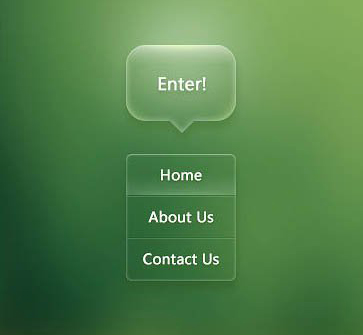
<a href="#" class="weui_btn weui_btn_primary"> button</a>
<a href="#" class="weui_btn weui_btn_disabled weui_btn_primary"> button</a>
<a href="#" class="weui_btn weui_btn_warn"> 电影</a>
<a href="#" class="weui_btn weui_btn_disabled weui_btn_warn"> 电影</a>
<a href="#" class="weui_btn weui_btn_default"> ; button</a>
<a href="#" class="weui_btn weui_btn_disabled weui_btn_default"> button</a>
<div class="button_sp_area"><a href="#" class="weui_btn weui_btn_plain_default"> button</a>
<a href="#" class="weui_btn weui_btn_plain_primary"> button</a>
<a href="#" class="weui_btn weui_btn_mini weui_btn_primary"> button</a>
<a href="#" class="weui_btn weui_btn_mini weui_btn_default"> button</a> </div>
Cell, list view, is used to display information on the page in a list structure. It is the most commonly used content structure on wap. Cell consists of multiple sections, each section includes section header weui_cells_title and cells weui_cells.
Cell consists of three parts: thumbnail weui_cell_hd, body weui_cell_bd, and accessory weui_cell_ft. Cell adopts adaptive layout. Just add class weui_cell_primary to the parts that need to be adaptive:
List item with description
<div class="weui_cells">
<div class="weui_cell">
; <div class="weui_cell_bd weui_cell_primary">
; <p>Title text</p>
; </div>
<div class="weui_cell_ft">
Cell can be customized with various extensions as needed, including auxiliary instructions, jumps, radio selections, check selections, etc. The following is a list item with icon, description, and jump. In other cases, you can directly refer to the code under example:
<div class="weui_cells weui_cells_access">
<a class="weui_cell" href="#">
<div class="weui_cell_hd" > class="weui_cell_bd weui_cell_primary">
</div>
</a>
<a class="weui_cell" href="#">
src="" alt="icon" style="width:20px;margin-right:5px;display:block">
</a>
</div>
If the system alert form cannot meet the temporary view content requirements of the web page, you can customize a dialog similar to the alert form, and Various controls can be customized in the dialog to meet your needs.

<div class "weui_dialog">
"weui_dialog_bd">Customize the content of the pop-up window, align the display to the left, and inform the information that needs to be confirmed, etc.</div>
class="weui_btn_dialog default">Cancel</a>
</div>
</div>
<div class="weui_mask"></div>
<div class="weui_dialog">
<div class="weui_dialog_hd"><strong class="weui_dialog_title">Pop-up window title</strong></div>
<div class="weui_dialog_bd">Pop-up window content, informing the current page Information, etc.</div>
/div>
</div>
</div>
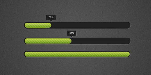
Progress is used for uploading, downloading and other time-consuming scenarios where progress needs to be displayed. The user can interrupt the operation at any time.
="width: 50%;"></div>
weui_icon_cancel"></i>
</a>
</div>
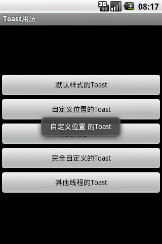
Toast is used to temporarily display certain information and will automatically disappear after a few seconds. This information is typically success, failure, or wait status information for lightweight operations.
p>
</div>
</div>
<div class="weui_mask_transparent"></div>
<div class="weui_toast">
<div class="weui_loading">
<!-- :) -->
<div class="weui_loading_leaf weui_loading_leaf_0"></div>
<div class="weui_loading_leaf weui_loading_leaf_1"></div>
<div class="weui_loading_leaf weui_loading_leaf_2"></div>
<div class="weui_loading_leaf weui_loading_leaf_3"></div>
<div class="weui_loading_leaf weui_loading_leaf_4"></div>
<div class="weui_loading_leaf weui_loading_leaf_5"></div>
<div class="weui_loading_leaf weui_loading_leaf_6"></div>
<div class="weui_loading_leaf weui_loading_leaf_7"></div>
<div class="weui_loading_leaf weui_loading_leaf_8"></div>
<div class="weui_loading_leaf weui_loading_leaf_9"></div>
<div class="weui_loading_leaf weui_loading_leaf_10"></div>
<div class="weui_loading_leaf weui_loading_leaf_11"></div>
</div>
<p class="weui_toast_content">数据加载中</p>
</div>
</div>
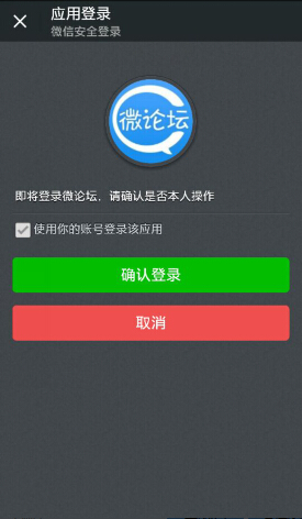
The result page can generally be thought of as a summary page at the end of the process after a series of steps. The main function of the results page is to inform the user of the operation processing results and necessary relevant details (which can be used to confirm whether the previous operations were correct); if the process is used to turn on or off some important functions, you can add the information related to the results page to the results page. Descriptive content related to functions; in addition, the results page can also carry some additional value operations, such as providing lottery draws, following public accounts and other functional entrances.
<div class="weui_text_area">
<h2 class="weui_msg_title">Operation successful</h2>
"weui_msg_desc">Content details can be arranged according to actual needs</p>
</div>
<div class="weui_opr_area">
<p class="weui_btn_area" > a>
</p>
</div>
<div class="weui_extra_area">
<a href="">View details</a>
</div>
</div>
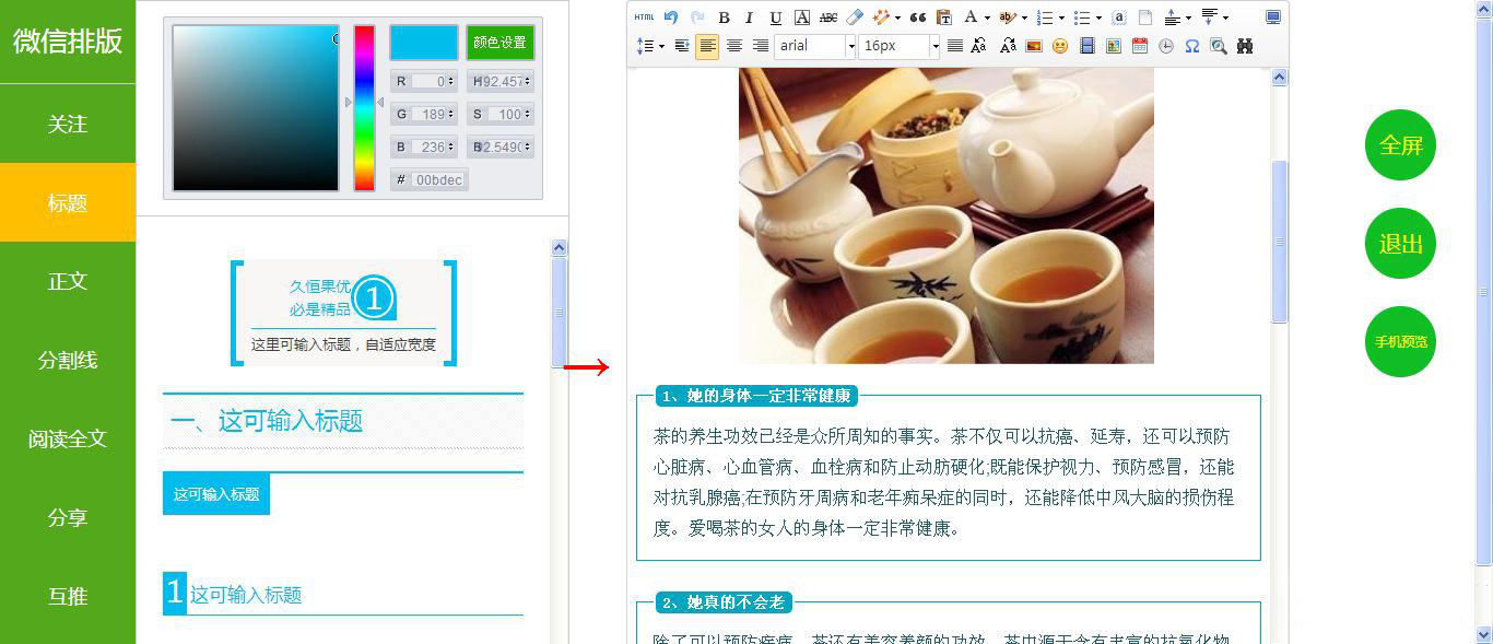
Text view displays large blocks of text, which are usually the main content on the page. Article supports rich text styles such as paragraphs, multi-layer titles, quotes, inline images, ordered/unordered lists, etc., and can respond to user selection operations.
When using Article in WeChat client webview, you must ensure that the text is sufficiently readable and legible, use standard fonts, ensure sufficient paragraph spacing, and have no indentation at the beginning of the paragraph.
<h1>大校题</h1>
<section>
<h2 class="title">章校题< ;/h2>
<section>
<h3>1.1 节标题</h3>
<p> They happened with some great labor and pain. For to come to the smallest detail, no one engages in any kind of exercise unless he obtains some benefit from it. Duis aute</p>
</section>
<section>
<h3>1.2 节标题</h3>
<p> Adipisicing developer, but I will be in an iIrmod
at work and painful pain. For to come to the smallest detail,
Unless they are blinded by desire and do not proceed, they are in fault who forsake their duties and soften their hearts, that is toil.
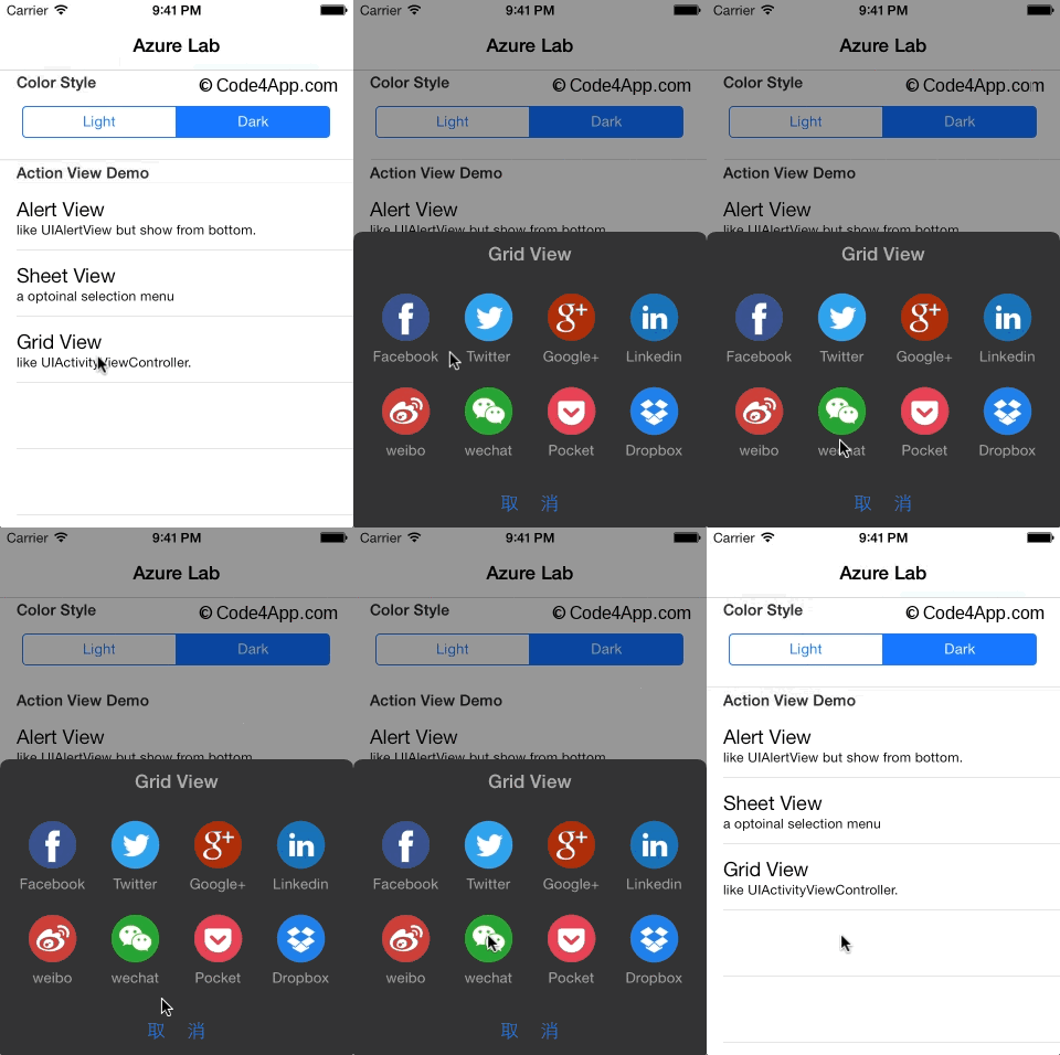
ActionSheet is used to display a series of interactive action collections, including instructions, jumps, etc. Pops up from the bottom, generally used to respond to user clicks on the page.
<div class="weui_actionsheet" id="weui_actionsheet">
; <div class="weui_actionsheet_menu">
; div class="weui_actionsheet_cell">Example menu</div>
>Example Menu</div>
use ’ ’ use ’s ’ use ’s ’ using ’s ’s ’s ’ s ’ s d through d ‐ ‐ d ‐ , ;/div>
</div>
</div>
</div>
<i class="weui_icon_msg weui_icon_info"></i>
<i class="weui_icon_msg weui_icon_warn"></i>
<i class="weui_icon_msg weui_icon_waiting"></i>
<i class="weui_icon_safe weui_icon_safe_success"></i>
<i class="weui_icon_safe weui_icon_safe_warn"></i>
<div class="icon_sp_area">
<i class="weui_icon_success"></i>
<i class="weui_icon_success_circle"></i>
<i class="weui_icon_success_no_circle"></i>
<i class="weui_icon_info"></i>
<i class="weui_icon_waiting"></i>
<i class="weui_icon_waiting_circle"></i>
<i class="weui_icon_circle"></i>
<i class="weui_icon_warn"></i>
<i class="weui_icon_download"></i>
<i class="weui_icon_info_circle"></i>
<i class="weui_icon_cancel"></i>
</div>


