Apply design specifications
A Interaction specification
A1 Instructions for use
- ##This document defines the interactive framework structure of Weibo’s third-party products. For the size definition and visual style of related content, please refer to Weibo’s visual specifications and PSD source files. Sections 02, 03, and 04 in this document are mandatory and must be followed when designing your product. Part 05 is optional and lists Weibo’s existing layout and component/control styles for reference during design.
A2 Interaction Design Principles
- Third-party products are designed in addition to following this document In addition to the general specifications listed, there is greater freedom of design. The Weibo Design Department provides the following interaction design principles for reference:
- ##Unity And standard
- Pages of the same type adopt the same or similar layout structure, and the response methods of similar operations remain consistent;
- The navigation structure remains consistent, including global navigation, search, filtering, etc. ;
- The copywriting expression is unified and easy to understand, including information prompts, titles, menus, grammatical punctuation, function names, etc.;
- ##Clear information and clear guidance
- The primary and secondary contents are well laid out and all types of information are organized logically; Clear Know the current page status. Second-level and lower pages must have a clear navigation hierarchy, such as unified navigation, breadcrumbs, etc.;
- Feedback is timely and effective
- Prompt feedback on user operations; Feedback information is accurate, concise, straightforward, and provides guidance for user operations Sex;
- Error and Safety Prevention
- Provide necessary reminders for operations with serious consequences;Provide ways to prevent or correct errors;
- Provide privacy protection measures;
A3.1 Overall framework layout
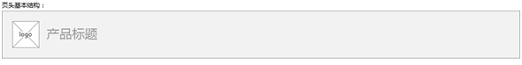
Third party The product must strictly contain the following five parts: Weibo top guide, page header, content, bottom guide and Weibo page footer. Among them, please call the interface directly for the top guide and footer of Weibo. For the header, content and bottom guide of the page, please design the specific structure content by yourself according to the principle of interactive framework.
A3.2 Weibo top guide
- In principle, third party For products, please directly call the simplified version of Weibo’s top guide. If you have special needs and want to use the full version of the top guide, please contact the relevant Weibo interface person for confirmation.
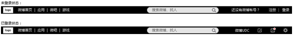
##A3.3 Header
- The header is the global navigation area of the entire product and must contain the product's logo and title. Other elements, such as slogan, brand header image display, search box, operation position, etc., please layout them yourself without damaging the overall structure of the page header.
- Header There are two sizes available: standard header and narrow header. The standard header is suitable for the first-level pages of the product, and the narrow header is suitable for the second-level pages. The purpose of designing a narrow header is to display more content on the secondary page, so the height of the header is lowered. In specific products, please follow the following principles. Product pages cannot use only narrow headers, and product first-level pages cannot use narrow headers.
- If the first-level navigation of the product is placed in the header area, please align it to the right. Reference the following structure:

##A3.4 Content
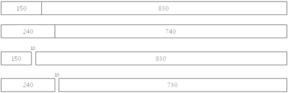
- The layout of the content area has a variety of column structures for use: three-column version, two-column version (left narrow and right wide, right wide and left narrow), and full-column version. Please refer to the visual specification definition for grid system dimensions. Products can choose appropriate layout formats based on their own structural characteristics.
- ##Three column version
- Left side For navigation, the middle is the main content area, and the right side is secondary content such as recommendations and help.

- #Two-column version-narrow left and wide right
- The navigation is on the left and the content area is on the right. According to the product content, you can choose the following four two-column layouts with narrow left and wide right.
- The left side is the content area and the right side is the navigation. Depending on the product content, you can choose from the following four two-column layouts with a wide left and narrow right.
- ##Blank version Blank structure for There are no clear standards for navigation and primary and secondary content, so please design it yourself. principles, the information structure is clear and the navigation guidance is clear.
 If the above column structure cannot meet the actual needs of the product, it can be changed based on this grid system with 30px as the module unit. Such as 720/260.
- The bottom guide serves as an external navigation portal related to the product, such as links to other third-party products, mobile download links, etc. Please refer to the following structure:
- #For third-party products, please call the bottom of the Weibo page directly.

##A4 Application embedded in Weibo personal homepage Framework specification
A4.1 Overall frame layout
The part selected by the dotted line in the figure below is for inline applications content area. Different from the design of independent web pages, the interactive components/controls and visual styles of embedded applications must strictly comply with Weibo's design specifications. For reused parts, please directly call Weibo's relevant interfaces.
A5 Common Components and Control Specifications
A5.1 Login page And login floating layer
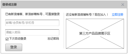
#Login has two forms, page and dialog box.
- When you need to use the login page, please call the Weibo Mini login page. Except for the operation area, the other parts of this page cannot be modified.
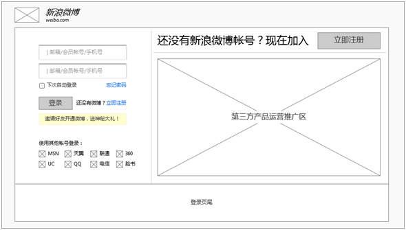
##When needed When using the login dialog box, please call the Weibo login panel.
 ##A5.2 Weibo Publisher
When you need to use Weibo sharing in third-party products, please call the Weibo publisher. The elements in the publisher are not allowed to be modified.
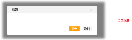
A5.3 Dialog box and pop-up layer
- Dialog box and Pop-up layers are interactive carriers used to complete certain information prompts or tasks. The difference is that dialog boxes tend to be more important operations or information behaviors. They appear in the middle of the page or near the operation object, forcing the user to interrupt the current situation. Task. The pop-up layer is more inclined to quick operations or information behaviors. It appears near the operation object, hoping to interrupt the user's current task as little as possible.
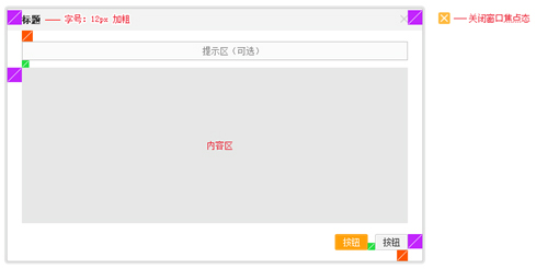
- ##Dialog box The following is the dialogue Basic structure of the box:
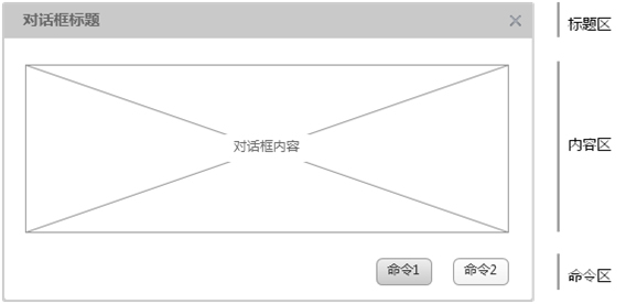
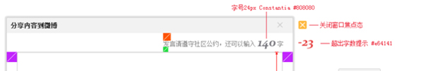
- ##The dialog box must contain a title, "X" button, content and commands. Title and content are aligned left, closing and command are aligned right. The command area must contain an operation to close the dialog box. In principle, the height of the dialog box is not allowed to be so high that it exceeds the user's screen.
- Dialog boxes are mainly divided into two categories: information dialog boxes and task dialog boxes.
- The information dialog box is suitable for important prompts, confirmations, warnings, feedback and other scenarios. Its content area is mainly text information description. It is required that there must be a type icon on the left side of the text information. For example, different icons should be used for deletion, confirmation, and warning operations to distinguish types. Task dialog boxes are suitable for object selection, form filling and other scenarios.
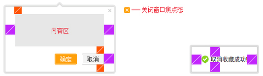
- ##Elastic layer
- Elastic layer is at Appears near the operation object. The following are the two basic structures of the elastic layer:
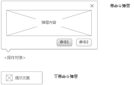
- With a command pop-up layer, it is suitable for task-type behaviors, and without a command pop-up layer, it is suitable for feedback of success prompts. The pop-up layer will automatically disappear without a command, so this prompt copy is not something the user must see.
B Visual specifications
B1 Instructions for use
- B Visual specifications define the grid system, framed visual size and style of Weibo’s third-party products. Relevant source files can be downloaded from the PSD file provided by Weibo.
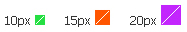
- Three unit size blocks are used in the visual specification, green is 10px, red is 15px, and purple is 20px.
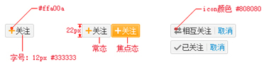
##B3 Navigation
B3.1 Weibo Top Guide
- The top navigation is centered, height: 25px.

##B3.2 Header
- Standard header

- ##Narrow page header
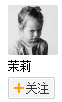
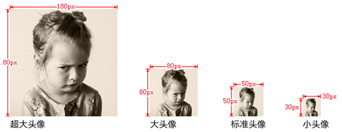
- #B5.2 Avatar
 ##B6 Application specifications for embedding Weibo personal homepage
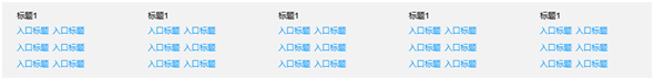
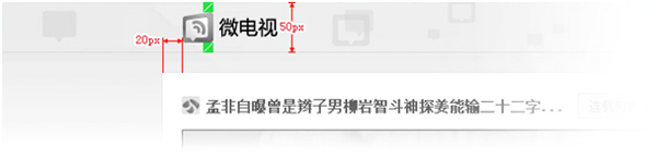
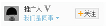
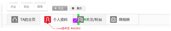
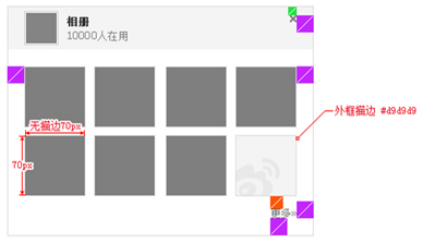
B6.1 Personal Home page card icon specification
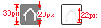
##Icon limit height: 20px, the height including projection should be 22 *Within 22px
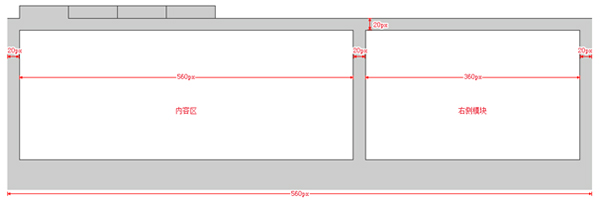
- ##B6.2 Page module spacing
- ##B6.3 Right side module specification
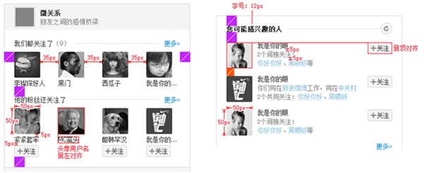
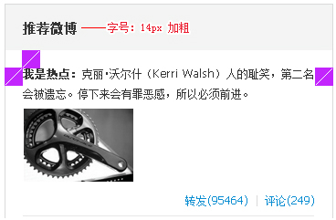
B6.4 Right module design example (optional)
- a User relationship content
- b Multimedia content
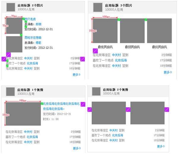
- #c Topic content
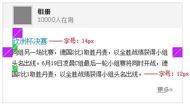
- ##d Weibo content
##B7 Dialog Box and Popup Layer
B7.1 Dialog box and elastic layer size definition
- Standard dialog box
##Elastic Layer
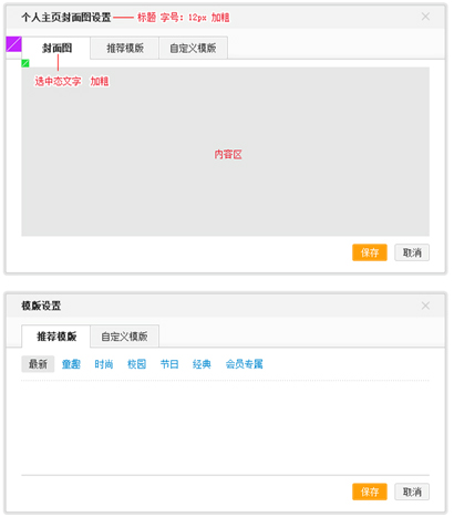
 ##B7.2 Design Example (optional)
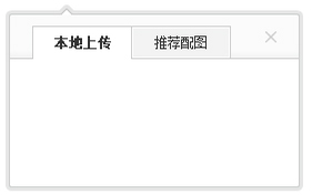
Template selection dialog box
B8.1 Logo proportion and light source
The proportional relationship between Chinese and English domain name combinations (this is the recommended combination):
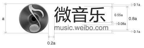
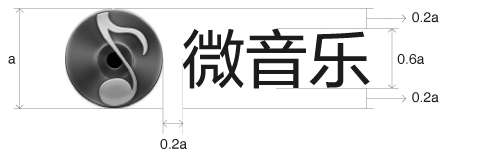
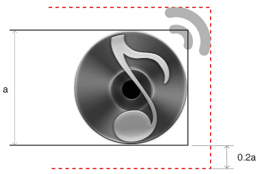
##B8.2 Logo graphic body and extension area safety range
- ##As shown in the figure, based on the height of the main body of the logo, its extension range shall not exceed 20% of the height of the main body.
B8.3 Logo font
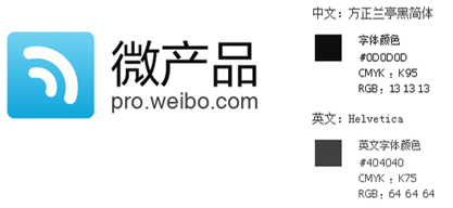
- Background brightness range B70~B100 , use the following specifications:
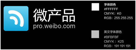
- ##When the background brightness range is B0~B60, use the following specifications:
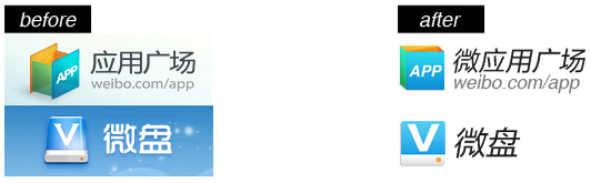
- The recommended design style is: light and thin , planarization. Heavy gradient textures, crystals and glows should be avoided.The following is a comparison of the before and after designs of micro applications and micro disks for reference:

 ##
##


