


我相信每个人的童年都有一个哆啦a梦,一个小小的肚皮里装满了不可思议的哆啦a梦,一个在你无助伤心的时候陪在你身边的哆啦a梦,一个陪你胡思乱想陪你吃铜锣烧的哆啦a梦~今天我们就来画一个我们心中的哆啦a梦吧~

定义哆啦a梦的容器
-
千篇一律先定义一个画哆啦a梦的大容器,确定它的大小和位置。
<!-- 哆啦A梦大容器 --><p class="doa"></p>
/*哆啦A梦*/
  .doa{position: relative;top: 100px;}
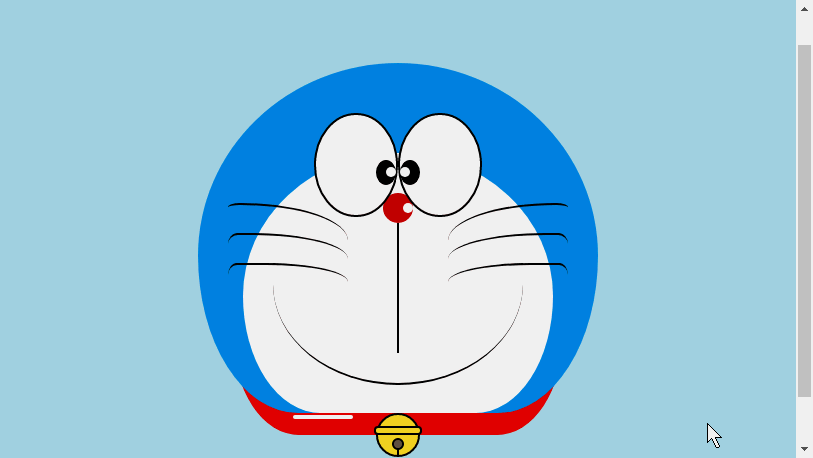
画哆啦a梦的头部(包括脸,脸部包括眼睛和鼻子)
头部包含好几块部分:哆啦a梦的脸部和鼻子,脸部又包括两只眼睛,两只眼睛里面还有眼珠和眼白部分,所以会有好几层的dom嵌套,当然基本图形都是由p+border-radius拼凑而成。
将画好的各个部位品拼凑到相应的位置上即可。
-
看我前面画的几个图画就知道border-radius是一个非常常用的属性,几乎p的每一次变形都离不开它,其实border-radius的真面目应该是
border-radius: 300px 300px 300px 300px/300px 300px 300px 300px;酱紫的,我们一般不写斜杠后面的内容,斜杠切面是水平长度,斜杠后面是垂直高度,前杠后面默认不写就是水平和垂直大小是一样的。我知道我这样说不够详细,可以参考我鑫神的博客秋月何时了,CSS3 border-radius知多少?,保证你分分钟在老司机的带领下彻底弄懂border-radius,还不快上车?<!-- 头 --> <p class="head"> <!-- 存放脸部的容器 --> <p class="face"> <!-- 左眼大圈儿 --> <p> <!-- 左眼眼珠(黑色部分) --> <p> <!-- 左眼眼白,黑色里面的白色部分 --> <p></p> </p> </p> <!-- 右眼大圈儿 --> <p> <!--右眼眼珠(黑色部分) --> <p> <!-- 右眼眼白,黑色里面的白色部分 --> <p></p> </p> </p> </p> <!-- 红鼻子部分 --> <p class="nose"> <!-- 红鼻子里面的白圈儿 --> <p></p> </p> <!-- 红鼻子下面的那根黑线,也属于鼻子部分 --> <p class="nose1"></p> </p> .head{ margin: 0 auto; /*头部定义大小并居中显示*/ width: 400px; height: 350px; background: #008ee3; /*头部定义背景颜色*/ position: relative; border-radius: 50% 50% 25% 25% / 55% 55% 45% 45%; /*头部定义四个方向圆角大小*/ } .face{ width: 310px; /*脸部定义大小*/ height: 260px; background: snow; /*脸部定义背景颜色*/ border-radius: 50% 50% 25% 25% / 55% 55% 45% 45%; /*脸部定义四个方向的圆角大小*/ position: relative; /*脸部定义位置,是相对于head的位置*/ top: 90px; left: 45px; } /*左眼眶*/ .face>p:first-child{ width: 80px; /*左眼框定义大小*/ height: 100px; border-radius: 50%; /*左眼框定义与圆角大小*/ border:2px #000 solid; /*定义外边框*/ background: snow; float: left; /*为了使左右两个眼睛能在一排显示*/ position: relative; /*位置是相对于face的位置*/ top:-40px; left: 71px; z-index: 50; } /*右眼眶,画法跟左眼一样*/ .face>p:last-child{ width: 80px; height: 100px; border-radius: 50%; border:2px #000 solid; background: snow; float: left; position: relative; top:-40px; left: 71px; z-index: 50; } /*左眼珠1*/ .face>p:first-child p{ width: 20px; /*定义眼珠的大小*/ height: 25px; background: #000; border-radius: 50%; position: absolute; /*定义眼珠的位置,相对于眼眶的位置*/ top: 45px; left: 60px; } /*左瞳孔*/ .face>p:first-child p p{ width: 10px; /*定义黑色瞳孔的大小*/ height: 10px; background: #ffffff; border-radius: 50%; position: absolute; /*定义黑色瞳孔的位置,相对于眼珠的位置*/ top: 7px; left: 10px; } /*右眼珠和左眼珠画法一样*/ .face>p:last-child p{ width: 20px; height: 25px; background: #000; border-radius: 50%; position: absolute; top: 45px; } /*右瞳孔和左瞳孔的画法一样*/ .face>p:last-child p p{ width: 10px; height: 10px; background: #ffffff; border-radius: 50%; position: absolute; top: 7px; } .nose{ width: 30px; /*定义红鼻子的大小*/ height: 30px; border-radius: 50%; background: #c70000; position: absolute; top: 130px; left: 50%; margin-left: -15px; z-index: 10; } .nose p{ width: 10px; /*定义红鼻子里面白色圈圈的大小*/ height: 10px; border-radius: 50%; position: absolute; background: #ffffff; top: 10px; margin-left: 20px; z-index: 10; } .nose1{ width: 2px; /*定义红鼻子下面的那一条黑线*/ height: 130px; background: #000; position: absolute; top: 160px; left: 50%; margin-left: -1px; z-index: 10; }
-

哆啦a梦的头部.png

画哆啦a梦的嘴巴部分
-
嘴巴应该是很简单的了吧,看一眼就知道是是用边框+border-radius实现的。
<p class="mouth"></p>
.mouth{      width: 250px;   /*定义嘴巴的大小*/      height: 200px;      border-radius: 50%;      background: snow;      border-bottom: 2px #000 solid;      margin: -230px auto;      position: relative;  /*定义嘴巴的位置*/
  }
哆啦a梦的嘴巴.png

画哆啦a梦的胡须部分
-
胡须部分其实在上一篇文章画html打造动画【连载3】- 小猫笑脸动画里面画胡须的时候就已经介绍了画胡须的方法,在这里就不赘述了,基本思路都是一样的。
<!-- 胡须 -->
  <p class="beard">
  <!-- 左边胡须部分 -->
      <p class="left">
      <!-- 第一根胡须 -->
          <p></p>
          <!-- 第二根胡须 -->
          <p></p>
          <!-- 第三根胡须 -->
          <p></p>
      </p>
      <p class="right">
          <p></p>
          <p></p>
          <p></p>
      </p>
      <!-- 脖子部分的小白条部分 -->
      <span></span>
  </p>/*胡须样式*/.beard .left p:first-child{      width: 120px;      height: 40px;      border-top: 2px #000 solid;      border-radius: 10% 90% 10% 90% / 10% 90% 10% 90%;      position: absolute;      left: 50%;      top: 140px;      margin-left: -170px;      z-index: 100;
  }  .beard .left p:nth-child(2){      width: 120px;      height: 40px;      border-top: 2px #000 solid;      border-radius: 10% 90% 10% 90% / 30% 70% 40% 60%;      position: absolute;      left: 50%;      top: 170px;      margin-left: -170px;      z-index: 100;
  }  .beard .left p:last-child{      width: 120px;      height: 40px;      border-top: 2px #000 solid;      border-radius: 10% 90% 10% 90% / 40% 60% 10% 90%;      position: absolute;      left: 50%;      top: 200px;      margin-left: -170px;      z-index: 100;
  }  .beard .right p:first-child{      width: 120px;      height: 40px;      border-top: 2px #000 solid;      border-radius: 90% 10% 90% 10% / 90% 10% 90% 10%;      position: absolute;      left: 50%;      top: 140px;      margin-left: 50px;      z-index: 100;
  }  .beard .right p:nth-child(2){      width: 120px;      height: 40px;      border-top: 2px #000 solid;      border-radius: 90% 10% 90% 10% / 70% 30% 60% 40%;      position: absolute;      left: 50%;      top: 170px;      margin-left: 50px;      z-index: 100;
  }  .beard .right p:last-child{      width: 120px;      height: 40px;      border-top: 2px #000 solid;      border-radius: 90% 10% 90% 10% / 60% 40% 90% 10%;      position: absolute;      left: 50%;      top: 200px;      margin-left: 50px;      z-index: 100;
  }  .beard span{      display: block;      width: 60px;      height: 3.5px;      background: #ffffff;      border-radius: 4px;      position: absolute;      top: 352px;      left: 50%;      margin-left: -105px;
  }
哆啦a梦的胡须.png

画哆啦a梦的脖子部分(脖子部分包括铃铛)
脖子就是基本p变形之后的图形,多余的部分隐藏到头部下面就可以了。
-
铃铛部分是各个很简单的基本图形组成。
<!-- 脖 -->
  <p class="neck">
  <!-- 铃铛的圆形 -->
      <p></p>
      <!-- 铃铛的小圆角矩形 -->
      <p></p>
      <!-- 铃铛的小圆形 -->
      <p></p>
      <!-- 铃铛的小竖线 -->
      <p></p>
  </p>
.neck{      width: 330px;      height: 200px;      border-radius: 50% 50% 20% 20% / 50% 50% 50% 50%;      background: #e30000;      margin: 80px auto;      z-index: 100;
  }  .neck p:first-child{      border: 2px #000 solid;      border-radius: 50%;      width: 40px;      height: 40px;      background: #ffdd2e;      position: absolute;      top: 350px;      left: 50%;      margin-left: -22px;      transition: all 1s;
  }  .neck p:nth-child(2){      border: 2px #000 solid;      width: 44px;      height: 5px;      background: #ffdd2e;      position: absolute;      left: 50%;      margin-left: -24px;      top: 363px;      border-radius: 5px;      transition: all 1s;
  }  .neck p:nth-child(3){      width: 8px;      height: 8px;      border: 2px #000 solid;      position: absolute;      background: #6c5844;      border-radius: 50%;      left: 50%;      margin-left: -6px;      top: 375px;      transition: all 1s;
  }  .neck p:nth-child(4){      width: 2px;      height: 8px;      background: #000;      position: absolute;      left: 50%;      margin-left: -1px;      top: 385px;      transition: all 1s;
  }
哆啦a梦的脖子.png

完成哆啦a梦的动态效果
动起来的哆啦a梦才比较萌对吧,那我们就让它动起来吧(transition属性)。
鼠标移动到眼睛部位左眼珠移动到左边。
鼠标移动到嘴巴部位,脸部表情变化。
-
鼠标移动到铃铛部分,铃铛变大。
/*眼睛动效*/.head:hover .face>p:first-child p{      left: 0px;      transition: all 1s;
  }  .head:hover .face>p:first-child p p{      left: 0px;      transition: all 1s;
  }/*嘴巴动效,嘴巴的dom容器下面要加了个空的p容器*/.mouth p:first-child{      width: 82px;      height: 2px;      background: #000;      position: absolute;      z-index: 1000;      top: -25px;      left: 6px;      display: none;
  }  .mouth p:nth-child(2){      width: 82px;      height: 2px;      background: #000;      position: absolute;      z-index: 1000;      top: -25px;      left: 90px;      display: none;
  }  .mouth:hover{      border-radius: 0;      width: 180px;      height: 200px;
  }  .mouth:hover p:first-child,.mouth:hover p:nth-child(2){      display: block;
  }/*铃铛动效*/.neck:hover p:first-child{      width: 60px;      height: 60px;      left: 50%;      margin-left: -30px;
  }  .neck:hover p:nth-child(2){      width: 66px;      height: 7.5px;      left: 50%;      margin-left: -33px;
  }  .neck:hover p:nth-child(3){      width: 12px;      height: 12px;      left: 50%;      margin-left: -6px;      top: 385px;
  }  .neck:hover p:nth-child(4){      width: 2px;      height: 12px;      left: 50%;      margin-left: 1px;      top: 400px;
  }
哆啦a梦动图.gif
Atas ialah kandungan terperinci html打造动漫人物--哆啦A梦. Untuk maklumat lanjut, sila ikut artikel berkaitan lain di laman web China PHP!

 Bagaimana kami menandakan font Google dan mencipta goofonts.comApr 12, 2025 pm 12:02 PM
Goofonts adalah projek sampingan yang ditandatangani oleh isteri pemaju dan suami pereka, kedua-duanya peminat besar tipografi. Kami telah menandakan Google
 Artikel Web Dev yang tidak berkesudahanApr 12, 2025 am 11:44 AM
Pavithra Kodmad meminta orang ramai untuk membuat cadangan mengenai apa yang mereka fikir adalah beberapa artikel yang paling abadi mengenai pembangunan web yang telah mengubahnya
 Perjanjian dengan elemen seksyenApr 12, 2025 am 11:39 AM
Dua artikel diterbitkan pada hari yang sama:
 Amalkan pertanyaan GraphQL dengan keadaan API JavaScriptApr 12, 2025 am 11:33 AM
Belajar bagaimana untuk membina API GraphQL boleh menjadi agak mencabar. Tetapi anda boleh belajar cara menggunakan API GraphQL dalam 10 minit! Dan ia berlaku saya ' ve mendapat yang sempurna
 CMSS peringkat komponenApr 12, 2025 am 11:09 AM
Apabila komponen tinggal di persekitaran di mana pertanyaan data memisahkannya tinggal berdekatan, terdapat garis langsung yang cukup antara komponen visual dan
 Tetapkan jenis pada bulatan ... dengan laluan mengimbangiApr 12, 2025 am 11:00 AM
Di sini ' s beberapa CSS Trickery dari Yuanchuan. Terdapat CSS Property Offset-Path. Suatu ketika dahulu, ia dipanggil gerakan-jalan dan kemudian ia dinamakan semula. I
 Apa yang 'kembali' lakukan dalam CSS?Apr 12, 2025 am 10:59 AM
Miriam Suzanne menerangkan dalam video pemaju Mozilla mengenai subjek.


Alat AI Hot

Undresser.AI Undress
Apl berkuasa AI untuk mencipta foto bogel yang realistik

AI Clothes Remover
Alat AI dalam talian untuk mengeluarkan pakaian daripada foto.

Undress AI Tool
Gambar buka pakaian secara percuma

Clothoff.io
Penyingkiran pakaian AI

AI Hentai Generator
Menjana ai hentai secara percuma.

Artikel Panas
Alat panas

MinGW - GNU Minimalis untuk Windows
Projek ini dalam proses untuk dipindahkan ke osdn.net/projects/mingw, anda boleh terus mengikuti kami di sana. MinGW: Port Windows asli bagi GNU Compiler Collection (GCC), perpustakaan import yang boleh diedarkan secara bebas dan fail pengepala untuk membina aplikasi Windows asli termasuk sambungan kepada masa jalan MSVC untuk menyokong fungsi C99. Semua perisian MinGW boleh dijalankan pada platform Windows 64-bit.

SublimeText3 Linux versi baharu
SublimeText3 Linux versi terkini

DVWA
Damn Vulnerable Web App (DVWA) ialah aplikasi web PHP/MySQL yang sangat terdedah. Matlamat utamanya adalah untuk menjadi bantuan bagi profesional keselamatan untuk menguji kemahiran dan alatan mereka dalam persekitaran undang-undang, untuk membantu pembangun web lebih memahami proses mengamankan aplikasi web, dan untuk membantu guru/pelajar mengajar/belajar dalam persekitaran bilik darjah Aplikasi web keselamatan. Matlamat DVWA adalah untuk mempraktikkan beberapa kelemahan web yang paling biasa melalui antara muka yang mudah dan mudah, dengan pelbagai tahap kesukaran. Sila ambil perhatian bahawa perisian ini

Muat turun versi mac editor Atom
Editor sumber terbuka yang paling popular

Pelayar Peperiksaan Selamat
Pelayar Peperiksaan Selamat ialah persekitaran pelayar selamat untuk mengambil peperiksaan dalam talian dengan selamat. Perisian ini menukar mana-mana komputer menjadi stesen kerja yang selamat. Ia mengawal akses kepada mana-mana utiliti dan menghalang pelajar daripada menggunakan sumber yang tidak dibenarkan.

