


0. Pengenalan
Dalam dunia pembangunan web, CSS ialah elemen utama dalam menjadikan antara muka pengguna cantik dan berfungsi.
Walau bagaimanapun, apabila kerumitan aplikasi web telah meningkat, Pengurusan CSS telah menjadi tugas yang semakin mencabar. Konflik gaya, kemerosotan prestasi dan kesukaran penyelenggaraan menjadi kebimbangan ramai pembangun.
Adakah isu ini menghalang kemajuan projek anda? (sumber imej)

Artikel ini mengupas secara mendalam pendekatan baharu untuk menyelesaikan masalah ini, terutamanya CSS dalam JS.
Bermula dengan latar belakang sejarah CSS, ia merangkumi pelbagai topik daripada kaedah penggayaan moden kepada sistem reka bentuk masa hadapan.
Struktur artikel adalah seperti berikut:
-
Takrif dan latar belakang CSS dalam JS
- 1. Apakah CSS dalam JS?
- 2. Latar belakang CSS dalam JS
-
Konteks sejarah CSS dan reka bentuk
- 3. Latar belakang CSS
- 4. Latar belakang Reka Bentuk
- 5. Latar belakang Sistem Reka Bentuk
-
Analisis kaedah pengurusan gaya dan cadangan baharu
- 6. Bagaimanakah gaya diuruskan?
- 7. Bagaimanakah gaya harus diuruskan?
-
Pelan pelaksanaan khusus untuk CSS dalam JS
- 8. Mengapa CSS dalam JS?
- 9. Perkenalkan projek mincho
- 10. CSS mesra CSS dalam JS
- 11. CSS boleh skala dalam JS
-
Integrasi dengan sistem reka bentuk
- 12. CSS dalam JS untuk Sistem Reka Bentuk
Khususnya, artikel ini memperkenalkan konsep baharu yang dipanggil metodologi CSS SCALE dan StyleStack, dan mencadangkan projek mincho berdasarkan ini. Ia bertujuan untuk melaksanakan CSS dalam JS yang mesra CSS dan berskala.
Tujuan utama artikel ini adalah untuk membentangkan kemungkinan penyelesaian penggayaan yang lebih baik kepada pembangun, pereka bentuk dan pihak berkepentingan projek web yang lain.
Sekarang, mari kita mendalami dunia CSS dalam JS dalam teks utama. Ia akan menjadi perjalanan yang panjang, tetapi saya harap ia memberi anda inspirasi dan peluang baharu untuk cabaran.
1. Apakah CSS dalam JS?
CSS dalam JS ialah teknik yang membolehkan anda menulis gaya CSS terus dalam kod JavaScript(atau TypeScript) anda.
Daripada membuat fail CSS yang berasingan, anda boleh menentukan gaya bersama komponen dalam fail JavaScript anda.
/** @jsxImportSource @emotion/react */
import { css } from "@emotion/react";

const buttonStyles = (primary) => css({
  backgroundColor: primary ? "blue" : "white",
  color: primary ? "white" : "black",
  fontSize: "1em",
  padding: "0.25em 1em",
  border: "2px solid blue",
  borderRadius: "3px",
  cursor: "pointer",
});

function Button({ primary, children }) {
  return (
    <button css="{buttonStyles(primary)}">
      {children}
    </button>
  );
}

function App() {
  return (
    <div>
      <button>Normal Button</button>
      <button primary>Primary Button</button>
    </div>
  );
}
Dapat menyepadukannya ke dalam JavaScript pastinya nampak mudah ?
2. Latar belakang CSS dalam JS
CSS dalam JS telah diperkenalkan daripada pembentangan bertajuk 'React: CSS in JS – NationJS' oleh Vjeux, pembangun Facebook.
Masalah yang CSS-in-JS bertujuan untuk diselesaikan adalah seperti berikut:

Apakah masalah yang lebih khusus?
Dan bagaimanakah CSS dalam JS menyelesaikannya?
Saya telah menyusunnya dalam jadual berikut:
| Problem | Solution | |
|---|---|---|
| Global namespace | Need unique class names that are not duplicated as all styles are declared globally | Use Local values as default - Creating unique class names - Dynamic styling |
| Implicit Dependencies | The difficulty of managing dependencies between CSS and JS - Side effect: CSS is applied globally, so it still works if another file is already using that CSS - Difficulty in call automation: It's not easy to statically analyze and automate CSS file calls, so developers have to manage them directly |
Using the module system of JS |
| Dead Code Elimination | Difficulty in removing unnecessary CSS during the process of adding, changing, or deleting features | Utilize the optimization features of the bundler |
| Minification | Dependencies should be identified and reduced | As dependencies are identified, it becomes easier to reduce them. |
| Sharing Constants | Unable to share JS code and state values | Use JS values as they are, or utilize CSS Variables |
| Non-deterministic Resolution | Style priority varies depending on the CSS loading order | - Specificity is automatically calculated and applied - Compose and use the final value |
| Breaking Isolation | Difficulty in managing external modifications to CSS (encapsulation) | - Encapsulation based on components - Styling based on state - Prevent styles that break encapsulation, such as .selector > * |
But it's not a silverbullet, and it has its drawbacks.
- CSS-in-JS adds runtime overhead.
- CSS-in-JS increases your bundle size.
- CSS-in-JS clutters the React DevTools.
- Frequently inserting CSS rules forces the browser to do a lot of extra work.
- With CSS-in-JS, there's a lot more that can go wrong, especially when using SSR and/or component libraries.
Aside from the DevTools issue, it appears to be mostly a performance issue.
Of course, there are CSS in JS, which overcomes these issues by extracting the CSS and making it zero runtime, but there are some tradeoffs.
Here are two examples.
- Co‑location: To support co-location while removing as much runtime as possible, the module graph and AST should be analyzed and build times will increase. Alternatively, there is a method of abandoning co-location and isolating on a file-by-file basis, similar to Vanilla Extract.
- Dynamic styling restrictions: The combination of build issues and the use of CSS Variables forces us to support only some representations, like Styling based on props in Pigment CSS, or learn to do things differently, like Coming from Emotion or styled-components. Dynamicity is also one of the main metrics that can be used to distinguish between CSS in JS.
Therefore, pursuing zero(or near-zero) runtime in CSS-in-JS implementation methods creates a significant difference in terms of expressiveness and API.
3. The background of CSS
3.1 The Beginning of CSS
Where did CSS come from?
Early web pages were composed only of HTML, with very limited styling options.
<p><font color="red">This text is red.</font></p>
<p>This is <strong>emphasized</strong> text.</p>
<p>This is <em>italicized</em> text.</p>
<p>This is <u>underlined</u> text.</p>
<p>This is <strike>strikethrough</strike> text.</p>
<p>This is <big>big</big> text, and this is <small>small</small> text.</p>
<p>H<sub>2</sub>O is the chemical formula for water.</p>
<p>2<sup>3</sup> is 8.</p>
For example, the font tag could change color and size, but it couldn't adjust letter spacing, line height, margins, and so on.
You might think, "Why not just extend HTML tags?" However, it's difficult to create tags for all styling options, and when changing designs, you'd have to modify the HTML structure itself.
This deviates from HTML's original purpose as a document markup language and also means that it's hard to style dynamically.
If you want to change an underline to a strikethrough at runtime, you'd have to create a strike element, clone the inner elements, and then replace them.
const strikeElement = document.createElement("strike");
strikeElement.innerHTML = uElement.innerHTML;
uElement.parentNode.replaceChild(strikeElement, uElement);
When separated by style, you only need to change the attributes.
element.style.textDecoration = "line-through";
If you convert to inline style, it would be as follows:
<p style="color: red;">This text is red.</p>
<p>This is <span style="font-weight: bold;">bold</span> text.</p>
<p>This is <span style="font-style: italic;">italic</span> text.</p>
<p>This is <span style="text-decoration: underline;">underlined</span> text.</p>
<p>This is <span style="text-decoration: line-through;">strikethrough</span> text.</p>
<p>This is <span style="font-size: larger;">large</span> text, and this is <span style="font-size: smaller;">small</span> text.</p>
<p>H<span style="vertical-align: sub; font-size: smaller;">2</span>O is the chemical formula for water.</p>
<p>2<span style="vertical-align: super; font-size: smaller;">3</span> is 8.</p>
However, inline style must be written repeatedly every time.
That's why CSS, which styles using selectors and declarations, was introduced.
<p>This is the <strong>important part</strong> of this sentence.</p>
<p>Hello! I want to <strong>emphasize this in red</strong></p>
<p>In a new sentence, there is still an <strong>important part</strong>.</p>

<style>
strong { color: red; text-decoration: underline; }
</style>
Since CSS is a method that applies multiple styles collectively, rules are needed to determine which style should take precedence when the target and style of CSS Rulesets overlap.
CSS was created with a feature called Cascade to address this issue. Cascade is a method of layering styles, starting with the simple ones and moving on to the more specific ones later. The idea was that it would be good to create a system where basic styles are first applied to the whole, and then increasingly specific styles are applied, in order to reduce repetitive work.
Therefore, CSS was designed to apply priorities differently according to the inherent specificity of CSS Rules, rather than the order in which they were written.
/* The following four codes produce the same result even if their order is changed. */
#id { color: red; }
.class { color: green; }
h1 { color: blue; }
[href] { color: yellow; }

/* Even if the order is changed, the result is the same as the above code. */
h1 { color: blue; }
#id { color: red; }
[href] { color: yellow; }
.class { color: green; }
However, as CSS became more scalable, a problem arose..
3.2 Scalable CSS
Despite the advancements in CSS, issues related to scalability in CSS are still being discussed.
In addition to the issues raised by CSS in JS, several other obstacles exist in CSS.
- Code duplication: When writing media queries, pseudo-classes, and pseudo-elements, a lot of duplication occurs if logic is required.
- Specificity wars: As a workaround for name collisions and non-deterministic ordering, specificity keeps raising the specificity to override the style. You can have fun reading Specificity Battle!
- Lack of type-safety: CSS does not work type-safely with TypeScript or Flow.
These issues can be addressed as follows:
- Duplication de code : Utiliser l'imbrication dans les préprocesseurs CSS, etc.
- Guerres de spécificités : Le CSS atomique est défini pour chaque propriété séparément, il a donc la même spécificité sauf pour l'ordre de chargement et !important.
- Manque de sécurité de type : Utilisez simplement CSS dans JS avec une prise en charge de type sécurisé.
L'expression de la mise en page est un autre obstacle en CSS, rendu plus complexe par les interactions entre diverses propriétés.

Le CSS peut paraître simple en surface, il n'est pas facile à maîtriser. Il est bien connu que de nombreuses personnes ont des difficultés même avec un simple alignement central (1, 2). L'apparente simplicité du CSS peut être trompeuse, car sa profondeur et ses nuances le rendent plus difficile qu'il n'y paraît au départ.
Par exemple, l'affichage en CSS a différents modèles de mise en page : bloc, en ligne, tableau, flex et grille.
Imaginez la complexité lorsque les propriétés suivantes sont utilisées en combinaison : modèle de boîte, conception réactive, flotteurs, positionnement, transformation, mode d'écriture, masque, etc.
À mesure que l'échelle du projet augmente, cela devient encore plus difficile en raison des effets secondaires liés au Positionnement, cascade et spécificité du DOM.
Les problèmes de mise en page doivent être résolus grâce à des frameworks CSS bien conçus et, comme mentionné précédemment, l'utilisation de CSS dans JS pour isoler les styles peut atténuer les effets secondaires.
Cependant, cette approche ne résout pas complètement tous les problèmes. L'isolement des styles peut entraîner de nouveaux effets secondaires, tels qu'une augmentation de la taille des fichiers en raison de déclarations de style en double dans chaque composant, ou de difficultés à maintenir la cohérence des styles communs dans l'application.
Cela entre directement en conflit avec les problèmes d'explosion combinatoire et de cohérence de conception qui seront introduits ensuite.
Pour l'instant, nous pouvons déléguer les soucis de mise en page à des frameworks comme Bootstrap ou Bulma, et nous concentrer davantage sur les aspects de gestion.
4. Le contexte du design
À la base, CSS est un outil puissant pour exprimer et mettre en œuvre le design dans le développement Web.
Il y a de nombreux facteurs à prendre en compte lors de la création d'une UI/UX, et les éléments suivants sont cruciaux à représenter dans votre conception :

-
Conception visuelle
- Mise en page : détermine la structure de l'écran et le placement des éléments. Tenez compte de l'espacement, de l'alignement et de la hiérarchie entre les éléments.
- Couleur : sélectionnez une palette de couleurs qui prend en compte l'identité de la marque et l'expérience utilisateur. La compréhension de la théorie des couleurs est nécessaire.
- Typographie : choisissez des polices et des styles de texte qui correspondent à la lisibilité et à l'image de la marque.
- Icônes et éléments graphiques : concevez des icônes et des graphiques intuitifs et cohérents.
-
Conception d'interactions
- Concevez le comportement des éléments de l'interface utilisateur tels que les boutons, les curseurs et les barres de défilement.
- Offrez une expérience utilisateur naturelle grâce à des animations et des effets de transition.
- Envisagez un design réactif qui s'adapte à différentes tailles d'écran.
-
Architecture de l'information
- Concevez la structure et la hiérarchie du contenu pour permettre aux utilisateurs de trouver et de comprendre facilement les informations.
- Concevez des systèmes de navigation pour permettre aux utilisateurs de se déplacer facilement vers les emplacements souhaités.
-
Accessibilité et convivialité
- Poursuivre une conception inclusive qui prend en compte la diversité des utilisateurs. i18n peut également être inclus.
- Créez des interfaces intuitives et faciles à utiliser pour réduire la charge cognitive des utilisateurs.
-
Guide de cohérence et de style
- Créez un guide de style pour maintenir un langage de conception cohérent tout au long de l'application.
- Développer des composants et des modèles réutilisables pour augmenter l'efficacité.
Exprimer avec précision divers éléments de conception dans diverses conditions présente un défi de taille.
Considérez que vous devez prendre en compte les appareils (téléphones, tablettes, ordinateurs portables, moniteurs, téléviseurs), les périphériques d'entrée (clavier, souris, tactile, voix), les modes paysage/portrait, les thèmes sombres/clairs, le mode contraste élevé, l'internationalisation (langue , LTR/RTL), et plus encore.
De plus, différentes interfaces utilisateur peuvent devoir être affichées en fonction des paramètres utilisateur.
Par conséquent, Explosion combinatoire est inévitable, et il est impossible de les mettre en œuvre une par une manuellement. (source de l'image)

À titre d'exemple représentatif, voir la définition et la compilation de la disposition de la barre d'onglets dans mon thème Firefox.
Bien qu'on ne considère que le système d'exploitation et les options de l'utilisateur, un fichier d'environ 360 lignes produit un résultat de compilation atteignant environ 1 400 lignes.
La conclusion est que la mise en œuvre efficace d'une conception doit être intrinsèquement évolutive, généralement gérée soit par programme, soit par le biais d'ensembles de règles bien définis.
Le résultat est un système de conception pour une gestion cohérente à grande échelle.
5. Le contexte du système de conception
Les systèmes de conception servent de source unique de vérité, couvrant tous les aspects de la conception et du développement, des styles visuels aux modèles d'interface utilisateur et à la mise en œuvre du code.

Selon Nielsen Norman Group, un système de conception comprend les éléments suivants :
- Guides de style : Documentation qui fournit des conseils de style sur des besoins de style spécifiques, notamment la marque, le contenu et la conception visuelle.
- Bibliothèque de composants : Ceux-ci spécifient des éléments d'interface utilisateur individuels réutilisables, par exemple des boutons. Pour chaque élément de l'interface utilisateur, des détails spécifiques de conception et de mise en œuvre sont fournis, y compris des informations telles que des attributs pouvant être personnalisés (taille, copie, etc.), différents états (activé, survol, focus, désactivé) et le code réutilisable, propre et serré pour chacun. élément.
- Bibliothèque de modèles : Ceux-ci spécifient des modèles réutilisables ou des groupes d'éléments d'interface utilisateur individuels extraits de la bibliothèque de composants. Par exemple, vous pouvez voir un modèle pour un en-tête de page, qui peut être composé d'un titre, d'un fil d'Ariane, d'une recherche et d'un bouton principal et secondaire.
- Ressources de conception : Pour que les concepteurs puissent réellement utiliser et concevoir avec les composants et les bibliothèques, un fichier de conception est requis (généralement dans Figma). Des ressources telles que des logos, des polices de caractères et des icônes sont généralement également incluses pour que les concepteurs et les développeurs puissent les utiliser.
Les systèmes de conception doivent fonctionner comme un carrefour pour les concepteurs et les développeurs, prenant en charge la fonctionnalité, la forme, l'accessibilité et la personnalisation.
Mais les concepteurs et les développeurs pensent différemment et ont des perspectives différentes.
Utilisons les composants comme une lentille pour reconnaître les différences entre les perspectives des concepteurs et des développeurs !!
5.1 Structure des composants
Le concepteur doit également décider quelle icône sera utilisée pour le contrôle de la case à cocher.

Les concepteurs ont tendance à se concentrer sur la forme, tandis que les développeurs ont tendance à se concentrer sur la fonction.
Pour les concepteurs, un bouton est un bouton s'il semble invitant à appuyer, tandis que pour les développeurs, c'est un bouton tant qu'il peut être enfoncé.
Si le composant est plus complexe, l'écart entre les concepteurs et les développeurs pourrait encore se creuser.

5.2 Considérations du concepteur
Options visuelles : L'apparence change en fonction des options définies telles que Primaire, Accent, Décrit, Texte uniquement, etc.

Options d'état : L'apparence change en fonction de l'état et du contexte
Décision de conception : Détermination des valeurs avec la structure des composants, les options visuelles/d'état, les attributs visuels (couleur, typographie, icône, etc.) et plus encore.


5.3 Considérations pour les développeurs
- Option : Valeurs initiales configurables. Des options visuelles sont également incluses. Ex) Décrit, Taille
- État : Modifications basées sur l'interaction de l'utilisateur. Ex) Survol, Appuyé, Focalisé, Sélectionné (Coché)
- Événement : Actions qui déclenchent un changement d'état. Ex) HoverEvent, PressEvent, FocusEvent, ClickEvent
- Contexte : Conditions injectées à partir du code qui affectent le comportement. Ex) Lecture seule, Désactivé
La forme finale est une combinaison d'option, d'état et de contexte, ce qui aboutit à l'explosion combinatoire mentionnée ci-dessus.
Parmi ceux-ci, Option s'aligne sur le point de vue du concepteur, contrairement à State et Context.
Effectuez une compression d'état en tenant compte des états parallèles, des hiérarchies, des gardes, etc. pour revenir à la perspective du concepteur.

- Activé : Désactivé OFF, Appuyé sur OFF, Survolé OFF, Focalisé OFF
- Survolé : Désactivé OFF, Appuyé sur OFF, Survolé ON
- Concentré : Désactivé OFF, enfoncé OFF, concentré ON
- Appuyé : Désactivé OFF, Appuyé sur ON
- Désactivé : Désactivé ON
6. Comment les styles étaient-ils gérés ?
Comme vous l'avez peut-être déjà réalisé, créer et maintenir une interface utilisateur de haute qualité est un travail difficile.
Les différents états sont donc couverts par la bibliothèque de gestion des états, mais comment les styles étaient-ils gérés ?
Alors que des méthodologies, des bibliothèques et des cadres continuent d'émerger parce que la solution n'a pas encore été établie, il existe trois paradigmes principaux.

- CSS sémantique : Attribuez une classe en fonction du but ou de la signification de l'élément.
- Atomic CSS : Créez une classe pour chaque attribut de style (visuel).
- CSS en JS : Écrivez en JavaScript et isolez le CSS pour chaque unité de composant.
Parmi ceux-ci, CSS dans JS ressemble à un paradigme qui utilise une approche fondamentalement différente pour exprimer et gérer les styles.
En effet, le CSS dans JS est comme des mécanismes, tandis que le CSS sémantique et le CSS atomique sont comme des politiques.
En raison de cette différence, CSS dans JS doit être expliqué séparément des deux autres approches. (source de l'image)

Lorsque l'on discute du mécanisme CSS dans JS, les pré/post-processeurs CSS peuvent venir à l'esprit.
De même, lorsqu'on parle de politiques, les « méthodologies CSS » peuvent venir à l'esprit.
Par conséquent, je présenterai les méthodes de gestion de style dans l'ordre suivant : CSS en JS, processeurs, CSS sémantique et CSS atomique, et autres méthodologies de style.
6.1 CSS dans JS
Alors, quelle est la véritable identité du CSS dans JS ?
La réponse réside dans la définition ci-dessus.
Écrivez en JavaScript et isolez le CSS pour chaque unité de composant.
- CSS écrit en JavaScript
- Isolement CSS au niveau des composants
Parmi ceux-ci, l'isolation CSS peut être suffisamment appliquée aux CSS existants pour résoudre les problèmes d'espace de noms global et de rupture d'isolation.
Il s'agit de modules CSS.

Sur la base du lien vers l'article d'analyse CSS dans JS mentionné ci-dessus, j'ai classé les fonctionnalités comme suit.
Chaque fonctionnalité comporte des compromis, et ce sont des facteurs importants lors de la création de CSS dans JS.
6.1.1 Intégration
Le contenu particulièrement remarquable serait SSR (Server Side Rendering) et RSC (React Server Component).
Ce sont les orientations que visent React et NEXT, qui représentent le frontend, et elles sont importantes car elles ont un impact significatif sur la mise en œuvre.
- IDE : Mise en évidence de la syntaxe et complétion du code
- TypeScript : Que ce soit typesafe
-
Cadre
- Agnostique : Indépendantes du framework, les bibliothèques comme StyledComponent sont conçues spécifiquement pour React.
- SSR : Extraire les styles sous forme de chaînes lors du rendu sur le serveur et prendre en charge l'hydratation
- RSC : RSC s'exécute uniquement sur le serveur, il ne peut donc pas utiliser d'API côté client.
Le rendu côté serveur crée du HTML sur le serveur et l'envoie au client, il doit donc être extrait sous forme de chaîne, et une réponse au streaming est nécessaire. Comme dans l'exemple du composant stylisé, des paramètres supplémentaires peuvent être requis. (source de l'image)

-
Server-side style extraction
- Should be able to extract styles as strings when rendering on the server
- Insert extracted styles inline into HTML or create separate stylesheets
-
Unique class name generation
- Need a mechanism to generate unique class names to prevent class name conflicts between server and client
-
Hydration support
- The client should be able to recognize and reuse styles generated on the server
-
Asynchronous rendering support
- Should be able to apply accurate styles even in asynchronous rendering situations due to data fetching, etc.
Server components have more limitations. [1, 2]
Server and client components are separated, and dynamic styling based on props, state, and context is not possible in server components.
It should be able to extract .css files as mentioned below.

-
Static CSS generation
- Should be able to generate static CSS at build time
- Should be able to apply styles without executing JavaScript at runtime
-
Server component compatibility
- Should be able to define styles within server components
- Should not depend on client-side APIs
-
Style synchronization between client and server
- Styles generated on the server must be accurately transmitted to the client
6.1.2 Style Writing
As these are widely known issues, I will not make any further mention of them.
- Co-location: Styles within the same file as the component?
- Theming: Design token feature supports
- Definition: Plain CSS string vs Style Objects
-
Nesting
- Contextual: Utilize parent selectors using &
- Abitrary: Whether arbitrary deep nesting is possible
6.1.3 Style Output and Apply
The notable point in the CSS output is Atomic CSS.
Styles are split and output according to each CSS property.

-
Style Ouput
- .css file: Extraction as CSS files
-
Injection into the of the
- Inline style: Injected inline for each HTML element
-
Styles apply method
- className: Specify className as a string
- styled component: Create and use Styled Components
- css prop: Generate className from the css prop in jsx
- Atomic CSS: Create separate classes for each CSS property
6.2 CSS Processors
There might be a way to solve this by extending CSS rather than using a JavaScript-centric approach. (image source)

CSS preprocessors use their own syntax to extend CSS for writing code, which is then compiled into regular CSS.
Examples of CSS preprocessors include Sass, Less, and Stylus.
CSS postprocessors use standard CSS syntax as-is and transform it through a plugin system.
PostCSS is an example of a CSS postprocessor, and Lightning CSS also has postprocessing capabilities.
Here, the nesting and mixin features are particularly worth discussing.
I will explain based on SCSS.
The nesting feature allows you to write CSS code in a structure similar to HTML.
.nav {
  background-color: #f0f0f0;
  ul {
    list-style: none;
    li {
      display: inline-block;
      a {
        color: #333;
        &:hover {
          color: #007bff;
        }
      }
    }
  }
}
You can use the & symbol to reference the parent selector. This is useful when creating pseudo-classes or modifier classes.
.button {
  background-color: #007bff;

  &:hover { background-color: #0056b3; }
  &--large { font-size: 18px; }
  &--small { font-size: 14px; }
}
Related properties and media queries can also be nested, improving the structure of the code.
.element {
  font: {
    family: Arial;
    size: 16px;
  }

  @media (min-width: 768px) {
    font-size: 18px;
  }
}
Mixins are reusable style blocks that allow you to create styles in advance or vary them with parameters.
@mixin center-text {
  text-align: center;
  vertical-align: middle;
}

@mixin border-radius($radius: 3px) {
  border-radius: $radius;
}

.header {
  @include center-text;
  @include border-radius(5px);
}

.button {
  @include border-radius(); // Use default value
}
You can also apply styles using control logic or apply additional styles using the @content directive.
@mixin media-query($breakpoint) {
  @if $breakpoint == tablet {
    @media (min-width: 768px) and (max-width: 1023px) {
      @content;
    }
  } @else if $breakpoint == desktop {
    @media (min-width: 1024px) {
      @content;
    }
  } @else {
    @warn "Unknown breakpoint: #{$breakpoint}";
  }
}

.responsive-element {
  font-size: 16px;

  @include media-query(tablet) {
    font-size: 18px;
  }

  @include media-query(desktop) {
    font-size: 20px;
  }
}
6.3 Semantic CSS and Atomic CSS
The biggest difference between Semantic CSS and Atomic CSS is likely whether they prioritize visual appearance or meaning.
When prioritizing visual appearance, you might use something like .text-red { color: red; }, while prioritizing meaning would lead to something like .error { color: red; }.
Due to these characteristics, the methods for achieving goals also differ.
For example, what if you needed to create various designs with the same content, like in CSS Zen Garden?
The visual approach would keep the CSS fixed but achieve the goal by modifying the HTML.
The semantic approach would keep the HTML fixed but achieve the goal by modifying the CSS.

Maximizing the visual approach minimizes CSS file size and reduces coupling by reusing small, single-purpose classes.
This is precisely Atomic CSS.

Atomic CSS is a functional CSS approach that composes styles by combining small, single-purpose classes.
.m-0 { margin: 0; }
.p-1 { padding: 1rem; }
.text-center { text-align: center; }
<div class="m-0 p-1 text-center">
  Hello, World!
</div>
Maximizing the semantic approach improves code readability and increases CSS cohesion. It also facilitates better separation of content(HTML) and formatting(CSS).
The class serves as an identifier for grouped elements and is also a W3C recommendation because it emphasizes the separation between HTML and CSS.
BEM is one of the most popular semantic CSS methodologies. (image source)

BEM(Block Element Modifier) structures class names of HTML elements by naming them as Block, Element, and Modifier.
- Block: Independent component
- Element: Part of a Block
- Modifier: Variation of Block or Element
/* Structure */
.block {}
.block__element {}
.block--modifier {}

/* Example */
.button {}
.button__icon {}
.button--large {}
<button class="button button--large">
  <span class="button__icon">?</span>
  Open File
</button>
BEM makes it possible to understand the HTML structure through class names alone.
6.4 CSS Methodologies
CSS methodologies are not limited to just Atomic CSS and BEM.
There are many diverse CSS methodologies, and I will compare them to find common elements among these methodologies.

Here are some famous CSS methodologies:
- OOCSS(Object Oriented CSS): A methodology that separates CSS into reusable 'objects', managing structure and skin independently.
- SMACSS(Scalable and Modular Architecture for CSS): A methodology that categorizes CSS into five categories: Base, Layout, Module, State, and Theme.
- ITCSS(Inverted Triangle CSS): An architecture that organizes CSS hierarchically based on specificity, explicitness, and reach.
- SUITCSS: A component-based CSS methodology with structured class names and clear relationships.
- CUBE CSS: A methodology that provides flexible and scalable styling by utilizing the inherent characteristics of CSS using the concepts of Composition, Utility, Block, and Exception.
6.4.1 OOCSS (Object Oriented CSS)
OOCSS is a methodology for writing CSS in an object-oriented way. Its main principles are:
-
Visual focus: Separation of structure and skin
- Structure: Defines layout-related properties such as size, position, and margins of elements.
- Skin: Defines visual styles such as colors, fonts, and shadows.
-
Information focus: Separation of container and content
- Container: The parent element that wraps other elements, mainly responsible for layout.
- Content: The element containing the actual content, which should maintain consistent styling regardless of its location.
Example:
/* Structure */
.button {
  display: inline-block;
  padding: 5px 10px;
  border-radius: 5px;
}

/* Skin */
.button-primary {
  background-color: blue;
  color: white;
}

/* Container */
.sidebar {
  width: 300px;
  float: left;
}

/* Contents */
.widget {
  margin-bottom: 20px;
  padding: 15px;
  background-color: #f0f0f0;
}
OOCSS can increase reusability and reduce CSS file size.
6.4.2 SMACSS (Scalable and Modular Architecture for CSS)
SMACSS is a methodology that divides CSS into five categories:
- Base: This category defines basic styles, including default styles for element selectors and CSS resets.
- Layout: This category defines the main structure and grid system of the page, responsible for layouts such as headers, footers, and sidebars.
- Module: This category defines reusable independent components, including UI elements such as buttons, cards, and navigation.
- State: This category represents specific states of modules or layouts, defining state changes such as active, inactive, and hidden.
- Theme: This category defines the overall look and feel, including styles related to themes such as color schemes and typography.
Example:
/* Base */
body, p, h1, h2, h3 { margin: 0; padding: 0; }

/* Layout */
.l-header { ... }
.l-sidebar { ... }

/* Module */
.btn { ... }
.btn-primary { ... }

/* State */
.is-hidden { display: none; }

/* Theme */
.theme-dark .btn { background-color: #333; }
SMACSS allows for systematic management of CSS structure.
6.4.3 ITCSS (Inverted Triangle CSS)
ITCSS is a methodology that organizes CSS hierarchically according to specificity, explicitness, and reach. (image source)

The main layers are as follows:
- Settings: This layer includes basic project settings such as global variables, color definitions, and font settings.
- Tools: This layer defines globally used tools such as mixins and functions, with no actual CSS output.
- Generic: This layer defines the most basic and high-level styles, such as resets and normalization.
- Elements: This layer defines the basic styles of HTML elements, using only element selectors without classes.
- Objects: This layer defines structural and skeletal styles in the OOCSS approach, including reusable design patterns.
- Components: This layer defines styles for specific and complete UI components.
- Utilities: This layer includes utility classes that forcefully apply specific styles, being the most specific and highest priority.
This methodology minimizes specificity conflicts in CSS and improves maintainability.
6.4.4 SUITCSS
SUITCSS is a component-based CSS methodology with structured class names and clear relationships:
- Component: The base component class like ComponentName
- Modifier: Changes the style of the component like .ComponentName--modifierName
- Descendent: Part of the component like .ComponentName-descendentName
- Utility: Single-purpose styling like .u-utilityName
/* Component */
.Button { ... }
.Button-icon { ... }

/* Modifier */
.Button--large { ... }

/* Utility */
.u-textCenter { text-align: center; }
<button class="Button Button--large">
  <span class="Button-icon"></span>
  Submit
</button>
<div class="u-textCenter">
  Centered text
</div>
6.4.5 CUBE CSS
CUBE CSS stands for Composition, Utility, Block, Exception and encompasses the following key concepts:
- Composition: Defines layout patterns
- Utility: Defines small units of styles
- Block: Defines reusable components
- Exception: Handles exceptions in specific situations
It maximize the use of CSS Cascade and others.
Example:
/* Composition */
.cluster {
  display: flex;
  flex-wrap: wrap;
  gap: 1rem;
}

/* Utility */
.center {
  text-align: center;
}

/* Block */
.card {
  background: white;
  padding: 1rem;
  border-radius: 0.25rem;
}

/* Exception */
.card[data-state="active"] {
  border: 2px solid blue;
}
<div class="cluster">
  <div class="card center">
    <h2 id="Card-Title">Card Title</h2>
    <p>Card content</p>
  </div>
  <div class="card center" data-state="active">
    <h2 id="Active-Card">Active Card</h2>
    <p>This card is active</p>
  </div>
</div>
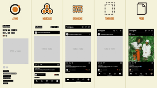
6.5 Atomic Design
And there is a similarly named methodology called Atomic Design, which is related to the Atomic CSS concept mentioned earlier.
It's closer to a designer-centric methodology rather than a developer-centric one.

- Ions: Design tokens that define basic design values such as colors, typography, and spacing.
- Atoms: Basic UI elements that cannot be broken down further, such as buttons, input fields, and labels.
- Molecules: Simple and reusable components created by combining multiple atoms.
- Organisms: Relatively complex UI sections made by combining molecules and atoms.
- Templates: Structures that form the layout of a page by arranging various organisms, molecules, and atoms.
- Pages: Completed UIs filled with actual content, which are the final screens that users see.
If you want to see the differences between these at a glance, I recommend checking out the following tweet or article.
Une autre caractéristique est la distinction entre systèmes et produits.

- Système : Une collection de composants réutilisables et généraux
- Produit : Un ensemble d'éléments spécifiques à un produit ou un projet particulier
7. Comment gérer les styles ?
Ce chapitre vise à présenter un nouveau paradigme de gestion du style adapté aux environnements de développement Web modernes, basé sur les concepts évoqués précédemment. (source de l'image)

Le contenu est divisé en trois zones principales :
- Structuration Méthodologies CSS et présentation de modèles mentaux
- Proposer des bonnes pratiques et des modèles mentaux pour Expression CSS
- Une approche intégrée du style de gestion prenant en compte les deux domaines
Tout d'abord, nous présentons la méthodologie CSS SCALE, intuitive et évolutive, développée grâce à la substitution de méthodologies CSS existantes telles que ITCSS, BEM et OOCSS. Ce processus intègre les concepts de base de chaque méthodologie et explore des moyens efficaces de traiter divers cas.
Comme discuté au chapitre 6, Les méthodologies CSS sont des politiques, tandis que Les CSS en JS et les pré/post-processeurs CSS sont des mécanismes. Si les politiques sont plus proches de la forme qui contient le contenu, les mécanismes sont des outils pour justifier l'expression.
Pour nous concentrer davantage sur les méthodes de gestion CSS plutôt que sur les outils, et pour trouver des points de contact avec les politiques, nous considérons les aspects formels de l'expression plutôt que son fond.
Nous partageons des bonnes pratiques à cet égard :
- Jetons de conception : Encodage des décisions de conception pour limiter les valeurs sélectionnables et inverser les dépendances.
- Atomic CSS : Mappage des propriétés de style et des jetons de conception sous une seule responsabilité, réduisant le couplage grâce à la ségrégation des interfaces.
- Variantes : Définir les styles de composants selon le principe ouvert-fermé en tant que « variantes » pour permettre la substitution de Liskov et augmenter la cohésion.
En combinant ces concepts, nous proposons StyleStack comme stratégie de gestion de style. Cette stratégie combine la cohérence des jetons de conception, l'efficacité d'Atomic CSS et la flexibilité des variantes pour implémenter des interfaces utilisateur complexes plus rapidement et de manière plus cohérente.
Enfin, nous réunissons la méthodologie SCALE CSS et StyleStack en termes formels, aidant la méthodologie à évoluer vers la justification de la forme et en dérivant une structure de répertoires concrète.
Une fois ces étapes terminées, nous serons préparés à discuter de la mise en œuvre du CSS dans JS, un outil de justification de l'expression.
7.1 Repenser les méthodologies
Lorsque l'on examine les méthodologies, il semble y avoir un sentiment de similitude. (source de l'image)

Organisons-les sur la base de l'ITCSS, la méthodologie la plus détaillée, avec l'ajout des États.
Dans Outils, j'ai inclus Atomic CSS, en considérant chacun comme une 'fonction'.
- Paramètres : Thème SMACSS, jeton de conception d'Atomic Design
- Outils : Atomic CSS, utilitaire CUBE CSS
- Générique : Base du SMACSS
- Éléments : Les atomes d'Atomic Design
- Objets : Conteneur d'OOCSS, mise en page de SMACSS, composition de CUBE CSS, modèles d'Atomic Design
- Composants : Bloc/élément de BEM, contenu d'OOCSS, module de SMACSS, composant de SUITCSS, bloc de CUBE CSS, molécules/organismes d'Atomic Design
- États : Structure/Skin d'OOCSS, Modfier de BEM, État de SMACSS, Modfier de SUITCSS
- Utilitaires : Utilitaire SUITCSS, exception CUBE CSS
Cette classification semble couvrir presque tous les cas.
Cependant, il est à noter que dans Élément de composant (élément de BEM, molécules d'Atomic Design) et État, la distinction Structure/Skin d'OOCSS combine deux concepts, et d'Atomic Design 🎜>Les modèles, qui définissent les mises en page au niveau de la page, sont associés aux objets.
We've encountered the concept of Component's Element before, and it's certainly a familiar concept.
Depending on the complexity of the component, we can define it in the same file as the Block, or create a folder and define each Element and Block separately.

Now, let's consider Structure/Skin.
It's ambiguous to add states that affect layout and decorative states as separate classifications.
Instead, it would be better to separate them when creating each Variant, like size: "small" | "medium" | "large" and shape: "primary" | "filled" | "outlined".

Atomic Design's Templates are about separating page-level layouts, not component-level layouts.
It's the same concept as Next.js transitioning from page router to app router, where it's divided into pages and templates.
Depending on the project, they could be managed in the same directory as pages, or collected in something like src/layouts/page-template.

Now that we've sorted out the exceptions, let's further organize the structure and names of ITCSS.
Let's group items that do similar things and change them to more intuitive names.
- Settings define static values, and Tools define dynamic functions, both meant to be imported and used, not directly affecting the app. Recently, Configs and Utils seem to be used more often.
- Generic's reset, normalization, and Elements' default styles are Bases styles that apply globally.
- Layouts is more intuitive than Objects, and Exception is better than Utilities.
- States are included in each Layout or Component.
Let's apply this to ITCSS:
       /\
      /  \
     /    \  Exceptions (Styles for special cases)
    /      \
   /        \  Components (Reusable components)
  /          \
 /            \ Layouts (Layout-related styles)
/              \
----------------
|    Bases     | (Globally applied styles)
----------------
|    Utils     | (Globally used utilities)
----------------
|   Configs    | (Basic settings)
----------------
- Configs: Include project basic settings such as global variables, design tokens(color definitions, font settings), etc.
- Utils: Define globally used tools such as mixins/functions, atomic css etc.
- Bases: Styles to be applied globally, such as reset/normalization, and basic styles for HTML elements
- Layouts: Layout-related styles, can have elements and states(structure/skin), page templates
- Components: Reusable components, can have elements and states(structure/skin)
- Exceptions: Styles used exceptionally. e.g. Using values not present in design tokens, Increasing CSS specificity, Use !important
In this article, we will refer to it as the SCALE(Scalable, Composable, Adaptive Layered Expression) CSS methodology.
7.2 Design Tokens
The above discussion considered the aspect of management but did not take into account the design system.
A representative element of design systems is design tokens.
Design tokens store repetitive design decisions as a single source of truth.
Simply put, it's like saving a color palette from a vast color space and using it consistently across the project.

However, design tokens are not just simple 'settings'. They need to be set at both the app and component levels, and they function similarly to reactivity. [paste - design tokens, Tokens, variables, and styles]


Design tokens, like styles, are defined from simple to specific.
-
Primitive tokens: Define the most basic design values such as colors, fonts, sizes, spacing, etc.
- These have the lowest level of abstraction and contain specific values.
- Example: color-blue-500: #0000FF, font-size-16: 16px
-
Semantic tokens: Semantic tokens are tokens that give meaning based on primitive tokens.
- They use abstracted names that represent the purpose or intention of the design.
- They are defined by referencing primitive tokens.
- Example: color-primary: $color-blue-500, font-size-body: $font-size-16
-
Component tokens: Component tokens define design values thar are applied to specific UI components.
- These are tokens that are directly applied to actual UI components.
- They are mainly defined by referencing semantic tokens. (Sometimes primitive tokens can also be directly referenced)
- Example: button-primary-color: $color-primary
Naming is important for semantic tokens.

7.3 Atomic CSS
Atomic CSS, as we have seen earlier, is one of the major paradigms and is both a useful tool and a controversial topic.
However, when we examine Atomic CSS, it can mean various things:
- Atomic CSS as usage: Can various types of visual styles be written easily in className?
- Atomic CSS as scope: Should it be applied globally or only to parts?
- Atomic CSS as a framework: Does it have a well-defined design system?
- Atomic CSS as output: Is it converted to single-property classes after build?
Here, we will analyze each case and derive its advantages and disadvantages, focusing primarily on Tailwind CSS, a representative Atomic CSS Framework, while also examining why we need on-demand global atomic CSS.

7.3.1 Atomic CSS as Usage
It can be used like inline CSS.
You don't need to name it, and it's located even closer than co-location, making it very convenient when the scale is small or when creating prototypes.
- This greatly reduces the time spent writing separate CSS files and class names.
- Styles can be applied intuitively.
<!-- PrimaryButton.vue -->
<template>
  <button class="bg-blue-500 hover:bg-blue-700 text-white font-bold py-2 px-4 rounded">
    <slot></slot>
  </button>
</template>
However, it's different from inline styles:
- Limitations: No limitations such as media queries, selectors, pseudo-elements, animations, etc.
- File size: File size is reduced as it's defined only once for use.
- Naming: Each name is short and concise, making it good for typing.
- Value type: It's a string value.
Except for number 4, all are good characteristics.
Number 4 is a definite drawback as it's difficult to utilize type systems and highlighting.
What if we express it in CSS in JS like this:
css([
  {
    bg: {
      base: "blue-500",
      _hover: "blue-700",
    },
    text: "white",
    font: "bold",
    py: 2,
    px: 3,
  },
  "rounded",
]);
Number 3 can also be controversial, but the bigger issue is how to define the ubiquitous language in the design system.
If necessary, you can use the CSS property names as they are.
Finally, the usesage of Atomic CSS itself can be controversial(1, 2).
While it certainly has the drawback of lack of meaning, web development has changed.
With most solutions now having the front-end directly modify HTML and CSS. The era when dynamic pages became necessary in the early days of web development, leading to the emergence of backend technologies like PHP/JSP/Django to generate HTML, and when semantic CSS was absolutely necessary for styling interfaces with the frontend has now passed.
7.3.2 Atomic CSS as Scope
Atomic CSS should be used globally. (image source)

Why has TailWind CSS succeeded, unlike traditional Atomic CSS?
The most significant feature of Tailwind CSS is its utility-first approach.
Previously, it was either used partially like Bootstrap's Helpers or had to be built from scratch.
Partial use is literally closer to utilities or helpers, making it difficult to fully utilize the advantages of Atomic CSS, such as minimal file size increase.
Conversely, building a comprehensive system from scratch is prone to exceptions and difficult to maintain consistently, unlike semantic methodologies that can directly utilize product domain meanings or component structures.
However, Tailwind provides a design system that allows global use of Atomic CSS.
It maps CSS properties to design tokens and designates all available styles as a single source of truth.
To utilize Atomic CSS well, we should prevent one-time style additions and apply it globally!!
7.3.3 Atomic CSS as a Framework
To apply it globally, it's essential to have a framework that allows using predefined classes.
This article doesn't aim to create a CSS framework itself, so we'll skip that.

However, mapping CSS properties to design tokens is an important part as a meta-design system.
We need to provide a way to map according to the theme specifications of Theme UI or Styled System.
7.3.4 Atomic CSS as Output
As seen in 6.1.3 Style Output and Apply, even if the input is not Atomic CSS, Atomic CSS can be generated in the output.
Here, we argue that we should have global atomic CSS as a single source of truth, so we'll skip this as well.

However, generating all styles to create a single source of truth for mapping CSS properties to design tokens is inefficient.
It will become unbearable due to the Combinatorial Explosion.
Styles should be generated only for the rules used on-demand, according to a set of rules that map CSS properties to design tokens based on theme specifications.
Yes, we need on-demand global atomic CSS.
7.4 Variants
Atomic CSS is convenient as it can be written without the need to name classes.
However, what about when we need to handle complex states?
Variants(Modifier) are visual representation that compresses the Option, State, and Context discussed in the design system.
It's also known for its API introduced by Stitches.

The Stitches Variants API is innovative.
It allows for declarative description of each state style of the modifier.
const Button = styled("button", {
  // base styles

  variants: {
    color: {
      violet: {
        backgroundColor: "blueviolet",
        color: "white",
        "&:hover": {
          backgroundColor: "darkviolet"
        }
      },
      gray: {
        backgroundColor: "gainsboro",
        "&:hover": {
          backgroundColor: "lightgray"
        }
      }
    }
  }
});

() => <button color="violet">Button</button>;
What's even more impressive is that you can declaratively express everything from the default value of a Variant to when interactions occur between Variants.
const Button = styled("button", {
  ...styles,

  variants: {
    color: {
      violet: { ...violetStyles },
      gray: { ...grayStyles }
    },
    outlined: {
      true: { ...outlineVariants }
    }
  },

  defaultVariants: {
    color: "violet"
  },

  compoundVariants: [
    {
      color: "violet",
      outlined: true,
      css: {
        color: "blueVariantsviolet",
        borderColor: "darkviolet",
        "&:hover": {
          color: "white"
        }
      }
    },
    {
      color: "gray",
      outlined: true,
      css: {
        color: "gray",
        borderColor: "lightgray",
        "&:hover": {
          color: "black"
        }
      }
    }
  ]
});

() => (
  <button color="violet" outlined>
    Button
  </button>
);
Now BEM can be expressed through the Variants API.
- Block: File
- Element: Each component
- Modifier: Variants included in the component
You can immediately adhere to all constraints without relying on rule-based tools such as BEM Tools.
In traditional Atomic CSS, a tool called CVA(Class Variance Authority) makes this possible.
Since we will be using CSS in JS approach, our method will be slightly different.
7.5 Layers for Style
For the expression of style(CSS) to actually appear, there must be elements(HTML) as content, and dynamic application(JavaScript) should also be considered.
To prevent repetitive styles, pre/post-processors or JavaScript are also needed. (image source)

This is similar to the relationship between JSX and State.
For the expression of JSX to actually render, there must be state as dynamic content.
CSS is essential for visual styling, as JSX and state management alone cannot fully express design aesthetics.
To achieve consistent and maintainable styling, CSS should be strategically integrated with JSX and state management, creating a unified approach to building user interfaces.
From a JavaScript perspective, the layers would be as follows:
Referencing Adobe Spectrum Architecture and The future of Chakra UI.
- JSX: Binds HTML/Widget and JS
- State hook: Logic independent of view platform
- Behavior hook: Handles events, accessibility, internationalization, etc. for platform APIs (DOM, React Native, etc.)
- Headless Component: Provides binding of JSX and hooks for use
- Component: Component blocks including design
From a style perspective, it appears as follows:

- Literal: CSS pre/post-processors or CSS-in-JS, considering repetitive use of CSS, etc.
- Theme: Design token values and customization for Color, Typography, Spaces, etc.
- Atomic: Atomic styles that map to visual values
- Variants: Styles for reusable blocks
- Styled Component: Binding with JSX components
This will be referred to as StyleStack.
7.6 Combination with Methodologies and Folder Structure
Let's combine the StyleStack Layer with SCALE CSS methodology for management.
The methodologies focus more on Form than Substance, while the style layers focus more on Expression than Content, so there will inevitably be some discrepancies despite seeming similar. (image source)

If you need more explanation about the relationship between Expression-Content and Form-Substance, I recommend reading Rock-Paper-Scissors: A Linguistic Approach to Games.
Basically, it follows the perspective of Hjelmslev's semiotics.
- Literal: Closer to elements constituting Substance, so it's not here.
- Theme: Corresponds to Configs.
- Atomic: Belongs to Utils, right?
- Variants: Modifiers, so they'll belong to Layouts and Components.
- Styled Components: Also close to binding to Elements, so they'll belong to Layouts and Components.
Bases and Exceptions don't have separate matches.
Bases are Content made from Literal, and Exceptions are closer to Content that occurs at the component level.
For StyleStack layers and SCALE CSS methodology to complement each other, they should each have Content and Substance, right?
For style layers to have Content, people need to write the content, so there's nothing to do right away.
On the other hand, how about making the methodology into Substance?
It's possible to some extent by creating a Form for the folder structure.
- Configs: It's better to separate global variables and design tokens.
- Utils: It's better to separate Atomic CSS (core-style) and simple utilities.
- Bases: Usually, reset/normalization is imported from libraries, so it's okay to define it together in global css.
- Layouts: Use as is. However, for page templates, as mentioned earlier, using app/ or layouts/page-template is also good.
- Components: Use as is.
- Exceptions: In cases where !important is used, gathering and managing them together is one approach.
src/
├── styles/
│   ├── constants/: Configs - Global variables
│   ├── theme/: Configs - Design Tokens definitions
│   ├── core-styles/: Utils - Atomic CSS definitions
│   ├── utils/: Utils - Mixins and style-related functions
│   └── expetions/: Exeptions - Collection of exceptions
├── app/
│   ├── layout.tsx: Layouts - Page templates
│   ├── page.tsx
│   ├── global.css: Bases - Normalization and global styles
│   └── [pages]/
├── assets/
├── components/
├── layouts/
└── .../
Now, let's focus more on Expression(StyleStack layer) and think about it.
8. Why CSS in JS?
Now that we've finished defining the StyleStack layer, we need to implement a natural connection from Literal to Styled Component. (image source)

First, should we use pre/post-processors or Javascript to extend Literal CSS?
One of the original advantages of CSS in JS, isolation, has been offset by CSS Modules and @layer.
Conversely, since the features of post-processors can be used in CSS in JS, we don't consider them.
8.1 Preprocessors
- Learning curve: Since it's an extension of CSS, it's easy to adapt and existing CSS code can be used as is.
- Highlighting and auto-completion: You can use the highlighting and auto-completion provided by the editor as is.
- Mixins and CSS-specific syntax: Control flow and @content allow you to easily add styles just by declaring styles where needed without object manipulation or returns. Less's property merging and Stylus's Property lookup are also interesting features.
- CSS-specific utilities: It includes features like SASS's color module and calc() optimization.
- Ecosystem: There's infrastructure like Stylelint and Critical CSS.
8.2 CSS in JS
- Code sharing: You can immediately use all of Javascript's functions, variables, and rich libraries.
- Javascript: You only need to learn Javascript. Also, Javascript provides more robust capabilities for complex object manipulation and flow control compared to preprocessor.
- References: Dependencies are explicit, and features like go-to-definition and refactoring can be used immediately. Vue partially supports this, but it's not possible when nested. It's also a great help in removing zombie code.
- Dynamic styles: Features like values changing according to props or compound variants are easy to write and integrate in CSS in JS.
- Co-location: You can write styles in the same file as the component.
8.3 So, Why CSS in JS
Many of the advantages available in preprocessors can be relatively easily achieved by investing in the tooling infrastructure of CSS in JS.
- Highlighting and auto-completion: It's possible with tools like vscode-styled-components, and there are precedents for copy and paste as well.
- CSS-specific utilities: Can be complemented with a nice library called polished.
- Ecosystem: linaria has proven that source maps, linting, etc. can be used.
With a little effort, you can even mimic usage similar to @mixin.
function mediaQuery(breakpoint) {
  const breakpoints = {
    tablet: "@media (min-width: 768px) and (max-width: 1023px)",
    desktop: "@media (min-width: 1024px)",
  };

  if (breakpoint in breakpoints) {
    return (styles) => ({
      [breakpoints[breakpoint]]: styles,
    });
  } else {
    // or use throw
    console.warn("Unknown breakpoint: " + breakpoint);
    return () => ({});
  }
}

// Usage example
const responsiveElement = css({
  fontSize: 16px,
  ...mediaQuery("tablet")({
    fontSize: "18px",
  }),
  ...mediaQuery("desktop")({
    fontSize: "20px",
  }),
});
Of course, go-to-definition is not exclusive to CSS in JS. It's possible through CSS Module extensions.
However, there are many constraints in sharing Javascript variables and using libraries, dynamic styles, and co-location (possible in SFC).
Crucially, there's also the point that JavaScript runtime is ultimately necessary for creating Styled Components, which is the final step of StyleStack.
I think there's still a lot of room for improvement in CSS in JS infrastructure, and it has relatively fewer constraints.
For these reasons, despite quite liking preprocessors like Sass, I believe investing in CSS in JS is the right path.
9. Introduce project mincho
I would like to introduce you to the project that will proceed based on the content discussed so far.
- mincho-js/mincho

9.1 Motivation
The original motivation for starting my project was to unify the Atomic CSS and SemanticCSS methodologies. From a semiotic approach, I believed that this could be sufficiently represented as Expression and Content using the Sign function.

Le nom du projet a été décidé dès le début.
En Corée, le chocolat à la menthe est abrégé en « Mincho(민초) », et avec la vanille, c'est l'une de mes saveurs de glace préférées.
Le chocolat à la menthe est unique dans sa combinaison de saveurs contrastées, harmonisant le goût frais et rafraîchissant de la menthe avec le goût sucré et onctueux du chocolat.
C'est de là qu'est venue l'idée :

- La combinaison Atomic CSS (Bon) + Variant (Bon) = Mieux ressemble au chocolat à la menthe.
- J'avais prévu de le baser sur une bibliothèque appelée Vanilla Extract.
- C'est une saveur que j'aime bien. Le plus personnel est le plus créatif, n'est-ce pas ? ?
9.2 Pourquoi utiliser l'extrait de vanille ?
L'extrait de vanille a été choisi comme base pour ce projet pour plusieurs raisons.

- Type-Safe : Il a été créé en mettant l'accent sur la sécurité des types.
- Zéro-runtime : Comme mentionné dans « 6.1.1 Intégration », ceci est très important compte tenu de l'avenir de RSC.
- API : La conception de base, telle que l'API Composition, est très épurée.
- Fonctionnalités : Les fonctionnalités existantes telles que Style, StyleVariants, Theme et Recipe sont suffisamment puissantes et méritent d'être référencées.
- Contraintes : Empêche les opérations de rupture d'encapsulation telles que .selector > * au moment de la construction.
- Potentiel : Bien que la colocalisation ne soit pas disponible actuellement, faire référence à Macaron suggère que cela devrait être possible.
9.3 Bref plan
Nous ne pouvons pas fournir toutes les fonctionnalités dès le début, nous prévoyons de les réaliser étape par étape.
- CSS naturel dans TypeScript : Nous lierons diverses fonctionnalités de prétraitement CSS pour les spécialiser dans TypeScript.
- Un CSS en JS pour Scalable : Prend en charge et intègre les couches StyleStack (Theme, Atomic CSS, Variants et Styled Component), permettant de gérer des styles à grande échelle.
- Construisez votre propre système de conception : Il fonctionne comme un cadre pour créer des systèmes de conception via les plugins Figma et le système Document, entre autres.
Au moment d'écrire ces lignes, la phase « CSS naturel en TypeScript » est presque terminée et j'espère atteindre un CSS en JS pour évolutif au cours de cette année.
Comme il s'agit actuellement d'un Work In Progress (WIP), l'API est instable.
Une refonte majeure de l'API est prévue autour de l'achèvement de la phase A CSS in JS for Scalable, qui prendra en compte de manière exhaustive une petite surface d'API, une sécurité de type améliorée, la prise en charge de SSR (et des composants serveur) et la compatibilité de Vanilla Extract. .
Par exemple, même si nous nous efforçons d'assurer une compatibilité maximale avec l'utilisation de Vanilla Extract, des différences peuvent survenir à mesure que le projet progresse, et il existe d'inévitables différences dans la façon dont les choses fonctionnent.
Par conséquent, nous nommé intentionnellement les fonctions différemment de Vanilla Extract (les rendant généralement plus concises), et nous prévoyons de créer un package de compatibilité distinct pour les API compatibles.
Vous trouverez ci-dessous une description de nos idées concernant la orientation de la conception de l'API de StyleStack et les plans ultérieurs.
10. CSS compatible CSS dans JS
Que signifie être spécialisé dans le traitement CSS ?
Outre l'infrastructure d'outils mentionnée précédemment, nous pouvons également envisager une syntaxe optimisée pour CSS.
Imaginons CSS en JS à partir de zéro selon diverses conditions.
10.1 Chaîne de modèle et style d'objet
- Chaînes de modèles et objets dans CSSinJS
Dans le monde du CSS En JS, il existe deux façons d'exprimer le CSS :
Chaîne de modèle et style d'objet.
Les chaînes de modèles semblent meilleures pour une utilisation simple.
En effet, vous pouvez utiliser les propriétés et la syntaxe CSS telles quelles.

Cependant, le style d'objet est la même méthode d'expression que CSSOM et constitue une meilleure méthode lorsque beaucoup d'interpolation est nécessaire.

Lors de l'utilisation de TypeScript, il y a également l'avantage de prendre en charge les types.
La raison d'utiliser CSS In JS est essentiellement de gérer de nombreuses règles et d'interagir avec JS.
Par conséquent, lors de l'utilisation de CSS en JS, il est recommandé d'utiliser principalement le Style d'objet.
If there are few design rules and interaction with JS is unnecessary, it's better to use a CSS preprocessor.
10.2 Overcoming Syntax
The fundamental limitation of CSS In JS is that CSS syntax is not literal.
Because of this, color codes basically don't work with pickers in editors, and CSS units (px, rem, vw, etc.) and values (visible, space-between, etc.) cannot be used without treating them as strings.
const sample = css({
  // Color
  color: "red",
  background: "#EEEEEE",

  // Unit
  fontSize: "16px",
  fontSize: "1rem",

  // Value
  visibility: "visible",
  justifyContent: "space-between"
});
Fortunately, there is an extension for color picker.
For properties that receive common values like px, you could define them like JSS's default-unit or Vanilla Extract's unitless property.
const sample = css({
  // cast to pixels
  padding: 10,
  marginTop: 25,

  // unitless properties
  flexGrow: 1,
  opacity: 0.5
});
10.3 SCSS and Nested Syntax
The area where SCSS took the lead is nested syntax.
As you've seen earlier, it supports attribute nesting, parent selector nesting using &, and even nesting of @at-rules like @media.
.sample {
  width: 200px;
  font: {
    /* Property Nested */
    size: 10px;
    weight: bold;
  }

  /* Selector Nested */
  a & {
    background: grey;
  }
  &:hover {
    background: blue;
  }

  /* At rule Nested  */
  @media (prefers-color-scheme: dark) {
    color: red;
  }
}
This is made possible by using several rules:
- Nesting occurs when it's an object rather than a regular value, and since kebab-case is converted to camelCase, nested properties also follow the rules
- If an attribute contains & like in Emotion, it is treated as a selector
- Simple selectors like "&:hover" can be used as :hover, reducing unnecessary &, similar to vanilla extract's Simple pseudo selectors, for Pseudo-classes and Pseudo-elements
const sample = css({
  width: 200,
  font: {
    Size: 10,
    Weight: "bold"
  },

  "a &": {
    background: "grey"
  },
  ":hover": {
    background: "blue"
  },

  "@media (prefers-color-scheme: dark)": {
    color: red;
  }
});
Let's think about how to make it a little more convenient.
Like Panda CSS's Conditional Styles, we can use _ instead of : and use camelCase to make it immediately usable in properties. (Only _ and $ are special characters that can be used immediately in JavaScript properties)
If there's an issue with the Panda CSS approach, it's the ad-hoc nature of inserting arbitrary classes, such as _dark meaning &.dark, .dark &.
This might be acceptable for framework presets, but it's not suitable for applying as a literal syntax.
const sample = css({
  background: "#EEEEEE",
  _hover: {
    background: "blue"
  },
  __before: {
    background: "grey"
  },

  // Or
  background: {
    base: "#EEEEEE",
    _hover: "blue",
    __before: "grey"
  }
});
When nesting at-rules, we could group them together if they're the same rule, or we could utilize Conditional Styles.
const sample = css({
  background: "#EEEEEE",
  "@media": {
    "(min-width: 768px) and (max-width: 1023px)": {
      background: "blue"
    },
    "(min-width: 1024px)": {
      background: "grey"
    }
  },

  // Or
  background: {
    base: "#EEEEEE",
    "@media (min-width: 768px) and (max-width: 1023px)": "blue",
    "@media (min-width: 1024px)": "grey"
  }
});
Of course, excessive use of nesting can cause problems, so it would be good to set a maximum nesting count as an ESLint rule or similar.
10.4 Less and Merge properties
One of the main characteristics of Less is that it's lazy.
However, since JavaScript is strict by default, I think this approach is not suitable for applying to CSS in JS.
However, the Merge properties feature appears to be quite useful.
This is because long properties like box-shadow or transform were difficult to write in a single line.
.sample {
  /* Merge with Comma */
  box-shadow+: inset 0 0 10px #555;
  box-shadow+: 0 0 20px black;

  /* Merge with Space */
  transform+_: scale(2);
  transform+_: rotate(15deg);
}
.sample {
  box-shadow: inset 0 0 10px #555, 0 0 20px black;
  transform: scale(2) rotate(15deg);
}
As mentioned earlier, only _ and $ can be used as special characters in JavaScript.
Since space is similar to _, it would be good to add $ to commas.
- Since you can't have the same key multiple times, values are represented as arrays
- If it ends with $, join with ,, if it ends with _, join with a space
const sample = css({
  boxShadow$: ["inset 0 0 10px #555", "0 0 20px black"],
  transform_: ["scale(2)", "rotate(15deg)"]
});
10.5 Stylus and References
Stylus provides several features for referencing.
Both Partial Reference and Relative Reference seem to have a high potential for causing mistakes.
Moreover, given the nature of CSS in JS, which is designed around components and doesn't require much nesting, the likelihood of needing these is low.
However, property value referencing could be beneficial.
It seems useful as it can eliminate unnecessary variables, and if there's no reference target, it can be displayed as an error at build time.
const sample = css({
  width: 100,
  marginLeft: "@width",
  marginTop: "calc(-(@width / 2))"
});
9.6 PostCSS and CSS Extensions
PostCSS uses standard CSS syntax, so it can be used together with CSS in JS.
Among them, postcss-preset-env extends various syntaxes by default.
For example, there are convenient media query ranges.
const sample = css({
  "@media (480px


<pre class="brush:php;toolbar:false">@media (min-width: 480px) and (max-width: 767.98px) {
  .sample {
      font-family: system-ui, -apple-system, Segoe UI, Roboto, Ubuntu, Cantarell, Noto Sans, sans-serif;
  }
}
11. Scalable CSS in JS
In CSS-friendly CSS in JS, we explored methods to appropriately express CSS in Javascript.
Now, we need to manage CSS interactions with other CSS and Javascript.
Since runtime caused problems with scalability, we will try to deal with Zero runtime or Near Zero Runtime cases whenever possible.
11.1 Composition
In practice, using multiple CSS classes together is more common than applying just one.
In this case, we can use Composition.
If you want to focus only on class names, clsx is also a good option.
const base = css({ padding: 12 });
const primary = css([base, { background: "blue" }]);
const secondary = css([base, { background: "aqua" }]);
.styles_base__1hiof570 {
  padding: 12px;
}
.styles_primary__1hiof571 {
  background: blue;
}
.styles_secondary__1hiof572 {
  background: aqua;
}
Vanilla Extract's method excellently reduces CSS output.
However, there are specificity issues. It would be more intuitive if the last style was always applied, as it is in Emotion.
const danger = css({
  color: "red"
});
const base = css({
  color: "yellow"
});
const sample = style([base, danger]); // `base` is applied
We can partially solve this by declaring and merging objects, or by directly specifying the color(since .sample is declared after .base). However, we need to consider the potential increase in output size with these approaches.
const danger = {
  color: "red"
};
const base = {
  color: "yellow"
};
const sample = style([base, danger]);

// or
const base = css({
  color: "yellow"
});
const sample = style([base, {color: "red"}]);
Since Atomic CSS also has the Shorthand-Longhand problem, we should always keep specificity issues in mind when dealing with composition.
11.2 UI = f( State )
As React and Flutter assert, UI can be thought of as a function.

Then, is there any reason why Style shouldn't be a function?
This is the same approach as Fela's principles, and following this philosophy, Flutter implements even Padding as a widget.
const sample = css((props) => ({
  color: "red",
  background: props.bgColor
}));

function Sample() {
  return <div classname="{sample({" bgcolor:>content</div>;
}
.sample {
   color: red;
   background: var(--sample-bgColor)
}
.SampleComponent.sample {
  --sample-bgColor: blue;
}
It's not good to have different usages or return values from a single function.
Therefore, interfaces should be separated.
// Return string(class name)
const static = css({
  color: "red",
});

//  Return function
const dynamic = rules(({ color }) => ({
  color,
  background: ({ bg } = { bg: "blue" }) => bg
}));
11.3 Making it Declarative
The previous example would work well in CSS in JS with runtime, but not in zero-runtime CSS in JS.
As seen in the cases of StyleX and PigmentCSS, dynamic styles are quite limited.
const dynamic = rules(({ color }) => ({
  color,
  background: ({ bg } = { bg: "blue" }) => bg
}));
Also, traversing the AST to evaluate dynamic styles is a rather arduous task.
Is it possible to create a declarative approach similar to the Variants example previously mentioned as an effective declarative API?
The above cases could be represented as follows:
const dynamic = rules({
  props: ["color", { bg: { base: "blue", target: "background" }}]
});
You might want arbitrary Props only when using specific variants.
// Same behavior
const sample1 = rules((props) => {
  if("color" in props) {
    if(props.color == "white") {
      return ({
        color: "#EEEEEE",
        background: props.background
      });
    }
  }
});

const sample2 = rules({
  variants: {
    color: {
        white: [{ color: "#EEEEEE" }, "background"]
      }
    }
  }
});

sample2({ color: "white", background: "red" });
It would be convenient if we could create Styled Components with Props specified based on Rules, wouldn't it?
const Container = styled.div([
  sample2,
  {
    display: "flex",
    variants: { vertical: { true: { flexdirection: "column" } } },
  },
]);
function Sample() {
  return (
    <container color="white" background="black" vertical>
      text
    </container>/>
  );
}
By creating it this way, you can make styled components as conveniently as with Styled System.
11.4 Atomic CSS
We've briefly explored simple and dynamic concepts, and addressed Variants, which transformed BEM, a prominent semantic CSS methodology, into a declarative approach.
Recall the primary objective of Atomic CSS in comparison to semantic CSS.
Styles should be generated only for the rules used on-demand, according to a set of rules that map CSS properties to design tokens based on theme specifications.
How can we ensure that styles are generated only for the rules being used?
Looking at various issues(#91, #992, #1132, #1237) with Vanilla Extract, it doesn't seem easy.
A potential approach involves creating rules and utilizing them with the previously defined css(), rules(), and styled() functions, while caching each property-value pair.
By creating it this way, you can achieve Tailwind's usage and Windi CSS's Attributify Mode in a near on-demand manner without the complex regular expressions of UnoCSS.
const { css, rules, styled } = defineRules({ /* Something */ });

const sample1 = css(["inline", { px: 2, c: "indigo-800" }]);
const sample2 = rules({
  px: 4,
  variants: {
    color: {
        white: [{ c: "white-100" }, "bg"]
      }
    }
  }
});
const Sample3 = styled.div([saple2]);
While '11.1 Composition' may cause specificity issues, it can mitigate the problem by behaving similarly to tailwind-merge at build time.
While not yet fully established, we can propose a Draft API as follows:
When strict mode is true, only shortcuts and toggles can be used instead of properties.
const { css, rules, styled } = defineRules({
  // Whether to allow properties attributes - allow only toggles or shortcuts
  strict: true,

  // Restrictions on features available in CSS
  properties: {
    // Allow only values in arrays
    display: ["none", "inline"],
    paddingLeft: [0, 2, 4, 8, 16, 32, 64],
    paddingRight: [0, 2, 4, 8, 16, 32, 64],

    // Allow only values in objects
    color: { "indigo-800": "rgb(55, 48, 163)" },

    //Entire properties
    background: true,
    border: false
  },
  shortcuts: {
    pl: "paddingLeft",
    pr: "paddingRight",
    px: ["pl", "pr"],
    c: "color",
    bg: "background"
  },
  toggles: {
    inline: { display: "none" }
  }
});
However, mapping every element individually may prove cumbersome.
The availability of predefined sets, similar to the ThemeUI spec, would greatly enhance convenience.
You might want to map not only the property values but also shortcuts and toggles like tailwind.
const { css, rules, styled } = defineRules({
  // Restrictions on features available in CSS
  properties: themeUISpec({
    colors: { "indigo-800": "rgb(55, 48, 163)" }, // color, background, accentColor, ...
    space: [0, 2, 4, 8, 16, 32, 64] // margin, padding, inset, top, ..
  }),
   ...twindShorcutSpec() // Predefined shortcuts and toggles like the tailwind API
});
The provision of such diverse presets would significantly simplify the creation and utilization of Atomic CSS.
And, like PandaCSS's Conditional Styles, it will be necessary to provide various conditions.
const { css, rules, styled } = defineRules({
  defaultCondition: ["light", "vertical"],
  conditions: {
    light: "",
    dark: ["&.dark", ".dark &"],
    osLight: {},
    osDark: { "@media": "(prefers-color-scheme: dark)" },
    horizontal: "&[data-orientation=horizontal]",
    vertical: "&[data-orientation=vertical]"
  },
  compoundConditions: [
    {
      when: ["light", "osLight"],
      condition: "&.pureLight"
    },
    {
      when: ["dark", "osDark"],
      condition: "&.pureDark"
    }
  ]
});
11.5 Theme
Let's discuss the Theme concept mentioned in Atomic CSS in more detail.
Themes are mappings of design tokens, and as we saw in Atomic CSS, they typically have two structures.
Of course, we could also follow the W3C Design Token Format.
const theme = {
  spaces: [0, 2, 4, 8, 16, 32, 64],
  colors: {
    "black-100": "#000",
    "white-100": "#fff",
    "blue-500": "#07c"
  }
};
We need to consider the scalability across primitive tokens, semantic tokens, and component tokens.
For primitive tokens, we can create subgroups for categories like color:
const [, tokens] = theme({
  spaces: [0, 2, 4, 8, 16, 32, 64],
  colors: {
    black: {
      100: "#000"
      // ...
    },
    white: {
      100: "#fff"
      // ...
    },
    blue: {
      // ...
      500: "#07c"
    }
  }
});
Let's consider semantic tokens.
While they can be isolated like component tokens, semantic tokens are often used globally at the application level.
Therefore, we need to design them to handle derivable tokens.
const [, tokens] = theme({
  // Main values
  values: {
    spaces: [0, 2, 4, 8, 16, 32, 64],
    colors: {
      black: {
        100: "#000",
        // ...
      },
      white: {
        100: "#fff"
        // ...
      },
      blue: {
         // ...
        500: "#07c"
      }
    }
  },

  // Derived values
  alias: ({ spaces, colors }) => ({
    spaces: {
      small: spaces[2],
      medium: spaces[3],
      large: spaces[5]
    },
    colors: {
      text: colors["white-100"]
      primary: colors["blue-500"]
    }
  })
});
Component tokens should be isolated by component and be derivable.
const [, tokens] = theme({ /* Something */ });
const buttonPrimary = token(tokens.colors.primary);
While it may seem we've covered most aspects of tokens, there's more to consider.
We also need to consider applying tokens in modes (conditions) such as Dark and Light.
It would be fine to manually combine Light and Dark in css() or rules(), but if we want values that automatically switch based on conditions, we run into circular dependency issues with Atomic CSS(defineRules).
I'm currently considering how to express this aspect more elegantly.
However, if we forgo automatic conversion based on conditions, the current structure should suffice.
const { css } = defineRules({
  // ...
  properties: {
    paddingLeft: tokens.spaces,
    paddingRight: tokens.spaces,
    color: tokens.colors,
  }
  // ...
});
A potential solution is to make the result of defineRules() include theme() as well.
11.6 Looking Back
It seems we've achieved to some extent the concept of the StyleStack layers we defined earlier, '7.5 Layers for Style'.
- Literal: Provides various CSS-specific syntax of CSS preprocessors, considering the syntactic limitations of JavaScript. Use css().
- Theme: Design token values and customization for Color, Typography, Spaces, etc. Use theme().
- Atomic: Atomic styles that map to visual values. Use defineRules()
- Variants: Styles for reusable blocks. Use rules()
- Styled Component: Binding with JSX components. Use styled()
We have created a hypothetical syntax and library API that is declarative and easy to write/manage.
Personally, I find the result clean and appealing, and there are several principles behind it:
- Be declarative rather than listing out logic
- APIs for each layer should be isomorphic
- Expression and content presuppose each other, so they must be considered
- The law of excluded middle applies when hierarchies(perspectives) differ
As a result, the API is very clean and consistent.
// Theme Syntax
const [, tokens] = theme({
spaces: [0, 2, 4, 8, 16, 32, 64],
colors: {
black: {
100: "#000"
// ...
},
white: {
100: "#fff"
// ...
},
blue: {
// ...
500: "#07c"
}
}
});
const buttonPrimary = token(tokens.colors.primary);
// Literal Syntax
const base = css({ color: "#444" });
const sample1 = rules({ props: { bg: "background" });
const sample2 = css(["pure-class-name", base, sample1({ bg: buttonPrimary }), { width: 10 }]);
// Atomic Syntax
const { css: atomic } = defineRules({
properties: themeUISpec(tokens),
...twindShorcutSpec()
});
const sample3 = atomic(["uppercase", { px: 4, _hover: { bg: buttonPrimary } }]);
// Variants Syntax
const variants = rules({
// ...
variants: {
outlined: {
true: {
border: "1px solid currentColor",
background: "transparent"
},
},
accent: {
// ...
pink: {
backgroundColor: "pink",
color: "white"
},
},
}
});
const sample4 = variants(["outlined", { accent: "pink" }]);
// Atomic Variants Syntax
const { rules: atomicRules } = defineRules({
properties: themeUISpec(tokens),
...twindShorcutSpec()
});
const atomicVariants = atomicRules({
// ...
variants: {
outlined: {
true: {
border: ["base", "current"],
bg: "transparent"
},
},
accent: {
// ...
pink: {
bg: "pink-500",
text: "white"
},
},
}
});
const sample5 = atomicVariants(["outlined", { accent: "pink" }]);
// Styled Component Syntax
const Sample6 = styled.button([sample4, { /* Something like rules() */ }]);
const element1 = Button;
// Atomic Styled Component Syntax
const { styled: atomicStyled } = defineRules(/* Something like atomicRules() */);
const Sample6 = atomicStyled.div([sample5, { /* Something like atomic rules() */ }]);
const element2 =
Above all, it is possible to use only the parts of StyleStack with "as much abstraction as you want".
This is an important characteristic that enables progressive enhancement and makes scalability and migration easier.
12. CSS in JS for Design Systems
It seems quite good for programmers to manage styles.
Then, how about collaborators? (image source)

Designers primarily focus on making design decisions and creating the visual aspects of components and applications, rather than coding.
This leads to some discrepancies in integration with design tools, documentation, and so on.
Not only designers but also marketers can be considered.
Brand guidelines should be integrated into the style guide, and they will want to see A/B tests and user feedback on UI/UX at a glance.
They may also want to use design assets and templates for newsletters, social media posts, and banners, as well as manage styles for each marketing campaign.
There's also a need to follow certain rules with other developers.
For example, the depth of nested styles and the order of style alignment mentioned earlier.
12.1 Figma
Among the various design tools available, Figma is widely recognized as one of the best for UI design. Therefore, this section focuses on Figma-based workflows. (image source)

One of the problems with design was the Combinatorial Explosion.
Let's take an example.
GitHub's button component has the following conditions:
- Structures : Il comporte des éléments leadsVisual, label, trailingVisual et trailingAction, qui peuvent apparaître simultanément. Cependant, il n’existe aucun cas où tous les éléments soient absents.
- Formes : Il existe des couleurs primaires, secondaires, invisibles et dangereuses.
- États : Il existe des états Repos, Survol, Désactivé, Enfoncé et Focus.
- Contextes : Il existe des contextes Inactif et En cours de chargement.
- Schéma de couleurs : Il existe un support pour les modes clair et sombre
Si on calcule le nombre de cas, c'est (24−1)×4×5×2×2=1200.
Cependant, aucun concepteur ne voudrait créer 1 200 composants juste pour les boutons.
Par conséquent, j'aimerais avoir le flux suivant :
- Les concepteurs et les développeurs discutent ensemble des composants (besoin d'un wireframe).
- Les concepteurs créent des composants comprenant des options visuelles majeures, tandis que les développeurs implémentent des fonctionnalités. Une fois terminé, générez les styles initiaux à l'aide de Figma to Code.
- Après avoir reçu une explication du concepteur, le développeur analyse les décisions visuelles et effectue une compression d'état pour réduire le nombre de cas au maximum,
- Après avoir appliqué des jetons de conception, etc., créez-le avec Code to Figma
- Le concepteur vérifie si le composant a été créé comme prévu et s'il manque des règles, met à jour le composant représentatif.
- Obtenez des informations d'implémentation pour ce composant avec Figma to Code
- Appliquez des règles visuelles puis mettez à jour le reste des composants avec Code to Figma
Cela nécessite deux plugins principaux. (source de l'image)

Heureusement, il semble y avoir de nombreux exemples de Figma to Code.
- Code vers Figma : Code vers Design, UxPin, Storybook
- Figma à coder :Anima, Builder.io, Grida, Figma-Low-Code
En plus de ces plugins, les outils basés sur l'IA peuvent améliorer considérablement le processus de modification et de création de conceptions. Par exemple, text-to-figma permet aux concepteurs de générer des conceptions Figma à partir de descriptions textuelles, rationalisant ainsi le processus de conception.
Pour assurer une intégration fluide avec Figma, en particulier avec des fonctionnalités telles que la mise en page automatique, les contraintes, la position, un cadre CSS avisé pourrait être nécessaire.
Ce cadre devrait être compatible avec les paradigmes de conception de Figma tout en étant également adapté au développement basé sur du code. Une discussion détaillée sur les frameworks CSS appropriés pour l'intégration Figma sera abordée dans un article séparé pour maintenir la concision dans cet aperçu.
12.2 Documents
Les guides de style sont généralement créés par les concepteurs pour garantir la cohérence de la conception au sein d'un projet ou d'une organisation.
Pour faciliter la création et la maintenance de ces guides de style, des outils de documentation faciles à utiliser sont essentiels.
Zeroheight, Frontify et Supernova en sont des exemples représentatifs. (source de l'image)

Pour la documentation des composants des développeurs, il existe Storybook, Histoire, Ladle et Pattern Lab, mais ils sont insuffisants pour le concepteur.
Le système de documentation doit au moins être capable des éléments suivants :
- Affichage des jetons de conception et de l'échantillon de code ensemble
- Fournir et tester des exemples de composants interactifs avec des états
- Expliquer les intentions de conception et la mise en œuvre technique les détails en parallèle
- Éditeur de documents interactif pour des modifications faciles
- Recherche intégrée avec quelque chose comme la recherche Algolia
- Contrôle de version suivi
- Intégré à Figma
Particulièrement pour le suivi du contrôle de version, une intégration avec Git est nécessaire, similaire aux services i18n (crowdin, lokalise, pontoon .etc).
Si nous développons un peu plus, nous pourrions prendre en charge ce qui suit :
- Outils : Prise en charge de l'internationalisation (i18n), tests A/B, tests réactifs, contrôles d'accessibilité et intégration d'outils de test de performances.
- Tableaux de bord : Pour les statistiques d'utilisation du style et les modèles de comportement des utilisateurs.
- Collaboration et communication : Tels que les commentaires en temps réel, l'attribution et le suivi des tâches.
- Gérer : Système de contrôle d'accès basé sur les rôles.
- Outils de création : Permettez aux rédacteurs de contenu de créer instantanément des sorties selon des modèles.
- Personnalisé : Organisez et décorez la page. Vous souhaiterez peut-être également inclure une vignette de style (1, 2).
12.3 Outils de développement
Pour un système de conception complet, une infrastructure d'outils robuste pour les développeurs est essentielle, notamment : (source de l'image)

- Intégration d'outils tels que Stylelint et Sourcemap
- Plugins/règles ESLint pour CSS en JS
- Mise en évidence et auto-complétion dans la chaîne de valeur de l'éditeur au même niveau que CSS, et conversion entre kebab-case et camelCase
- Tests de régression visuelleoutils intégrés à Figma/Storybook
- Inspecteur comme unocss
Il en est encore à ses débuts et l'API est instable.
Cependant, j'espère qu'un jour l'API se stabilisera et qu'une infrastructure d'outils sera fournie, permettant à chacun d'exprimer librement ses styles et de créer et maintenir facilement des systèmes de conception !
Merci d'avoir lu ce long article.
Si vous avez trouvé ce projet intéressant ou utile, j'apprécierais que vous puissiez mettre en vedette le projet.
Si vous souhaitez le tester et nous aider à l'améliorer, veuillez nous contacter sur Twitter ou m'envoyer un e-mail à alstjr7375@daum.net.
Plus de références : (Malheureusement, les articles/vidéos sont en coréen)
- Comprendre pourquoi CSS est devenu difficile à travers son histoire
- Systèmes de conception, au-delà de la forme : vidéo / présentation
- Système de conception multiplateforme, un record d'un an et demi : vidéo/présentation
Atas ialah kandungan terperinci Memikirkan semula CSS dalam JS. Untuk maklumat lanjut, sila ikut artikel berkaitan lain di laman web China PHP!

 Apakah grid CSS?Apr 30, 2025 pm 03:21 PM
CSS Grid adalah alat yang berkuasa untuk mewujudkan susun atur web yang rumit dan responsif. Ia memudahkan reka bentuk, meningkatkan kebolehcapaian, dan menawarkan lebih banyak kawalan daripada kaedah yang lebih lama.
 Apakah CSS Flexbox?Apr 30, 2025 pm 03:20 PM
Artikel membincangkan CSS Flexbox, kaedah susun atur untuk penjajaran yang cekap dan pengedaran ruang dalam reka bentuk responsif. Ia menerangkan penggunaan Flexbox, membandingkannya dengan grid CSS, dan butiran sokongan penyemak imbas.
 Bagaimanakah kita boleh membuat laman web kami responsif menggunakan CSS?Apr 30, 2025 pm 03:19 PM
Artikel ini membincangkan teknik untuk membuat laman web responsif menggunakan CSS, termasuk tag Meta Viewport, grid fleksibel, media cecair, pertanyaan media, dan unit relatif. Ia juga meliputi menggunakan grid CSS dan Flexbox bersama -sama dan mengesyorkan rangka kerja CSS
 Apakah harta saiz kotak CSS?Apr 30, 2025 pm 03:18 PM
Artikel ini membincangkan harta saiz kotak CSS, yang mengawal bagaimana dimensi elemen dikira. Ia menerangkan nilai seperti kotak kandungan, kotak sempadan, dan kotak padding, dan kesannya terhadap reka bentuk susun atur dan penjajaran bentuk.
 Bagaimanakah kita boleh menghidupkan CSS?Apr 30, 2025 pm 03:17 PM
Artikel membincangkan membuat animasi menggunakan CSS, sifat utama, dan menggabungkan dengan JavaScript. Isu utama adalah keserasian penyemak imbas.
 Bolehkah kita menambah transformasi 3D ke projek kami menggunakan CSS?Apr 30, 2025 pm 03:16 PM
Artikel membincangkan menggunakan CSS untuk transformasi 3D, sifat utama, keserasian penyemak imbas, dan pertimbangan prestasi untuk projek web. (Kira -kira aksara: 159)
 Bagaimana kita boleh menambah kecerunan dalam CSS?Apr 30, 2025 pm 03:15 PM
Artikel ini membincangkan menggunakan kecerunan CSS (linear, radial, mengulangi) untuk meningkatkan visual laman web, menambah kedalaman, fokus, dan estetika moden.
 Apakah unsur-unsur pseudo dalam CSS?Apr 30, 2025 pm 03:14 PM
Artikel membincangkan unsur-unsur pseudo dalam CSS, penggunaannya dalam meningkatkan gaya HTML, dan perbezaan dari kelas pseudo. Menyediakan contoh praktikal.


Alat AI Hot

Undresser.AI Undress
Apl berkuasa AI untuk mencipta foto bogel yang realistik

AI Clothes Remover
Alat AI dalam talian untuk mengeluarkan pakaian daripada foto.

Undress AI Tool
Gambar buka pakaian secara percuma

Clothoff.io
Penyingkiran pakaian AI

Video Face Swap
Tukar muka dalam mana-mana video dengan mudah menggunakan alat tukar muka AI percuma kami!

Artikel Panas
Alat panas

SublimeText3 versi Mac
Perisian penyuntingan kod peringkat Tuhan (SublimeText3)

Dreamweaver CS6
Alat pembangunan web visual

ZendStudio 13.5.1 Mac
Persekitaran pembangunan bersepadu PHP yang berkuasa

SublimeText3 versi Cina
Versi Cina, sangat mudah digunakan

Penyesuai Pelayan SAP NetWeaver untuk Eclipse
Integrasikan Eclipse dengan pelayan aplikasi SAP NetWeaver.

