
포인트 애니메이션 효과를 달성하는 CSS

- 青灯夜游앞으로
- 2021-01-20 16:01:173900검색

최근 프로젝트에서 포인트를 모으는 효과를 내고 싶다고 사장님 설명에 따르면 이 효과는 알리페이 개미숲의 에너지 모으는 효과와 비슷하다고 합니다. 전체적인 효과는 나무 주위에 떠다니는 여러 개의 포인트 요소가 반짝이는 별처럼 위아래로 미끄러지는 것입니다. 포인트 요소를 클릭하여 수집한 후 나무의 중심을 따라 미끄러지면서 나무의 에너지가 증가합니다. 확장되어 커집니다.
1. 전체적인 아이디어
우선 기본 윤곽은 반원형으로 여러 개의 반짝이는 작은 별들로 둘러싸여 있다가 동시에 지구로 떨어지는 것이라고 생각합니다. CSS 포지셔닝, border-radius를 사용하여 원 그리기, 애니메이션, 클릭 액션을 사용하여 새 애니메이션 실행, 포인트 증가 효과는 countUp.js와 유사하지만 여기서는 이 플러그인을 사용하지 않고 수동으로 구현합니다.
(학습 영상 공유: css 영상 튜토리얼)
1.1 반원 주변 효과
이것은 수학적 지식을 포함하며 각도(라디안 = 각도 * 파이/180)를 기준으로 라디안을 구하고, 그런 다음 좌표로 변환하고 전체 적분 주위에 적분 요소를 배치합니다. 키 코드는 다음과 같습니다.
this.integral.forEach(i => {
    // 角度转化为弧度
    let angle = Math.PI / 180 * this.getRandomArbitrary(90, 270)
    // 根据弧度获取坐标
    i.x = xAxis + 100 * Math.sin(angle)
    i.y = 100 + 100 * Math.cos(angle)
    // 贝塞尔函数
    i.timing = this.timeFun[parseInt(this.getRandomArbitrary(0, 3))]
})
getRandomArbitrary() 함수의 함수는 다음과 같이 난수를 얻는 것입니다.
// 求两个数之间的随机数
getRandomArbitrary(min, max) {
    return Math.random() * (max - min) + min;
}
timeFunc는 적분 플래싱 효과를 얻기 위해 Bessel 함수 이름의 모음입니다.
timeFun: ['ease', 'ease-in', 'ease-in-out', 'ease-out'], // 贝塞尔函数实现闪烁效果
1.2 Points flicker (slide up and down)
CSS 애니메이션을 사용하여 점들이 위아래로 미끄러지는 것을 구현하는 방법은 다음과 같습니다. 변환: 변환Y(5px), 이는 y축에서 특정 거리를 이동하고 반복 재생에 애니메이션을 적용하는 것입니다. 코드는 다음과 같습니다.
.foo {
    display: flex;
    font-size: 10px;
    align-items: center;
    justify-content: center;
    width: 30px;
    height: 30px;
    position: fixed;
    top: 0;
    left: 0;
    animation-name: slideDown;
    /*默认贝塞尔函数*/
    animation-timing-function: ease-out;
    /*动画时间*/
    animation-duration: 1500ms;
    /*动画循环播放*/
    animation-iteration-count: infinite;
    -moz-box-shadow: -5px -5px 10px 3px rgb(277, 102, 63) inset;
    -webkit-box-shadow: -5px -5px 10px 3px rgb(277, 102, 63) inset;
    box-shadow: -5px -5px 10px 3px rgb(277, 102, 63) inset;
}

/*小积分上下闪烁*/
@keyframes slideDown {
    from {
        transform: translateY(0);
    }
    50% {
        transform: translateY(5px);
        background-color: rgb(255, 234, 170);
    }
    to {
        transform: translateY(0);
        background: rgb(255, 202, 168);
    }
}
포인트를 위아래로 이동하는 것 외에도 그에 따라 배경색도 변경하도록 했습니다. 위아래로 움직이는 속도가 일정하지 않고 그렇지 않으면 둔해 보일 수 있으므로 난수 기능을 사용하여 베셀 함수 중 하나를 무작위로 선택하면 적분 공이 위아래로 미끄러져 고르지 않게 보입니다. 키 코드는 다음과 같습니다.
/*html*/{{item.value}}/*js*/ // data中定义 timeFun: ['ease', 'ease-in', 'ease-in-out', 'ease-out'], // 贝塞尔函数实现闪烁效果 // 随机获取贝塞尔函数 i.timing = this.timeFun[parseInt(this.getRandomArbitrary(0, 3))]
1.3 총 포인트 증가 효과
포인트 청구를 클릭하면 총 포인트가 누적됩니다. 이는 countUp.js의 효과와 비슷하지만 이 플러그인은- 이 기능에 대해서는 여기서 인용할 수 없습니다. 이 프로젝트에서는 vue.js를 사용합니다. 데이터의 반응형 속성을 수정하여 숫자를 변경하는 것을 생각하기 쉽습니다. 핵심은 이러한 변경을 한꺼번에가 아니라 점진적으로 수행하는 방법입니다. 여기서 내 생각은 Promise+setTimeout입니다. 특정 시간에 데이터 속성을 수정하여 갑자기 변경되는 것처럼 보이지 않도록 합니다.
애니메이션 효과가 부드럽게 보이도록 하려면 총 시간(1500밀리초)을 작은 적분 수로 나누어 애니메이션 키 프레임과 유사한 값을 얻은 다음 이 값을 변경 횟수로 사용하여 실행합니다. 특정 시간마다. 전체적인 효과가 일관되도록 모든 애니메이션 시간은 1500밀리초로 설정됩니다.
핵심 코드는 다음과 같습니다.
this.integralClass.fooClear = true
this.totalClass.totalAdd = true
this.totalText = `${this.totalIntegral}积分`
let count = this.integral.length, timeoutID = null, tasks = [], totalTime = parseInt(1500 / count)
const output = (i) => new Promise((resolve) => {
    timeoutID = setTimeout(() => {
        // 积分递增
        this.totalIntegral += this.integral[i].value
        // 修改响应式属性
        this.totalText = `${this.totalIntegral}积分`
        resolve();
    }, totalTime * i);
})
for (var i = 0; i < 5; i++) {
    tasks.push(output(i));
}
Promise.all(tasks).then(() => {
    clearTimeout(timeoutID)
})
1.4 소적분이 사라지고 총적분이 확장됩니다. 마지막 단계는 소적분이 총적분의 방향으로 이동하여 사라지고 총적분이 확장되는 것입니다. 소적분은 이동하고 사라진다. x축 좌표는 총적분의 x축 좌표로 이동하고, y축은 총적분의 y축 좌표로 이동한다. 전체 적분과 동일하므로 중심을 따라 이동하는 방향이 같습니다. 모든 소적분의 좌표가 여기로 이동하면 데이터가 삭제될 수 있습니다. 핵심 CSS는 다음과 같습니다.
.fooClear {
    animation-name: clearAway;
    animation-timing-function: ease-in-out;
    animation-iteration-count: 1;
    animation-fill-mode: forwards;
    -webkit-animation-duration: 1500ms;
    -moz-animation-duration: 1500ms;
    -o-animation-duration: 1500ms;
    animation-duration: 1500ms;
}

/*清除小的积分*/
@keyframes clearAway {
    to {
        top: 150px;
        left: 207px;
        opacity: 0;
        visibility: hidden;
        width: 0;
        height: 0;
    }
}
총 포인트가 확장됩니다. 여기서 구현 아이디어는 변환: scale(1.5, 1.5)입니다. 즉, 원래 크기보다 조금 더 크게 만들고 최종적으로 원래 크기로 돌아갑니다. 변환: scale(1, 1); 핵심 CSS는 다음과 같습니다.
.totalAdd {
    animation-name: totalScale;
    animation-timing-function: ease-in-out;
    /*动画只播放一次*/
    animation-iteration-count: 1;
    /*动画停留在最后一个关键帧*/
    animation-fill-mode: forwards;
    -webkit-animation-duration: 1500ms;
    -moz-animation-duration: 1500ms;
    -o-animation-duration: 1500ms;
    animation-duration: 1500ms;
}

@keyframes totalScale {
    50% {
        transform: scale(1.15, 1.15);
        -ms-transform: scale(1.15, 1.15);
        -moz-transform: scale(1.15, 1.15);
        -webkit-transform: scale(1.15, 1.15);
        -o-transform: scale(1.15, 1.15);
    }
    to {
        transform: scale(1, 1);
        -ms-transform: scale(1, 1);
        -moz-transform: scale(1, 1);
        -webkit-transform: scale(1, 1);
        -o-transform: scale(1, 1);
    }
}
이제 전체 애니메이션의 로직이 명확해졌습니다. 먼저 애니메이션을 통합하는 데모를 작성해 보겠습니다. .
효과는 다음과 같습니다.
2. 프로젝트에 구현됨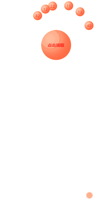
마지막으로 프로젝트에서는 포인트를 받기 위한 ajax 요청이 포함됩니다. ajax 요청 성공 콜백이 완료되었습니다. 주요 js 코드는 다음과 같습니다. // 一键领取积分
aKeyReceive() {
if (this.unreceivedIntegral.length === 0) {
return bottomTip("暂无未领积分")
}
if (this.userInfo.memberAKeyGet) {
let param = {
memberId: this.userInfo.memberId,
integralIds: this.unreceivedIntegral.map(u => u.id).join(","),
integralValue: this.unreceivedIntegral.reduce((acc, curr, index, arr) => { return acc + curr.value }, 0)
}
this.$refs.resLoading.show(true)
api.getAllChangeStatus(param).then(res => {
let data = res.data
if (data.success) {
this.getRecordIntegralList()
this.playIntegralAnim()
} else {
bottomTip(data.message)
}
}).finally(() => {
this.$refs.resLoading.show(false)
})
} else {
this.$refs.refPopTip.show()
}
},
// 领取积分的动画
playIntegralAnim() {
this.integralClass.fooClear = true
this.totalClass.totalAdd = true
this.totalText = `${this.statisticsData.useValue}积分`
let count = this.unreceivedIntegral.length, timeoutID = null, tasks = [], totalTime = parseInt(1500 / count)
const output = (i) => new Promise((resolve) => {
timeoutID = setTimeout(() => {
this.statisticsData.useValue += this.unreceivedIntegral[i].value
this.totalText = `${this.statisticsData.useValue}积分`
resolve();
}, totalTime * i);
})
for (let i = 0; i < count; i++) {
tasks.push(output(i));
}
Promise.all(tasks).then(() => {
clearTimeout(timeoutID)
})
}프로젝트가 온라인 상태가 된 후의 최종 효과는 다음과 같습니다.
여기서 페이지가 깜박이는 이유는 Ajax 요청에 로딩 상태가 있기 때문입니다. 사실, 서버가 완전히 안정적이라면 불가능할까요?  마지막으로, 비슷한 요구 사항이 있는 독자가 있다면 그들에게서 배우고 싶을 수도 있습니다. 더 나은 아이디어가 있으면 제 참고 자료로 가져오세요.
더 많은 프로그래밍 관련 지식을 보려면
프로그래밍 배우기를 방문하세요! !
위 내용은 포인트 애니메이션 효과를 달성하는 CSS의 상세 내용입니다. 자세한 내용은 PHP 중국어 웹사이트의 기타 관련 기사를 참조하세요!