
CSS3 및 js를 사용하여 시계 코드 프로세스 구현

- 不言원래의
- 2018-09-20 16:43:523142검색
이 글의 내용은 CSS3와 JS를 사용하여 시계 코드 프로세스를 구현하는 내용입니다. 참고할 만한 내용이 있으니 참고하시면 도움이 될 것입니다.
어느 날 CSS3 회전 속성을 보고 즉흥적으로(브라우저 호환 없이) 시계를 작성했습니다.
#🎜🎜 #한 번 해보세요! 먼저 완성된 제품의 사진, 최종 결과가 어떻게 보일지(동적) p, 맨 아래 레이어는 다이얼의 배경 이미지이고 나머지 세 레이어는 시침, 분입니다.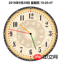 html 코드는 다음과 같습니다.
<div class="dial">
</div>
<div class="bigdiv bigdiv1" id="secondHand">
    <div class="secondHand"></div>
</div>
<div class="bigdiv bigdiv2" id="minuteHand">
    <div class="minuteHand"></div>
</div>
<div class="bigdiv bigdiv3" id="hourHand">
    <div class="center"></div>
    <div class="hourHand"></div>
</div>
변수 이름은 자연스럽게 선택됩니다. 클래스의 p는 신경쓰지 마세요. center는 테이블 중앙에 있는 작은 검은 점입니다. 초침은 60초에 한 번 회전하므로 CSS 코드는 다음과 같습니다↓.dial{
width:600px;
height:600px;
margin:0 auto;
position: absolute;
border-radius: 50%;
overflow: hidden;
background-color: rgba(153,50,204,0.2);
background-image: url(img/表盘.jpg);
background-size: 100% 100%;
}
.bigdiv{
width:600px;
height:600px;
margin:0 auto;
position: absolute;
border-radius: 50%;
overflow: hidden;
}
.bigdiv>div{
position: absolute;
left:298px;
border-radius: 100px;
}
.bigdiv1{
animation: moves 60s steps(60) infinite;
}
.bigdiv1 .secondHand{
width:4px;
height:250px;
background-color: red;
top:50px;
left:298px;
}
.bigdiv2{
animation: moves 3600s steps(3600) infinite;
}
.bigdiv2 .minuteHand{
width:6px;
height:180px;
background-color: green;
top:120px;
left:297px;
}
.bigdiv3{
animation: moves 216000s steps(216000) infinite;
}
.bigdiv3 .hourHand{
width:8px;
height:160px;
background-color: orange;
top:140px;
left:296px;
border-radius: 100px;
}
.bigdiv .center{
top:290px;
left:290px;
width:20px;
height:20px;
background-color: black;
z-index: 2;
}
@keyframes moves{
from{ transform: rotateZ(0deg); }
to{ transform: rotateZ(360deg); }
}이 단계가 완료되면 렌더링이 수행됩니다. 다음과 같습니다: #🎜🎜 #
그런 다음 js를 사용하여 현재 시간을 계산하고,
var date = new Date(); var hours = date.getHours(); var minutes = date.getMinutes(); var seconds = date.getSeconds();
그런 다음 각각의 현재 회전 각도를 계산합니다. needle
var secondAngle = seconds; var minuteAngle = minutes * 60 + seconds; var hourAngle = (60/12) * ((hours%12) * 3600 + minuteAngle);
현재 아이디어는 각 바늘이 자신의 고유한 시간을 따른다는 것입니다. 특정 시간에 원을 만들면 현재 시간을 표시하는 동적 시계를 구성하는 방법도 알 수 있습니다. ? 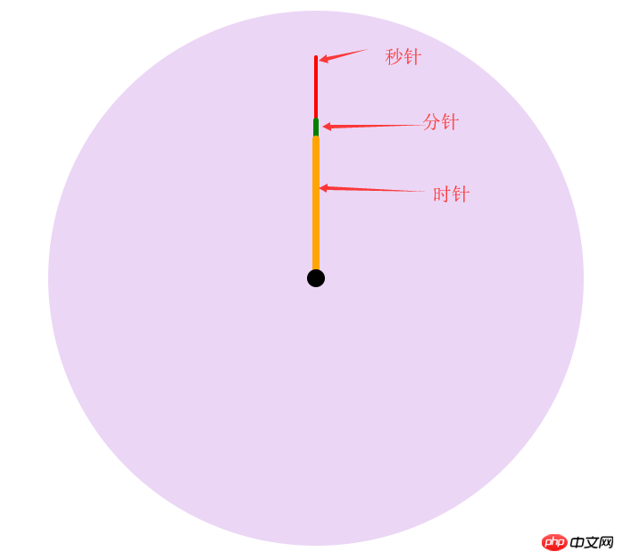
이 포인터가 해당 각도를 미리 시작하도록 하는 데 사용할 수 있습니다. js 코드는 다음과 같습니다.
hourHand.style.cssText = "animation-delay: -"+ hourAngle +"s"; minuteHand.style.cssText = "animation-delay: -"+ minuteAngle +"s"; secondHand.style.cssText = "animation-delay: -"+ secondAngle +"s";마침내 동적 시간을 하나 추가했습니다. 시계 상단에 표시됨다음은 편집 후 전체 코드입니다. 복사하여 붙여넣어 사용하세요
CSS
body,html{
margin:0;
}
.location{
position: relative;
width:600px;
height:600px;
left: calc(50% - 300px);
}
.dial{
    width:600px;
    height:600px;
    margin:0 auto;
    position: absolute;
    border-radius: 50%;
    overflow: hidden;
    background-color: rgba(153,50,204,0.2);
    background-image: url(img/表盘.jpg);
    background-size: 100% 100%;
}
.bigdiv{
    width:600px;
    height:600px;
    margin:0 auto;
    position: absolute;
    border-radius: 50%;
    overflow: hidden;
}
.bigdiv>div{
    position: absolute;
    left:298px;
    border-radius: 100px;
}
.bigdiv1{
    animation: moves 60s steps(60) infinite;
}
.bigdiv1 .secondHand{
    width:4px;
    height:250px;
    background-color: red;
    top:50px;
    left:298px;
}
.bigdiv2{
    animation: moves 3600s steps(3600) infinite;
}
.bigdiv2 .minuteHand{
    width:6px;
    height:180px;
    background-color: green;
    top:120px;
    left:297px;
}
.bigdiv3{
    animation: moves 216000s steps(216000) infinite;
}
.bigdiv3 .hourHand{
    width:8px;
    height:160px;
    background-color: orange;
    top:140px;
    left:296px;
    border-radius: 100px;
}
.bigdiv .center{
    top:290px;
    left:290px;
    width:20px;
    height:20px;
    background-color: black;
    z-index: 2;
}
@keyframes moves{
    from{ transform: rotateZ(0deg); }
    to{ transform: rotateZ(360deg); }
}
#dateshow{
text-align: center;
}#🎜 🎜# HTML 코드js 코드<div class="dial"> </div> <div class="bigdiv bigdiv1" id="secondHand"> <div class="secondHand"></div> </div> <div class="bigdiv bigdiv2" id="minuteHand"> <div class="minuteHand"></div> </div> <div class="bigdiv bigdiv3" id="hourHand"> <div class="center"></div> <div class="hourHand"></div> </div>
var dateshow = document.getElementById("dateshow");
var clock = {
weeks : ["一","二","三","四","五","六","日"],
getDate:function(){
date = new Date();
year = date.getFullYear();
month = date.getMonth()+1;
day = date.getDate();
hours = date.getHours();
minutes = date.getMinutes();
seconds = date.getSeconds();
week = date.getDay(); // 星期
dateText = year+"年"+month+"月"+clock.format(day)+"日 星期"+clock.formatnum(week)+" "+
clock.format(hours)+":"+clock.format(minutes)+":"+clock.format(seconds);
return dateText;
},
format:function (data){
if(data.toString().length == 1){
data = "0" + data;
};
return data;
},
formatnum:function (num){
return clock.weeks[num-1];
},
showdate:function (){
dateshow.innerText = clock.getDate();
},
go:function (){
var secondHand = document.getElementById("secondHand");
var minuteHand = document.getElementById("minuteHand");
var hourHand = document.getElementById("hourHand");
date = new Date();
hours = date.getHours();
minutes = date.getMinutes();
seconds = date.getSeconds();
var secondAngle = seconds;
var minuteAngle = minutes * 60 + seconds;
var hourAngle = (60/12) * ((hours%12) * 3600 + minuteAngle);
hourHand.style.cssText = "animation-delay: -"+ hourAngle +"s";
minuteHand.style.cssText = "animation-delay: -"+ minuteAngle +"s";
secondHand.style.cssText = "animation-delay: -"+ secondAngle +"s";
}
}
clock.go();
clock.showdate();
setInterval("clock.showdate()",1000);위 내용은 CSS3 및 js를 사용하여 시계 코드 프로세스 구현의 상세 내용입니다. 자세한 내용은 PHP 중국어 웹사이트의 기타 관련 기사를 참조하세요!
성명:
본 글의 내용은 네티즌들의 자발적인 기여로 작성되었으며, 저작권은 원저작자에게 있습니다. 본 사이트는 이에 상응하는 법적 책임을 지지 않습니다. 표절이나 침해가 의심되는 콘텐츠를 발견한 경우 admin@php.cn으로 문의하세요.