
CSS를 사용하여 웹 페이지의 줄무늬 배경 스타일 만들기 소개

- 不言원래의
- 2018-07-02 11:07:412740검색
이 글은 주로 웹 페이지의 줄무늬 배경 스타일을 만들기 위한 CSS 소개를 소개합니다. 이제는 참고할 만한 가치가 있습니다. 도움이 필요한 친구들이 참고할 수 있습니다.
주로 선형 그라데이션을 통해 표시할 수 있습니다. 다양한 방향의 CSS 스트라이프 효과 여기에서는 CSS를 사용하여 웹 페이지에 줄무늬 배경 스타일을 만드는 기술을 자세히 설명합니다. 도움이 필요한 친구들은 참고할 수 있습니다.
1. 가로 줄무늬
다음 코드:
background: linear-gradient(#fb3 20%, #58a 80%)
The 위 코드는 전체 이미지의 위쪽 부분을 표현한 것입니다. 20%와 아래쪽 20%는 해당 단색이고, 가운데 부분만 그라데이션 색상입니다. 중간 부분이 점차 줄어들어 중간 부분이 0이 되면, 즉 위쪽과 아래쪽 색상의 7개 점과 끝점이 같을 때 그라데이션이 없으며 두 가지 색상의 컬러바가 됩니다.
background: linear-gradient(#fb3 50%, #58a 50%);
다음으로 배경의 크기를 설정하면 배경의 높이가 작아지고 기본적으로 배경이 반복되어 줄무늬가 나타나도록 설정할 수 있습니다
background: linear-gradient(#fb3 50%, #58a 50%);
background-size: 100% 30px;
배경의 시작 위치를 설정할 수 없습니다. 두 번째 색상을 0으로 설정하면 브라우저는 기본적으로 이전 색상부터 시작합니다.
background: linear-gradient(#fb3 30%, #58a 0);
background-size:100% 30px;
이것은 노란색 30%, 파란색 70%로 줄무늬 배경을 형성합니다
아래에 세 가지 색상의 줄무늬를 설정할 수도 있습니다. :
background: linear-gradient(#fb3 33.3%, #58a 0, #58a 66.6%,yellowgreen 0);
background-size: 100% 45px;
2. 수직 줄무늬
선형 그라데이션 방법에 접두사를 추가하면 됩니다. 배경 크기 길이 및 너비 설정도 반대로 해야 합니다.
background: linear-gradient(to rightright, #fb3 50%, #58a 0);
background-size:30px 100%;
3. 경사 줄무늬
배경 크기 값을 수정하고 선형 그라데이션에 각도를 추가하여 경사 줄무늬를 얻을 수 있습니다.
배경: Linear-gradient(45deg, #fb3 50%, #58a 0); //배경의 그라데이션에 경사를 갖도록 합니다
background-size:30px 30px; //각 작은 구성요소는 고정된 너비와 높이를 갖습니다
그러나 결과는 다음과 같습니다. 이 중 전체 p 대각선 대신 작은 대각선 조각을 형성하게 됩니다. 대각선을 4개의 작은 p 그룹으로 그리고 선형 그라데이션에 색상 분해를 추가해야 합니다.
background: linear-gradient(45deg, #fb3 25%, #58a 0, #58a50%, #fb3 0, #fb3 75%, #58a 0);
background-size:30px 30px;
4. 반복 사용 -linear-gradient
대각선 배경을 그릴 때에는 반복-선형-그라디언트 방식을 사용하는 것이 더 효과적입니다. 이 방법을 사용하면 p 전체가 덮일 때까지 설정된 색상 변경이 자동으로 반복됩니다. 예제 코드는 다음과 같습니다.
background: repeating-linear-gradient(45deg, #fb3, #58a 30px);
이렇게 하면 위의 방법에서 조정의 어려움 없이 각도를 임의로 변경할 수 있습니다.
배경: Repeating-linear-gradient(60deg, #fb3, #fb315px, #58a 0, # 58a 30px);
(이 방법은 실제로 크기 조절과 그라데이션 조절을 결합한 것과 동일합니다)
5. 색상 설정에 대해
줄무늬 배경의 색상이 비슷한 색상이길 바라지만 수동으로 설정하는 것이 불편할 때가 있습니다. 이 색상의 #도 없고 어떤 색상을 선택해야 할지 찾기도 어렵습니다. 다음 방법을 사용할 수 있습니다.
background: #58a;
background-image: repeating-linear-gradient(30deg,
hsla(0,0%,100%,.1),
hsla(0,0%,100%,.1)15px,
transparent 0,transparent 30px);
이 방법의 원리는 배경에 가장 어두운 색상을 지정하고 기사에서 다른 유사한 색상을 투명도로 조정하는 것입니다.
6 종합 예
렌더링은 여기에 함께 있습니다. 다음 스타일은 일대일로 대응됩니다: 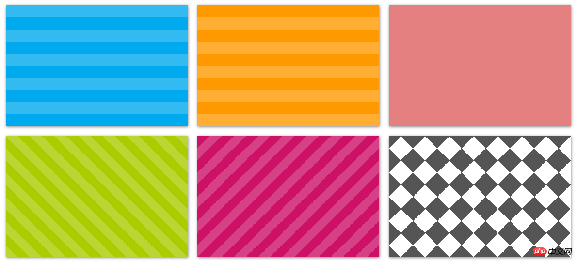
.stripes {
    height: 250px;
    width: 375px;
    float: left;
    margin: 10px;
    -webkit-background-size: 50px 50px;
    -moz-background-size: 50px 50px;
    background-size: 50px 50px; /* 控制条纹的大小 */
    -moz-box-shadow: 1px 1px 8px gray;
    -webkit-box-shadow: 1px 1px 8px gray;
    box-shadow: 1px 1px 8px gray;
}
.horizontal {
background-color: #0ae;
background-image: -webkit-gradient(linear, 0 0, 0 100%, color-stop(.5, rgba(255, 255, 255, .2)), color-stop(.5, transparent), to(transparent));
background-image: -moz-linear-gradient(rgba(255, 255, 255, .2) 50%, transparent 50%, transparent);
background-image: -o-linear-gradient(rgba(255, 255, 255, .2) 50%, transparent 50%, transparent);
background-image: linear-gradient(rgba(255, 255, 255, .2) 50%, transparent 50%, transparent);
}.vertical {
background-color: #f90;
background-image: -webkit-gradient(linear, 0 0, 100% 0, color-stop(.5, rgba(255, 255, 255, .2)), color-stop(.5, transparent), to(transparent));
background-image: -moz-linear-gradient(0deg, rgba(255, 255, 255, .2) 50%, transparent 50%, transparent);
background-image: -o-linear-gradient(0deg, rgba(255, 255, 255, .2) 50%, transparent 50%, transparent);
background-image: linear-gradient(0deg, rgba(255, 255, 255, .2) 50%, transparent 50%, transparent);
}.picnic {
background-color:white;
background-image: -webkit-gradient(linear, 0 0, 0 100%, color-stop(.5, transparent), color-stop(.5, rgba(200, 0, 0, .5)), to(rgba(200, 0, 0, .5))),
-webkit-gradient(linear, 0 0, 100% 0, color-stop(.5, transparent), color-stop(.5, rgba(200, 0, 0, .5)), to(rgba(200, 0, 0, .5)));
background-image: -moz-linear-gradient(transparent 50%, rgba(200, 0, 0, .5) 50%, rgba(200, 0, 0, .5)),
-moz-linear-gradient(0deg, transparent 50%, rgba(200, 0, 0, .5) 50%, rgba(200, 0, 0, .5));
background-image: -o-linear-gradient(transparent 50%, rgba(200, 0, 0, .5) 50%, rgba(200, 0, 0, .5)),
-o-linear-gradient(0deg, transparent 50%, rgba(200, 0, 0, .5) 50%, rgba(200, 0, 0, .5));
background-image: linear-gradient(transparent 50%, rgba(200, 0, 0, .5) 50%, rgba(200, 0, 0, .5)),
linear-gradient(0deg, transparent 50%, rgba(200, 0, 0, .5) 50%, rgba(200, 0, 0, .5));
}.angled-135 {
background-color: #c16;
background-image: -webkit-gradient(linear, 0 0, 100% 100%,
color-stop(.25, rgba(255, 255, 255, .2)), color-stop(.25, transparent),
color-stop(.5, transparent), color-stop(.5, rgba(255, 255, 255, .2)),
color-stop(.75, rgba(255, 255, 255, .2)), color-stop(.75, transparent),
to(transparent));
background-image: -moz-linear-gradient(-45deg, rgba(255, 255, 255, .2) 25%, transparent 25%,
transparent 50%, rgba(255, 255, 255, .2) 50%, rgba(255, 255, 255, .2) 75%,
transparent 75%, transparent);
background-image: -o-linear-gradient(-45deg, rgba(255, 255, 255, .2) 25%, transparent 25%,
transparent 50%, rgba(255, 255, 255, .2) 50%, rgba(255, 255, 255, .2) 75%,
transparent 75%, transparent);
background-image: linear-gradient(-45deg, rgba(255, 255, 255, .2) 25%, transparent 25%,
transparent 50%, rgba(255, 255, 255, .2) 50%, rgba(255, 255, 255, .2) 75%,
transparent 75%, transparent);
}.checkered {
background-image: -webkit-gradient(linear, 0 0, 100% 100%, color-stop(.25, #555), color-stop(.25, transparent), to(transparent)),
-webkit-gradient(linear, 0 100%, 100% 0, color-stop(.25, #555), color-stop(.25, transparent), to(transparent)),
-webkit-gradient(linear, 0 0, 100% 100%, color-stop(.75, transparent), color-stop(.75, #555)),
-webkit-gradient(linear, 0 100%, 100% 0, color-stop(.75, transparent), color-stop(.75, #555));
background-image: -moz-linear-gradient(45deg, #555 25%, transparent 25%, transparent),
-moz-linear-gradient(-45deg, #555 25%, transparent 25%, transparent),
-moz-linear-gradient(45deg, transparent 75%, #555 75%),
-moz-linear-gradient(-45deg, transparent 75%, #555 75%);
background-image: -o-linear-gradient(45deg, #555 25%, transparent 25%, transparent),
-o-linear-gradient(-45deg, #555 25%, transparent 25%, transparent),
-o-linear-gradient(45deg, transparent 75%, #555 75%),
-o-linear-gradient(-45deg, transparent 75%, #555 75%);
background-image: linear-gradient(45deg, #555 25%, transparent 25%, transparent),
linear-gradient(-45deg, #555 25%, transparent 25%, transparent),
linear-gradient(45deg, transparent 75%, #555 75%),
linear-gradient(-45deg, transparent 75%, #555 75%);
}HTML 코드:
<p class="horizontal stripes"></p>
<p class="vertical stripes"></p>
<p class="picnic stripes"></p>
<p class="angled stripes"></p>
<p class="angled-135 stripes"></p>
<p class="checkered stripes"></p>
위 내용은 모두의 학습에 도움이 되기를 바랍니다. PHP 중국어 웹사이트!
관련 추천 :
CSS 그라데이션 색상 생략 표시 내장 글꼴 텍스트 그림자에 대한 종합 소개
위 내용은 CSS를 사용하여 웹 페이지의 줄무늬 배경 스타일 만들기 소개의 상세 내용입니다. 자세한 내용은 PHP 중국어 웹사이트의 기타 관련 기사를 참조하세요!