
CSS3 모바일 속성
- php中世界最好的语言원래의
- 2018-03-21 17:12:161709검색
이번에는 CSS3의 모바일 속성에 대해 알려드리겠습니다. CSS3 모바일 속성 사용 시 주의사항은 무엇인가요? 실제 사례를 살펴보겠습니다.
transform 함수
scaling
텍스트나 이미지의 크기를 조정하려면 sacle(0.5)를 사용하면 50% 감소를 의미합니다.
<!DOCTYPE html>
<html lang="en">
<head>
    <meta charset="UTF-8">
    <title>scale方法使用示例</title>
    <style>
        p {
            width: 300px;
            margin: 150px auto;
            background-color: yellow;
            text-align: center;
            -webkit-transform: scale(0.5);
            -moz-transform: scale(0.5);
            -o-transform: scale(0.5);
        }
    </style>
</head>
<body>
<p>示例文字</p>
</body>
</html>
또한 요소의 가로 방향 배율과 세로 방향의 배율을 각각 지정할 수 있습니다. 예는 다음과 같습니다. 텍스트나 이미지의 기울기 처리를 구현하고, 기울기 각도와 세로 방향의 기울기 각도를 지정합니다. 예를 들어 "skew(30deg,30deg)"는 수평 방향으로 30도 기울어지는 것을 의미합니다. 수직 방향으로 30도 기울어지는 예는 다음과 같습니다:
<!DOCTYPE html>
<html lang="en">
<head>
    <meta charset="UTF-8">
    <title>scale方法使用示例</title>
    <style>
        p {
            width: 300px;
            margin: 150px auto;
            background-color: yellow;
            text-align: center;
            -webkit-transform: scale(0.5,2);
            -moz-transform: scale(0.5,2);
            -o-transform: scale(0.5,2);
        }
    </style>
</head>
<body>
<p>示例文字</p>
</body>
</html>
Rotate
회전 방법 사용 요소를 회전하려면 매개변수 "angle"이 하나 있습니다. 단위는 각도를 의미합니다. 양수는 시계 방향 회전을 의미하고 음수는 시계 반대 방향 회전을 의미합니다. 예를 들면 다음과 같습니다.
<!DOCTYPE html>
<html lang="en">
<head>
    <meta charset="UTF-8">
    <title>skew方法使用示例</title>
    <style>
        p {
            width: 300px;
            margin: 150px auto;
            background-color: yellow;
            text-align: center;
            -webkit-transform: skew(30deg, 30deg);
            -moz-transform: skew(30deg,30deg);
            -o-transform: skew(30deg,30deg);
        }
    </style>
</head>
<body>
<p>示例文字</p>
</body>
</html>
Move
번역 방법을 사용하여 텍스트나 이미지를 이동하고, 매개변수에 가로 방향의 이동 거리와 세로 방향의 이동 거리를 지정합니다. 예:
<!DOCTYPE html>
<html lang="en">
<head>
    <meta charset="UTF-8">
    <title>对元素使用多重变形的示例</title>
    <style>
        p {
            margin: 100px;
            width: 300px;
            background-color: yellow;
            text-align: center;
            -webkit-transform:rotate(30deg);
            -moz-transform:rotate(30deg);
            -o-transform:rotate(30deg);
        }
    </style>
</head>
<body>
<p>示例文字</p>
</body>
</html>
변환 예
예 1:
<!DOCTYPE html>
<html lang="en">
<head>
    <meta charset="UTF-8">
    <title>translate方法使用示例</title>
    <style>
        p {
            width: 300px;
            margin: 150px auto;
            background-color: yellow;
            text-align: center;
            -webkit-transform: translate(50px,50px);
            -moz-transform: translate(50px,50px);
            -o-transform: translate(50px,50px);
        }
    </style>
</head>
<body>
<p>示例文字</p>
</body>
</html>
이 예는 먼저 이동한 다음 회전하고 마지막으로 크기를 조정하는 것입니다.효과:
예 2:<!DOCTYPE html>
<html lang="en">
<head>
<meta charset="UTF-8">
<title>对元素使用多重变形的示例</title>
<style>
p {
width: 300px;
background-color: yellow;
text-align: center;
-webkit-transform: translate(150px,200px) rotate(45deg) scale(1.5);
-moz-transform: translate(50px,50px) rotate(45deg) scale(1.5);
-o-transform: translate(50px,50px) rotate(45deg) scale(1.5);
}
</style>
</head>
<body>
<p>示例文字</p>
</body>
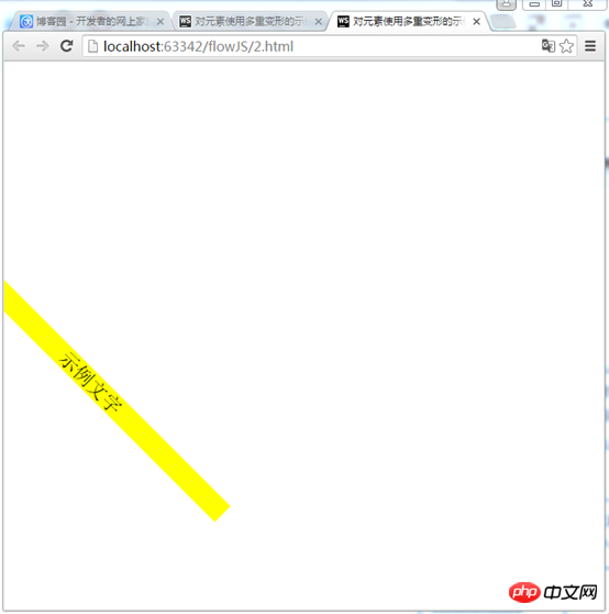
</html> 첫 번째 회전 , 크기 조정 후 마지막으로 이동 효과: 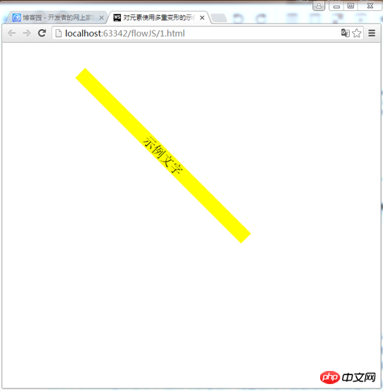
첫 번째 예:
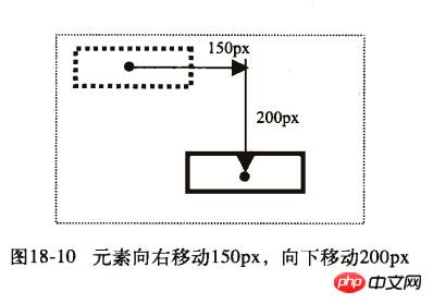
 1) 먼저 오른쪽으로 150px, 아래로 200px 이동합니다.
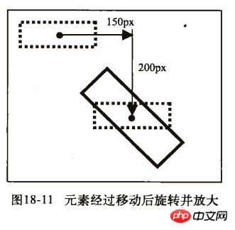
2) 그런 다음 45도 회전하여 1.5배 확대합니다.
 두 번째 예:
2) 그런 다음 오른쪽으로 150px, 아래로 200px 이동합니다.
이 기사의 사례를 읽으신 후 방법을 마스터하셨다고 생각합니다. 더 흥미로운 정보를 보려면 PHP 중국어 웹사이트의 다른 관련 기사를 주목하세요! 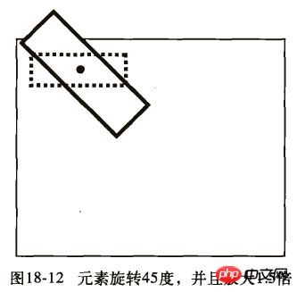
CSS 선택기 사용에 대한 자세한 설명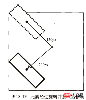
CSS 여백의 특수한 사용 기술에 대한 자세한 설명
위 내용은 CSS3 모바일 속성의 상세 내용입니다. 자세한 내용은 PHP 중국어 웹사이트의 기타 관련 기사를 참조하세요!