
CSS3 모방 Alibaba Cloud 물 패턴 효과 코드 공유

- 小云云원래의
- 2018-02-23 09:34:081798검색
이 기사에서는 Alibaba Cloud의 물 패턴 효과를 모방한 CSS3 샘플 코드에 대한 관련 정보를 주로 소개합니다. 편집자는 꽤 좋다고 생각하므로 지금 공유하고 참고용으로 제공하겠습니다. 편집자를 따라 살펴보겠습니다. 모두에게 도움이 되기를 바랍니다.
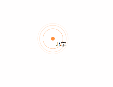
Rendering
말은 그만하고 코드를 살펴보겠습니다.
<!DOCTYPE html>
<html>
<head>
    <title>css3 水纹效果</title>
    <style type="text/css">
        .point_area {
            text-align: center;
            position: relative;
            width: 150px;
            height: 150px;
            transition: opacity .5s ease-out;
        }
        .point_area .point {
            position: absolute;
            top: 0;
            left: 0;
            right: 0;
            bottom: 0;
            width: 10px;
            height: 10px;
            margin: auto;
            -webkit-border-radius: 50%;
            -webkit-background-clip: padding-box;
            -moz-border-radius: 50%;
            -moz-background-clip: padding;
            border-radius: 50%;
            background-clip: padding-box;
            background: transparent;
        }
        .point_area .point_dot {
            z-index: 1;
            background-color: #ff903d;
            border: 1px solid rgba(255,144,61,.37);
        }
        .point_area .point_10 {
            width: 100%;
            height: 100%;
        }
        .point_area .point_10:after {
            content: "";
            display: block;
            position: absolute;
            top: 0;
            right: 0;
            bottom: 0;
            left: 0;
            border-radius: 50%;
            border: 2px solid #ff903d;
            opacity: 0;
            -webkit-animation: ripple 4.5s ease-out 225ms infinite;
            animation: ripple 4.5s ease-out 225ms infinite;
        }
        .point_area .point_40 {
            width: 100%;
            height: 100%;
        }
        .point_area .point_40:after {
            content: "";
            display: block;
            position: absolute;
            top: 0;
            right: 0;
            bottom: 0;
            left: 0;
            border-radius: 50%;
            border: 2px solid #ff903d;
            opacity: 0;
            -webkit-animation: ripple 4.5s ease-out .9s infinite;
            animation: ripple 4.5s ease-out .9s infinite;
        }
        .point_area .point_80 {
            width: 100%;
            height: 100%;
        }
        .point_area .point_80:after {
            content: "";
            display: block;
            position: absolute;
            top: 0;
            right: 0;
            bottom: 0;
            left: 0;
            border-radius: 50%;
            border: 2px solid #ff903d;
            opacity: 0;
            -webkit-animation: ripple 4.5s ease-out 1.8s infinite;
            animation: ripple 4.5s ease-out 1.8s infinite;
        }
        @-webkit-keyframes ripple{
            0%{
                opacity:0;-webkit-transform:scale(.1)
            }
            5%{
                opacity:1
            }
            to{
                opacity:0;
                -webkit-transform:scale(1)
            }
        }
        @keyframes ripple{
            0%{
                opacity:0;
                -webkit-transform:scale(.1);
                transform:scale(.1)
            }
            5%{
                opacity:1
            }
            to{
                opacity:0;
                -webkit-transform:scale(1);
                transform:scale(1)
            }
        }
    </style>
</head>
<body style="position: relative;">
    <p class="point_area" style="top: 158px; left: 661px; position: absolute; width: 110px; height: 110px; visibility: visible; opacity: 1;">
        <p class="point_name" style="position: absolute; top: 45px; left: 65px;">北京</p>
        <a href="#" target="_blank" class="point point_dot"></a>
        <p class="point point_10"></p>
        <p class="point point_40"></p>
        <p class="point point_shadow point_80"></p>
    </p>
</body>
</html>
관련 추천:
jQuery를 통해 클릭 물 리플을 실현 animation_jquery
위 내용은 CSS3 모방 Alibaba Cloud 물 패턴 효과 코드 공유의 상세 내용입니다. 자세한 내용은 PHP 중국어 웹사이트의 기타 관련 기사를 참조하세요!
성명:
본 글의 내용은 네티즌들의 자발적인 기여로 작성되었으며, 저작권은 원저작자에게 있습니다. 본 사이트는 이에 상응하는 법적 책임을 지지 않습니다. 표절이나 침해가 의심되는 콘텐츠를 발견한 경우 admin@php.cn으로 문의하세요.
이전 기사:6가지 CSS 수평 및 수직 센터링 솔루션다음 기사:6가지 CSS 수평 및 수직 센터링 솔루션