
JavaScript를 사용하여 슬라이드쇼를 구현하는 간단한 예

- 黄舟원래의
- 2017-11-20 09:22:573867검색
일상적인 개발 작업에서 우리는 흔히 슬라이드 전환을 접하게 됩니다. 일반적인 슬라이드 전환은 슬라이드 전환의 종류에 관계없이 타이머를 사용하여 점진적으로 사진이나 사진 그룹을 변경합니다. 특정 속성을 사용하여 이를 달성하려면 오늘 JavaScript에서 슬라이드쇼를 구현하는 간단한 예를 소개하겠습니다!
다른 효과를 버리세요. 가장 간단한 캐러셀에는
parent.appendChild(parent.firstChild)라는 명령문 하나만 있습니다. 이 명령문은 목록의 요소를 마지막 항목에 계속 추가하므로 다음과 같습니다. 전환 효과를 얻을 수 있습니다.
한 가지, IE는 다른 브라우저와 다르게 텍스트 노드를 취급합니다. 또한, 다른 버전의 FF에서는 children 속성에도 주의를 기울여야 합니다.
아래 데모에서는 #view의 Overflow:hidden을 설정하지 않았습니다.
demo_1:
코드는 다음과 같습니다:
<!DOCTYPE html PUBLIC "-//W3C//DTD XHTML 1.0 Transitional//EN"
"http://www.w3.org/TR/xhtml1/DTD/xhtml1-transitional.dtd">
<html>
<head>
<meta http-equiv="Content-Type" content="text/html; charset=utf-8"/>
<title></title>
<style type="text/css">
*{ margin: 0; padding: 0;}
ul{ list-style: none;}
#view{ position: relative; width: 320px; height: 120px; margin-left:320px; border: 10px solid #bc8f8f; }
#view:after{ content: '.'; display: block; clear: both; height: 0; visibility:hidden;}
#img_list{ position: absolute; width: 960px;}
#img_list li{ float: left; width: 320px; height: 120px; }
#a{ background: #87ceeb;}
#b{ background: #ff69b4;}
#c{ background: #98fb98;}
</style>
</head>
<body>
<p id="view">
<ul id="img_list">
<li id="a"></li>
<li id="b"></li>
<li id="c"></li>
</ul>
</p>
<script type="text/javascript">
var img_list = document.getElementById('img_list');
setInterval(function(){
img_list.appendChild(img_list.firstChild);
},500)
</script>
</body>
</html>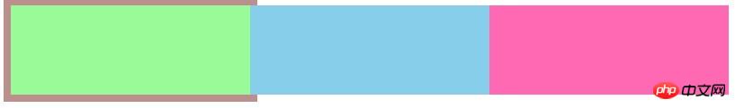
(위의 데모는 실제로 플로팅할 필요가 없으며 나중에 시연하기 위한 것입니다.)
또 다른 방법은 변경하지 않고 전체 목록을 특정 방향으로 이동하는 것입니다. 노드 순서(목록의 왼쪽 속성을 지속적으로 변경),
demo_2:
코드는 다음과 같습니다.
<html>
<head>
<meta http-equiv="Content-Type" content="text/html; charset=utf-8"/>
<title></title>
<style type="text/css">
*{ margin: 0; padding: 0;}
ul{ list-style: none;}
#view{ position: relative; width: 320px; height: 120px; margin-left:320px; border: 10px solid #bc8f8f; }
#view:after{ content: '.'; display: block; clear: both; height: 0; visibility:hidden;}
#img_list{ position: absolute; width: 960px;}
#img_list li{ float: left; width: 320px; height: 120px; }
#a{ background: #87ceeb;}
#b{ background: #ff69b4;}
#c{ background: #98fb98;}
</style>
</head>
<body>
<p id="view">
<ul id="img_list">
<li id="a"></li>
<li id="b"></li>
<li id="c"></li>
</ul>
</p>
<script type="text/javascript">
var img_list = document.getElementById('img_list');
img_list.style.left = 0;
setInterval(function(){
img_list.style.left = parseInt(img_list.style.left) == -640 ? 0: (parseInt(img_list.style.left) - 320 + 'px');
},500)
</script>
</body>
</html>위 데모는 갑작스럽고 느낌이 좋지 않으므로 부드러운 움직임 효과를 추가할 수 있습니다.
소위 부드러운 움직임 효과는 실제로 위의 두 번째 데모의 각 큰 단계를 여러 개의 작은 부분으로 분해하고 320px의 움직임을 50번으로 나누어 실행하는 것입니다.
demo_3:
코드는 다음과 같습니다.
<!DOCTYPE html PUBLIC "-//W3C//DTD XHTML 1.0 Transitional//EN"
"http://www.w3.org/TR/xhtml1/DTD/xhtml1-transitional.dtd">
<html>
<head>
<meta http-equiv="Content-Type" content="text/html; charset=utf-8"/>
<title></title>
<style type="text/css">
*{ margin: 0; padding: 0;}
ul{ list-style: none;}
#view{ position: relative; width: 320px; height: 120px; margin-left:320px; border: 10px solid #bc8f8f; }
#view:after{ content: '.'; display: block; clear: both; height: 0; visibility:hidden;}
#img_list{ position: absolute; width: 960px;}
#img_list li{ float: left; width: 320px; height: 120px; }
#a{ background: #87ceeb;}
#b{ background: #ff69b4;}
#c{ background: #98fb98;}
</style>
</head>
<body>
<p id="view">
<ul id="img_list">
<li id="a"></li>
<li id="b"></li>
<li id="c"></li>
</ul>
</p>
<script type="text/javascript">
var img_list = document.getElementById('img_list');
img_list.style.left = 0;
setInterval(function(){
for(var i = 0 ; i < 100 ; i++){
(function(pos){
setTimeout(function(){
img_list.style.left = parseInt(img_list.style.left) == -640 ? 0: -pos/100 * 640+'px';
},(pos + 1)*10)
})(i)
}
},1500)
</script>
</body>
</html>Demo_1의 경우, firstChild의 너비를 지속적으로 줄여 데모_3과 비슷한 효과를 얻을 수 있습니다. demo_4
<!DOCTYPE html PUBLIC "-//W3C//DTD XHTML 1.0 Transitional//EN"
"http://www.w3.org/TR/xhtml1/DTD/xhtml1-transitional.dtd">
<html>
<head>
<meta http-equiv="Content-Type" content="text/html; charset=utf-8"/>
<title></title>
<style type="text/css">
*{ margin: 0; padding: 0;}
ul{ list-style: none;}
#view{ position: relative; width: 320px; height: 120px; margin-left:320px; border: 10px solid #bc8f8f; }
#view:after{ content: '.'; display: block; clear: both; height: 0; visibility:hidden;}
#img_list{ position: absolute; width: 960px;}
#img_list li{ float: left; width: 320px; height: 120px; }
#a{ background: #87ceeb;}
#b{ background: #ff69b4;}
#c{ background: #98fb98;}
</style>
</head>
<body>
<p id="view">
<ul id="img_list">
<li id="a"></li>
<li id="b"></li>
<li id="c"></li>
</ul>
</p>
<script type="text/javascript">
var img_list = document.getElementById('img_list');
setInterval(function(){
var current = img_list.children[0];
for(var i = 0 ; i < 100 ; i++){
(function(pos){
setTimeout(function(){
current.style.width = 320 - (pos/100)*320 + 'px';
},(pos + 1)*10)
})(i)
}
setTimeout(function(){
img_list.appendChild(current);
current.style.width = '320px';
},1010);
},1500)
</script>
</body>
</html>위의 방법들은 원칙적으로 비슷합니다. 또한, 투명 그라데이션을 설정하여 사진의 투명도를 1에서 0까지 만들 수도 있으므로, 전환 효과 및 코드 변경이 매우 작습니다. demo_5:
<!DOCTYPE html PUBLIC "-//W3C//DTD XHTML 1.0 Transitional//EN"
"http://www.w3.org/TR/xhtml1/DTD/xhtml1-transitional.dtd">
<html>
<head>
<meta http-equiv="Content-Type" content="text/html; charset=utf-8"/>
<title></title>
<style type="text/css">
*{ margin: 0; padding: 0;}
ul{ list-style: none;}
#view{ position: relative; width: 320px; height: 120px; margin-left:320px; border: 10px solid #bc8f8f; }
#view:after{ content: '.'; display: block; clear: both; height: 0; visibility:hidden;}
#img_list{ position: absolute; width: 960px;}
#img_list li{position: absolute; top:0; left: 0; width: 320px; height: 120px; }
#a{ background: #87ceeb;}
#b{ background: #ff69b4;}
#c{ background: #98fb98;}
</style>
</head>
<body>
<p id="view">
<ul id="img_list">
<li id="a"></li>
<li id="b"></li>
<li id="c"></li>
</ul>
</p>
<script type="text/javascript">
var img_list = document.getElementById('img_list');
setInterval(function(){
var current = img_list.children[0];
for(var i = 0 ; i < 100 ; i++){
(function(pos){
setTimeout(function(){
current.style.opacity = 1 - (pos/100)*1;
},(pos + 1)*10)
})(i)
}
setTimeout(function(){
img_list.appendChild(current);
current.style.opacity = 1;
},1010);
},1500)
</script>
</body>
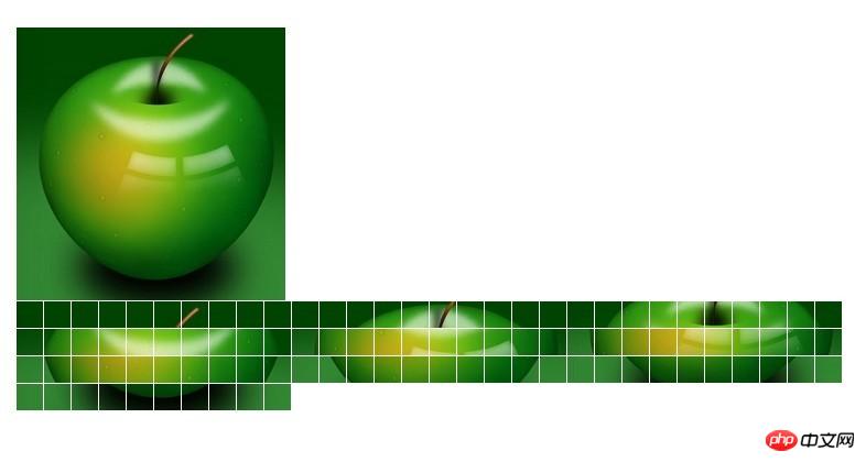
</html>다른 멋진 효과의 경우 다른 조합으로 처리할 수 있습니다. 한 가지 방법은 사진을 n개의 영역으로 나누고 표시해야 하는 사진에 배경을 설정한 다음 해당 배경을 다른 영역에 표시하는 것입니다. 이런 방식으로 100*100 사진을 10*10 크기의 작은 정사각형 100개로 나눈 다음 이 정사각형을 처리하여 더 많은 효과를 얻을 수 있습니다. 이론적으로는 1*1 작은 점 10,000개로 나눌 수 있는데 브라우저가 터질 것 같아요...
demo_6:
<!DOCTYPE html PUBLIC "-//W3C//DTD XHTML 1.0 Transitional//EN"
"http://www.w3.org/TR/xhtml1/DTD/xhtml1-transitional.dtd">
<html>
<head>
<meta http-equiv="Content-Type" content="text/html; charset=utf-8"/>
<title></title>
<style type="text/css">
*{ margin: 0; padding: 0; border: 0;}
body{ padding: 50px;}
.sep{ float: left; margin:1px 1px 0 0;}
</style>
</head>
<body>
<img id="img" src="../动画/apple.jpg" alt="" />
<p id="wrap" style="position: relative; "></p>
<script type="text/javascript">
var img = document.getElementById('img');
var wrap = document.getElementById('wrap');
img.onload = function(){
console.dir(img);
var h = img.naturalHeight;
var w = img.naturalWidth;
newPanel(w,h);
}
function newPanel(w,h){
var cols = 10;
var rows = 10;
var colWidth = Math.floor(w/cols);
var rowHeight = Math.floor(w/rows);
for(var row = 0; row < rows; row++){
for(var col =0; col < cols; col++){
var p = document.createElement('p');
p.style.width = colWidth + 'px';
p.style.height= rowHeight + 'px';
p.className= 'sep';
p.style.backgroundImage = 'url(' + img.src + ')';
p.style.backgroundPosition = -colWidth*col +'px ' + -rowHeight*row +'px' ;
wrap.appendChild(p);
}
}
}
setTimeout(function(){
setInterval(function(){
wrap.lastChild && wrap.removeChild(wrap.lastChild);
},50)
},1000)
</script>
</body>
</html>
마지막으로 CSS3가 일부 슬라이드 효과도 구현할 수 있다는 것은 모두가 알고 있습니다.
demo_7:
<!DOCTYPE HTML PUBLIC "-//W3C//DTD HTML 4.01 Transitional//EN"
"http://www.w3.org/TR/html4/loose.dtd">
<html>
<head>
<meta http-equiv="Content-Type" content="text/html; charset=utf-8"/>
<title></title>
<style type="text/css">
*{
margin: 0;
padding: 0;
}
#test{
position: relative;
width: 300px;
height: 200px;
overflow: hidden;
border: 1px solid #d4d4d4;
}
#test ul{
position: absolute;
top:0;
left: 0;
height:200px;
}
#test ul li{
float: left;
width: 300px;
height:200px;
}
@-webkit-keyframes myAnimation{
0%{
top:0;
}
40%{
top:-200px;
}
70%{
top:-400px;
}
100%{
top:-600px;
}
}
#test ul{
-webkit-animation-name:myAnimation;
-webkit-animation-duration:4s;
-webkit-animation-timing-function:linear;
-webkit-animation-iteration-count:infinite;
}
</style>
</head>
<body>
<p id="test">
<ul>
<li><img width="300" height="200" src="../image/a.jpg" alt="" /></li>
<li><img width="300" height="200" src="../image/a.jpg" alt="" /></li>
<li><img width="300" height="200" src="../image/a.jpg" alt="" /></li>
<li><img width="300" height="200" src="../image/a.jpg" alt="" /></li>
</ul>
</p>
</body>
</html>

요약:
관련 추천:
javascript는 이미지 전환의 슬라이드쇼 효과 소스 코드를 구현합니다.
위 내용은 JavaScript를 사용하여 슬라이드쇼를 구현하는 간단한 예의 상세 내용입니다. 자세한 내용은 PHP 중국어 웹사이트의 기타 관련 기사를 참조하세요!