


누구나 어린 시절의 도라에몽, 놀라운 도라에몽으로 가득 찬 작은 배, 무기력하고 슬플 때 곁에 있어주는 도라에몽, 무기력하고 슬플 때 곁에 있어주는 도라에몽이 있다고 믿습니다. 엉뚱한 생각을 하며 도라야키를 함께 먹습니다~ 오늘은 마음속의 도라에몽을 그려보겠습니다~

도라에몽을 정의하는 용기
-
동일 먼저 큰 용기를 정의하여 도라에몽을 그리고 결정합니다. 그 크기와 위치.
<!-- 哆啦A梦大容器 -->
<p class="doa"></p>
/*哆啦A梦*/
 .doa{position: relative;top: 100px;}
도라에몽의 머리 그리기(얼굴 포함, 얼굴에는 눈과 코 포함)
머리는 여러 부분으로 구성됩니다: 도라에몽의 얼굴과 코, 얼굴에는 눈이 두 개 있고, 안에 눈알과 눈 흰자가 있습니다. 따라서 여러 레이어의 DOM 중첩이 있을 것입니다. 물론 기본 그래픽은 모두 p+border-radius로 구성됩니다.
그린 아이템의 다양한 부분을 해당 위치에 배치하면 됩니다.
-
내가 이전에 그린 몇 장의 그림을 보면 border-radius가 매우 일반적으로 사용되는 속성이라는 것을 알 수 있습니다. p의 거의 모든 변형은 실제로 border-radius의 실제 모습입니다. -radius: 300px 300px 300px 300px/300px 300px 300px 300px; Jiangzi에서는 일반적으로 슬래시 뒤에 내용을 쓰지 않습니다. 슬래시 부분은 가로 길이이고, 슬래시는 세로 높이입니다. 동일합니다. 제가 말한 내용이 충분히 상세하지 않다는 것을 알고 있습니다. 제 Xinshen 블로그를 참조하세요. 가을 달은 언제 올까요? CSS3 border-radius에 대해 얼마나 알고 계시나요? , 숙련된 운전기사의 안내에 따라 국경 반경을 완벽하게 이해할 수 있도록 몇 분 안에 버스에 탑승해 보는 것은 어떨까요?
<!-- 头 --> <p class="head"> <!-- 存放脸部的容器 --> <p class="face"> <!-- 左眼大圈儿 --> <p> <!-- 左眼眼珠(黑色部分) --> <p> <!-- 左眼眼白,黑色里面的白色部分 --> <p></p> </p> </p> <!-- 右眼大圈儿 --> <p> <!--右眼眼珠(黑色部分) --> <p> <!-- 右眼眼白,黑色里面的白色部分 --> <p></p> </p> </p> </p> <!-- 红鼻子部分 --> <p class="nose"> <!-- 红鼻子里面的白圈儿 --> <p></p> </p> <!-- 红鼻子下面的那根黑线,也属于鼻子部分 --> <p class="nose1"></p> </p> .head{ margin: 0 auto; /*头部定义大小并居中显示*/ width: 400px; height: 350px; background: #008ee3; /*头部定义背景颜色*/ position: relative; border-radius: 50% 50% 25% 25% / 55% 55% 45% 45%; /*头部定义四个方向圆角大小*/ } .face{ width: 310px; /*脸部定义大小*/ height: 260px; background: snow; /*脸部定义背景颜色*/ border-radius: 50% 50% 25% 25% / 55% 55% 45% 45%; /*脸部定义四个方向的圆角大小*/ position: relative; /*脸部定义位置,是相对于head的位置*/ top: 90px; left: 45px; } /*左眼眶*/ .face>p:first-child{ width: 80px; /*左眼框定义大小*/ height: 100px; border-radius: 50%; /*左眼框定义与圆角大小*/ border:2px #000 solid; /*定义外边框*/ background: snow; float: left; /*为了使左右两个眼睛能在一排显示*/ position: relative; /*位置是相对于face的位置*/ top:-40px; left: 71px; z-index: 50; } /*右眼眶,画法跟左眼一样*/ .face>p:last-child{ width: 80px; height: 100px; border-radius: 50%; border:2px #000 solid; background: snow; float: left; position: relative; top:-40px; left: 71px; z-index: 50; } /*左眼珠1*/ .face>p:first-child p{ width: 20px; /*定义眼珠的大小*/ height: 25px; background: #000; border-radius: 50%; position: absolute; /*定义眼珠的位置,相对于眼眶的位置*/ top: 45px; left: 60px; } /*左瞳孔*/ .face>p:first-child p p{ width: 10px; /*定义黑色瞳孔的大小*/ height: 10px; background: #ffffff; border-radius: 50%; position: absolute; /*定义黑色瞳孔的位置,相对于眼珠的位置*/ top: 7px; left: 10px; } /*右眼珠和左眼珠画法一样*/ .face>p:last-child p{ width: 20px; height: 25px; background: #000; border-radius: 50%; position: absolute; top: 45px; } /*右瞳孔和左瞳孔的画法一样*/ .face>p:last-child p p{ width: 10px; height: 10px; background: #ffffff; border-radius: 50%; position: absolute; top: 7px; } .nose{ width: 30px; /*定义红鼻子的大小*/ height: 30px; border-radius: 50%; background: #c70000; position: absolute; top: 130px; left: 50%; margin-left: -15px; z-index: 10; } .nose p{ width: 10px; /*定义红鼻子里面白色圈圈的大小*/ height: 10px; border-radius: 50%; position: absolute; background: #ffffff; top: 10px; margin-left: 20px; z-index: 10; } .nose1{ width: 2px; /*定义红鼻子下面的那一条黑线*/ height: 130px; background: #000; position: absolute; top: 160px; left: 50%; margin-left: -1px; z-index: 10; } -

도라에몽의 머리.png
도라에몽 입 그리기
-
입은 매우 단순해야 하며, Border+border-Radius로 구현을 사용하고 있음을 한눈에 알 수 있습니다.
<p class="mouth"></p>
.mouth{
 width: 250px; /*定义嘴巴的大小*/
 height: 200px;
 border-radius: 50%;
 background: snow;
 border-bottom: 2px #000 solid;
 margin: -230px auto;
 position: relative; /*定义嘴巴的位置*/
 }
도라에몽 입.png
도라에몽 수염 부분 그리기
-
수염 부분은 애니메이션 제작을 위해 이전 글에서 실제로 그려봤습니다 [연재3] - 수염 그리는 방법은 이미 새끼 고양이 스마일 애니메이션에서 수염을 그릴 때 소개되었으므로 여기서는 자세한 내용을 다루지 않겠습니다. 기본 아이디어는 동일합니다.
<!-- 胡须 -->
  <p class="beard">
 <!-- 左边胡须部分 -->
 <p class="left">
 <!-- 第一根胡须 -->
 <p></p>
 <!-- 第二根胡须 -->
 <p></p>
 <!-- 第三根胡须 -->
 <p></p>
 </p>
 <p class="right">
 <p></p>
 <p></p>
 <p></p>
 </p>
 <!-- 脖子部分的小白条部分 -->
 <span></span>
 </p>
/*胡须样式*/
.beard .left p:first-child{
 width: 120px;
 height: 40px;
 border-top: 2px #000 solid;
 border-radius: 10% 90% 10% 90% / 10% 90% 10% 90%;
 position: absolute;
 left: 50%;
 top: 140px;
 margin-left: -170px;
 z-index: 100;
 }
 .beard .left p:nth-child(2){
 width: 120px;
 height: 40px;
 border-top: 2px #000 solid;
 border-radius: 10% 90% 10% 90% / 30% 70% 40% 60%;
 position: absolute;
 left: 50%;
 top: 170px;
 margin-left: -170px;
 z-index: 100;
 }
 .beard .left p:last-child{
 width: 120px;
 height: 40px;
 border-top: 2px #000 solid;
 border-radius: 10% 90% 10% 90% / 40% 60% 10% 90%;
 position: absolute;
 left: 50%;
 top: 200px;
 margin-left: -170px;
 z-index: 100;
 }

 .beard .right p:first-child{
 width: 120px;
 height: 40px;
 border-top: 2px #000 solid;
 border-radius: 90% 10% 90% 10% / 90% 10% 90% 10%;
 position: absolute;
 left: 50%;
 top: 140px;
 margin-left: 50px;
 z-index: 100;
 }
 .beard .right p:nth-child(2){
 width: 120px;
 height: 40px;
 border-top: 2px #000 solid;
 border-radius: 90% 10% 90% 10% / 70% 30% 60% 40%;
 position: absolute;
 left: 50%;
 top: 170px;
 margin-left: 50px;
 z-index: 100;
 }
 .beard .right p:last-child{
 width: 120px;
 height: 40px;
 border-top: 2px #000 solid;
 border-radius: 90% 10% 90% 10% / 60% 40% 90% 10%;
 position: absolute;
 left: 50%;
 top: 200px;
 margin-left: 50px;
 z-index: 100;
 }
 .beard span{
 display: block;
 width: 60px;
 height: 3.5px;
 background: #ffffff;
 border-radius: 4px;
 position: absolute;
 top: 352px;
 left: 50%;
 margin-left: -105px;
 }
도라에몽 턱수염.png
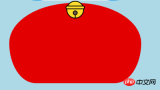
도라에몽의 목부분을 그려주세요(목부분에는 종도 포함되어있습니다)
목은 기본 p변형 후의 모양으로 중복되어 부분적으로 아래로 숨기시면 됩니다 머리.
-
벨부분은 아주 심플한 기본 그래픽으로 구성되어있습니다.
<!-- 脖 -->
  <p class="neck">
 <!-- 铃铛的圆形 -->
 <p></p>
 <!-- 铃铛的小圆角矩形 -->
 <p></p>
 <!-- 铃铛的小圆形 -->
 <p></p>
 <!-- 铃铛的小竖线 -->
 <p></p>
 </p>
.neck{
 width: 330px;
 height: 200px;
 border-radius: 50% 50% 20% 20% / 50% 50% 50% 50%;
 background: #e30000;
 margin: 80px auto;
 z-index: 100;
 }
 .neck p:first-child{
 border: 2px #000 solid;
 border-radius: 50%;
 width: 40px;
 height: 40px;
 background: #ffdd2e;
 position: absolute;
 top: 350px;
 left: 50%;
 margin-left: -22px;
 transition: all 1s;
 }
 .neck p:nth-child(2){
 border: 2px #000 solid;
 width: 44px;
 height: 5px;
 background: #ffdd2e;
 position: absolute;
 left: 50%;
 margin-left: -24px;
 top: 363px;
 border-radius: 5px;
 transition: all 1s;
 }
 .neck p:nth-child(3){
 width: 8px;
 height: 8px;
 border: 2px #000 solid;
 position: absolute;
 background: #6c5844;
 border-radius: 50%;
 left: 50%;
 margin-left: -6px;
 top: 375px;
 transition: all 1s;
 }
 .neck p:nth-child(4){
 width: 2px;
 height: 8px;
 background: #000;
 position: absolute;
 left: 50%;
 margin-left: -1px;
 top: 385px;
 transition: all 1s;
 }
도라에몽의 목.png
도라에몽의 다이나믹한 효과 완성
도라에몽은 움직일때가 더 귀엽죠?
마우스를 눈 영역으로 이동하고 왼쪽 안구를 왼쪽으로 이동합니다.
마우스를 입으로 가져가면 표정이 변합니다.
-
마우스를 벨 부분으로 옮기면 벨이 커집니다.
/*眼睛动效*/
.head:hover .face>p:first-child p{
 left: 0px;
 transition: all 1s;
 }
 .head:hover .face>p:first-child p p{
 left: 0px;
 transition: all 1s;
 }
/*嘴巴动效,嘴巴的dom容器下面要加了个空的p容器*/
.mouth p:first-child{
 width: 82px;
 height: 2px;
 background: #000;
 position: absolute;
 z-index: 1000;
 top: -25px;
 left: 6px;
 display: none;
 }
 .mouth p:nth-child(2){
 width: 82px;
 height: 2px;
 background: #000;
 position: absolute;
 z-index: 1000;
 top: -25px;
 left: 90px;
 display: none;
 }
 .mouth:hover{
 border-radius: 0;
 width: 180px;
 height: 200px;
 }
 .mouth:hover p:first-child,.mouth:hover p:nth-child(2){
 display: block;
 }
/*铃铛动效*/
.neck:hover p:first-child{
 width: 60px;
 height: 60px;
 left: 50%;
 margin-left: -30px;
 }
 .neck:hover p:nth-child(2){
 width: 66px;
 height: 7.5px;
 left: 50%;
 margin-left: -33px;
 }
 .neck:hover p:nth-child(3){
 width: 12px;
 height: 12px;
 left: 50%;
 margin-left: -6px;
 top: 385px;
 }
 .neck:hover p:nth-child(4){
 width: 2px;
 height: 12px;
 left: 50%;
 margin-left: 1px;
 top: 400px;
 }


위 내용은 HTML 샘플 코드를 공유하여 애니메이션 도라에몽 만들기의 상세 내용입니다. 자세한 내용은 PHP 중국어 웹사이트의 기타 관련 기사를 참조하세요!

 HTML : 구조, CSS : 스타일, 자바 스크립트 : 동작Apr 18, 2025 am 12:09 AM
웹 개발에서 HTML, CSS 및 JavaScript의 역할은 다음과 같습니다. 1. HTML은 웹 페이지 구조를 정의하고, 2. CSS는 웹 페이지 스타일을 제어하고 3. JavaScript는 동적 동작을 추가합니다. 그들은 함께 현대 웹 사이트의 프레임 워크, 미학 및 상호 작용을 구축합니다.
 HTML의 미래 : 웹 디자인의 진화 및 트렌드Apr 17, 2025 am 12:12 AM
HTML의 미래는 무한한 가능성으로 가득합니다. 1) 새로운 기능과 표준에는 더 많은 의미 론적 태그와 WebComponents의 인기가 포함됩니다. 2) 웹 디자인 트렌드는 반응적이고 접근 가능한 디자인을 향해 계속 발전 할 것입니다. 3) 성능 최적화는 반응 형 이미지 로딩 및 게으른로드 기술을 통해 사용자 경험을 향상시킬 것입니다.
 HTML vs. CSS vs. JavaScript : 비교 개요Apr 16, 2025 am 12:04 AM
웹 개발에서 HTML, CSS 및 JavaScript의 역할은 다음과 같습니다. HTML은 컨텐츠 구조를 담당하고 CSS는 스타일을 담당하며 JavaScript는 동적 동작을 담당합니다. 1. HTML은 태그를 통해 웹 페이지 구조와 컨텐츠를 정의하여 의미를 보장합니다. 2. CSS는 선택기와 속성을 통해 웹 페이지 스타일을 제어하여 아름답고 읽기 쉽게 만듭니다. 3. JavaScript는 스크립트를 통해 웹 페이지 동작을 제어하여 동적 및 대화식 기능을 달성합니다.
 HTML : 프로그래밍 언어입니까 아니면 다른 것입니까?Apr 15, 2025 am 12:13 AM
Htmlisnotaprogramminglanguage; itisamarkuplanguage.1) htmlstructuresandformatswebcontentusingtags.2) itworksporstylingandjavaScriptOfforIncincivity, WebDevelopment 향상.
 HTML : 웹 페이지 구조 구축Apr 14, 2025 am 12:14 AM
HTML은 웹 페이지 구조를 구축하는 초석입니다. 1. HTML은 컨텐츠 구조와 의미론 및 사용 등을 정의합니다. 태그. 2. SEO 효과를 향상시키기 위해 시맨틱 마커 등을 제공합니다. 3. 태그를 통한 사용자 상호 작용을 실현하려면 형식 검증에주의를 기울이십시오. 4. 자바 스크립트와 결합하여 동적 효과를 달성하기 위해 고급 요소를 사용하십시오. 5. 일반적인 오류에는 탈수 된 레이블과 인용되지 않은 속성 값이 포함되며 검증 도구가 필요합니다. 6. 최적화 전략에는 HTTP 요청 감소, HTML 압축, 시맨틱 태그 사용 등이 포함됩니다.
 텍스트에서 웹 사이트로 : HTML의 힘Apr 13, 2025 am 12:07 AM
HTML은 웹 페이지를 작성하는 데 사용되는 언어로, 태그 및 속성을 통해 웹 페이지 구조 및 컨텐츠를 정의합니다. 1) HTML과 같은 태그를 통해 문서 구조를 구성합니다. 2) 브라우저는 HTML을 구문 분석하여 DOM을 빌드하고 웹 페이지를 렌더링합니다. 3) 멀티미디어 기능을 향상시키는 HTML5의 새로운 기능. 4) 일반적인 오류에는 탈수 된 레이블과 인용되지 않은 속성 값이 포함됩니다. 5) 최적화 제안에는 시맨틱 태그 사용 및 파일 크기 감소가 포함됩니다.
 HTML, CSS 및 JavaScript 이해 : 초보자 안내서Apr 12, 2025 am 12:02 AM
WebDevelopmentReliesonHtml, CSS 및 JavaScript : 1) HtmlStructuresContent, 2) CSSSTYLESIT, 및 3) JAVASCRIPTADDSINGINTERACTIVITY, BASISOFMODERNWEBEXPERIENCES를 형성합니다.
 HTML의 역할 : 웹 컨텐츠 구조Apr 11, 2025 am 12:12 AM
HTML의 역할은 태그 및 속성을 통해 웹 페이지의 구조와 내용을 정의하는 것입니다. 1. HTML은 읽기 쉽고 이해하기 쉽게하는 태그를 통해 컨텐츠를 구성합니다. 2. 접근성 및 SEO와 같은 시맨틱 태그 등을 사용하십시오. 3. HTML 코드를 최적화하면 웹 페이지로드 속도 및 사용자 경험이 향상 될 수 있습니다.


핫 AI 도구

Undresser.AI Undress
사실적인 누드 사진을 만들기 위한 AI 기반 앱

AI Clothes Remover
사진에서 옷을 제거하는 온라인 AI 도구입니다.

Undress AI Tool
무료로 이미지를 벗다

Clothoff.io
AI 옷 제거제

AI Hentai Generator
AI Hentai를 무료로 생성하십시오.

인기 기사
뜨거운 도구

PhpStorm 맥 버전
최신(2018.2.1) 전문 PHP 통합 개발 도구

Eclipse용 SAP NetWeaver 서버 어댑터
Eclipse를 SAP NetWeaver 애플리케이션 서버와 통합합니다.

SublimeText3 영어 버전
권장 사항: Win 버전, 코드 프롬프트 지원!

Atom Editor Mac 버전 다운로드
가장 인기 있는 오픈 소스 편집기

Dreamweaver Mac版
시각적 웹 개발 도구

