
CSS3의 애니메이션 예에 대한 자세한 설명

- 零下一度원래의
- 2017-06-30 10:11:371986검색
1: 애니메이션 매개변수에 대한 자세한 설명
위에서는 애니메이션 애니메이션을 사용했으므로 이 애니메이션의 매개변수에 대해 자세히 소개합니다.
소개
CSS 애니메이션(애니메이션)은 고정된 애니메이션 시간 내에 특정 빈도 내에서 CSS 값 중 하나 또는 일부를 비밀리에 변경하여 시각적 변형 애니메이션 효과를 얻는 것입니다. 애니메이션 실행 시간, 시작 및 종료 값, 애니메이션 일시 중지 및 지연된 시작 시간을 포함하여 애니메이션의 다양한 측면을 제어할 수 있습니다.
Syntax
<single-animation-name> || <single-animation-timing-function> <단일 애니메이션-반복 횟수> || <단일 애니메이션-재생 상태> <single-animation> = <single-animation-name> || <time> || <single-animation-timing-function> || <time> || <single-animation-iteration-count> || <single-animation-direction> || <single-animation-fill-mode> || <single-animation-play-state>
<' animation-name '>:检索或设置对象所应用的动画名称<' animation-duration '>:检索或设置对象动画的持续时间<' animation-timing-function '>:检索或设置对象动画的过渡类型<' animation-delay '>:检索或设置对象动画延迟的时间<' animation-iteration-count '>:检索或设置对象动画的循环次数<' animation-direction '>:检索或设置对象动画在循环中是否反向运动<' animation-fill-mode '>:检索或设置对象动画时间之外的状态<' animation-play-state '>:检索或设置对象动画的状态。w3c正考虑是否将该属性移除,因为动画的状态可以通过其它的方式实现,比如重设样式
animation
所有动画属性的简写属性,除了 animation-play-state 属性。
animation-name
规定 @keyframes 动画的名称。就是@keyframes后面跟着的动画名称。
animation-duration
规定动画完成一个周期所花费的秒或毫秒。默认是 0。
animation-timing-function
规定动画的速度曲线。默认是 "ease"。
常见的动画速度参数:
linear:线性过渡。等同于贝塞尔曲线(0.0, 0.0, 1.0, 1.0)
ease:平滑过渡。等同于贝塞尔曲线(0.25, 0.1, 0.25, 1.0)
ease-in:由慢到快。等同于贝塞尔曲线(0.42, 0, 1.0, 1.0)
ease-out:由快到慢。等同于贝塞尔曲线(0, 0, 0.58, 1.0)
ease-in-out:由慢到快再到慢。等同于贝塞尔曲线(0.42, 0, 0.58, 1.0)
step-start:等同于 steps(1, start)
step-end:等同于 steps(1, end)
steps(
[, [ start | end ] ]?):接受两个参数的步进函数。第一个参数必须为正整数,指定函数的步数。第二个参数取值可以是start或end,指定每一步的值发生变化的时间点。第二个参数是可选的,默认值为end。 cubic-bezier(
, , , ):特定的贝塞尔曲线类型,4个数值需在[0, 1]区间内
animation-delay
规定动画何时开始。默认是 0。也即是指动画延时执行时间。
animation-iteration-count
规定动画被播放的次数。默认是 1。当然,我们可以设置2次,3次,依次递推。还有个无线循环关键字infinite,也即是反复循环播放动画。
animation-direction
规定动画是否在下一周期逆向地播放。默认是 "normal"。当然还有下列值:
reverse:反方向运行alternate:动画先正常运行再反方向运行,并持续交替运行-
: 개체 애니메이션의 지속 시간을 검색하거나 설정합니다.alternate-reverse<' animation-name '>: 개체에 적용된 애니메이션 이름을 검색하거나 설정합니다<' animation-duration '>
🎜< ;' animation-timing-function '>🎜: 객체 애니메이션의 전환 유형 검색 또는 설정
🎜<' animation-delay /code> 🎜</strong>: 객체 애니메이션 지연 시간 검색 또는 설정<br/><strong>🎜<code><' animation-iteration-count '>🎜: 객체 검색 또는 설정 애니메이션 루프 수
🎜<' animation-direction '>🎜: 객체 애니메이션이 반대 방향으로 이동할지 여부를 검색하거나 설정합니다. 루프에서
🎜<' animation-fill-mode '>🎜: 애니메이션 시간 이외의 개체 상태를 검색하거나 설정합니다.
🎜< ;' animation-play-state '>: 객체 애니메이션의 상태를 검색하거나 설정합니다. w3c는 애니메이션의 상태가 스타일 재설정과 같은 다른 방법으로 달성될 수 있기 때문에 이 속성을 제거할지 고려하고 있습니다. 🎜🎜animation-name🎜🎜@keyframes 애니메이션의 이름을 지정합니다. @keyframes가 뒤에 오는 애니메이션 이름입니다. 🎜🎜animation-duration🎜🎜애니메이션이 한 주기를 완료하는 데 걸리는 시간(초 또는 밀리초)을 지정합니다. 기본값은 0입니다. 🎜🎜animation-timing-function🎜🎜은 애니메이션의 속도 곡선을 지정합니다. 기본값은 "쉽게"입니다. 🎜🎜일반적인 애니메이션 속도 매개변수: 🎜- 🎜linear: 선형 전환. 베지어 곡선과 동일(0.0, 0.0, 1.0, 1.0)🎜
- 🎜ease: 부드러운 전환. 베지어 곡선과 동일(0.25, 0.1, 0.25, 1.0)🎜
- 🎜ease-in: 느린 속도에서 빠른 속도로. 베지어 곡선과 동일(0.42, 0, 1.0, 1.0)🎜
- 🎜ease-out: 빠른 것에서 느린 것까지. 베지어 곡선과 동일(0, 0, 0.58, 1.0)🎜
- 🎜ease-in-out: 느린 것에서 빠른 것, 그리고 느린 것. 베지어 곡선에 해당(0.42, 0, 0.58, 1.0)🎜
- 🎜step-start: steps(1, start)에 해당🎜
- 🎜step-end: 단계에 해당 (1, end)🎜
- 🎜steps(
[, [ start | end ] ]?): 두 개의 매개변수를 허용하는 단계 함수입니다. 첫 번째 매개변수는 함수의 단계 수를 지정하는 양의 정수여야 합니다. 두 번째 매개변수의 값은 start 또는 end일 수 있으며 각 단계의 값이 변경되는 시점을 지정합니다. 두 번째 매개변수는 선택사항이며 기본값은 end입니다. 🎜 - 🎜cubic-bezier(
, , , ): 특정 베지어 곡선 유형, 4개의 값은 [0에 있어야 합니다. , 1] 간격 🎜
infinite도 있는데, 이는 애니메이션이 루프에서 반복적으로 재생된다는 의미입니다. 🎜🎜animation-direction🎜🎜다음 주기에서 애니메이션을 역방향으로 재생할지 여부를 지정합니다. 기본값은 "정상"입니다. 물론 다음 값도 있습니다: 🎜- 🎜🎜
reverse: 🎜반대 방향으로 실행🎜🎜🎜 🎜🎜alternate: 🎜애니메이션은 처음에는 정상적으로 실행된 다음 반대 방향으로 실행되고 교대로 계속 실행됩니다.🎜🎜🎜
- 🎜🎜
alternate-reverse: 🎜애니메이션이 먼저 역방향으로 실행된 다음 정방향으로 실행되고 교대로 계속 실행됩니다.🎜🎜🎜
animation-fill-mode
는 애니메이션 시간 이외의 개체 상태를 지정합니다.
없음: 기본값. 애니메이션 외부에서 객체의 상태를 설정하지 마세요none:默认值。不设置对象动画之外的状态forwards:设置对象状态为动画结束时的状态backwards:设置对象状态为动画开始时的状态both:设置对象状态为动画结束或开始的状态,动画开始之前是"from"或"0%"关键帧;动画完成之后是"to"或"100%"关键帧状态。
animation-play-state
规定动画是否正在运行或暂停。默认是 "running"。还有个值paused:暂停。
二:animation动画实例
实例一使用from to
앞으로: 객체 상태를 마지막 상태로 설정 의 애니메이션뒤로:개체 상태를 애니메이션이 시작될 때의 상태로 설정
animation-play-state
"실행 중"입니다. 일시중지됨: 일시중지됨 값도 있습니다. 2: 애니메이션 애니메이션 예
from to:
🎜div{width:100px;height:100px;background:red;position:relative;animation:mymove 5s infinite;-moz-animation:mymove 5s infinite; /*Firefox*/-webkit-animation:mymove 5s infinite; /*Safari and Chrome*/}@keyframes mymove{from {left:0px;}to {left:200px;}}
@-moz-keyframes mymove { /*Firefox*/from {left:0px;}to {left:200px;}}
@-webkit-keyframes mymove{ /*Safari and Chrome*/from {left:0px;}to {left:200px;}}🎜🎜🎜🎜인스턴스 2 사용법 비율: 🎜🎜🎜🎜@keyframes myfirst{0% {background: red; left:0px; top:0px;}25% {background: yellow; left:200px; top:0px;}50% {background: blue; left:200px; top:200px;}75% {background: green; left:0px; top:200px;}100% {background: red; left:0px; top:0px;}}
@-moz-keyframes myfirst{ /* Firefox */0% {background: red; left:0px; top:0px;}25% {background: yellow; left:200px; top:0px;}50% {background: blue; left:200px; top:200px;}75% {background: green; left:0px; top:200px;}100% {background: red; left:0px; top:0px;}}
@-webkit-keyframes myfirst{ /* Safari 和 Chrome */0% {background: red; left:0px; top:0px;}25% {background: yellow; left:200px; top:0px;}50% {background: blue; left:200px; top:200px;}75% {background: green; left:0px; top:200px;}100% {background: red; left:0px; top:0px;}}
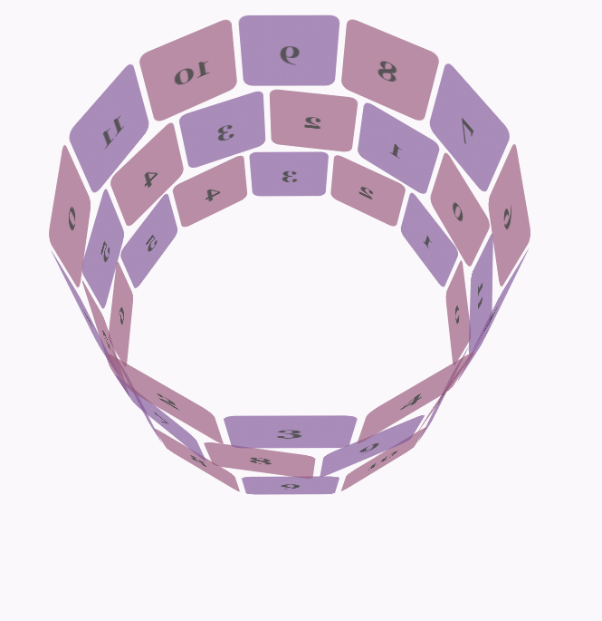
@-o-keyframes myfirst {/* Opera */0% {background: red; left:0px; top:0px;}25% {background: yellow; left:200px; top:0px;}50% {background: blue; left:200px; top:200px;}75% {background: green; left:0px; top:200px;}100% {background: red; left:0px; top:0px;}} 🎜🎜예제 3, js+Transform 및 애니메이션을 사용하여 3D 애니메이션 구현🎜🎜예제 주소: 🎜🎜웹킷 코어가 있는 브라우저에서만 관련 3D 애니메이션 효과를 볼 수 있습니다. 🎜🎜구현 효과는 그림에 나와 있습니다: 🎜🎜🎜🎜🎜css 코드: 🎜🎜body {font-family: 'Lucida Grande', Verdana, Arial;font-size: 12px;
} #stage {margin: 150px auto;width: 600px;height: 400px;-webkit-perspective: 800;
} #rotate {margin: 0 auto;width: 600px;height: 400px;-webkit-transform-style: preserve-3d;-webkit-animation-name: x-spin;-webkit-animation-duration: 7s;-webkit-animation-iteration-count: infinite;-webkit-animation-timing-function: linear;
} .ring {margin: 0 auto;height: 110px;width: 600px;-webkit-transform-style: preserve-3d;-webkit-animation-iteration-count: infinite;-webkit-animation-timing-function: linear;
}
.ring > :nth-child(odd) {background-color: #995C7F;
} .ring > :nth-child(even) {background-color: #835A99;
} .poster {position: absolute;left: 250px;width: 100px;height: 100px;opacity: 0.7;color: rgba(0,0,0,0.9);-webkit-border-radius: 10px;
}
.poster > p {font-family: 'Georgia', serif;font-size: 36px;font-weight: bold;text-align: center;margin-top: 28px;
} #ring-1 {-webkit-animation-name: y-spin;-webkit-animation-duration: 5s;
} #ring-2 {-webkit-animation-name: back-y-spin;-webkit-animation-duration: 4s;
} #ring-3 {-webkit-animation-name: y-spin;-webkit-animation-duration: 3s;
} @-webkit-keyframes x-spin {0% { -webkit-transform: rotateX(0deg); }50% { -webkit-transform: rotateX(180deg); }100% { -webkit-transform: rotateX(360deg); } }
@-webkit-keyframes y-spin {0% { -webkit-transform: rotateY(0deg); }50% { -webkit-transform: rotateY(180deg); }100% { -webkit-transform: rotateY(360deg); } }
@-webkit-keyframes back-y-spin {0% { -webkit-transform: rotateY(360deg); }50% { -webkit-transform: rotateY(180deg); }100% { -webkit-transform: rotateY(0deg); } }🎜🎜html 코드: 🎜🎜<div id="stage"> <div id="rotate"><div id="ring-1" class="ring"></div><div id="ring-2" class="ring"></div><div id="ring-3" class="ring"></div> </div></div>🎜🎜js 코드: 🎜🎜
const POSTERS_PER_ROW = 12;
const RING_RADIUS = 200;function setup_posters (row){var posterAngle = 360 / POSTERS_PER_ROW;for (var i = 0; i < POSTERS_PER_ROW; i ++) {      var poster = document.createElement('div');
      poster.className = 'poster';
      var transform = 'rotateY(' + (posterAngle * i) + 'deg) translateZ(' + RING_RADIUS + 'px)';
      poster.style.webkitTransform = transform;
      var content = poster.appendChild(document.createElement('p'));
      content.textContent = i;
      row.appendChild(poster);
    }
}function init (){
    setup_posters(document.getElementById('ring-1'));
    setup_posters(document.getElementById('ring-2'));
    setup_posters(document.getElementById('ring-3'));
}

window.addEventListener('load', init, false);🎜위 내용은 CSS3의 애니메이션 예에 대한 자세한 설명의 상세 내용입니다. 자세한 내용은 PHP 중국어 웹사이트의 기타 관련 기사를 참조하세요!