
집 >백엔드 개발 >C#.Net 튜토리얼 >Shape를 사용하여 애니메이션 예제 코드 만들기
Shape를 사용하여 애니메이션 예제 코드 만들기

- 零下一度원래의
- 2018-05-11 17:33:432942검색
WPF/Silverlight에 비해 UWP의 애니메이션 시스템은 크게 개선되었다고 할 수 있습니다. 그러나 이 기사에서는 이러한 애니메이션 API에 대해 심도 있게 논의할 의도는 없습니다. 또한 몇 가지 관련 기술도 소개합니다.
1. StrokeDashOffset을 사용하여 대기 프롬프트 애니메이션 만들기
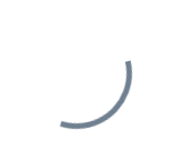
원형 대기 프롬프트 애니메이션은 만들기가 매우 쉽습니다. 그냥 회전시키세요.
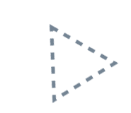
원 이외의 모양(예: 삼각형)은 만들기가 쉽지 않습니다. 단순히 회전하게 할 수는 없습니다.
이 문제를 해결하려면 StrokeDashOffset을 사용할 수 있습니다. StrokeDashOffset은 Shape의 시작점을 기준으로 점선 테두리의 첫 번째 짧은 선의 변위를 제어하는 데 사용됩니다. 애니메이션을 사용하여 이 값을 제어하면 테두리 스크롤 효과를 만들 수 있습니다.
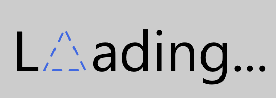
<Page.Resources><Storyboard x:Name="ProgressStoryboard"><DoubleAnimationUsingKeyFrames EnableDependentAnimation="True"
Storyboard.TargetProperty="(Shape.StrokeDashOffset)"
Storyboard.TargetName="triangle"><EasingDoubleKeyFrame KeyTime="0:1:0"
Value="-500" /></DoubleAnimationUsingKeyFrames></Storyboard></Page.Resources><Grid Background="#FFCCCCCC"><Grid Height="100"
HorizontalAlignment="Center"><StackPanel Orientation="Horizontal"
VerticalAlignment="Center"><TextBlock Text="L"
FontSize="55"
Margin="0,0,5,4" /><local:Triangle x:Name="triangle"
Height="40"
Width="40"
StrokeThickness="2"
Stroke="RoyalBlue"
StrokeDashArray="4.045 4.045"
StrokeDashOffset="0.05"
StrokeDashCap="Round" /><TextBlock Text="ading..."
FontSize="55"
Margin="5,0,0,4" /></StackPanel></Grid></Grid>
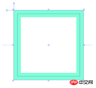
Shape의 측면 길이는 StrokeDashArray의 짧은 선과 간격의 합이 나누어질 수 있어야 합니다. 즉, side length/StrokeThickness % Sum( StrokeDashArray ) = 0이기 때문입니다. 아래 그림과 같이 StrokeDashOffset=0인 곳에서 짧은 줄이 잘립니다. 边长 / StrokeThickness % Sum( StrokeDashArray ) = 0,这是因为在StrokeDashOffset=0的地方会截断短线,如下图所示:
另外注意的是边长的计算,如Rectangle,边长并不是(Height + Width) * 2,而是(Height - StrokeThickness) * 2 + (Width- StrokeThickness) * 2,如下图所示,边长应该从边框正中间开始计算:
有一些Shape的边长计算还会受到Stretch影响,如上一篇中自定义的Triangle:
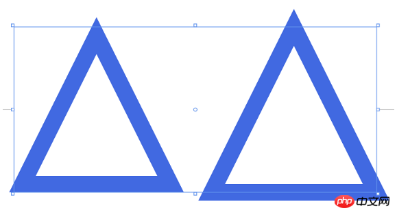
<StackPanel Orientation="Horizontal" HorizontalAlignment="Center"><Grid Height="50"
Width="50"><local:Triangle Stretch="Fill"
StrokeThickness="5"
Stroke="RoyalBlue" /></Grid><Grid Height="50"
Width="50"
Margin="10,0,0,0"><local:Triangle Stretch="None"
StrokeThickness="5"
Stroke="RoyalBlue" /></Grid></StackPanel>
2. 使用StrokeDashArray做进度提示动画
StrokeDashArray用于将Shape的边框变成虚线,StrokeDashArray的值是一个double类型的有序集合,里面的数值指定虚线中每一段以StrokeThickness为单位的长度。用StrokeDashArray做进度提示的基本做法就是将进度Progress通过Converter转换为分成两段的StrokeDashArray,第一段为实线,表示当前进度,第二段为空白。假设一个Shape的边长是100,当前进度为50,则将StrokeDashArray设置成{50,double.MaxValue}两段。
做成动画如下图所示:
<Page.Resources><Style TargetType="TextBlock"><Setter Property="FontSize"
Value="12" /></Style><local:ProgressToStrokeDashArrayConverter x:Key="ProgressToStrokeDashArrayConverter"
TargetPath="{Binding ElementName=Triangle}" /><local:ProgressToStrokeDashArrayConverter2 x:Key="ProgressToStrokeDashArrayConverter2"
TargetPath="{Binding ElementName=Triangle}" />
<toolkit:StringFormatConverter x:Key="StringFormatConverter" /><local:ProgressWrapper x:Name="ProgressWrapper" /><Storyboard x:Name="Storyboard1"><DoubleAnimation Duration="0:0:5"
To="100"
Storyboard.TargetProperty="Progress"
Storyboard.TargetName="ProgressWrapper"
EnableDependentAnimation="True" /></Storyboard></Page.Resources><Grid Background="{ThemeResource ApplicationPageBackgroundThemeBrush}"><Viewbox Height="150"><StackPanel Orientation="Horizontal"><Grid><local:Triangle Height="40"
Width="40"
StrokeThickness="2"
Stroke="DarkGray" /><local:Triangle x:Name="Triangle"
Height="40"
Width="40"
StrokeThickness="2"
Stroke="RoyalBlue"
StrokeDashArray="{Binding Progress,Source={StaticResource ProgressWrapper},Converter={StaticResource ProgressToStrokeDashArrayConverter}}" /><TextBlock Text="{Binding Progress,Source={StaticResource ProgressWrapper},Converter={StaticResource StringFormatConverter},ConverterParameter='{}{0:0}'}"
HorizontalAlignment="Center"
VerticalAlignment="Center"
Margin="0,15,0,0" /></Grid><Grid Margin="20,0,0,0"><local:Triangle Height="40"
Width="40"
StrokeThickness="2"
Stroke="DarkGray" /><local:Triangle x:Name="Triangle2"
Height="40"
Width="40"
StrokeThickness="2"
Stroke="RoyalBlue"
StrokeDashArray="{Binding Progress,Source={StaticResource ProgressWrapper},Converter={StaticResource ProgressToStrokeDashArrayConverter2}}" /><TextBlock Text="{Binding Progress,Source={StaticResource ProgressWrapper},Converter={StaticResource StringFormatConverter},ConverterParameter='{}{0:0}'}"
HorizontalAlignment="Center"
VerticalAlignment="Center"
Margin="0,15,0,0" /></Grid></StackPanel></Viewbox></Grid>其中ProgressToStrokeDashArrayConverter和ProgressToStrokeDashArrayConverter2的代码如下:
public class ProgressToStrokeDashArrayConverter : DependencyObject, IValueConverter
{/// <summary>/// 获取或设置TargetPath的值/// </summary>  public Path TargetPath
    {
    get { return (Path)GetValue(TargetPathProperty);
     }
    set {
     SetValue(TargetPathProperty, value);
    }
    }/// <summary>/// 标识 TargetPath 依赖属性。///
    </summary>public static readonly DependencyProperty TargetPathProperty =
        DependencyProperty.Register("TargetPath", typeof(Path), typeof(ProgressToStrokeDashArrayConverter), new PropertyMetadata(null));public virtual object Convert(object value, Type targetType, object parameter, string language)
    {
    if (value is double == false)return null;

        var progress = (double)value;if (TargetPath == null)return null;var totalLength = GetTotalLength();
        var firstSection = progress * totalLength / 100 / TargetPath.StrokeThickness;if (progress == 100)
            firstSection = Math.Ceiling(firstSection);var result = new DoubleCollection {
            firstSection, double.MaxValue };return result;
    }public object ConvertBack(object value, Type targetType, object parameter, string language)
    {throw new NotImplementedException();
    }protected double GetTotalLength()
    {var geometry = TargetPath.Data as PathGeometry;
    if (geometry == null)
    return 0;
    if (geometry.Figures.Any() == false)return 0;
    var figure = geometry.Figures.FirstOrDefault();
    if (figure == null)
    return 0;
    var totalLength = 0d;
    var point = figure.StartPoint;
    foreach (var item in figure.Segments)
        {
        var segment = item as LineSegment;
        if (segment == null)
        return 0;

            totalLength += Math.Sqrt(Math.Pow(point.X - segment.Point.X, 2) + Math.Pow(point.Y - segment.Point.Y, 2));
            point = segment.Point;
        }

        totalLength += Math.Sqrt(Math.Pow(point.X - figure.StartPoint.X, 2) + Math.Pow(point.Y - figure.StartPoint.Y, 2));
        return totalLength;
    }
}
public class ProgressToStrokeDashArrayConverter2 : ProgressToStrokeDashArrayConverter
{
public override object Convert(object value, Type targetType, object parameter, string language)
    {
    if (value is double == false)return null;

        var progress = (double)value;
        if (TargetPath == null)
        return null;
        var totalLength = GetTotalLength();
        totalLength = totalLength / TargetPath.StrokeThickness;
        var thirdSection = progress * totalLength / 100;
        if (progress == 100)
            thirdSection = Math.Ceiling(thirdSection);

        var secondSection = (totalLength - thirdSection) / 2;
        var result = new DoubleCollection { 0, secondSection, thirdSection, double.MaxValue };
        return result;
    }
}由于代码只是用于演示,protected double GetTotalLength()
 또 주의할 점은 Rectangle과 같은 변의 길이를 계산하는데, 변의 길이는
 (Height + Width) * 2가 아니고 (Height - StrokeThickness) * 2 + (Width- StrokeThickness) * 2, 아래 그림과 같이 측면 길이는 테두리 중앙에서 계산 시작:
 Shape에 대한 일부 변 길이 계산이 있습니다. 또한 이전의 사용자 정의된 삼각형과 같이 Stretch의 영향을 받습니다. 기사:
public class ProgressWrapper : DependencyObject
{/// <summary>/// 获取或设置Progress的值/// </summary>  public double Progress
    {get { return (double)GetValue(ProgressProperty); }set { SetValue(ProgressProperty, value); }
    }/// <summary>/// 标识 Progress 依赖属性。///
    </summary>public static readonly DependencyProperty ProgressProperty =
        DependencyProperty.Register("Progress", typeof(double), typeof(ProgressWrapper), new PropertyMetadata(0d));
}
2. 진행 프롬프트 애니메이션을 만들기 위해StrokeDashArray는 Shape의 테두리를 점선으로 바꾸는 데 사용됩니다. StrokeDashArray의 값은 double 유형의 순서 집합이며, 내부 값은 점선의 각 세그먼트 길이를 StrokeThickness 단위로 지정합니다. StrokeDashArray를 진행률 알림으로 사용하는 기본 방법은 Converter를 통해 진행률 Progress를 두 개의 세그먼트로 나누어진 StrokeDashArray로 변환하는 것입니다. 첫 번째 세그먼트는 현재 진행률을 나타내는 실선이고 두 번째 세그먼트는 비어 있습니다. Shape의 측면 길이가 100이고 현재 진행률이 50이라고 가정한 다음 StrokeDashArray를 두 세그먼트 {50, double.MaxValue}로 설정합니다. 애니메이션은 아래와 같습니다:
<UserControl.Resources>
  <Storyboard x:Name="Storyboard1"><DoubleAnimation Duration="0:0:5"
  To="100"
  Storyboard.TargetProperty="(local:PathExtention.Progress)"
  Storyboard.TargetName="Triangle" />
  </Storyboard></UserControl.Resources><Grid x:Name="LayoutRoot"
  Background="White"><local:Triangle x:Name="Triangle"
  Height="40"
  local:PathExtention.Progress="0"
  Width="40"
  StrokeThickness="2"
  Stroke="RoyalBlue" ></local:Triangle></Grid>
여기서 ProgressToStrokeDashArrayConverter는 ProgressToStrokeDashArrayConverter2가 포함된 코드는 다음과 같습니다. <UserControl.Resources> <Storyboard x:Name="Storyboard1"><DoubleAnimation Duration="0:0:5" To="100" Storyboard.TargetProperty="(local:PathExtention.Progress)" Storyboard.TargetName="TrianglePathExtention" /> </Storyboard></UserControl.Resources><Grid x:Name="LayoutRoot" Background="White"><local:Triangle x:Name="Triangle" Height="40" Width="40" StrokeThickness="2" Stroke="RoyalBlue" > <local:PathHelper><local:PathExtention x:Name="TrianglePathExtention" Progress="0" /> </local:PathHelper></local:Triangle></Grid>코드는 데모용이므로
protected double GetTotalLength()는 비교적 쉽게 작성됩니다. 이 두 Converter는 종속성 개체에서 상속되는 것을 볼 수 있습니다. 이는 바인딩을 통해 TargetPath에 값을 할당해야 하기 때문입니다.  여기에는 ProgressWrapper라는 또 다른 클래스가 있습니다.
XAML Behaviors非常重要,因为它们提供了一种方法,让开发人员能够以一种简洁、可重复的方式轻松地向UI对象添加功能。
他们无需创建控件的子类或重复编写逻辑代码,只要简单地增加一个XAML代码片段。
🎜스토리보드 작업에는 이중 속성이 없기 때문에 이 클래스는 Storyboard와 StrokeDashArray 사이의 브리지로 사용됩니다. UWPCommunityToolkit에는 유사한 사용법을 가진 BindableValueHolder 클래스도 있습니다. 이 클래스는 비교적 다재다능하므로 사용법을 참조할 수 있습니다. 🎜🎜3. Behaviour를 사용하여 진행률 프롬프트 애니메이션 코드 개선 🎜🎜 이는 단지 애니메이션일 뿐입니다. 이는 Converter, Wrapper 및 Binding에 Progress 속성이 있으면 훨씬 더 편리할 것입니다. 모양. 이때 추가 속성이 먼저 고려됩니다. Windows 런타임 XAML 구현에서는 사용자 지정 연결된 속성에 애니메이션을 적용할 수 없습니다. 이 제한으로 인해 XAML은 사용자 지정 연결된 속성에 애니메이션을 적용할 수 없습니다. 그러나 이 제한은 사용자 정의 연결된 속성 자체에 애니메이션을 적용하는 기능만 제한하고 연결된 속성에 있는 클래스의 속성에 애니메이션을 적용할 수 있습니다. 예를 들어 다음 작성 방법이 가능해야 합니다. 🎜
public class PathProgressBehavior : Behavior<UIElement>
{protected override void OnAttached()
    {base.OnAttached();UpdateStrokeDashArray();
    }/// <summary>/// 获取或设置Progress的值/// </summary>  public double Progress
    {get { return (double)GetValue(ProgressProperty); }set { SetValue(ProgressProperty, value); }
    }/*Progress DependencyProperty*/protected virtual void OnProgressChanged(double oldValue, double newValue)
    {UpdateStrokeDashArray();
    }protected virtual double GetTotalLength(Path path)
    {/*some code*/}private void UpdateStrokeDashArray()
    {
    var target = AssociatedObject as Path;if (target == null)return;double progress = Progress;
    //if (target.ActualHeight == 0 || target.ActualWidth == 0)//
    return;
    if (target.StrokeThickness == 0)
    return;
    var totalLength = GetTotalLength(target);
    var firstSection = progress * totalLength / 100 / target.StrokeThickness;
    if (progress == 100)
            firstSection = Math.Ceiling(firstSection);
            var result = new DoubleCollection {
             firstSection, double.MaxValue
             };
        target.StrokeDashArray = result;
    }
}
🎜보다 우아한 작성 방법은 다음과 같습니다. XamlBehaviors를 사용하는 경우 이 문서에서는 XamlBehaviors의 역할을 잘 설명합니다. 🎜<UserControl.Resources> <Storyboard x:Name="Storyboard1"><DoubleAnimation Duration="0:0:5" To="100" Storyboard.TargetProperty="Progress" Storyboard.TargetName="PathProgressBehavior" EnableDependentAnimation="True"/> </Storyboard></UserControl.Resources><Grid x:Name="LayoutRoot" Background="White"> <local:Triangle x:Name="Triangle" Height="40" local:PathExtention.Progress="0" Width="40" StrokeThickness="2" Stroke="RoyalBlue" ><interactivity:Interaction.Behaviors> <local:PathProgressBehavior x:Name="PathProgressBehavior" /></interactivity:Interaction.Behaviors> </local:Triangle></Grid>🎜Behavior를 사용하여 기존 코드를 개선하려면 PathProgressBehavior를 구현하기만 하면 됩니다. 🎜
<Page.Resources><Style TargetType="TextBlock"><Setter Property="FontSize"
Value="12" /></Style><local:ProgressToHeightConverter x:Key="ProgressToHeightConverter"
TargetContentControl="{Binding ElementName=ContentControl}" /><local:ReverseProgressToHeightConverter x:Key="ReverseProgressToHeightConverter"
TargetContentControl="{Binding ElementName=ContentControl2}" /><toolkit:StringFormatConverter x:Key="StringFormatConverter" /><local:ProgressWrapper x:Name="ProgressWrapper" /><Storyboard x:Name="Storyboard1"><DoubleAnimation Duration="0:0:5"
To="100"
Storyboard.TargetProperty="Progress"
Storyboard.TargetName="ProgressWrapper"
EnableDependentAnimation="True" /></Storyboard></Page.Resources><Grid Background="{ThemeResource ApplicationPageBackgroundThemeBrush}"><Grid><local:Triangle Height="40"
Width="40"
StrokeThickness="2"
Fill="LightGray" /><local:Triangle Height="40"
Width="40"
Stretch="Fill"
StrokeThickness="2"
Stroke="RoyalBlue" /><ContentControl x:Name="ContentControl"
VerticalAlignment="Bottom"
HorizontalAlignment="Center"
Height="{Binding Progress,Source={StaticResource ProgressWrapper},Converter={StaticResource ProgressToHeightConverter}}"><local:Triangle x:Name="Triangle3" Height="40"
Width="40"
StrokeThickness="2"
Fill="RoyalBlue"
Stretch="Uniform"
VerticalAlignment="Bottom" /></ContentControl><TextBlock Text="{Binding Progress,Source={StaticResource ProgressWrapper},Converter={StaticResource StringFormatConverter},ConverterParameter='{}{0:0}'}"
HorizontalAlignment="Center"
VerticalAlignment="Center"
Margin="0,12,0,0"
Foreground="White" /><ContentControl x:Name="ContentControl2"
Height="{Binding Progress,Source={StaticResource ProgressWrapper},Converter={StaticResource ReverseProgressToHeightConverter}}"
VerticalAlignment="Top"
HorizontalAlignment="Center"><ScrollViewer BorderThickness="0"
Padding="0,0,0,0"
VerticalScrollBarVisibility="Disabled"
HorizontalScrollBarVisibility="Disabled"
VerticalAlignment="Top"
Height="40"><Grid Height="40"><TextBlock Text="{Binding Progress,Source={StaticResource ProgressWrapper},Converter={StaticResource StringFormatConverter},ConverterParameter='{}{0:0}'}"
HorizontalAlignment="Center"
VerticalAlignment="Center"
Margin="0,12,0,0" /></Grid></ScrollViewer></ContentControl></Grid></Grid>🎜XAML에서 다음과 같이 사용하세요. 🎜public class ProgressToHeightConverter : DependencyObject, IValueConverter
{/// <summary>/// 获取或设置TargetContentControl的值/// </summary> public ContentControl TargetContentControl
{
get {
return (ContentControl)GetValue(TargetContentControlProperty);
}
set {
SetValue(TargetContentControlProperty, value);
}
}/// <summary>/// 标识 TargetContentControl 依赖属性。///
</summary>public static readonly DependencyProperty TargetContentControlProperty =
DependencyProperty.Register("TargetContentControl", typeof(ContentControl), typeof(ProgressToHeightConverter), new PropertyMetadata(null));
public object Convert(object value, Type targetType, object parameter, string language)
{
if (value is double == false)
return 0d;
var progress = (double)value;
if (TargetContentControl == null)
return 0d;
var element = TargetContentControl.Content as FrameworkElement;
if (element == null)
return 0d;return element.Height * progress / 100;
}public object ConvertBack(object value, Type targetType, object parameter, string language)
{throw new NotImplementedException();
}
}public class ReverseProgressToHeightConverter : DependencyObject, IValueConverter
{/// <summary>/// 获取或设置TargetContentControl的值/// </summary>
public ContentControl TargetContentControl
{
get {
return (ContentControl)GetValue(TargetContentControlProperty);
}
set {
SetValue(TargetContentControlProperty, value);
}
}/// <summary>/// 标识 TargetContentControl 依赖属性。///
</summary>public static readonly DependencyProperty TargetContentControlProperty =
DependencyProperty.Register("TargetContentControl", typeof(ContentControl), typeof(ReverseProgressToHeightConverter), new PropertyMetadata(null));
public object Convert(object value, Type targetType, object parameter, string language)
{
if (value is double == false)
return double.NaN;
var progress = (double)value;if (TargetContentControl == null)return double.NaN;
var element = TargetContentControl.Content as FrameworkElement;
if (element == null)return double.NaN;
return element.Height * (100 - progress) / 100;
}
public object ConvertBack(object value, Type targetType, object parameter, string language)
{
throw new NotImplementedException();
}
}🎜훨씬 깔끔해 보입니다. 🎜🎜4. 배경 채우기 애니메이션 모방🎜🎜 먼저 효과를 살펴보겠습니다. 🎜🎜🎜🎜其实这篇文章里并不会讨论填充动画,不过首先声明做填充动画会更方便快捷,这一段只是深入学习过程中的产物,实用价值不高。
上图三角形的填充的效果只需要叠加两个同样大小的Shape,前面那个设置Stretch="Uniform",再通过DoubleAnimation改变它的高度就可以了。文字也是相同的原理,叠加两个相同的TextBlock,将前面那个放在一个无边框的ScrollViewer里再去改变ScrollViewer的高度。
<Page.Resources><Style TargetType="TextBlock"><Setter Property="FontSize"
Value="12" /></Style><local:ProgressToHeightConverter x:Key="ProgressToHeightConverter"
TargetContentControl="{Binding ElementName=ContentControl}" /><local:ReverseProgressToHeightConverter x:Key="ReverseProgressToHeightConverter"
TargetContentControl="{Binding ElementName=ContentControl2}" /><toolkit:StringFormatConverter x:Key="StringFormatConverter" /><local:ProgressWrapper x:Name="ProgressWrapper" /><Storyboard x:Name="Storyboard1"><DoubleAnimation Duration="0:0:5"
To="100"
Storyboard.TargetProperty="Progress"
Storyboard.TargetName="ProgressWrapper"
EnableDependentAnimation="True" /></Storyboard></Page.Resources><Grid Background="{ThemeResource ApplicationPageBackgroundThemeBrush}"><Grid><local:Triangle Height="40"
Width="40"
StrokeThickness="2"
Fill="LightGray" /><local:Triangle Height="40"
Width="40"
Stretch="Fill"
StrokeThickness="2"
Stroke="RoyalBlue" /><ContentControl x:Name="ContentControl"
VerticalAlignment="Bottom"
HorizontalAlignment="Center"
Height="{Binding Progress,Source={StaticResource ProgressWrapper},Converter={StaticResource ProgressToHeightConverter}}"><local:Triangle x:Name="Triangle3" Height="40"
Width="40"
StrokeThickness="2"
Fill="RoyalBlue"
Stretch="Uniform"
VerticalAlignment="Bottom" /></ContentControl><TextBlock Text="{Binding Progress,Source={StaticResource ProgressWrapper},Converter={StaticResource StringFormatConverter},ConverterParameter='{}{0:0}'}"
HorizontalAlignment="Center"
VerticalAlignment="Center"
Margin="0,12,0,0"
Foreground="White" /><ContentControl x:Name="ContentControl2"
Height="{Binding Progress,Source={StaticResource ProgressWrapper},Converter={StaticResource ReverseProgressToHeightConverter}}"
VerticalAlignment="Top"
HorizontalAlignment="Center"><ScrollViewer BorderThickness="0"
Padding="0,0,0,0"
VerticalScrollBarVisibility="Disabled"
HorizontalScrollBarVisibility="Disabled"
VerticalAlignment="Top"
Height="40"><Grid Height="40"><TextBlock Text="{Binding Progress,Source={StaticResource ProgressWrapper},Converter={StaticResource StringFormatConverter},ConverterParameter='{}{0:0}'}"
HorizontalAlignment="Center"
VerticalAlignment="Center"
Margin="0,12,0,0" /></Grid></ScrollViewer></ContentControl></Grid></Grid>ProgressToHeightConverter和ReverseProgressToHeightConverter的代码如下:
public class ProgressToHeightConverter : DependencyObject, IValueConverter
{/// <summary>/// 获取或设置TargetContentControl的值/// </summary>  public ContentControl TargetContentControl
    {
    get {
    return (ContentControl)GetValue(TargetContentControlProperty);
    }
    set {
    SetValue(TargetContentControlProperty, value);
    }
    }/// <summary>/// 标识 TargetContentControl 依赖属性。///
     </summary>public static readonly DependencyProperty TargetContentControlProperty =
        DependencyProperty.Register("TargetContentControl", typeof(ContentControl), typeof(ProgressToHeightConverter), new PropertyMetadata(null));
        public object Convert(object value, Type targetType, object parameter, string language)
    {
    if (value is double == false)
    return 0d;

        var progress = (double)value;
        if (TargetContentControl == null)
        return 0d;
        var element = TargetContentControl.Content as FrameworkElement;
        if (element == null)
        return 0d;return element.Height * progress / 100;
    }public object ConvertBack(object value, Type targetType, object parameter, string language)
    {throw new NotImplementedException();
    }


}public class ReverseProgressToHeightConverter : DependencyObject, IValueConverter
{/// <summary>/// 获取或设置TargetContentControl的值/// </summary>
public ContentControl TargetContentControl
    {
    get {
    return (ContentControl)GetValue(TargetContentControlProperty);
     }
    set {
    SetValue(TargetContentControlProperty, value);
    }
    }/// <summary>/// 标识 TargetContentControl 依赖属性。///
    </summary>public static readonly DependencyProperty TargetContentControlProperty =
        DependencyProperty.Register("TargetContentControl", typeof(ContentControl), typeof(ReverseProgressToHeightConverter), new PropertyMetadata(null));
        public object Convert(object value, Type targetType, object parameter, string language)
    {
    if (value is double == false)
    return double.NaN;

        var progress = (double)value;if (TargetContentControl == null)return double.NaN;
        var element = TargetContentControl.Content as FrameworkElement;
        if (element == null)return double.NaN;
        return element.Height * (100 - progress) / 100;
    }
    public object ConvertBack(object value, Type targetType, object parameter, string language)
    {
    throw new NotImplementedException();
    }
}再提醒一次,实际上老老实实做填充动画好像更方便些。
5. 将动画应用到Button的ControlTemplate
同样的技术,配合ControlTemplate可以制作很有趣的按钮:
PointerEntered时,按钮的边框从进入点向反方向延伸。PointerExited时,边框从反方向向移出点消退。要做到这点需要在PointerEntered时改变边框的方向,使用了ChangeAngleToEnterPointerBehavior:
public class ChangeAngleToEnterPointerBehavior : Behavior<Ellipse>
{protected override void OnAttached()
    {base.OnAttached();
        AssociatedObject.PointerEntered += OnAssociatedObjectPointerEntered;
        AssociatedObject.PointerExited += OnAssociatedObjectPointerExited;
    }protected override void OnDetaching()
    {base.OnDetaching();
        AssociatedObject.PointerEntered -= OnAssociatedObjectPointerEntered;
        AssociatedObject.PointerExited -= OnAssociatedObjectPointerExited;
    }private void OnAssociatedObjectPointerExited(object sender, PointerRoutedEventArgs e)
    {UpdateAngle(e);
    }private void OnAssociatedObjectPointerEntered(object sender, PointerRoutedEventArgs e)
    {UpdateAngle(e);
    }private void UpdateAngle(PointerRoutedEventArgs e)
    {if (AssociatedObject == null || AssociatedObject.StrokeThickness == 0)return;

        AssociatedObject.RenderTransformOrigin = new Point(0.5, 0.5);var rotateTransform = AssociatedObject.RenderTransform as RotateTransform;if (rotateTransform == null)
        {
            rotateTransform = new RotateTransform();
            AssociatedObject.RenderTransform = rotateTransform;
        }var point = e.GetCurrentPoint(AssociatedObject.Parent as UIElement).Position;var centerPoint = new Point(AssociatedObject.ActualWidth / 2, AssociatedObject.ActualHeight / 2);var angleOfLine = Math.Atan2(point.Y - centerPoint.Y, point.X - centerPoint.X) * 180 / Math.PI;
        rotateTransform.Angle = angleOfLine + 180;
    }
}
这个类命名不是很好,不过将就一下吧。
为了做出边框延伸的效果,另外需要一个类EllipseProgressBehavior:
public class EllipseProgressBehavior : Behavior<Ellipse>
{/// <summary>/// 获取或设置Progress的值/// </summary>
public double Progress
    {
    get {
    return (double)GetValue(ProgressProperty);
    }
    set {
    SetValue(ProgressProperty, value);
    }
    }/// <summary>/// 标识 Progress 依赖属性。/// </summary>
    public static readonly DependencyProperty ProgressProperty =
        DependencyProperty.Register("Progress", typeof(double), typeof(EllipseProgressBehavior), new PropertyMetadata(0d, OnProgressChanged));
        private static void OnProgressChanged(DependencyObject obj, DependencyPropertyChangedEventArgs args)
    {
    var target = obj as EllipseProgressBehavior;
    double oldValue = (double)args.OldValue;
    double newValue = (double)args.NewValue;if (oldValue != newValue)
            target.OnProgressChanged(oldValue, newValue);
    }
    protected virtual void OnProgressChanged(double oldValue, double newValue)
    {UpdateStrokeDashArray();
    }protected virtual double GetTotalLength()
    {if (AssociatedObject == null)return 0;
    return (AssociatedObject.ActualHeight - AssociatedObject.StrokeThickness) * Math.PI;
    }private void UpdateStrokeDashArray()
    {if (AssociatedObject == null || AssociatedObject.StrokeThickness == 0)
    return;
    //if (target.ActualHeight == 0 || target.ActualWidth == 0)//
    return;var totalLength = GetTotalLength();
        totalLength = totalLength / AssociatedObject.StrokeThickness;
        var thirdSection = Progress * totalLength / 100;
        var secondSection = (totalLength - thirdSection) / 2;
        var result = new DoubleCollection { 0, secondSection, thirdSection, double.MaxValue };
        AssociatedObject.StrokeDashArray = result;
    }

}
套用到ControlTemplate如下:
<ControlTemplate TargetType="Button"><Grid x:Name="RootGrid"><VisualStateManager.VisualStateGroups><VisualStateGroup x:Name="CommonStates"><VisualStateGroup.Transitions><VisualTransition GeneratedDuration="0:0:1"
To="Normal"><Storyboard><DoubleAnimationUsingKeyFrames EnableDependentAnimation="True"
Storyboard.TargetProperty="(local:EllipseProgressBehavior.Progress)"
Storyboard.TargetName="EllipseProgressBehavior"><EasingDoubleKeyFrame KeyTime="0:0:1"
Value="0"><EasingDoubleKeyFrame.EasingFunction><QuinticEase EasingMode="EaseOut" /></EasingDoubleKeyFrame.EasingFunction></EasingDoubleKeyFrame></DoubleAnimationUsingKeyFrames></Storyboard></VisualTransition><VisualTransition GeneratedDuration="0:0:1"
To="PointerOver"><Storyboard><DoubleAnimationUsingKeyFrames EnableDependentAnimation="True"
Storyboard.TargetProperty="(local:EllipseProgressBehavior.Progress)"
Storyboard.TargetName="EllipseProgressBehavior"><EasingDoubleKeyFrame KeyTime="0:0:1"
Value="100"><EasingDoubleKeyFrame.EasingFunction><QuinticEase EasingMode="EaseOut" /></EasingDoubleKeyFrame.EasingFunction></EasingDoubleKeyFrame></DoubleAnimationUsingKeyFrames></Storyboard></VisualTransition></VisualStateGroup.Transitions><VisualState x:Name="Normal"><Storyboard><PointerUpThemeAnimation Storyboard.TargetName="RootGrid" /></Storyboard></VisualState><VisualState x:Name="PointerOver"><Storyboard><PointerUpThemeAnimation Storyboard.TargetName="RootGrid" /></Storyboard><VisualState.Setters><Setter Target="EllipseProgressBehavior.(local:EllipseProgressBehavior.Progress)"
 Value="100" /></VisualState.Setters></VisualState><VisualState x:Name="Pressed"><Storyboard><PointerDownThemeAnimation Storyboard.TargetName="RootGrid" /></Storyboard></VisualState><VisualState x:Name="Disabled" /></VisualStateGroup></VisualStateManager.VisualStateGroups><ContentPresenter x:Name="ContentPresenter"
AutomationProperties.AccessibilityView="Raw"
ContentTemplate="{TemplateBinding ContentTemplate}"
ContentTransitions="{TemplateBinding ContentTransitions}"
Content="{TemplateBinding Content}"
HorizontalContentAlignment="{TemplateBinding HorizontalContentAlignment}"
Padding="{TemplateBinding Padding}"
 VerticalContentAlignment="{TemplateBinding VerticalContentAlignment}" /><Ellipse Fill="Transparent"                 Stroke="{TemplateBinding BorderBrush}"                 StrokeThickness="2"><interactivity:Interaction.Behaviors><local:ChangeAngleToEnterPointerBehavior /><local:EllipseProgressBehavior x:Name="EllipseProgressBehavior" /></interactivity:Interaction.Behaviors></Ellipse></Grid></ControlTemplate>
注意:我没有鼓励任何人自定义按钮外观的意思,能用系统自带的动画或样式就尽量用系统自带的,没有设计师的情况下 又想UI做得与众不同通常会做得很难看。想要UI好看,合理的布局、合理的颜色、合理的图片就足够了。
6. 结语
在学习Shape的过程中觉得好玩就做了很多尝试,因为以前工作中做过不少等待、进度的动画,所以这次就试着做出本文的动画。
XAML的传统动画并没有提供太多功能,主要是ColorAnimation、DoubleAnimation、PointAnimation三种,不过靠Binding和Converter可以弥补这方面的不足,实现很多需要的功能。
本文的一些动画效果参考了SVG的动画。话说回来,Windows 10 1703新增了SvgImageSource,不过看起来只是简单地将SVG翻译成对应的Shape,然后用Shape呈现,不少高级特性都不支持(如下图阴影的滤镜),用法如下:
<Image><Image.Source><SvgImageSource UriSource="feoffset_1.svg" /></Image.Source></Image>
SvgImageSource:
原本的Svg:
위 내용은 Shape를 사용하여 애니메이션 예제 코드 만들기의 상세 내용입니다. 자세한 내용은 PHP 중국어 웹사이트의 기타 관련 기사를 참조하세요!