
HTML5+CSS3 3D변환효과 제작예시
- 巴扎黑원래의
- 2017-05-14 13:30:301847검색
저는 모두가 CSS의 2차원 세계에 익숙하다고 믿습니다. 2차원 세계에서는 요소의 너비, 높이, 위치, 회전, 배경 등을 설정할 수 있습니다. CSS 3차원 세계에서는 화면에 수직이고 바깥쪽을 가리키는 z축이 확장됩니다. 다음 기사에서는 HTML5+CSS3을 사용하여 3D 변환 효과를 얻는 데 필요한 관련 정보를 주로 소개합니다.
머리말
이 글에서는 누구나 참고할만한 가치가 있는 CSS3의 3D 모듈을 소개합니다. 우리를보세요.
소개
먼저 3D 좌표계를 화면상에서 x축이 가로, y축이 세로로 되어 있다는 것을 이해해 봅시다. , z축은 화면에 수직인 방향입니다.
이해가 안 되신다면 positioning 속성의 z-index 속성을 참고하시면 됩니다. 어떤 의미에서는 요소가 z축으로 움직일 수 있게 해주는 속성입니다.
2D 변환 모듈에서는 X축과 Y축을 중심으로 회전하는 RotateX() 및 RotateY() 메서드를 연구했습니다. 이는 실제로 3D 모듈의 구현입니다. , 근거리 및 원거리 크기를 확인해야 합니다. 3D 효과의 경우 상위 요소에 원근감 속성도 추가해야 합니다. 변환:원근법(500px) 값은 원근점에서 요소까지의 거리입니다. 개념에 대해서는 Art Perspective 튜토리얼을 참조하세요. . . .
더 이상 말할 필요도 없습니다. 코드는 다음과 같습니다.
<!DOCTYPE html>
<html lang="en">
<head>
    <meta charset="UTF-8">
    <title>Title</title>
    <style>
        p{
            width: 200px;
            height: 200px;
            margin: 0 auto;
        }
        .p1{
            margin-top: 100px;
            transform:perspective(500px) rotatey(0deg);
            position: relative;
            border:1px solid #000000;
            background-color: #ff0000;
        }
        .p1 p{
       transform:rotatey(45deg);

            position: absolute;
            font-size: 80px;
            line-height: 200px;
            text-align: center;
            top: 0;
            left: 0;
        }
    </style>
</head>
<body>
<p class="p1">
    <p class="p1_1">1</p>
</p>
</body>

</html>
렌더링:
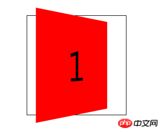
그러나 상위 요소를 90도 회전하면 해당 요소가 사라지는 것을 볼 수 있습니다. 이는 요소에 두께가 없음을 의미합니다. 이는 요소가 근거리, 대형, 원거리의 원근 속성을 갖고 있음에도 불구하고 본질적으로 여전히 2D임을 보여줍니다.
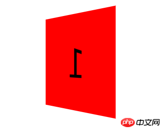
3D 공간에서 요소를 변환하려면 변환 스타일:preserve-3d 스타일을 추가해야 합니다. 이런 방식으로 요소는 3차원 공간에 있습니다. 상위 요소가 90도 회전해도 내부의 하위 요소가 계속 표시됩니다.
샘플 코드:
<!DOCTYPE html>
<html lang="en">
<head>
    <meta charset="UTF-8">
    <title>Title</title>
    <style>
        p{
            width: 200px;
            height: 200px;
            margin: 0 auto;
        }
        .p1{
            margin-top: 100px;
            transform:perspective(500px) rotatey(0deg);
            transform-style:preserve-3d;
            position: relative;
            border:1px solid #000000;
        }
        .p1 p{
            background-color: #ff0000;
            transform:rotatey(45deg);
            position: absolute;
            font-size: 80px;
            line-height: 200px;
            text-align: center;
            top: 0;
            left: 0;
        }
    </style>
</head>
<body>
<p class="p1">
    <p class="p1_1">1</p>
</p>
</body>

</html>
렌더링:
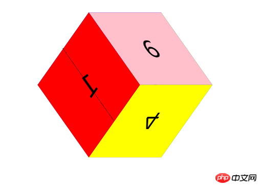
이상으로 3D 변환 모듈에 대한 사전 이해를 마쳤으며, 3D 모듈에 대한 지식을 정리하기 위해 큐브를 함께 만들어 보겠습니다.
차근차근 작성하기가 너무 번거로워서 과정은 코드댓글로 작성하겠습니다. 여러분 양해 부탁드립니다.
코드:
<!DOCTYPE html>
<html lang="en">
<head>
    <meta charset="UTF-8">
    <title>转换模块-正方体</title>
    <style>

    *{
        margin: 0;
        padding: 0;
        /*去除默认边距*/
    }

    ul{
        width: 200px;
        height: 200px;
        border: 1px solid #000;
        box-sizing: border-box;
        margin: 100px auto;
        position: relative;
        /*修改基本样式*/
        transform: rotateY(45deg) rotateX(45deg);
        /*旋转看看效果*/
        transform-style: preserve-3d;
        /*将父元素设置为3d空间*/
    }
    ul li{
        list-style: none;
        width: 200px;
        height: 200px;
        font-size: 60px;
        text-align: center;
        line-height: 200px;
        position: absolute;
        left: 0;
        top: 0;
        /*修改基本样式*/
    }
    ul li:nth-child(1){
        background-color: red;
        transform: translateX(-100px) rotateY(90deg);
        /*将第一个l向左移动100像素,然后绕y轴旋转90度,形成左边的面*/
    }
    ul li:nth-child(2){
        background-color: green;
        transform: translateX(100px) rotateY(90deg);
        /*将第一个2向右移动100像素,然后绕y轴旋转90度*,形成右边的面*/
    }
    ul li:nth-child(3){
        background-color: blue;
        transform: translateY(-100px) rotateX(90deg);
        /*将第一个3向上移动100像素,然后绕x轴旋转90度,形成上面的面*/
    }
    ul li:nth-child(4){
        background-color: yellow;
        transform: translateY(100px) rotateX(90deg);
        /*将第一个4向下移动100像素,然后绕x轴旋转90度*/
    }
    ul li:nth-child(5){
        background-color: purple;
        transform: translateZ(-100px);
        /*将第一个5向后移动100像素,形成后面的面*/
    }
    ul li:nth-child(6){
        background-color: pink;
        transform: translateZ(100px);
        /*将第一个l向前移动100像素,形成前面的面*/
    }

</style>
</head>
<body>
<ul>
    <!--首先做好html布局,正方体有6个面,所以写了6个li-->
    <li>1</li>
    <li>2</li>
    <li>3</li>
    <li>4</li>
    <li>5</li>
    <li>6</li>
</ul>
</body>
</html>
렌더링:
이 방법은 이해가 되셨다면 다음 내용을 읽어보시기 바랍니다.
코드는 아래와 같습니다:
<!DOCTYPE html>
<html lang="en">
<head>
    <meta charset="UTF-8">
    <title>Title</title>
    <style>
        p{
            width: 200px;
            height: 200px;
            margin: 0 auto;
            /*修改基本样式*/
        }
        .p1{
            margin-top: 100px;
            transform: perspective(400px) rotatex(0deg) rotatey(0deg);
            /*拥有近大远小透视效果*/
            transform-style: preserve-3d;
            /*设置为3d空间*/
            position: relative;
            border:1px solid #000000;
            animation: xuanzhuan 5s cubic-bezier(0.0,0.0,0.0,0.0) infinite forwards;
            /*旋转动画*/
        }
        .p1 p{
            position: absolute;
            font-size: 80px;
            line-height: 200px;
            text-align: center;
            top: 0;
            left: 0;
            /*内部样式*/
        }
        .p1_1{
            transform: translatez(100px);
            background-color: red;
            /*向前移动100像素,作为最前面的面*/
        }
        .p1_2{
            transform: rotatex(90deg) translatez(100px);
            background-color:green;
            /*绕x轴旋转90度,在z轴正方向移动100像素,作为上面的面*/
            /*注:旋转时坐标系会跟着一起旋转,z轴原来是垂直屏幕向外的,绕x轴旋转90度以后就是在屏幕上向上的方向*/
        }
        .p1_3{
            transform: rotatex(180deg) translatez(100px);
            background-color: blue;
            /*绕x轴旋转180度,这时z轴垂直屏幕向内,在z轴正方向移动100像素,作为后面的面*/
        }
        .p1_4{
            transform: rotatex(270deg) translatez(100px);
            background-color: purple;
            /*绕x轴旋转270度,这时z轴向下,在z轴正方向移动100像素,作为下面的面*/
        }
        .p1_5{
            transform: rotatey(90deg) translatez(100px);
            background-color: pink;
            /*绕y轴旋转90度,这时z轴向右,在z轴正方向移动100像素,作为右面的面*/
        }
        .p1_6{
            transform: rotatey(270deg) translatez(100px);
            background-color: yellow;
            /*绕y轴旋转90度,这时z轴向左,在z轴正方向移动100像素,作为左面的面*/
        }
        @-webkit-keyframes xuanzhuan{
            from{
                transform:perspective(400px) rotatex(0deg);
            }
            to{
                transform:perspective(400px) rotatex(360deg);
            }
        }
        .p1:hover{
            transform: perspective(400px) scale(1.5);
            animation: xuanzhuan 5s cubic-bezier(0.0,0.0,0.0,0.0) infinite paused forwards;
            /*有hover事件是动画暂停*/
        }

    </style>
</head>
<body>
<p class="p1">
    <p class="p1_1">1</p>
    <p class="p1_2">2</p>
    <p class="p1_3">3</p>
    <p class="p1_4">4</p>
    <p class="p1_5">5</p>
    <p class="p1_6">6</p>
</p>
<!--html标签布局-->
</body>
</html>
렌더링:
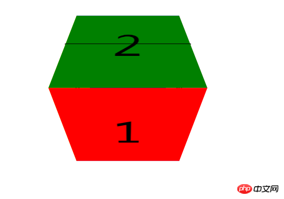
이 쓰기 방법을 이해하면 쓰기가 더 편리할 것이며, 잘못된 변환 각도로 인해 내용이 반전될 것이라고 생각할 필요가 없으므로 이 쓰기 방법을 권장합니다. 물론 이런 방식으로 쓰면 x축과 y축이 함께 회전할 때 내용이 반전되는 현상도 발생합니다.
위 내용은 HTML5+CSS3 3D변환효과 제작예시의 상세 내용입니다. 자세한 내용은 PHP 중국어 웹사이트의 기타 관련 기사를 참조하세요!