


0. 소개
웹 개발 세계에서 CSS는 사용자 인터페이스를 아름답고 기능적으로 만드는 핵심 요소입니다.
그러나 웹 애플리케이션의 복잡성이 증가함에 따라 CSS 관리가 점점 더 어려운 작업이 되었습니다. 스타일 충돌, 성능 저하, 유지 관리의 어려움은 많은 개발자의 관심사입니다.
이러한 문제가 프로젝트 진행을 방해하고 있나요? (이미지 출처)

이 기사에서는 이러한 문제를 해결하기 위한 새로운 접근 방식, 특히 JS의 CSS에 대해 자세히 설명합니다.
CSS의 역사적 배경을 시작으로 현대적인 스타일링 방법부터 미래의 디자인 시스템까지 광범위한 주제를 다루고 있습니다.
글의 구성은 다음과 같습니다.
-
JS에서 CSS의 정의와 배경
- 1. JS에서 CSS란 무엇인가요?
- 2. JS에서 CSS의 배경
-
CSS와 디자인의 역사적 맥락
- 3. CSS의 배경
- 4. 디자인의 배경
- 5. 디자인시스템의 배경
-
스타일 관리 방법 분석 및 새로운 제안
- 6. 스타일 관리는 어떻게 이루어졌나요?
- 7. 스타일은 어떻게 관리해야 하나요?
-
JS에서 CSS의 구체적인 구현 계획
- 8. 왜 JS에서 CSS를 사용하나요?
- 9. 프로젝트 민초를 소개합니다
- 10. JS의 CSS 친화적 CSS
- 11. JS에서 확장 가능한 CSS
-
디자인 시스템과의 통합
- 12. 디자인 시스템을 위한 JS의 CSS
특히, 본 글에서는 SCALE CSS 방법론과 StyleStack이라는 새로운 개념을 소개하고, 이를 기반으로 한 민초 프로젝트를 제안합니다. CSS 친화적이고 확장 가능한 CSS를 JS로 구현하는 것을 목표로 합니다.
이 글의 궁극적인 목적은 개발자, 디자이너 및 기타 웹 프로젝트 이해관계자에게 더 나은 스타일링 솔루션의 가능성을 제시하는 것입니다.
이제 본문에서 JS의 CSS 세계를 더 깊이 파헤쳐 보겠습니다. 긴 여정이 되겠지만, 새로운 감동과 도전의 기회를 선사하시길 바랍니다.
1. JS에서 CSS란 무엇인가요?
JS의 CSS는 JavaScript(또는 TypeScript) 코드 내에서 CSS 스타일을 직접 작성할 수 있는 기술입니다.
별도의 CSS 파일을 만드는 대신 JavaScript 파일의 구성 요소와 함께 스타일을 정의할 수 있습니다.
/** @jsxImportSource @emotion/react */
import { css } from "@emotion/react";

const buttonStyles = (primary) => css({
  backgroundColor: primary ? "blue" : "white",
  color: primary ? "white" : "black",
  fontSize: "1em",
  padding: "0.25em 1em",
  border: "2px solid blue",
  borderRadius: "3px",
  cursor: "pointer",
});

function Button({ primary, children }) {
  return (
    <button css="{buttonStyles(primary)}">
      {children}
    </button>
  );
}

function App() {
  return (
    <div>
      <button>Normal Button</button>
      <button primary>Primary Button</button>
    </div>
  );
}
JavaScript에 통합할 수 있으니 확실히 편리해 보이죠?
2. JS에서 CSS의 배경
CSS in JS는 페이스북 개발자 Vjeux의 'React: CSS in JS – NationJS' 프레젠테이션에서 소개되었습니다.
CSS-in-JS가 해결하고자 했던 문제는 다음과 같습니다.

더 구체적으로 어떤 문제가 있나요?
JS의 CSS는 이를 어떻게 해결하나요?
다음 표에 정리했습니다.
| Problem | Solution | |
|---|---|---|
| Global namespace | Need unique class names that are not duplicated as all styles are declared globally | Use Local values as default - Creating unique class names - Dynamic styling |
| Implicit Dependencies | The difficulty of managing dependencies between CSS and JS - Side effect: CSS is applied globally, so it still works if another file is already using that CSS - Difficulty in call automation: It's not easy to statically analyze and automate CSS file calls, so developers have to manage them directly |
Using the module system of JS |
| Dead Code Elimination | Difficulty in removing unnecessary CSS during the process of adding, changing, or deleting features | Utilize the optimization features of the bundler |
| Minification | Dependencies should be identified and reduced | As dependencies are identified, it becomes easier to reduce them. |
| Sharing Constants | Unable to share JS code and state values | Use JS values as they are, or utilize CSS Variables |
| Non-deterministic Resolution | Style priority varies depending on the CSS loading order | - Specificity is automatically calculated and applied - Compose and use the final value |
| Breaking Isolation | Difficulty in managing external modifications to CSS (encapsulation) | - Encapsulation based on components - Styling based on state - Prevent styles that break encapsulation, such as .selector > * |
But it's not a silverbullet, and it has its drawbacks.
- CSS-in-JS adds runtime overhead.
- CSS-in-JS increases your bundle size.
- CSS-in-JS clutters the React DevTools.
- Frequently inserting CSS rules forces the browser to do a lot of extra work.
- With CSS-in-JS, there's a lot more that can go wrong, especially when using SSR and/or component libraries.
Aside from the DevTools issue, it appears to be mostly a performance issue.
Of course, there are CSS in JS, which overcomes these issues by extracting the CSS and making it zero runtime, but there are some tradeoffs.
Here are two examples.
- Co‑location: To support co-location while removing as much runtime as possible, the module graph and AST should be analyzed and build times will increase. Alternatively, there is a method of abandoning co-location and isolating on a file-by-file basis, similar to Vanilla Extract.
- Dynamic styling restrictions: The combination of build issues and the use of CSS Variables forces us to support only some representations, like Styling based on props in Pigment CSS, or learn to do things differently, like Coming from Emotion or styled-components. Dynamicity is also one of the main metrics that can be used to distinguish between CSS in JS.
Therefore, pursuing zero(or near-zero) runtime in CSS-in-JS implementation methods creates a significant difference in terms of expressiveness and API.
3. The background of CSS
3.1 The Beginning of CSS
Where did CSS come from?
Early web pages were composed only of HTML, with very limited styling options.
<p><font color="red">This text is red.</font></p>
<p>This is <strong>emphasized</strong> text.</p>
<p>This is <em>italicized</em> text.</p>
<p>This is <u>underlined</u> text.</p>
<p>This is <strike>strikethrough</strike> text.</p>
<p>This is <big>big</big> text, and this is <small>small</small> text.</p>
<p>H<sub>2</sub>O is the chemical formula for water.</p>
<p>2<sup>3</sup> is 8.</p>
For example, the font tag could change color and size, but it couldn't adjust letter spacing, line height, margins, and so on.
You might think, "Why not just extend HTML tags?" However, it's difficult to create tags for all styling options, and when changing designs, you'd have to modify the HTML structure itself.
This deviates from HTML's original purpose as a document markup language and also means that it's hard to style dynamically.
If you want to change an underline to a strikethrough at runtime, you'd have to create a strike element, clone the inner elements, and then replace them.
const strikeElement = document.createElement("strike");
strikeElement.innerHTML = uElement.innerHTML;
uElement.parentNode.replaceChild(strikeElement, uElement);
When separated by style, you only need to change the attributes.
element.style.textDecoration = "line-through";
If you convert to inline style, it would be as follows:
<p style="color: red;">This text is red.</p>
<p>This is <span style="font-weight: bold;">bold</span> text.</p>
<p>This is <span style="font-style: italic;">italic</span> text.</p>
<p>This is <span style="text-decoration: underline;">underlined</span> text.</p>
<p>This is <span style="text-decoration: line-through;">strikethrough</span> text.</p>
<p>This is <span style="font-size: larger;">large</span> text, and this is <span style="font-size: smaller;">small</span> text.</p>
<p>H<span style="vertical-align: sub; font-size: smaller;">2</span>O is the chemical formula for water.</p>
<p>2<span style="vertical-align: super; font-size: smaller;">3</span> is 8.</p>
However, inline style must be written repeatedly every time.
That's why CSS, which styles using selectors and declarations, was introduced.
<p>This is the <strong>important part</strong> of this sentence.</p>
<p>Hello! I want to <strong>emphasize this in red</strong></p>
<p>In a new sentence, there is still an <strong>important part</strong>.</p>

<style>
strong { color: red; text-decoration: underline; }
</style>
Since CSS is a method that applies multiple styles collectively, rules are needed to determine which style should take precedence when the target and style of CSS Rulesets overlap.
CSS was created with a feature called Cascade to address this issue. Cascade is a method of layering styles, starting with the simple ones and moving on to the more specific ones later. The idea was that it would be good to create a system where basic styles are first applied to the whole, and then increasingly specific styles are applied, in order to reduce repetitive work.
Therefore, CSS was designed to apply priorities differently according to the inherent specificity of CSS Rules, rather than the order in which they were written.
/* The following four codes produce the same result even if their order is changed. */
#id { color: red; }
.class { color: green; }
h1 { color: blue; }
[href] { color: yellow; }

/* Even if the order is changed, the result is the same as the above code. */
h1 { color: blue; }
#id { color: red; }
[href] { color: yellow; }
.class { color: green; }
However, as CSS became more scalable, a problem arose..
3.2 Scalable CSS
Despite the advancements in CSS, issues related to scalability in CSS are still being discussed.
In addition to the issues raised by CSS in JS, several other obstacles exist in CSS.
- Code duplication: When writing media queries, pseudo-classes, and pseudo-elements, a lot of duplication occurs if logic is required.
- Specificity wars: As a workaround for name collisions and non-deterministic ordering, specificity keeps raising the specificity to override the style. You can have fun reading Specificity Battle!
- Lack of type-safety: CSS does not work type-safely with TypeScript or Flow.
These issues can be addressed as follows:
- Code duplication: Use nesting in CSS preprocessors, etc.
- Specificity wars: Atomic CSS is defined for each property separately, so it has the same specificity except for the loading order and !important.
- Lack of type-safety: Just use CSS in JS with type-safe support.
Expressing layout is another hurdle in CSS, made more complex by the interactions between various properties.

CSS might seem simple on the surface, it's not easy to master. It is well known that many people struggle even with simple center alignment(1, 2). The apparent simplicity of CSS can be deceptive, as its depth and nuances make it more challenging than it initially appears.
For example, display in CSS has different layout models: block, inline, table, flex, and grid.
Imagine the complexity when the following properties are used in combination: box model,Responsive design, Floats, Positioning, transform, writing-mode, mask, etc.
As project scale increases, it becomes even more challenging due to side effects related to DOM positioning, cascading, and specificity.
Layout issues should be addressed through well-designed CSS frameworks, and as previously mentioned, using CSS in JS to isolate styles can mitigate side effects.
However, this approach does not completely solve all problems. Style isolation may lead to new side effects, such as increased file sizes due to duplicate style declarations in each component, or difficulties in maintaining consistency of common styles across the application.
This directly conflicts with the design combinatorial explosion and consistency issues that will be introduced next.
For now, we can delegate layout concerns to frameworks like Bootstrap or Bulma, and focus more on management aspects.
4. The background of Design
At its core, CSS is a powerful tool for expressing and implementing design in web development.
There are many factors to consider when creating a UI/UX, and the following elements are crucial to represent in your design:

-
Visual Design
- Layout: Determines the structure of the screen and the placement of elements. Consider spacing, alignment, and hierarchy between elements.
- Color: Select a color palette that considers brand identity and user experience. Understanding of color theory is necessary.
- Typography: Choose fonts and text styles that match readability and brand image.
- Icons and Graphic Elements: Design intuitive and consistent icons and graphics.
-
Interaction Design
- Design the behavior of UI elements such as buttons, sliders, and scrollbars.
- Provide a natural user experience through animations and transition effects.
- Consider responsive design that adapts to various screen sizes.
-
Information Architecture
- Design the structure and hierarchy of content to allow users to easily find and understand information.
- Design navigation systems to enable users to easily move to desired locations.
-
Accessibility and Usability
- Pursue inclusive design that considers diverse users. i18n can also be included.
- Create intuitive and easy-to-use interfaces to reduce users' cognitive load.
-
Consistency and Style Guide
- Create a style guide to maintain consistent design language throughout the application.
- Develop reusable components and patterns to increase efficiency.
Accurately expressing various design elements across diverse conditions presents a significant challenge.
Consider that you need to take into account devices (phones, tablets, laptops, monitors, TVs), input devices (keyboard, mouse, touch, voice), landscape/portrait modes, dark/light themes, high contrast mode, internationalization (language, LTR/RTL), and more.
Moreover, different UIs may need to be displayed based on user settings.
Therefore, Combinatorial Explosion is inevitable, and it's impossible to implement them one by one manually. (image source)

As a representative example, see the definition and compilation of the tab bar layout in my Firefox theme.
Despite only considering the OS and user options, a file of about 360 lines produces a compilation result reaching approximately 1400 lines.
The conclusion is that effective design implementation needs to be inherently scalable, typically managed either programmatically or through well-defined rulesets.
The result is a design system for consistent management at scale.
5. The background of Design System
Design systems serve as a single source of truth, covering all aspects of design and development from visual styles to UI patterns and code implementation.

According to Nielsen Norman Group, a design system includes the following:
- Style Guides: Documentation that provides style guidance on specific style needs, including brand, content, and visual design.
- Component library: These specify reusable individual UI elements, for example buttons. For each UI element, specific design and implementation details are provided, including information like attributes that can be customized(size, copy, etc), different states(enabled, hover, focus, disabled), and the reusable clean, tight code for each element.
- Pattern library: These specify reusable patterns, or groups of individual UI elements taken from the component library. For example, you might see a pattern for a page header, which could be made up of a title, a breadcrumb, a search, and a primary and secondary button.
- Design resources: For designers to actually use and design with the components and libraries, a design file is required (usually in Figma). Resources such as logos, typefaces and fonts, and icons are usually also included for designers and developers to use.
Design systems should function as a crossroads for designers and developers, supporting functionality, form, accessibility, and customization.
But designers and developers think differently and have different perspectives.
Let's use components as a lens to recognize the differences between designers' and developers' perspectives!!
5.1 Component Structure
The designer should also decide which icon will be used for the checkbox control.

Designers tend to focus on form, while developers tend to focus on function.
For designers, a button is a button if it looks inviting to press, while for developers, it's a button as long as it can be pressed.
If the component is more complex, the gap between designers and developers could widen even further.

5.2 Designer considerations
Visual options: The appearance changes according to the set options such as Primary, Accent, Outlined, Text-only, etc.

State options: The appearance changes depending on the state and context
Design Decision: Determining values with Component Structure, Visual/State Options, Visual Attributes(Color, Typography, Icon, etc) and more.


5.3 Developer considerations
- Option: Configurable initial values. Visual options are also included. Ex) Outlined, Size
- State: Changes based on user interaction. Ex) Hover, Pressed, Focused, Selected(Checked)
- Event: Actions that trigger a change in state. Ex) HoverEvent, PressEvent, FocusEvent, ClickEvent
- Context: Conditions injected from code that affect behavior. Ex) Readonly, Disabled
The final form is a combination of Option, State, and Context, which results in the combinatorial explosion mentioned above.
Of these, Option aligns with the designer's perspective, while State and Context do not.
Perform state compression considering Parallel states, Hierarchies, Guards, etc to return to the designer perspective.

- Enabled: Disabled OFF, Pressed OFF, Hovered OFF, Focused OFF
- Hovered: Disabled OFF, Pressed OFF, Hovered ON
- Focused: Disabled OFF, Pressed OFF, Focused ON
- Pressed: Disabled OFF, Pressed ON
- Disabled: Disabled ON
6. How were styles being managed?
As you may have realized by now, creating and maintaining a high-quality UI is hard work.
So the various states are covered by the state management library, but how were styles being managed?
While methodologies, libraries, and frameworks continue to emerge because the solution has not yet been established, there are three main paradigms.

- Semantic CSS: Assign class based on the purpose or meaning of the element.
- Atomic CSS: Create one class for each style(visual) attribute.
- CSS in JS: Write in JavaScript and isolate CSS for each component unit.
Among these, CSS in JS feels like a paradigm that uses a fundamentally different approach to expressing and managing styles.
This is because CSS in JS is like mechanisms, while and Semantic CSS and Atomic CSS are like policies.
Due to this difference, CSS in JS needs to be explained separately from the other two approaches. (image source)

When discussing the CSS in JS mechanism, CSS pre/post processors may come to mind.
Similarly, when talking about policies, 'CSS methodologies' may come to mind.
Therefore, I will introduce style management methods in the following order: CSS in JS, processors, Semantic CSS and Atomic CSS, and other Style methodologies.
6.1 CSS in JS
Then, what is the true identity of CSS in JS?
The answer lies in the definition above.
Write in JavaScript and isolate CSS for each component unit.
- CSS written in JavaScript
- CSS isolation at the component level
Among these, CSS isolation can be sufficiently applied to existing CSS to solve Global namespace and Breaking Isolation issues.
This is CSS Modules.

Based on the link to the CSS in JS analysis article mentioned above, I have categorized the features as follows.
Each feature has trade-offs, and these are important factors when creating CSS in JS.
6.1.1 Integration
Particularly noteworthy content would be SSR(Server Side Rendering) and RSC(React Server Component).
These are the directions that React and NEXT, which represent the frontend, are aiming for, and they are important because they have a significant impact on implementation.
- IDE: Syntax highlighting and code completion
- TypeScript: Whether it's typesafe
-
Framework
- Agnostic: Framework independent, libraries like StyledComponent are designed specifically for React.
- SSR: Extract styles as strings when rendering on the server and support hydration
- RSC: RSC runs only on the server, so it cannot use client-side APIs.
Server-side rendering creates HTML on the server and sends it to the client, so it needs to be extracted as a string, and a response to streaming is necessary. As in the example of Styled Component, additional settings may be required. (image source)

-
Server-side style extraction
- Should be able to extract styles as strings when rendering on the server
- Insert extracted styles inline into HTML or create separate stylesheets
-
Unique class name generation
- Need a mechanism to generate unique class names to prevent class name conflicts between server and client
-
Hydration support
- The client should be able to recognize and reuse styles generated on the server
-
Asynchronous rendering support
- Should be able to apply accurate styles even in asynchronous rendering situations due to data fetching, etc.
Server components have more limitations. [1, 2]
Server and client components are separated, and dynamic styling based on props, state, and context is not possible in server components.
It should be able to extract .css files as mentioned below.

-
Static CSS generation
- Should be able to generate static CSS at build time
- Should be able to apply styles without executing JavaScript at runtime
-
Server component compatibility
- Should be able to define styles within server components
- Should not depend on client-side APIs
-
Style synchronization between client and server
- Styles generated on the server must be accurately transmitted to the client
6.1.2 Style Writing
As these are widely known issues, I will not make any further mention of them.
- Co-location: Styles within the same file as the component?
- Theming: Design token feature supports
- Definition: Plain CSS string vs Style Objects
-
Nesting
- Contextual: Utilize parent selectors using &
- Abitrary: Whether arbitrary deep nesting is possible
6.1.3 Style Output and Apply
The notable point in the CSS output is Atomic CSS.
Styles are split and output according to each CSS property.

-
Style Ouput
- .css file: Extraction as CSS files
-
Injection into the of the
- Inline style: Injected inline for each HTML element
-
Styles apply method
- className: Specify className as a string
- styled component: Create and use Styled Components
- css prop: Generate className from the css prop in jsx
- Atomic CSS: Create separate classes for each CSS property
6.2 CSS Processors
There might be a way to solve this by extending CSS rather than using a JavaScript-centric approach. (image source)

CSS preprocessors use their own syntax to extend CSS for writing code, which is then compiled into regular CSS.
Examples of CSS preprocessors include Sass, Less, and Stylus.
CSS postprocessors use standard CSS syntax as-is and transform it through a plugin system.
PostCSS is an example of a CSS postprocessor, and Lightning CSS also has postprocessing capabilities.
Here, the nesting and mixin features are particularly worth discussing.
I will explain based on SCSS.
The nesting feature allows you to write CSS code in a structure similar to HTML.
.nav {
  background-color: #f0f0f0;
  ul {
    list-style: none;
    li {
      display: inline-block;
      a {
        color: #333;
        &:hover {
          color: #007bff;
        }
      }
    }
  }
}
You can use the & symbol to reference the parent selector. This is useful when creating pseudo-classes or modifier classes.
.button {
  background-color: #007bff;

  &:hover { background-color: #0056b3; }
  &--large { font-size: 18px; }
  &--small { font-size: 14px; }
}
Related properties and media queries can also be nested, improving the structure of the code.
.element {
  font: {
    family: Arial;
    size: 16px;
  }

  @media (min-width: 768px) {
    font-size: 18px;
  }
}
Mixins are reusable style blocks that allow you to create styles in advance or vary them with parameters.
@mixin center-text {
  text-align: center;
  vertical-align: middle;
}

@mixin border-radius($radius: 3px) {
  border-radius: $radius;
}

.header {
  @include center-text;
  @include border-radius(5px);
}

.button {
  @include border-radius(); // Use default value
}
You can also apply styles using control logic or apply additional styles using the @content directive.
@mixin media-query($breakpoint) {
  @if $breakpoint == tablet {
    @media (min-width: 768px) and (max-width: 1023px) {
      @content;
    }
  } @else if $breakpoint == desktop {
    @media (min-width: 1024px) {
      @content;
    }
  } @else {
    @warn "Unknown breakpoint: #{$breakpoint}";
  }
}

.responsive-element {
  font-size: 16px;

  @include media-query(tablet) {
    font-size: 18px;
  }

  @include media-query(desktop) {
    font-size: 20px;
  }
}
6.3 Semantic CSS and Atomic CSS
The biggest difference between Semantic CSS and Atomic CSS is likely whether they prioritize visual appearance or meaning.
When prioritizing visual appearance, you might use something like .text-red { color: red; }, while prioritizing meaning would lead to something like .error { color: red; }.
Due to these characteristics, the methods for achieving goals also differ.
For example, what if you needed to create various designs with the same content, like in CSS Zen Garden?
The visual approach would keep the CSS fixed but achieve the goal by modifying the HTML.
The semantic approach would keep the HTML fixed but achieve the goal by modifying the CSS.

Maximizing the visual approach minimizes CSS file size and reduces coupling by reusing small, single-purpose classes.
This is precisely Atomic CSS.

Atomic CSS is a functional CSS approach that composes styles by combining small, single-purpose classes.
.m-0 { margin: 0; }
.p-1 { padding: 1rem; }
.text-center { text-align: center; }
<div class="m-0 p-1 text-center">
  Hello, World!
</div>
Maximizing the semantic approach improves code readability and increases CSS cohesion. It also facilitates better separation of content(HTML) and formatting(CSS).
The class serves as an identifier for grouped elements and is also a W3C recommendation because it emphasizes the separation between HTML and CSS.
BEM is one of the most popular semantic CSS methodologies. (image source)

BEM(Block Element Modifier) structures class names of HTML elements by naming them as Block, Element, and Modifier.
- Block: Independent component
- Element: Part of a Block
- Modifier: Variation of Block or Element
/* Structure */
.block {}
.block__element {}
.block--modifier {}

/* Example */
.button {}
.button__icon {}
.button--large {}
<button class="button button--large">
  <span class="button__icon">?</span>
  Open File
</button>
BEM makes it possible to understand the HTML structure through class names alone.
6.4 CSS Methodologies
CSS methodologies are not limited to just Atomic CSS and BEM.
There are many diverse CSS methodologies, and I will compare them to find common elements among these methodologies.

Here are some famous CSS methodologies:
- OOCSS(Object Oriented CSS): A methodology that separates CSS into reusable 'objects', managing structure and skin independently.
- SMACSS(Scalable and Modular Architecture for CSS): A methodology that categorizes CSS into five categories: Base, Layout, Module, State, and Theme.
- ITCSS(Inverted Triangle CSS): An architecture that organizes CSS hierarchically based on specificity, explicitness, and reach.
- SUITCSS: A component-based CSS methodology with structured class names and clear relationships.
- CUBE CSS: A methodology that provides flexible and scalable styling by utilizing the inherent characteristics of CSS using the concepts of Composition, Utility, Block, and Exception.
6.4.1 OOCSS (Object Oriented CSS)
OOCSS is a methodology for writing CSS in an object-oriented way. Its main principles are:
-
Visual focus: Separation of structure and skin
- Structure: Defines layout-related properties such as size, position, and margins of elements.
- Skin: Defines visual styles such as colors, fonts, and shadows.
-
Information focus: Separation of container and content
- Container: The parent element that wraps other elements, mainly responsible for layout.
- Content: The element containing the actual content, which should maintain consistent styling regardless of its location.
Example:
/* Structure */
.button {
  display: inline-block;
  padding: 5px 10px;
  border-radius: 5px;
}

/* Skin */
.button-primary {
  background-color: blue;
  color: white;
}

/* Container */
.sidebar {
  width: 300px;
  float: left;
}

/* Contents */
.widget {
  margin-bottom: 20px;
  padding: 15px;
  background-color: #f0f0f0;
}
OOCSS can increase reusability and reduce CSS file size.
6.4.2 SMACSS (Scalable and Modular Architecture for CSS)
SMACSS is a methodology that divides CSS into five categories:
- Base: This category defines basic styles, including default styles for element selectors and CSS resets.
- Layout: This category defines the main structure and grid system of the page, responsible for layouts such as headers, footers, and sidebars.
- Module: This category defines reusable independent components, including UI elements such as buttons, cards, and navigation.
- State: This category represents specific states of modules or layouts, defining state changes such as active, inactive, and hidden.
- Theme: This category defines the overall look and feel, including styles related to themes such as color schemes and typography.
Example:
/* Base */
body, p, h1, h2, h3 { margin: 0; padding: 0; }

/* Layout */
.l-header { ... }
.l-sidebar { ... }

/* Module */
.btn { ... }
.btn-primary { ... }

/* State */
.is-hidden { display: none; }

/* Theme */
.theme-dark .btn { background-color: #333; }
SMACSS allows for systematic management of CSS structure.
6.4.3 ITCSS (Inverted Triangle CSS)
ITCSS is a methodology that organizes CSS hierarchically according to specificity, explicitness, and reach. (image source)

The main layers are as follows:
- Settings: This layer includes basic project settings such as global variables, color definitions, and font settings.
- Tools: This layer defines globally used tools such as mixins and functions, with no actual CSS output.
- Generic: This layer defines the most basic and high-level styles, such as resets and normalization.
- Elements: This layer defines the basic styles of HTML elements, using only element selectors without classes.
- Objects: This layer defines structural and skeletal styles in the OOCSS approach, including reusable design patterns.
- Components: This layer defines styles for specific and complete UI components.
- Utilities: This layer includes utility classes that forcefully apply specific styles, being the most specific and highest priority.
This methodology minimizes specificity conflicts in CSS and improves maintainability.
6.4.4 SUITCSS
SUITCSS is a component-based CSS methodology with structured class names and clear relationships:
- Component: The base component class like ComponentName
- Modifier: Changes the style of the component like .ComponentName--modifierName
- Descendent: Part of the component like .ComponentName-descendentName
- Utility: Single-purpose styling like .u-utilityName
/* Component */
.Button { ... }
.Button-icon { ... }

/* Modifier */
.Button--large { ... }

/* Utility */
.u-textCenter { text-align: center; }
<button class="Button Button--large">
  <span class="Button-icon"></span>
  Submit
</button>
<div class="u-textCenter">
  Centered text
</div>
6.4.5 CUBE CSS
CUBE CSS stands for Composition, Utility, Block, Exception and encompasses the following key concepts:
- Composition: Defines layout patterns
- Utility: Defines small units of styles
- Block: Defines reusable components
- Exception: Handles exceptions in specific situations
It maximize the use of CSS Cascade and others.
Example:
/* Composition */
.cluster {
  display: flex;
  flex-wrap: wrap;
  gap: 1rem;
}

/* Utility */
.center {
  text-align: center;
}

/* Block */
.card {
  background: white;
  padding: 1rem;
  border-radius: 0.25rem;
}

/* Exception */
.card[data-state="active"] {
  border: 2px solid blue;
}
<div class="cluster">
  <div class="card center">
    <h2 id="Card-Title">Card Title</h2>
    <p>Card content</p>
  </div>
  <div class="card center" data-state="active">
    <h2 id="Active-Card">Active Card</h2>
    <p>This card is active</p>
  </div>
</div>
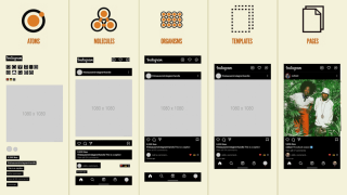
6.5 Atomic Design
And there is a similarly named methodology called Atomic Design, which is related to the Atomic CSS concept mentioned earlier.
It's closer to a designer-centric methodology rather than a developer-centric one.

- Ions: Design tokens that define basic design values such as colors, typography, and spacing.
- Atoms: Basic UI elements that cannot be broken down further, such as buttons, input fields, and labels.
- Molecules: Simple and reusable components created by combining multiple atoms.
- Organisms: Relatively complex UI sections made by combining molecules and atoms.
- Templates: Structures that form the layout of a page by arranging various organisms, molecules, and atoms.
- Pages: Completed UIs filled with actual content, which are the final screens that users see.
If you want to see the differences between these at a glance, I recommend checking out the following tweet or article.
Another characteristic is the distinction between systems and products.

- System: A collection of reusable and general components
- Product: A set of elements specific to a particular product or project
7. How should styles be managed?
This chapter aims to present a new paradigm for style management suitable for modern web development environments, based on previously discussed concepts. (image source)

The content is divided into three main areas:
- Structuring CSS methodologies and presenting mental models
- Proposing best practices and mental models for CSS expression
- An integrated approach to style management considering both areas
First, we introduce the SCALE CSS methodology, which is intuitive and scalable, developed through the sublation of existing CSS methodologies such as ITCSS, BEM, and OOCSS. This process integrates core concepts from each methodology and explores effective ways to handle various cases.
As discussed in Chapter 6, CSS methodologies are policies, while CSS in JS and CSS pre/post processors are mechanisms. If policies are closer to the form that contains the content, mechanisms are tools for substantiating expression.
To focus more on methods for CSS management rather than tools, and to find points of contact with policies, we consider the formal aspects of expression rather than its substance.
We share good practices in this regard:
- Design Tokens: Encoding design decisions to limit selectable values and invert dependencies.
- Atomic CSS: Mapping style properties and design tokens under single responsibility, reducing coupling through interface segregation.
- Variants: Defining component styles under the open-closed principle as 'variants' to enable Liskov substitution and increase cohesion.
Combining these concepts, we propose StyleStack as a style management strategy. This strategy combines the consistency of design tokens, the efficiency of Atomic CSS, and the flexibility of variants to implement complex UIs faster and more consistently.
Finally, we bring together the SCALE CSS methodology and StyleStack in formal terms, helping the methodology move towards the substantiation of form and deriving a concrete directory structure.
Upon completing these steps, we will be prepared to discuss the implementation of CSS in JS, a tool for substantiating expression.
7.1 Rethinking Methodologies
When looking at the methodologies, there seems to be a sense of similarity. (image source)

Let's organize them based on ITCSS, the most detailed methodology, with the addition of States.
In Tools, I've included Atomic CSS, considering each as a 'function'.
- Settings: SMACSS's Theme, Atomic Design's Design token
- Tools: Atomic CSS, CUBE CSS's Utility
- Generic: SMACSS's Base
- Elements: Atomic Design's Atoms
- Objects: OOCSS's Container, SMACSS's Layout, CUBE CSS's Composition, Atomic Design's Templates
- Components: BEM's Block/Element, OOCSS's Content, SMACSS's Module, SUITCSS's Component, CUBE CSS's Block, Atomic Design's Molecules/Organisms
- States: OOCSS's Structure/Skin, BEM's Modfier, SMACSS's State, SUITCSS's Modfier
- Utilities: SUITCSS's Utility, CUBE CSS's Exception
This classification seems to cover almost all cases.
However, it's noticeable that in Component's Element (BEM's Element, Atomic Design's Molecules) and State, OOCSS's Structure/Skin distinction combines two concepts, and Atomic Design's Templates, which define page-level layouts, are together with Objects.
We've encountered the concept of Component's Element before, and it's certainly a familiar concept.
Depending on the complexity of the component, we can define it in the same file as the Block, or create a folder and define each Element and Block separately.

Now, let's consider Structure/Skin.
It's ambiguous to add states that affect layout and decorative states as separate classifications.
Instead, it would be better to separate them when creating each Variant, like size: "small" | "medium" | "large" and shape: "primary" | "filled" | "outlined".

Atomic Design's Templates are about separating page-level layouts, not component-level layouts.
It's the same concept as Next.js transitioning from page router to app router, where it's divided into pages and templates.
Depending on the project, they could be managed in the same directory as pages, or collected in something like src/layouts/page-template.

Now that we've sorted out the exceptions, let's further organize the structure and names of ITCSS.
Let's group items that do similar things and change them to more intuitive names.
- Settings define static values, and Tools define dynamic functions, both meant to be imported and used, not directly affecting the app. Recently, Configs and Utils seem to be used more often.
- Generic's reset, normalization, and Elements' default styles are Bases styles that apply globally.
- Layouts is more intuitive than Objects, and Exception is better than Utilities.
- States are included in each Layout or Component.
Let's apply this to ITCSS:
       /\
      /  \
     /    \  Exceptions (Styles for special cases)
    /      \
   /        \  Components (Reusable components)
  /          \
 /            \ Layouts (Layout-related styles)
/              \
----------------
|    Bases     | (Globally applied styles)
----------------
|    Utils     | (Globally used utilities)
----------------
|   Configs    | (Basic settings)
----------------
- Configs: Include project basic settings such as global variables, design tokens(color definitions, font settings), etc.
- Utils: Define globally used tools such as mixins/functions, atomic css etc.
- Bases: Styles to be applied globally, such as reset/normalization, and basic styles for HTML elements
- Layouts: Layout-related styles, can have elements and states(structure/skin), page templates
- Components: Reusable components, can have elements and states(structure/skin)
- Exceptions: Styles used exceptionally. e.g. Using values not present in design tokens, Increasing CSS specificity, Use !important
In this article, we will refer to it as the SCALE(Scalable, Composable, Adaptive Layered Expression) CSS methodology.
7.2 Design Tokens
The above discussion considered the aspect of management but did not take into account the design system.
A representative element of design systems is design tokens.
Design tokens store repetitive design decisions as a single source of truth.
Simply put, it's like saving a color palette from a vast color space and using it consistently across the project.

However, design tokens are not just simple 'settings'. They need to be set at both the app and component levels, and they function similarly to reactivity. [paste - design tokens, Tokens, variables, and styles]


Design tokens, like styles, are defined from simple to specific.
-
Primitive tokens: Define the most basic design values such as colors, fonts, sizes, spacing, etc.
- These have the lowest level of abstraction and contain specific values.
- Example: color-blue-500: #0000FF, font-size-16: 16px
-
Semantic tokens: Semantic tokens are tokens that give meaning based on primitive tokens.
- They use abstracted names that represent the purpose or intention of the design.
- They are defined by referencing primitive tokens.
- Example: color-primary: $color-blue-500, font-size-body: $font-size-16
-
Component tokens: Component tokens define design values thar are applied to specific UI components.
- These are tokens that are directly applied to actual UI components.
- They are mainly defined by referencing semantic tokens. (Sometimes primitive tokens can also be directly referenced)
- Example: button-primary-color: $color-primary
Naming is important for semantic tokens.

7.3 Atomic CSS
Atomic CSS, as we have seen earlier, is one of the major paradigms and is both a useful tool and a controversial topic.
However, when we examine Atomic CSS, it can mean various things:
- Atomic CSS as usage: Can various types of visual styles be written easily in className?
- Atomic CSS as scope: Should it be applied globally or only to parts?
- Atomic CSS as a framework: Does it have a well-defined design system?
- Atomic CSS as output: Is it converted to single-property classes after build?
Here, we will analyze each case and derive its advantages and disadvantages, focusing primarily on Tailwind CSS, a representative Atomic CSS Framework, while also examining why we need on-demand global atomic CSS.

7.3.1 Atomic CSS as Usage
It can be used like inline CSS.
You don't need to name it, and it's located even closer than co-location, making it very convenient when the scale is small or when creating prototypes.
- This greatly reduces the time spent writing separate CSS files and class names.
- Styles can be applied intuitively.
<!-- PrimaryButton.vue -->
<template>
  <button class="bg-blue-500 hover:bg-blue-700 text-white font-bold py-2 px-4 rounded">
    <slot></slot>
  </button>
</template>
However, it's different from inline styles:
- Limitations: No limitations such as media queries, selectors, pseudo-elements, animations, etc.
- File size: File size is reduced as it's defined only once for use.
- Naming: Each name is short and concise, making it good for typing.
- Value type: It's a string value.
Except for number 4, all are good characteristics.
Number 4 is a definite drawback as it's difficult to utilize type systems and highlighting.
What if we express it in CSS in JS like this:
css([
  {
    bg: {
      base: "blue-500",
      _hover: "blue-700",
    },
    text: "white",
    font: "bold",
    py: 2,
    px: 3,
  },
  "rounded",
]);
Number 3 can also be controversial, but the bigger issue is how to define the ubiquitous language in the design system.
If necessary, you can use the CSS property names as they are.
Finally, the usesage of Atomic CSS itself can be controversial(1, 2).
While it certainly has the drawback of lack of meaning, web development has changed.
With most solutions now having the front-end directly modify HTML and CSS. The era when dynamic pages became necessary in the early days of web development, leading to the emergence of backend technologies like PHP/JSP/Django to generate HTML, and when semantic CSS was absolutely necessary for styling interfaces with the frontend has now passed.
7.3.2 Atomic CSS as Scope
Atomic CSS should be used globally. (image source)

Why has TailWind CSS succeeded, unlike traditional Atomic CSS?
The most significant feature of Tailwind CSS is its utility-first approach.
Previously, it was either used partially like Bootstrap's Helpers or had to be built from scratch.
Partial use is literally closer to utilities or helpers, making it difficult to fully utilize the advantages of Atomic CSS, such as minimal file size increase.
Conversely, building a comprehensive system from scratch is prone to exceptions and difficult to maintain consistently, unlike semantic methodologies that can directly utilize product domain meanings or component structures.
However, Tailwind provides a design system that allows global use of Atomic CSS.
It maps CSS properties to design tokens and designates all available styles as a single source of truth.
To utilize Atomic CSS well, we should prevent one-time style additions and apply it globally!!
7.3.3 Atomic CSS as a Framework
To apply it globally, it's essential to have a framework that allows using predefined classes.
This article doesn't aim to create a CSS framework itself, so we'll skip that.

However, mapping CSS properties to design tokens is an important part as a meta-design system.
We need to provide a way to map according to the theme specifications of Theme UI or Styled System.
7.3.4 Atomic CSS as Output
As seen in 6.1.3 Style Output and Apply, even if the input is not Atomic CSS, Atomic CSS can be generated in the output.
Here, we argue that we should have global atomic CSS as a single source of truth, so we'll skip this as well.

However, generating all styles to create a single source of truth for mapping CSS properties to design tokens is inefficient.
It will become unbearable due to the Combinatorial Explosion.
Styles should be generated only for the rules used on-demand, according to a set of rules that map CSS properties to design tokens based on theme specifications.
Yes, we need on-demand global atomic CSS.
7.4 Variants
Atomic CSS is convenient as it can be written without the need to name classes.
However, what about when we need to handle complex states?
Variants(Modifier) are visual representation that compresses the Option, State, and Context discussed in the design system.
It's also known for its API introduced by Stitches.

The Stitches Variants API is innovative.
It allows for declarative description of each state style of the modifier.
const Button = styled("button", {
  // base styles

  variants: {
    color: {
      violet: {
        backgroundColor: "blueviolet",
        color: "white",
        "&:hover": {
          backgroundColor: "darkviolet"
        }
      },
      gray: {
        backgroundColor: "gainsboro",
        "&:hover": {
          backgroundColor: "lightgray"
        }
      }
    }
  }
});

() => <button color="violet">Button</button>;
What's even more impressive is that you can declaratively express everything from the default value of a Variant to when interactions occur between Variants.
const Button = styled("button", {
  ...styles,

  variants: {
    color: {
      violet: { ...violetStyles },
      gray: { ...grayStyles }
    },
    outlined: {
      true: { ...outlineVariants }
    }
  },

  defaultVariants: {
    color: "violet"
  },

  compoundVariants: [
    {
      color: "violet",
      outlined: true,
      css: {
        color: "blueVariantsviolet",
        borderColor: "darkviolet",
        "&:hover": {
          color: "white"
        }
      }
    },
    {
      color: "gray",
      outlined: true,
      css: {
        color: "gray",
        borderColor: "lightgray",
        "&:hover": {
          color: "black"
        }
      }
    }
  ]
});

() => (
  <button color="violet" outlined>
    Button
  </button>
);
Now BEM can be expressed through the Variants API.
- Block: File
- Element: Each component
- Modifier: Variants included in the component
You can immediately adhere to all constraints without relying on rule-based tools such as BEM Tools.
In traditional Atomic CSS, a tool called CVA(Class Variance Authority) makes this possible.
Since we will be using CSS in JS approach, our method will be slightly different.
7.5 Layers for Style
For the expression of style(CSS) to actually appear, there must be elements(HTML) as content, and dynamic application(JavaScript) should also be considered.
To prevent repetitive styles, pre/post-processors or JavaScript are also needed. (image source)

This is similar to the relationship between JSX and State.
For the expression of JSX to actually render, there must be state as dynamic content.
CSS is essential for visual styling, as JSX and state management alone cannot fully express design aesthetics.
To achieve consistent and maintainable styling, CSS should be strategically integrated with JSX and state management, creating a unified approach to building user interfaces.
From a JavaScript perspective, the layers would be as follows:
Referencing Adobe Spectrum Architecture and The future of Chakra UI.
- JSX: Binds HTML/Widget and JS
- State hook: Logic independent of view platform
- Behavior hook: Handles events, accessibility, internationalization, etc. for platform APIs (DOM, React Native, etc.)
- Headless Component: Provides binding of JSX and hooks for use
- Component: Component blocks including design
From a style perspective, it appears as follows:

- Literal: CSS pre/post-processors or CSS-in-JS, considering repetitive use of CSS, etc.
- Theme: Design token values and customization for Color, Typography, Spaces, etc.
- Atomic: Atomic styles that map to visual values
- Variants: Styles for reusable blocks
- Styled Component: Binding with JSX components
This will be referred to as StyleStack.
7.6 Combination with Methodologies and Folder Structure
Let's combine the StyleStack Layer with SCALE CSS methodology for management.
The methodologies focus more on Form than Substance, while the style layers focus more on Expression than Content, so there will inevitably be some discrepancies despite seeming similar. (image source)

If you need more explanation about the relationship between Expression-Content and Form-Substance, I recommend reading Rock-Paper-Scissors: A Linguistic Approach to Games.
Basically, it follows the perspective of Hjelmslev's semiotics.
- Literal: Closer to elements constituting Substance, so it's not here.
- Theme: Corresponds to Configs.
- Atomic: Belongs to Utils, right?
- Variants: Modifiers, so they'll belong to Layouts and Components.
- Styled Components: Also close to binding to Elements, so they'll belong to Layouts and Components.
Bases and Exceptions don't have separate matches.
Bases are Content made from Literal, and Exceptions are closer to Content that occurs at the component level.
For StyleStack layers and SCALE CSS methodology to complement each other, they should each have Content and Substance, right?
For style layers to have Content, people need to write the content, so there's nothing to do right away.
On the other hand, how about making the methodology into Substance?
It's possible to some extent by creating a Form for the folder structure.
- Configs: It's better to separate global variables and design tokens.
- Utils: It's better to separate Atomic CSS (core-style) and simple utilities.
- Bases: Usually, reset/normalization is imported from libraries, so it's okay to define it together in global css.
- Layouts: Use as is. However, for page templates, as mentioned earlier, using app/ or layouts/page-template is also good.
- Components: Use as is.
- Exceptions: In cases where !important is used, gathering and managing them together is one approach.
src/
├── styles/
│   ├── constants/: Configs - Global variables
│   ├── theme/: Configs - Design Tokens definitions
│   ├── core-styles/: Utils - Atomic CSS definitions
│   ├── utils/: Utils - Mixins and style-related functions
│   └── expetions/: Exeptions - Collection of exceptions
├── app/
│   ├── layout.tsx: Layouts - Page templates
│   ├── page.tsx
│   ├── global.css: Bases - Normalization and global styles
│   └── [pages]/
├── assets/
├── components/
├── layouts/
└── .../
Now, let's focus more on Expression(StyleStack layer) and think about it.
8. Why CSS in JS?
Now that we've finished defining the StyleStack layer, we need to implement a natural connection from Literal to Styled Component. (image source)

First, should we use pre/post-processors or Javascript to extend Literal CSS?
One of the original advantages of CSS in JS, isolation, has been offset by CSS Modules and @layer.
Conversely, since the features of post-processors can be used in CSS in JS, we don't consider them.
8.1 Preprocessors
- Learning curve: Since it's an extension of CSS, it's easy to adapt and existing CSS code can be used as is.
- Highlighting and auto-completion: You can use the highlighting and auto-completion provided by the editor as is.
- Mixins and CSS-specific syntax: Control flow and @content allow you to easily add styles just by declaring styles where needed without object manipulation or returns. Less's property merging and Stylus's Property lookup are also interesting features.
- CSS-specific utilities: It includes features like SASS's color module and calc() optimization.
- Ecosystem: There's infrastructure like Stylelint and Critical CSS.
8.2 CSS in JS
- Code sharing: You can immediately use all of Javascript's functions, variables, and rich libraries.
- Javascript: You only need to learn Javascript. Also, Javascript provides more robust capabilities for complex object manipulation and flow control compared to preprocessor.
- References: Dependencies are explicit, and features like go-to-definition and refactoring can be used immediately. Vue partially supports this, but it's not possible when nested. It's also a great help in removing zombie code.
- Dynamic styles: Features like values changing according to props or compound variants are easy to write and integrate in CSS in JS.
- Co-location: You can write styles in the same file as the component.
8.3 So, Why CSS in JS
Many of the advantages available in preprocessors can be relatively easily achieved by investing in the tooling infrastructure of CSS in JS.
- Highlighting and auto-completion: It's possible with tools like vscode-styled-components, and there are precedents for copy and paste as well.
- CSS-specific utilities: Can be complemented with a nice library called polished.
- Ecosystem: linaria has proven that source maps, linting, etc. can be used.
With a little effort, you can even mimic usage similar to @mixin.
function mediaQuery(breakpoint) {
  const breakpoints = {
    tablet: "@media (min-width: 768px) and (max-width: 1023px)",
    desktop: "@media (min-width: 1024px)",
  };

  if (breakpoint in breakpoints) {
    return (styles) => ({
      [breakpoints[breakpoint]]: styles,
    });
  } else {
    // or use throw
    console.warn("Unknown breakpoint: " + breakpoint);
    return () => ({});
  }
}

// Usage example
const responsiveElement = css({
  fontSize: 16px,
  ...mediaQuery("tablet")({
    fontSize: "18px",
  }),
  ...mediaQuery("desktop")({
    fontSize: "20px",
  }),
});
Of course, go-to-definition is not exclusive to CSS in JS. It's possible through CSS Module extensions.
However, there are many constraints in sharing Javascript variables and using libraries, dynamic styles, and co-location (possible in SFC).
Crucially, there's also the point that JavaScript runtime is ultimately necessary for creating Styled Components, which is the final step of StyleStack.
I think there's still a lot of room for improvement in CSS in JS infrastructure, and it has relatively fewer constraints.
For these reasons, despite quite liking preprocessors like Sass, I believe investing in CSS in JS is the right path.
9. Introduce project mincho
I would like to introduce you to the project that will proceed based on the content discussed so far.
- mincho-js/mincho

9.1 Motivation
The original motivation for starting my project was to unify the Atomic CSS and SemanticCSS methodologies. From a semiotic approach, I believed that this could be sufficiently represented as Expression and Content using the Sign function.

The project name was decided early on.
In Korea, mint chocolate is abbreviated as 'Mincho(민초)', and along with vanilla, it's one of my favorite ice cream flavors.
Mint chocolate is unique in its combination of contrasting flavors, harmonizing the cool and refreshing taste of mint with the sweet and smooth taste of chocolate.
This is where the idea came from:

- The combination of Atomic CSS (Good) Variant (Good) = Better resembles mint chocolate.
- I planned to base it on a library called Vanilla Extract.
- It's a flavor I like. The most personal is the most creative, isn't it? ?
9.2 Why use Vanilla Extract?
Vanilla Extract was chosen as the foundation for this project for several reasons.

- Type-Safe: It was created with a focus on type safety.
- Zero-runtime: As mentioned in '6.1.1 Integration', this is very important considering the future of RSC.
- API: The basic design, such as the Composition API, is very clean.
- Features: Existing features like Style, StyleVariants, Theme, and Recipe are sufficiently powerful and worth referencing.
- Constraints: Prevents encapsulation-breaking operations like .selector > * at build time.
- Potential: Although co-location is not currently available, referring to Macaron suggests it should be possible.
9.3 Brief Plan
We cannot provide all features from the beginning, we plan to achieve them step by step.
- Natural CSS in TypeScript: We will bind various CSS preprocessing features to be specialized for TypeScript.
- A CSS in JS for Scalable: Supports and integrates StyleStack(Theme, Atomic CSS, Variants, and Styled Component) layers, making it possible to manage large-scale styles.
- Build your own design system: It functions as a framework for creating design systems through Figma plugins and Document system, among others.
As of writing this, the 'Natural CSS in TypeScript' phase is nearing completion, and I hope to achieve A CSS in JS for Scalable within this year.
As it is currently a Work In Progress (WIP), the API is unstable.
A major API overhaul is planned around the completion of the A CSS in JS for Scalable phase, which will comprehensively consider a small API surface, improved type safety, SSR (and Server Component) support, and Vanilla Extract compatibility.
For example, while we strive to ensure maximum compatibility with Vanilla Extract's usage, differences may arise as the project progresses, and there are inevitable differences in how things operate.
Therefore, we intentionally named the functions differently from Vanilla Extract(generally making them more concise), and we plan to create a separate compat package for compatible APIs.
Below is a describe of our ideas regarding the direction of StyleStack's API design and subsequent plans.
10. CSS-friendly CSS in JS
What does it mean to be specialized in CSS processing?
Besides the tooling infrastructure mentioned earlier, we can also consider syntax optimized for CSS.
Let's imagine CSS in JS from scratch according to various conditions.
10.1 Template String vs Object Style
- Template Strings vs. Objects in CSSinJS
In the world of CSS In JS, there are two ways to express CSS:
Template string and Object style.
Template strings seem better for simple use.
This is because you can use CSS properties and syntax as they are.

However, the object style is the same expression method as CSSOM and is a better method when a lot of interpolation is needed.

When using TypeScript, there is also the advantage of supporting types.
The reason for using CSS In JS is basically to handle many rules and to interact with JS.
Therefore, when using CSS In JS, it's recommended to primarily use the Object style.
If there are few design rules and interaction with JS is unnecessary, it's better to use a CSS preprocessor.
10.2 Overcoming Syntax
The fundamental limitation of CSS In JS is that CSS syntax is not literal.
Because of this, color codes basically don't work with pickers in editors, and CSS units (px, rem, vw, etc.) and values (visible, space-between, etc.) cannot be used without treating them as strings.
const sample = css({
  // Color
  color: "red",
  background: "#EEEEEE",

  // Unit
  fontSize: "16px",
  fontSize: "1rem",

  // Value
  visibility: "visible",
  justifyContent: "space-between"
});
Fortunately, there is an extension for color picker.
For properties that receive common values like px, you could define them like JSS's default-unit or Vanilla Extract's unitless property.
const sample = css({
  // cast to pixels
  padding: 10,
  marginTop: 25,

  // unitless properties
  flexGrow: 1,
  opacity: 0.5
});
10.3 SCSS and Nested Syntax
The area where SCSS took the lead is nested syntax.
As you've seen earlier, it supports attribute nesting, parent selector nesting using &, and even nesting of @at-rules like @media.
.sample {
  width: 200px;
  font: {
    /* Property Nested */
    size: 10px;
    weight: bold;
  }

  /* Selector Nested */
  a & {
    background: grey;
  }
  &:hover {
    background: blue;
  }

  /* At rule Nested  */
  @media (prefers-color-scheme: dark) {
    color: red;
  }
}
This is made possible by using several rules:
- Nesting occurs when it's an object rather than a regular value, and since kebab-case is converted to camelCase, nested properties also follow the rules
- If an attribute contains & like in Emotion, it is treated as a selector
- Simple selectors like "&:hover" can be used as :hover, reducing unnecessary &, similar to vanilla extract's Simple pseudo selectors, for Pseudo-classes and Pseudo-elements
const sample = css({
  width: 200,
  font: {
    Size: 10,
    Weight: "bold"
  },

  "a &": {
    background: "grey"
  },
  ":hover": {
    background: "blue"
  },

  "@media (prefers-color-scheme: dark)": {
    color: red;
  }
});
Let's think about how to make it a little more convenient.
Like Panda CSS's Conditional Styles, we can use _ instead of : and use camelCase to make it immediately usable in properties. (Only _ and $ are special characters that can be used immediately in JavaScript properties)
If there's an issue with the Panda CSS approach, it's the ad-hoc nature of inserting arbitrary classes, such as _dark meaning &.dark, .dark &.
This might be acceptable for framework presets, but it's not suitable for applying as a literal syntax.
const sample = css({
  background: "#EEEEEE",
  _hover: {
    background: "blue"
  },
  __before: {
    background: "grey"
  },

  // Or
  background: {
    base: "#EEEEEE",
    _hover: "blue",
    __before: "grey"
  }
});
When nesting at-rules, we could group them together if they're the same rule, or we could utilize Conditional Styles.
const sample = css({
  background: "#EEEEEE",
  "@media": {
    "(min-width: 768px) and (max-width: 1023px)": {
      background: "blue"
    },
    "(min-width: 1024px)": {
      background: "grey"
    }
  },

  // Or
  background: {
    base: "#EEEEEE",
    "@media (min-width: 768px) and (max-width: 1023px)": "blue",
    "@media (min-width: 1024px)": "grey"
  }
});
Of course, excessive use of nesting can cause problems, so it would be good to set a maximum nesting count as an ESLint rule or similar.
10.4 Less and Merge properties
One of the main characteristics of Less is that it's lazy.
However, since JavaScript is strict by default, I think this approach is not suitable for applying to CSS in JS.
However, the Merge properties feature appears to be quite useful.
This is because long properties like box-shadow or transform were difficult to write in a single line.
.sample {
  /* Merge with Comma */
  box-shadow+: inset 0 0 10px #555;
  box-shadow+: 0 0 20px black;

  /* Merge with Space */
  transform+_: scale(2);
  transform+_: rotate(15deg);
}
.sample {
  box-shadow: inset 0 0 10px #555, 0 0 20px black;
  transform: scale(2) rotate(15deg);
}
As mentioned earlier, only _ and $ can be used as special characters in JavaScript.
Since space is similar to _, it would be good to add $ to commas.
- Since you can't have the same key multiple times, values are represented as arrays
- If it ends with $, join with ,, if it ends with _, join with a space
const sample = css({
  boxShadow$: ["inset 0 0 10px #555", "0 0 20px black"],
  transform_: ["scale(2)", "rotate(15deg)"]
});
10.5 Stylus and References
Stylus provides several features for referencing.
Both Partial Reference and Relative Reference seem to have a high potential for causing mistakes.
Moreover, given the nature of CSS in JS, which is designed around components and doesn't require much nesting, the likelihood of needing these is low.
However, property value referencing could be beneficial.
It seems useful as it can eliminate unnecessary variables, and if there's no reference target, it can be displayed as an error at build time.
const sample = css({
  width: 100,
  marginLeft: "@width",
  marginTop: "calc(-(@width / 2))"
});
9.6 PostCSS and CSS Extensions
PostCSS uses standard CSS syntax, so it can be used together with CSS in JS.
Among them, postcss-preset-env extends various syntaxes by default.
For example, there are convenient media query ranges.
const sample = css({
  "@media (480px


<pre class="brush:php;toolbar:false">@media (min-width: 480px) and (max-width: 767.98px) {
  .sample {
      font-family: system-ui, -apple-system, Segoe UI, Roboto, Ubuntu, Cantarell, Noto Sans, sans-serif;
  }
}
11. Scalable CSS in JS
In CSS-friendly CSS in JS, we explored methods to appropriately express CSS in Javascript.
Now, we need to manage CSS interactions with other CSS and Javascript.
Since runtime caused problems with scalability, we will try to deal with Zero runtime or Near Zero Runtime cases whenever possible.
11.1 Composition
In practice, using multiple CSS classes together is more common than applying just one.
In this case, we can use Composition.
If you want to focus only on class names, clsx is also a good option.
const base = css({ padding: 12 });
const primary = css([base, { background: "blue" }]);
const secondary = css([base, { background: "aqua" }]);
.styles_base__1hiof570 {
  padding: 12px;
}
.styles_primary__1hiof571 {
  background: blue;
}
.styles_secondary__1hiof572 {
  background: aqua;
}
Vanilla Extract's method excellently reduces CSS output.
However, there are specificity issues. It would be more intuitive if the last style was always applied, as it is in Emotion.
const danger = css({
  color: "red"
});
const base = css({
  color: "yellow"
});
const sample = style([base, danger]); // `base` is applied
We can partially solve this by declaring and merging objects, or by directly specifying the color(since .sample is declared after .base). However, we need to consider the potential increase in output size with these approaches.
const danger = {
  color: "red"
};
const base = {
  color: "yellow"
};
const sample = style([base, danger]);

// or
const base = css({
  color: "yellow"
});
const sample = style([base, {color: "red"}]);
Since Atomic CSS also has the Shorthand-Longhand problem, we should always keep specificity issues in mind when dealing with composition.
11.2 UI = f( State )
As React and Flutter assert, UI can be thought of as a function.

Then, is there any reason why Style shouldn't be a function?
This is the same approach as Fela's principles, and following this philosophy, Flutter implements even Padding as a widget.
const sample = css((props) => ({
  color: "red",
  background: props.bgColor
}));

function Sample() {
  return <div classname="{sample({" bgcolor:>content</div>;
}
.sample {
   color: red;
   background: var(--sample-bgColor)
}
.SampleComponent.sample {
  --sample-bgColor: blue;
}
It's not good to have different usages or return values from a single function.
Therefore, interfaces should be separated.
// Return string(class name)
const static = css({
  color: "red",
});

//  Return function
const dynamic = rules(({ color }) => ({
  color,
  background: ({ bg } = { bg: "blue" }) => bg
}));
11.3 Making it Declarative
The previous example would work well in CSS in JS with runtime, but not in zero-runtime CSS in JS.
As seen in the cases of StyleX and PigmentCSS, dynamic styles are quite limited.
const dynamic = rules(({ color }) => ({
  color,
  background: ({ bg } = { bg: "blue" }) => bg
}));
Also, traversing the AST to evaluate dynamic styles is a rather arduous task.
Is it possible to create a declarative approach similar to the Variants example previously mentioned as an effective declarative API?
The above cases could be represented as follows:
const dynamic = rules({
  props: ["color", { bg: { base: "blue", target: "background" }}]
});
You might want arbitrary Props only when using specific variants.
// Same behavior
const sample1 = rules((props) => {
  if("color" in props) {
    if(props.color == "white") {
      return ({
        color: "#EEEEEE",
        background: props.background
      });
    }
  }
});

const sample2 = rules({
  variants: {
    color: {
        white: [{ color: "#EEEEEE" }, "background"]
      }
    }
  }
});

sample2({ color: "white", background: "red" });
It would be convenient if we could create Styled Components with Props specified based on Rules, wouldn't it?
const Container = styled.div([
  sample2,
  {
    display: "flex",
    variants: { vertical: { true: { flexdirection: "column" } } },
  },
]);
function Sample() {
  return (
    <container color="white" background="black" vertical>
      text
    </container>/>
  );
}
By creating it this way, you can make styled components as conveniently as with Styled System.
11.4 Atomic CSS
We've briefly explored simple and dynamic concepts, and addressed Variants, which transformed BEM, a prominent semantic CSS methodology, into a declarative approach.
Recall the primary objective of Atomic CSS in comparison to semantic CSS.
Styles should be generated only for the rules used on-demand, according to a set of rules that map CSS properties to design tokens based on theme specifications.
How can we ensure that styles are generated only for the rules being used?
Looking at various issues(#91, #992, #1132, #1237) with Vanilla Extract, it doesn't seem easy.
A potential approach involves creating rules and utilizing them with the previously defined css(), rules(), and styled() functions, while caching each property-value pair.
By creating it this way, you can achieve Tailwind's usage and Windi CSS's Attributify Mode in a near on-demand manner without the complex regular expressions of UnoCSS.
const { css, rules, styled } = defineRules({ /* Something */ });

const sample1 = css(["inline", { px: 2, c: "indigo-800" }]);
const sample2 = rules({
  px: 4,
  variants: {
    color: {
        white: [{ c: "white-100" }, "bg"]
      }
    }
  }
});
const Sample3 = styled.div([saple2]);
While '11.1 Composition' may cause specificity issues, it can mitigate the problem by behaving similarly to tailwind-merge at build time.
While not yet fully established, we can propose a Draft API as follows:
When strict mode is true, only shortcuts and toggles can be used instead of properties.
const { css, rules, styled } = defineRules({
  // Whether to allow properties attributes - allow only toggles or shortcuts
  strict: true,

  // Restrictions on features available in CSS
  properties: {
    // Allow only values in arrays
    display: ["none", "inline"],
    paddingLeft: [0, 2, 4, 8, 16, 32, 64],
    paddingRight: [0, 2, 4, 8, 16, 32, 64],

    // Allow only values in objects
    color: { "indigo-800": "rgb(55, 48, 163)" },

    //Entire properties
    background: true,
    border: false
  },
  shortcuts: {
    pl: "paddingLeft",
    pr: "paddingRight",
    px: ["pl", "pr"],
    c: "color",
    bg: "background"
  },
  toggles: {
    inline: { display: "none" }
  }
});
However, mapping every element individually may prove cumbersome.
The availability of predefined sets, similar to the ThemeUI spec, would greatly enhance convenience.
You might want to map not only the property values but also shortcuts and toggles like tailwind.
const { css, rules, styled } = defineRules({
  // Restrictions on features available in CSS
  properties: themeUISpec({
    colors: { "indigo-800": "rgb(55, 48, 163)" }, // color, background, accentColor, ...
    space: [0, 2, 4, 8, 16, 32, 64] // margin, padding, inset, top, ..
  }),
   ...twindShorcutSpec() // Predefined shortcuts and toggles like the tailwind API
});
The provision of such diverse presets would significantly simplify the creation and utilization of Atomic CSS.
And, like PandaCSS's Conditional Styles, it will be necessary to provide various conditions.
const { css, rules, styled } = defineRules({
  defaultCondition: ["light", "vertical"],
  conditions: {
    light: "",
    dark: ["&.dark", ".dark &"],
    osLight: {},
    osDark: { "@media": "(prefers-color-scheme: dark)" },
    horizontal: "&[data-orientation=horizontal]",
    vertical: "&[data-orientation=vertical]"
  },
  compoundConditions: [
    {
      when: ["light", "osLight"],
      condition: "&.pureLight"
    },
    {
      when: ["dark", "osDark"],
      condition: "&.pureDark"
    }
  ]
});
11.5 Theme
Let's discuss the Theme concept mentioned in Atomic CSS in more detail.
Themes are mappings of design tokens, and as we saw in Atomic CSS, they typically have two structures.
Of course, we could also follow the W3C Design Token Format.
const theme = {
  spaces: [0, 2, 4, 8, 16, 32, 64],
  colors: {
    "black-100": "#000",
    "white-100": "#fff",
    "blue-500": "#07c"
  }
};
We need to consider the scalability across primitive tokens, semantic tokens, and component tokens.
For primitive tokens, we can create subgroups for categories like color:
const [, tokens] = theme({
  spaces: [0, 2, 4, 8, 16, 32, 64],
  colors: {
    black: {
      100: "#000"
      // ...
    },
    white: {
      100: "#fff"
      // ...
    },
    blue: {
      // ...
      500: "#07c"
    }
  }
});
Let's consider semantic tokens.
While they can be isolated like component tokens, semantic tokens are often used globally at the application level.
Therefore, we need to design them to handle derivable tokens.
const [, tokens] = theme({
  // Main values
  values: {
    spaces: [0, 2, 4, 8, 16, 32, 64],
    colors: {
      black: {
        100: "#000",
        // ...
      },
      white: {
        100: "#fff"
        // ...
      },
      blue: {
         // ...
        500: "#07c"
      }
    }
  },

  // Derived values
  alias: ({ spaces, colors }) => ({
    spaces: {
      small: spaces[2],
      medium: spaces[3],
      large: spaces[5]
    },
    colors: {
      text: colors["white-100"]
      primary: colors["blue-500"]
    }
  })
});
Component tokens should be isolated by component and be derivable.
const [, tokens] = theme({ /* Something */ });
const buttonPrimary = token(tokens.colors.primary);
While it may seem we've covered most aspects of tokens, there's more to consider.
We also need to consider applying tokens in modes (conditions) such as Dark and Light.
It would be fine to manually combine Light and Dark in css() or rules(), but if we want values that automatically switch based on conditions, we run into circular dependency issues with Atomic CSS(defineRules).
I'm currently considering how to express this aspect more elegantly.
However, if we forgo automatic conversion based on conditions, the current structure should suffice.
const { css } = defineRules({
  // ...
  properties: {
    paddingLeft: tokens.spaces,
    paddingRight: tokens.spaces,
    color: tokens.colors,
  }
  // ...
});
A potential solution is to make the result of defineRules() include theme() as well.
11.6 Looking Back
It seems we've achieved to some extent the concept of the StyleStack layers we defined earlier, '7.5 Layers for Style'.
- Literal: Provides various CSS-specific syntax of CSS preprocessors, considering the syntactic limitations of JavaScript. Use css().
- Theme: Design token values and customization for Color, Typography, Spaces, etc. Use theme().
- Atomic: Atomic styles that map to visual values. Use defineRules()
- Variants: Styles for reusable blocks. Use rules()
- Styled Component: Binding with JSX components. Use styled()
We have created a hypothetical syntax and library API that is declarative and easy to write/manage.
Personally, I find the result clean and appealing, and there are several principles behind it:
- Be declarative rather than listing out logic
- APIs for each layer should be isomorphic
- Expression and content presuppose each other, so they must be considered
- The law of excluded middle applies when hierarchies(perspectives) differ
As a result, the API is very clean and consistent.
// Theme Syntax
const [, tokens] = theme({
spaces: [0, 2, 4, 8, 16, 32, 64],
colors: {
black: {
100: "#000"
// ...
},
white: {
100: "#fff"
// ...
},
blue: {
// ...
500: "#07c"
}
}
});
const buttonPrimary = token(tokens.colors.primary);
// Literal Syntax
const base = css({ color: "#444" });
const sample1 = rules({ props: { bg: "background" });
const sample2 = css(["pure-class-name", base, sample1({ bg: buttonPrimary }), { width: 10 }]);
// Atomic Syntax
const { css: atomic } = defineRules({
properties: themeUISpec(tokens),
...twindShorcutSpec()
});
const sample3 = atomic(["uppercase", { px: 4, _hover: { bg: buttonPrimary } }]);
// Variants Syntax
const variants = rules({
// ...
variants: {
outlined: {
true: {
border: "1px solid currentColor",
background: "transparent"
},
},
accent: {
// ...
pink: {
backgroundColor: "pink",
color: "white"
},
},
}
});
const sample4 = variants(["outlined", { accent: "pink" }]);
// Atomic Variants Syntax
const { rules: atomicRules } = defineRules({
properties: themeUISpec(tokens),
...twindShorcutSpec()
});
const atomicVariants = atomicRules({
// ...
variants: {
outlined: {
true: {
border: ["base", "current"],
bg: "transparent"
},
},
accent: {
// ...
pink: {
bg: "pink-500",
text: "white"
},
},
}
});
const sample5 = atomicVariants(["outlined", { accent: "pink" }]);
// Styled Component Syntax
const Sample6 = styled.button([sample4, { /* Something like rules() */ }]);
const element1 = Button;
// Atomic Styled Component Syntax
const { styled: atomicStyled } = defineRules(/* Something like atomicRules() */);
const Sample6 = atomicStyled.div([sample5, { /* Something like atomic rules() */ }]);
const element2 =
Above all, it is possible to use only the parts of StyleStack with "as much abstraction as you want".
This is an important characteristic that enables progressive enhancement and makes scalability and migration easier.
12. CSS in JS for Design Systems
It seems quite good for programmers to manage styles.
Then, how about collaborators? (image source)

Designers primarily focus on making design decisions and creating the visual aspects of components and applications, rather than coding.
This leads to some discrepancies in integration with design tools, documentation, and so on.
Not only designers but also marketers can be considered.
Brand guidelines should be integrated into the style guide, and they will want to see A/B tests and user feedback on UI/UX at a glance.
They may also want to use design assets and templates for newsletters, social media posts, and banners, as well as manage styles for each marketing campaign.
There's also a need to follow certain rules with other developers.
For example, the depth of nested styles and the order of style alignment mentioned earlier.
12.1 Figma
Among the various design tools available, Figma is widely recognized as one of the best for UI design. Therefore, this section focuses on Figma-based workflows. (image source)

One of the problems with design was the Combinatorial Explosion.
Let's take an example.
GitHub's button component has the following conditions:
- Structures: It has leadingVisual, label, trailingVisual, and trailingAction elements, which can appear simultaneously. However, there's no case where all elements are absent.
- Shapes: There are Primary, Secondary, Invisible, and Danger colors.
- States: There are Rest, Hover, Disabled, Pressed, and Focus states.
- Contexts: There are Inactive and Loading contexts.
- Color Scheme: There are support light and dark mode
If we calculate the number of cases, it's (24−1)×4×5×2×2=1200.
However, no designer would want to create 1200 components just for buttons.
Therefore, I'd like to have the following flow:
- Designers and developers discuss components together(Need wireframe).
- Designers create components including major visual options, while developers implement functionality. After finishing, generate initial styles using Figma to Code.
- After receiving an explanation from the designer, the developer analyzes the visual decisions and performs state compression to reduce the number of cases as much as possible,
- After applying design tokens, etc., create it with Code to Figma
- The designer checks if the component has been created as intended, and if there are any missing rules, updates the representative component.
- Obtain implementation information for that component with Figma to Code
- Apply visual rules and then update the rest of the components with Code to Figma
This requires two main plugins. (image source)

Fortunately, there seem to be many examples of Figma to Code.
- Code to Figma: Code to Design, UxPin, Storybook
- Figma to Code: Anima, Builder.io, Grida, Figma-Low-Code
In addition to these plugins, AI-powered tools can significantly enhance the process of modifying and creating designs. For instance, text-to-figma allows designers to generate Figma designs from text descriptions, streamlining the design process.
To ensure smooth integration with Figma, particularly with features like AutoLayout, Constraints, Position, an opinionated CSS framework might be necessary.
This framework would need to be compatible with Figma's design paradigms while also being suitable for code-based development. A detailed discussion on suitable CSS frameworks for Figma integration will be addressed in a separate article to maintain conciseness in this overview.
12.2 Documentation
Style guides are typically created by designers to ensure consistency in design across a project or organization.
To facilitate the creation and maintenance of these style guides, easy-to-use documentation tools are essential.
Zeroheight, Frontify, and Supernova are representative examples. (image source)

For developers' component documentation, there are Storybook, Histoire, Ladle, and Pattern Lab, but they are insufficient for designer.
The documentation system should at least be capable of the following:
- Displaying design tokens and code sample together
- Providing and testing interactive component examples with states
- Explaining design intentions and technical implementation details in parallel
- Interactive document editor for easy modifications
- Search integrated with something like Algolia search
- Version control tracking
- Integrated with Figma
Particularly for version control tracking, integration with Git is necessary, similar to i18n services(crowdin, lokalise, pontoon .etc).
If we expand a bit further, we could support the following:
- Tools: Internationalization(i18n) support, A/B Testing, responsive testing, accessibility checks, and performance testing tool integration.
- Dashboards: For style usage statistics and user behavior patterns.
- Collaboration and communication: Such as real-time comments/feedback and task assignment and tracking.
- Manage: Role-based access control system.
- Authoring tools: Allow content writers to instantly create outputs according to templates.
- Custom: Arrange and decorate the page. You might also want to include a style tile(1, 2).
12.3 Development Tools
For a comprehensive design system, a robust tooling infrastructure for developers is essential, including: (image source)

- Integration of tools such as Stylelint and Sourcemap
- ESLint plugins/rules for CSS in JS
- Highlighting and auto-completion in the editor's value string at the same level as CSS, and conversion between kebab-case and camelCase
- Visual regression testing tools integrated with Figma/Storybook
- Inspector like unocss
It's still in a very early stage, and the API is unstable.
However, I hope that someday the API will stabilize and tooling infrastructure will be provided, allowing everyone to freely express styles and easily create and maintain design systems!
Thank you for reading this long post.
If you found this project interesting or helpful, I would appreciate if you could star the project.
If you'd like to test it out and help us improve it, please reach out on Twitter or email me at alstjr7375@daum.net.
More References: (Unfortunately, the articles/videos are in Korean)
- Understanding why CSS has become difficult through its history
- Design Systems, Beyond Form: Video / Presentation
- Cross-Platform Design System, A 1.5-Year Record: Video / Presentation
위 내용은 JS에서 CSS를 다시 생각하다의 상세 내용입니다. 자세한 내용은 PHP 중국어 웹사이트의 기타 관련 기사를 참조하세요!

 CSS 그리드는 무엇입니까?Apr 30, 2025 pm 03:21 PM
CSS 그리드는 복잡하고 반응이 좋은 웹 레이아웃을 만드는 강력한 도구입니다. 디자인을 단순화하고 접근성을 향상 시키며 이전 방법보다 더 많은 제어를 제공합니다.
 CSS Flexbox 란 무엇입니까?Apr 30, 2025 pm 03:20 PM
기사는 반응 형 설계에서 공간의 효율적인 정렬 및 분포를위한 레이아웃 방법 인 CSS Flexbox에 대해 설명합니다. Flexbox 사용을 설명하고 CSS 그리드와 비교하고 브라우저 지원 세부 사항을 설명합니다.
 CSS를 사용하여 웹 사이트를 반응하게 만드는 방법은 무엇입니까?Apr 30, 2025 pm 03:19 PM
이 기사는 Viewport Meta 태그, 유연한 그리드, 유체 미디어, 미디어 쿼리 및 상대 장치를 포함하여 CSS를 사용하여 반응 형 웹 사이트를 만드는 기술에 대해 설명합니다. 또한 CSS 그리드 및 Flexbox를 함께 사용하여 CSS 프레임 워크를 권장합니다.
 CSS 박스 크기 부동산은 무엇을합니까?Apr 30, 2025 pm 03:18 PM
이 기사는 요소 치수 계산 방법을 제어하는 CSS 박스 크기 속성에 대해 설명합니다. Content-Box, Border-Box 및 Padding-Box와 같은 값과 레이아웃 설계 및 형태 정렬에 미치는 영향을 설명합니다.
 CSS를 사용하여 어떻게 애니메이션 할 수 있습니까?Apr 30, 2025 pm 03:17 PM
기사는 CSS, 주요 특성 및 JavaScript와 결합 된 애니메이션 작성에 대해 논의합니다. 주요 문제는 브라우저 호환성입니다.
 CSS를 사용하여 프로젝트에 3D 변환을 추가 할 수 있습니까?Apr 30, 2025 pm 03:16 PM
기사는 3D 변환, 주요 속성, 브라우저 호환성 및 웹 프로젝트에 대한 성능 고려 사항에 대한 CSS 사용에 대해 논의합니다. (문자 수 : 159)
 CSS에 기울기를 추가 할 수있는 방법은 무엇입니까?Apr 30, 2025 pm 03:15 PM
이 기사는 CSS 그라디언트 (선형, 방사형, 반복)를 사용하여 웹 사이트 비주얼을 향상시키고 깊이, 초점 및 현대적인 미학을 추가합니다.
 CSS의 의사 요소는 무엇입니까?Apr 30, 2025 pm 03:14 PM
기사는 CSS의 의사 요소, HTML 스타일을 향상시키는 데 사용 및 의사 급의 차이점에 대해 설명합니다. 실제 사례를 제공합니다.


핫 AI 도구

Undresser.AI Undress
사실적인 누드 사진을 만들기 위한 AI 기반 앱

AI Clothes Remover
사진에서 옷을 제거하는 온라인 AI 도구입니다.

Undress AI Tool
무료로 이미지를 벗다

Clothoff.io
AI 옷 제거제

Video Face Swap
완전히 무료인 AI 얼굴 교환 도구를 사용하여 모든 비디오의 얼굴을 쉽게 바꾸세요!

인기 기사
뜨거운 도구

SublimeText3 중국어 버전
중국어 버전, 사용하기 매우 쉽습니다.

VSCode Windows 64비트 다운로드
Microsoft에서 출시한 강력한 무료 IDE 편집기

드림위버 CS6
시각적 웹 개발 도구

Dreamweaver Mac版
시각적 웹 개발 도구

SublimeText3 Linux 새 버전
SublimeText3 Linux 최신 버전

