
jquery를 기반으로 상단에 고정된 탐색이 브라우저 스크롤 막대 events_jquery에 응답합니다.

- WBOYWBOYWBOYWBOYWBOYWBOYWBOYWBOYWBOYWBOYWBOYWBOYWB원래의
- 2016-05-16 16:32:251674검색
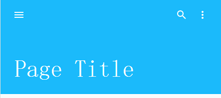
오늘은 jquery를 기반으로 상단에 고정되는 네비게이션을 공유해드리고자 합니다. 브라우저 스크롤 바가 상단에 있을 때, 브라우저가 아래로 스크롤되면 네비게이션 높이가 자동으로 높아집니다. 축소되어 상단에 위치합니다. 렌더링은 다음과 같습니다.
구현 코드:
html 코드:
<div id="page">
<div id="toolbar" data-0="height:192px" data-128="height: 64px">
<div id="actions">
<div class="icon">
<svg viewbox="0 0 24 24" x="0px" y="0px" version="1.1" xmlns="http://www.w3.org/2000/svg"
xmlns:xlink="http://www.w3.org/1999/xlink">
<g id="menu">
<path d="M3,18h18v-2H3V18z M3,13h18v-2H3V13z M3,6v2h18V6H3z">
</path>
</g>
</svg>
</div>
<div class="spacer">
</div>
<div class="icon">
<svg viewbox="0 0 24 24" x="0px" y="0px" version="1.1" xmlns="http://www.w3.org/2000/svg"
xmlns:xlink="http://www.w3.org/1999/xlink">
<g id="search">
<path d="M15.5,14h-0.8l-0.3-0.3c1-1.1,1.6-2.6,1.6-4.2C16,5.9,13.1,3,9.5,3C5.9,3,3,5.9,3,9.5S5.9,16,9.5,16c1.6,0,3.1-0.6,4.2-1.6l0.3,0.3v0.8l5,5l1.5-1.5L15.5,14z M9.5,14C7,14,5,12,5,9.5S7,5,9.5,5C12,5,14,7,14,9.5S12,14,9.5,14z">
</path>
</g>
</svg>
</div>
<div class="icon">
<svg viewbox="0 0 24 24" x="0px" y="0px" version="1.1" xmlns="http://www.w3.org/2000/svg"
xmlns:xlink="http://www.w3.org/1999/xlink">
<g id="more-vert">
<path d="M12,8c1.1,0,2-0.9,2-2s-0.9-2-2-2c-1.1,0-2,0.9-2,2S10.9,8,12,8z M12,10c-1.1,0-2,0.9-2,2s0.9,2,2,2c1.1,0,2-0.9,2-2S13.1,10,12,10z M12,16c-1.1,0-2,0.9-2,2s0.9,2,2,2c1.1,0,2-0.9,2-2S13.1,16,12,16z">
</path>
</g>
</svg>
</div>
</div>
<div id="title" data-0="font-size: 48px; padding: 0 0 24px 12px;" data-128="font-size: 18px; padding: 0 0 21px 60px;">
Page Title
</div>
</div>
<div id="content" data-0="padding-top: 192px;" data-192="padding-top: 190px;">
<div class="card">
Content goes here!
</div>
<div class="card">
Content goes here!
</div>
<div class="card">
Content goes here!
</div>
<div class="card">
Content goes here!
</div>
<div class="card">
Content goes here!
</div>
<div class="card">
Content goes here!
</div>
<div class="card">
Content goes here!
</div>
</div>
</div>
<script src='jquery.js'></script>
<script src='skrollr.min.js'></script>
<script> $(document).ready(function () {
skrollr.init({ smoothScrolling: true });
}); //@ sourceURL=pen.js
</script>
CSS 코드:
html, body {
background: #fafafa;
color: #1BBBFB;
font-family: sans-serif;
}

#page {
position: absolute;
top: 0;
right: 0;
bottom: 0;
left: 0;
}

#toolbar {
display: block;
position: fixed;
width: 100%;
z-index: 10;
box-sizing: border-box;
-moz-box-sizing: border-box;
background-color: #1BBBFB;
padding: 0 16px;
}

#actions {
position: relative;
display: flex;
align-items: center;
flex-direction: row;
height: 64px;
top: 0;
left: 0;
right 0;
}

#actions .icon {
padding: 7px;
margin: 2px;
vertical-align: middle;
}

#actions .spacer {
flex: 1;
}

#actions svg {
display: inline-block;
pointer-events: none;
position: relative;
vertical-align: middle;
width: 24px;
height: 24px;
fill: #fff;
}

#title {
padding: 21px;
position: absolute;
bottom: 0;
color: #fff;
}

#content {
display: block;
position: relative;
padding: 24px;
}

.card {
display: block;
position: relative;
width: 60%;
height: 100px;
border: 1px solid #1BBBFB;
-webkit-border-radius: 4px;
-moz-border-radius: 4px;
border-radius: 4px;
background-color: #fff;
margin: 16px auto;
padding: 24px;
}
성명:
본 글의 내용은 네티즌들의 자발적인 기여로 작성되었으며, 저작권은 원저작자에게 있습니다. 본 사이트는 이에 상응하는 법적 책임을 지지 않습니다. 표절이나 침해가 의심되는 콘텐츠를 발견한 경우 admin@php.cn으로 문의하세요.