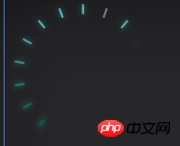
ホームページ  >  に質問  >  本文

html - CSS3能写出这种环状吗,不是环形进度条?

抛开颜色不看 ,只是这种排版做得到吗?

PHP中文网PHP中文网2713日前493

全員に返信(6)返信します

  • PHP中文网

    PHP中文网2017-04-17 15:20:01

    效果图:

    用了SCSS来写,如果不太熟悉的话,可以看CSS。话不多说,直接上代码

    index.html

    <p class="loading">
        <p></p>
        <p></p>
        <p></p>
        <p></p>
        <p></p>
        <p></p>
        <p></p>
        <p></p>
        <p></p>
        <p></p>
        <p></p>
        <p></p>
        <p></p>
    </p>

    loading.scss

    // 线条总数
    $total: 13;
    // 每个线条相差的角度
    $angel: 180/($total - 1);
    
    .loading {
        background: black;
        width: 400px;
        height: 400px;
        position: relative;
        p {
            position: absolute;
            display: block;
            width: 100%;
            height: 2px;
            top: 50%;
            transform-origin: 50% 50%;
            &:before {
                display: block;
                content: "";
                height: 100%;
                width: 10%;
                background: white;
            }
            @for $i from 1 through $total {
                &:nth-child(#{$i}) {
                    transform: translate3d(0, -50%, 0) rotate(#{$angel*($i - 1)}deg);
                    opacity: 0.2 + 0.8 * $i / $total;
                }
            }
        }
    }

    loading.css

    .loading {
        background: black;
        width: 400px;
        height: 400px;
        position: relative;
    }
    
    .loading p {
        position: absolute;
        display: block;
        width: 100%;
        height: 2px;
        top: 50%;
        transform-origin: 50% 50%;
    }
    
    .loading p:before {
        display: block;
        content: "";
        height: 100%;
        width: 10%;
        background: white;
    }
    
    .loading p:nth-child(1) {
        transform: translate3d(0, -50%, 0) rotate(0deg);
        opacity: 0.26154;
    }
    
    .loading p:nth-child(2) {
        transform: translate3d(0, -50%, 0) rotate(15deg);
        opacity: 0.32308;
    }
    
    .loading p:nth-child(3) {
        transform: translate3d(0, -50%, 0) rotate(30deg);
        opacity: 0.38462;
    }
    
    .loading p:nth-child(4) {
        transform: translate3d(0, -50%, 0) rotate(45deg);
        opacity: 0.44615;
    }
    
    .loading p:nth-child(5) {
        transform: translate3d(0, -50%, 0) rotate(60deg);
        opacity: 0.50769;
    }
    
    .loading p:nth-child(6) {
        transform: translate3d(0, -50%, 0) rotate(75deg);
        opacity: 0.56923;
    }
    
    .loading p:nth-child(7) {
        transform: translate3d(0, -50%, 0) rotate(90deg);
        opacity: 0.63077;
    }
    
    .loading p:nth-child(8) {
        transform: translate3d(0, -50%, 0) rotate(105deg);
        opacity: 0.69231;
    }
    
    .loading p:nth-child(9) {
        transform: translate3d(0, -50%, 0) rotate(120deg);
        opacity: 0.75385;
    }
    
    .loading p:nth-child(10) {
        transform: translate3d(0, -50%, 0) rotate(135deg);
        opacity: 0.81538;
    }
    
    .loading p:nth-child(11) {
        transform: translate3d(0, -50%, 0) rotate(150deg);
        opacity: 0.87692;
    }
    
    .loading p:nth-child(12) {
        transform: translate3d(0, -50%, 0) rotate(165deg);
        opacity: 0.93846;
    }
    
    .loading p:nth-child(13) {
        transform: translate3d(0, -50%, 0) rotate(180deg);
        opacity: 1;
    }
    

    返事
    0
  • 巴扎黑

    巴扎黑2017-04-17 15:20:01

    svg应该可以

    返事
    0
  • 伊谢尔伦

    伊谢尔伦2017-04-17 15:20:01

    可以啊...每一个点都是一个元素 定位 旋转 颜色都可以符合

    返事
    0
  • PHPz

    PHPz2017-04-17 15:20:01

    完全可以!
    你是不是不知道旋转?

    返事
    0
  • PHP中文网

    PHP中文网2017-04-17 15:20:01

    CSS3 的rotate,旋转角度,还有h5的canvas和svg

    返事
    0
  • 阿神

    阿神2017-04-17 15:20:01

    svg 和 canvas

    返事
    0
  • キャンセル返事