


以下では、CSS3 の変形とアニメーション効果を画像とテキストで示します
CSS3 アニメーションのいくつかのプロパティ: 変換、トランジション、アニメーション。
以下に紹介: 移行。
1. 例
まず、例を通してトランジションのアニメーション効果を理解しましょう。
マウスをその上に置くと、div の幅が 100px から 200px に増加します。
<style type="text/css">
div{
width: 100px;
height: 100px;
background-color: red;
}
div:hover{
width: 200px;
}</style><div></div>
このエフェクトは実際にはアニメーションですが、変化が非常に早く、滑らかではありません。
マウスを置いてから 5 秒以内に div 幅を 200px にスムーズに移行したい場合。コードを 1 行追加するだけです
div:hover{
幅: 200px; トランジション:幅 5 秒イーズイン;}
マウスを置いた後 5 秒以内に div 幅を 200px にスムーズに移行したい場合。コードを 1 行追加するだけです
幅: 200px; トランジション:幅 5 秒イーズイン;}
上記で使用されているtransitionは略語であり、transition-property、transition-duration、transition-timing-function、transition-layの4つの属性が含まれており、以下で1つずつ紹介します。
2. 遷移CSS3 では新しいトランジション属性が追加されており、イベントによってトリガーされる要素のスタイルが変更されたときの効果をより繊細かつスムーズにすることができます。
transitionは、CSS 属性値を一定期間内に 1 つの値から別の値にスムーズに遷移させる方法を記述するために使用されます。このトランジション効果は、マウスのクリック、フォーカスの取得、のクリック、または 要素への変更によってトリガーできます。 構文:
transition :
[<'transition-property'> || <'transition-duration'> || <'transition-timing-function'> ||
<'transition-delay'> [, [<'transition-property'> || <'transition-duration'> ||
<'transition-timing-function'> || <'transition-delay'>]]*
トランジションには 4 つの属性値があります:
transition-property: トランジションを実行するプロパティ。
transition-duration: 移行が完了するまでに必要な時間を指定します。
Transition-timing-function: 継続期間中に、遷移変換の速度が変化することを簡単に理解すると、遷移関数を指定します。
transition-lay: 遷移遅延時間。
1. 遷移プロパティTransition-property は、トランジション アニメーション効果を使用するプロパティを指定するために使用されます。
構文:
: デフォルト値。値が all の場合、要素のいずれかの属性値が変化したときにトランジション効果が実行されます。 ident: 要素の属性名。 ident を通じて特定の属性を指定します。指定された複数の属性の 1 つにトランジション効果を適用できない場合でも、他の属性が有効になります。
トランジション アトリビュートは、
中間値(アニメートする必要があるアトリビュート) を持つ場合にのみトランジション エフェクトを持つことができます。トランジション効果を実現できるすべての CSS 属性値と値の型は、w3c にリストされています。
Property Name
Typebackground-color
as colorbackground-position
as repeatable list of simple list of length, percentage, or calcborder-bottom-color
as colorborder-bottom-width
as lengthborder-left-color
as colorborder-left-width
as lengthborder-right-color
as colorborder-right-width
as lengthborder-spacing
as simple list of lengthborder-top-color
as colorborder-top-width
as lengthbottom
as length, percentage, or calcclip
as rectanglecolor
as colorfont-size
as lengthfont-weight
as font weightheight
as length, percentage, or calcleft
as length, percentage, or calcletter-spacing
as lengthline-height
as either number or lengthmargin-bottom
as lengthmargin-left
as lengthmargin-right
as lengthmargin-top
as lengthmax-height
as length, percentage, or calcmax-width
as length, percentage, or calcmin-height
as length, percentage, or calcmin-width
as length, percentage, or calcopacity
as numberoutline-color
as coloroutline-width
as lengthpadding-bottom
as lengthpadding-left
as lengthpadding-right
as lengthpadding-top
as lengthright
as length, percentage, or calctext-indent
as length, percentage, or calctext-shadow
as shadow listtop
as length, percentage, or calcvertical-align
as lengthvisibility
as visibilitywidth
as length, percentage, or calcword-spacing
as lengthz-index
as integer
: ページの適応幅など、すべての属性変更がトランジション アニメーション効果をトリガーするわけではありません。ブラウザーが幅を変更しても、トランジション効果はトリガーされません。ただし、上の表に示されている属性タイプを変更すると、トランジション アクション効果がトリガーされます。 例: 高さと行の高さのアニメーション効果を同時に設定するなど、複数の属性を同時にアニメーション化して、div が高くなり、テキストが垂直方向の中央に配置されるようにすることができます。
<!DOCTYPE html><html><head>
<meta charset="utf-8">
<title>变形与动画</title>
<style type="text/css">div {
width: 300px;
height: 200px;
line-height: 200px;
text-align: center;
background-color: orange;
margin: 20px auto;
-webkit-transition-property: height line-height;
transition-property: height line-height;
-webkit-transition-duration: 1s;
transition-duration: 1s;
-webkit-transition-timing-function: ease-out;
transition-timing-function: ease-out;
-webkit-transition-delay: .2s;
transition-delay: .2s;}div:hover {
height: 100px;
line-height: 100px;}</style></head><body>
<div>文字垂直居中</div></body></html>

Transition-duration は、古い属性から新しい属性に遷移するのに必要な時間、つまり継続時間を設定するために使用されます。
3. 遷移タイミング関数構文:
transition-timing-function属性指的是过渡的“缓动函数”。通过这个函数会建立一条加速度曲线,因此在整个transition变化过程中,变化速度可以不断改变。主要包括以下几种函数。
ease:默认值,元素样式从初始状态过渡到终止状态速度由快到慢,逐渐变慢。linear:意思是线性过渡,即过渡过程恒速。ease-in:速度越来越快,呈现加速状态,通常称为“渐显效果”。ease-out:速度越来越慢,呈现减速状态,通常称为“渐隐效果”。ease-in-out速度先加速后减速,称为“渐显渐隐效果”。
举例:鼠标经过问号,帮助信息渐显渐隐。
<!doctype html><html><head>
<meta charset="utf-8">
<title>transition-demo by starof</title>
<style>#help{
width:20px;
height:20px;
border-radius:10px;
color:#fff;
background:#000;
text-align:center;
position:relative;
margin:50px 20px;
cursor:pointer;}#help .tips{
position:absolute;
width:300px;
height:100px;
background:#000;
top:-30px;
left:35px;
border-radius:10px;
opacity:0;
/*渐隐效果*/
transition: opacity .8s ease-in-out;
-moz-transition: opacity .8s ease-in-out;
-webkit-transition: opacity .8s ease-in-out;}.tips:before{
content:"";
border-width:10px;
border-style:solid;
border-color:transparent #000 transparent transparent;
position:absolute;
left:-20px;
top:30px;}#help:hover .tips{
opacity:0.5;
/*渐显效果*/
transition: opacity .8s ease-in-out;
-moz-transition: opacity .8s ease-in-out;
-webkit-transition: opacity .8s ease-in-out;}</style></head><body>
<div id="help">
?
<div >帮助信息</div>
</div></body></html>

4、transition-delay
transition-delay设置改变属性值后多长时间开始执行动画。
5、属性简写
在改变多个css属性的transition效果时,把几个transition声明用逗号隔开,然后每个属性就都有各自的过渡时间和效果。
Note:第一个时间是时长,第二个是延时。
a{
transition: background 0.8s ease-in 0.3,
color 0.6s ease-out 0.3;}
三、贝塞尔曲线和transition
transition的数学模型就是贝塞尔曲线,下面介绍。
曲线其实就是两点之间插值的效果,贝塞尔曲线是一种插值算法,比线性插值复杂一点。
贝塞尔曲线:起始点,终止点(也称锚点),控制点。通过调整控制点,贝塞尔曲线的形状发生变化。
k阶贝塞尔插值算法需要k+1个控制点。
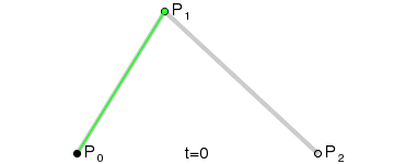
一阶贝塞尔曲线(线段):意思就是从P0到P1的连续点,用来描述一段线段。一次贝塞尔插值就是线性插值。


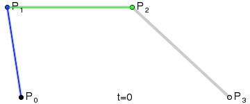
二阶贝塞尔曲线(抛物线):P0-P1是曲线在P0处的切线。

三阶贝塞尔曲线:

transition用到的就是三阶贝塞尔插值算法,如下图。
时间在0,1区间,待变换属性也认为是0,1区间。P0和P3的坐标一直是(0,0)和(1,1)。transition-timing-function属性用来确定P1和P2的坐标。
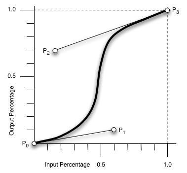
ease [0, 0] [0.25, 0.1] [0.25, 1.0] [1.0,1.0]
linear [0, 0] [0.0, 0.0] [1.0, 1.0] [1.0,1.0]
ease-in [0, 0] [0.42, 0] [1.0, 1.0] [1.0,1.0]
ease-out [0, 0] [0, 0] [0.58, 1.0] [1.0,1.0]
ease-in-out [0, 0] [0.42, 0] [0.58, 1.0] [1.0,1.0]
step-start steps(1,start)
step-end steps(1,end)
cubic-bezier(x1,y1,x2,y2) [0, 0] [x1, y1] [x2, y2] [1.0,1.0]
四、其他相关资料
canvas画贝塞尔曲线
<!DOCTYPE html PUBLIC "-//W3C//DTD XHTML 1.0 Transitional//EN" "http://www.w3.org/TR/xhtml1/DTD/xhtml1-transitional.dtd">
<html xmlns="http://www.w3.org/1999/xhtml">
<head>
<meta http-equiv="Content-Type" content="text/html; charset=utf-8">
<title>bezier demo</title>
</head>
<body>
<div style="width:800px;height:600px;background-color:#fac0c0;">
<canvas id="cvs" width="800" height="600">骚瑞,您的浏览器不支持canvas</canvas>
</div>
<script type="text/javascript">var cvs=document.getElementById("cvs"),
context=cvs.getContext("2d"),points=[];function getXY(node){var x=0,y=0;if (node.offsetParent)
{while (node.offsetParent)
{x += node.offsetLeft;y += node.offsetTop;node = node.offsetParent;}}
else {node.x && (x += node.x);node.y && (y += node.y);}return [x,y];}
function drawPoint(x,y,c,b) {!b && (b=2);context.fillStyle=c || "red";
context.fillRect(x,y,b,b);}function bezier(points,t){var i,n=points.length-1,x=0,y=0;function fn(p,n,i,t){return arrangement(n,i)*p*Math.pow(1-t,n-i)*Math.pow(t,i);}for(i=0;i<n+1;i++){x+=fn(points[i][0],n,i,t);
y+=fn(points[i][1],n,i,t);}return [x,y];}function factorial(n){if(isNaN(n) || n<=0 || Math.floor(n)!==n){return 1;}var s=1;
while(n){s*=n--;}return s;}function arrangement(n,r){return factorial(n)/(factorial(r)*factorial(n-r));}
cvs.addEventListener("click",function(event){var i,point=getXY(this),x=event.clientX-point[0]+(document.documentElement.scrollLeft || document.body.scrollLeft),y=event.clientY-point[1]+(document.documentElement.scrollTop || document.body.scrollTop);points.push([x,y]);context.clearRect(0,0,screen.width,screen.height);context.beginPath();
//pointsfor(i=0;i<points.length;i++){drawPoint(points[i][0],points[i][1],"blue",4);}//bezierfor (i = 0; i < 1; i += 0.001)
{drawPoint.apply(this, bezier(points,i));}//lineif(points.length==1){context.moveTo(points[0][0],points[0][1]);}else if (points.length>1){for(i=0;i<points.length;i++){context.lineTo(points[i][0],points[i][1]);}
context.lineWidth=0.2;context.stroke();context.closePath();}},true);</script>
</body>
</html>

希望这些内容可以帮助到大家,谢谢。

 JavaScriptエンジンの理解:実装の詳細Apr 17, 2025 am 12:05 AM
JavaScriptエンジンが内部的にどのように機能するかを理解することは、開発者にとってより効率的なコードの作成とパフォーマンスのボトルネックと最適化戦略の理解に役立つためです。 1)エンジンのワークフローには、3つの段階が含まれます。解析、コンパイル、実行。 2)実行プロセス中、エンジンはインラインキャッシュや非表示クラスなどの動的最適化を実行します。 3)ベストプラクティスには、グローバル変数の避け、ループの最適化、constとletsの使用、閉鎖の過度の使用の回避が含まれます。
 Python vs. JavaScript:学習曲線と使いやすさApr 16, 2025 am 12:12 AM
Pythonは、スムーズな学習曲線と簡潔な構文を備えた初心者により適しています。 JavaScriptは、急な学習曲線と柔軟な構文を備えたフロントエンド開発に適しています。 1。Python構文は直感的で、データサイエンスやバックエンド開発に適しています。 2。JavaScriptは柔軟で、フロントエンドおよびサーバー側のプログラミングで広く使用されています。
 Python vs. JavaScript:コミュニティ、ライブラリ、リソースApr 15, 2025 am 12:16 AM
PythonとJavaScriptには、コミュニティ、ライブラリ、リソースの観点から、独自の利点と短所があります。 1)Pythonコミュニティはフレンドリーで初心者に適していますが、フロントエンドの開発リソースはJavaScriptほど豊富ではありません。 2)Pythonはデータサイエンスおよび機械学習ライブラリで強力ですが、JavaScriptはフロントエンド開発ライブラリとフレームワークで優れています。 3)どちらも豊富な学習リソースを持っていますが、Pythonは公式文書から始めるのに適していますが、JavaScriptはMDNWebDocsにより優れています。選択は、プロジェクトのニーズと個人的な関心に基づいている必要があります。
 C/CからJavaScriptへ:すべてがどのように機能するかApr 14, 2025 am 12:05 AM
C/CからJavaScriptへのシフトには、動的なタイピング、ゴミ収集、非同期プログラミングへの適応が必要です。 1)C/Cは、手動メモリ管理を必要とする静的に型付けられた言語であり、JavaScriptは動的に型付けされ、ごみ収集が自動的に処理されます。 2)C/Cはマシンコードにコンパイルする必要がありますが、JavaScriptは解釈言語です。 3)JavaScriptは、閉鎖、プロトタイプチェーン、約束などの概念を導入します。これにより、柔軟性と非同期プログラミング機能が向上します。
 JavaScriptエンジン:実装の比較Apr 13, 2025 am 12:05 AM
さまざまなJavaScriptエンジンは、各エンジンの実装原則と最適化戦略が異なるため、JavaScriptコードを解析および実行するときに異なる効果をもたらします。 1。語彙分析:ソースコードを語彙ユニットに変換します。 2。文法分析:抽象的な構文ツリーを生成します。 3。最適化とコンパイル:JITコンパイラを介してマシンコードを生成します。 4。実行:マシンコードを実行します。 V8エンジンはインスタントコンピレーションと非表示クラスを通じて最適化され、Spidermonkeyはタイプ推論システムを使用して、同じコードで異なるパフォーマンスパフォーマンスをもたらします。
 ブラウザを超えて:現実世界のJavaScriptApr 12, 2025 am 12:06 AM
現実世界におけるJavaScriptのアプリケーションには、サーバー側のプログラミング、モバイルアプリケーション開発、モノのインターネット制御が含まれます。 2。モバイルアプリケーションの開発は、ReactNativeを通じて実行され、クロスプラットフォームの展開をサポートします。 3.ハードウェアの相互作用に適したJohnny-Fiveライブラリを介したIoTデバイス制御に使用されます。
 next.jsを使用してマルチテナントSaaSアプリケーションを構築する(バックエンド統合)Apr 11, 2025 am 08:23 AM
私はあなたの日常的な技術ツールを使用して機能的なマルチテナントSaaSアプリケーション(EDTECHアプリ)を作成しましたが、あなたは同じことをすることができます。 まず、マルチテナントSaaSアプリケーションとは何ですか? マルチテナントSaaSアプリケーションを使用すると、Singの複数の顧客にサービスを提供できます
 next.jsを使用してマルチテナントSaaSアプリケーションを構築する方法(フロントエンド統合)Apr 11, 2025 am 08:22 AM
この記事では、許可によって保護されたバックエンドとのフロントエンド統合を示し、next.jsを使用して機能的なedtech SaaSアプリケーションを構築します。 FrontEndはユーザーのアクセス許可を取得してUIの可視性を制御し、APIリクエストがロールベースに付着することを保証します


ホットAIツール

Undresser.AI Undress
リアルなヌード写真を作成する AI 搭載アプリ

AI Clothes Remover
写真から衣服を削除するオンライン AI ツール。

Undress AI Tool
脱衣画像を無料で

Clothoff.io
AI衣類リムーバー

AI Hentai Generator
AIヘンタイを無料で生成します。

人気の記事
ホットツール

PhpStorm Mac バージョン
最新(2018.2.1)のプロフェッショナル向けPHP統合開発ツール

ゼンドスタジオ 13.0.1
強力な PHP 統合開発環境

EditPlus 中国語クラック版
サイズが小さく、構文の強調表示、コード プロンプト機能はサポートされていません

SublimeText3 英語版
推奨: Win バージョン、コードプロンプトをサポート!

SAP NetWeaver Server Adapter for Eclipse
Eclipse を SAP NetWeaver アプリケーション サーバーと統合します。

