
ホームページ >バックエンド開発 >Python チュートリアル >興味深い Python 視覚化テクニックを共有する
興味深い Python 視覚化テクニックを共有する

- WBOYWBOYWBOYWBOYWBOYWBOYWBOYWBOYWBOYWBOYWBOYWBOYWB転載
- 2023-04-12 08:22:141841ブラウズ
以下に示すように:

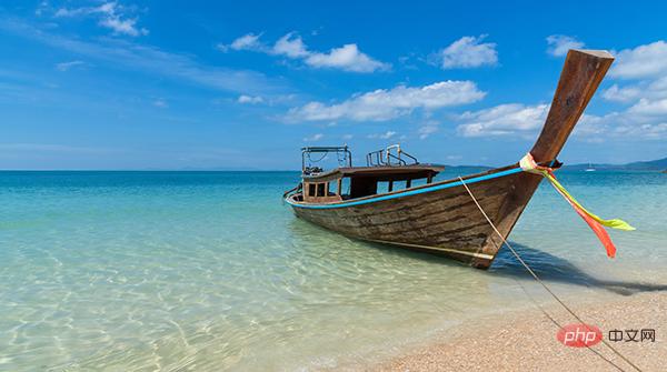
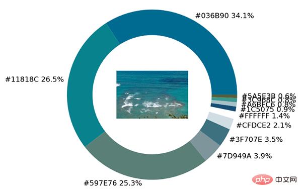
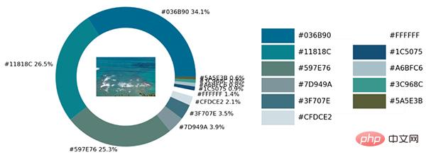
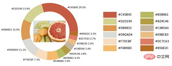
サンプル写真にはさまざまな色があります。Python を使用して視覚化モジュールとopencv モジュールは、画像内のすべての色要素を識別し、それらをビジュアル チャートのカラー マッチングに追加します。
モジュールをインポートして画像をロード
いつものように、最初のステップはモジュールをインポートすることです。視覚化に使用されるモジュールは matplotlib モジュールです。画像から色を抽出して保存します。カラーマップ テーブルにあるため、カラーマップ モジュールを使用するには、それもインポートする必要があります。
import numpy as np
import pandas as pd
import matplotlib.pyplot as plt
import matplotlib.patches as patches
import matplotlib.image as mpimg
from PIL import Image
from matplotlib.offsetbox import OffsetImage, AnnotationBbox
import cv2
import extcolors
from colormap import rgb2hex
次に、最初に画像をロードしましょう。コードは次のとおりです:
input_name = 'test_1.png'
img = plt.imread(input_name)
plt.imshow(img)
plt.axis('off')
plt.show()
output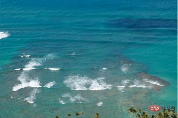
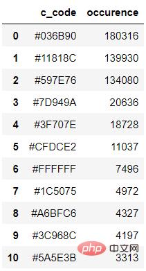
colors_x = extcolors.extract_from_path(img_url, tolerance=12, limit = 12)
colors_x
output
([((3, 107, 144), 180316),
 ((17, 129, 140), 139930),
 ((89, 126, 118), 134080),
 ((125, 148, 154), 20636),
 ((63, 112, 126), 18728),
 ((207, 220, 226), 11037),
 ((255, 255, 255), 7496),
 ((28, 80, 117), 4972),
 ((166, 191, 198), 4327),
 ((60, 150, 140), 4197),
 ((90, 94, 59), 3313),
 ((56, 66, 39), 1669)],
538200)
上記の結果を統合しますコードは次のとおりです。
def color_to_df(input_color):
 colors_pre_list = str(input_color).replace('([(', '').split(', (')[0:-1]
 df_rgb = [i.split('), ')[0] + ')' for i in colors_pre_list]
 df_percent = [i.split('), ')[1].replace(')', '') for i in colors_pre_list]
 # 将RGB转换成十六进制的颜色
 df_color_up = [rgb2hex(int(i.split(", ")[0].replace("(", "")),
int(i.split(", ")[1]),
int(i.split(", ")[2].replace(")", ""))) for i in df_rgb]
 df = pd.DataFrame(zip(df_color_up, df_percent), columns=['c_code', 'occurence'])
 return df
上記のカスタム関数を呼び出して、結果を DataFrame データ セットに出力しようとします。 df_color = color_to_df(colors_x) df_coloroutput
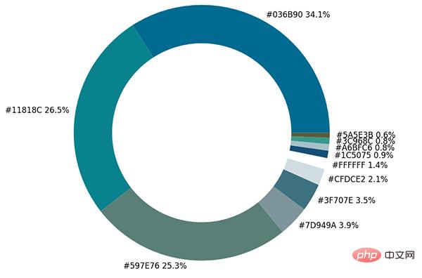
fig, ax = plt.subplots(figsize=(90,90),dpi=10)
wedges, text = ax.pie(list_precent,
 labels= text_c,
 labeldistance= 1.05,
 colors = list_color,
 textprops={'fontsize': 120, 'color':'black'}
)
plt.setp(wedges, width=0.3)
ax.set_aspect("equal")
fig.set_facecolor('white')
plt.show()
output
imagebox = OffsetImage(img, zoom=2.3)
ab = AnnotationBbox(imagebox, (0, 0))
ax1.add_artist(ab)
output
## 调色盘
x_posi, y_posi, y_posi2 = 160, -170, -170
for c in list_color:
 if list_color.index(c) <= 5:
 y_posi += 180
 rect = patches.Rectangle((x_posi, y_posi), 360, 160, facecolor = c)
 ax2.add_patch(rect)
 ax2.text(x = x_posi+400, y = y_posi+100, s = c, fontdict={'fontsize': 190})
 else:
 y_posi2 += 180
 rect = patches.Rectangle((x_posi + 1000, y_posi2), 360, 160, facecolor = c)
 ax2.add_artist(rect)
 ax2.text(x = x_posi+1400, y = y_posi2+100, s = c, fontdict={'fontsize': 190})
ax2.axis('off')
fig.set_facecolor('white')
plt.imshow(bg)
plt.tight_layout()
output
def exact_color(input_image, resize, tolerance, zoom):
 output_width = resize
 img = Image.open(input_image)
 if img.size[0] >= resize:
 wpercent = (output_width/float(img.size[0]))
 hsize = int((float(img.size[1])*float(wpercent)))
 img = img.resize((output_width,hsize), Image.ANTIALIAS)
 resize_name = 'resize_'+ input_image
 img.save(resize_name)
 else:
 resize_name = input_image

 fig.set_facecolor('white')
 ax2.axis('off')
 bg = plt.imread('bg.png')
plt.imshow(bg)
 plt.tight_layout()
 return plt.show()

exact_color('test_2.png', 900, 12, 2.5)
出力
以上が興味深い Python 視覚化テクニックを共有するの詳細内容です。詳細については、PHP 中国語 Web サイトの他の関連記事を参照してください。
声明:
この記事は51cto.comで複製されています。侵害がある場合は、admin@php.cn までご連絡ください。