


異常データを排除する 4 つの方法は、1. 「隔離フォレスト」、2. DBSCAN、3. OneClassSVM、4. サンプルの異常度を反映する数値スコアを計算する「ローカル外れ値係数」です。

このチュートリアルの動作環境: Windows 7 システム、Dell G3 コンピューター。
異常値検出 異常値の特定方法
1. 隔離フォレスト 隔離フォレスト
1.1 テストサンプル例
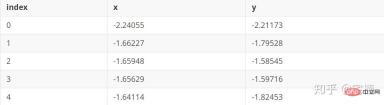
ファイル test.pkl
# 参考https://blog.csdn.net/ye1215172385/article/details/79762317
# 官方例子https://scikit-learn.org/stable/auto_examples/ensemble/plot_isolation_forest.html#sphx-glr-auto-examples-ensemble-plot-isolation-forest-py
import numpy as np
import matplotlib.pyplot as plt
from sklearn.ensemble import IsolationForest

rng = np.random.RandomState(42)

# 构造训练样本
n_samples = 200  #样本总数
outliers_fraction = 0.25  #异常样本比例
n_inliers = int((1. - outliers_fraction) * n_samples)
n_outliers = int(outliers_fraction * n_samples)

X = 0.3 * rng.randn(n_inliers // 2, 2)
X_train = np.r_[X + 2, X - 2]   #正常样本
X_train = np.r_[X_train, np.random.uniform(low=-6, high=6, size=(n_outliers, 2))]  #正常样本加上异常样本

# 构造模型并拟合
clf = IsolationForest(max_samples=n_samples, random_state=rng, contamination=outliers_fraction)
clf.fit(X_train)
# 计算得分并设置阈值
scores_pred = clf.decision_function(X_train)
threshold = np.percentile(scores_pred, 100 * outliers_fraction)  #根据训练样本中异常样本比例,得到阈值,用于绘图

# plot the line, the samples, and the nearest vectors to the plane
xx, yy = np.meshgrid(np.linspace(-7, 7, 50), np.linspace(-7, 7, 50))
Z = clf.decision_function(np.c_[xx.ravel(), yy.ravel()])
Z = Z.reshape(xx.shape)

plt.title("IsolationForest")
# plt.contourf(xx, yy, Z, cmap=plt.cm.Blues_r)
plt.contourf(xx, yy, Z, levels=np.linspace(Z.min(), threshold, 7), cmap=plt.cm.Blues_r)  #绘制异常点区域,值从最小的到阈值的那部分
a = plt.contour(xx, yy, Z, levels=[threshold], linewidths=2, colors='red')  #绘制异常点区域和正常点区域的边界
plt.contourf(xx, yy, Z, levels=[threshold, Z.max()], colors='palevioletred')  #绘制正常点区域,值从阈值到最大的那部分

b = plt.scatter(X_train[:-n_outliers, 0], X_train[:-n_outliers, 1], c='white',
                    s=20, edgecolor='k')
c = plt.scatter(X_train[-n_outliers:, 0], X_train[-n_outliers:, 1], c='black',
                    s=20, edgecolor='k')
plt.axis('tight')
plt.xlim((-7, 7))
plt.ylim((-7, 7))
plt.legend([a.collections[0], b, c],
           ['learned decision function', 'true inliers', 'true outliers'],
           loc="upper left")
plt.show()
1.3 自分で変更すると、X_train を必要なデータに変更できますここには標準化はありません。最初に標準化してから、標準化に基づいて異常値を削除できます。from sklearn .preprocessing import StandardScalerimport numpy as np
import matplotlib.pyplot as plt
from sklearn.ensemble import IsolationForest
from scipy import stats
rng = np.random.RandomState(42)
X_train = X_train_demo.values
outliers_fraction = 0.1
n_samples = 500
# 构造模型并拟合
clf = IsolationForest(max_samples=n_samples, random_state=rng, contamination=outliers_fraction)
clf.fit(X_train)
# 计算得分并设置阈值
scores_pred = clf.decision_function(X_train)
threshold = stats.scoreatpercentile(scores_pred, 100 * outliers_fraction) #根据训练样本中异常样本比例,得到阈值,用于绘图
# plot the line, the samples, and the nearest vectors to the plane
range_max_min0 = (X_train[:,0].max()-X_train[:,0].min())*0.2
range_max_min1 = (X_train[:,1].max()-X_train[:,1].min())*0.2
xx, yy = np.meshgrid(np.linspace(X_train[:,0].min()-range_max_min0, X_train[:,0].max()+range_max_min0, 500),
np.linspace(X_train[:,1].min()-range_max_min1, X_train[:,1].max()+range_max_min1, 500))
Z = clf.decision_function(np.c_[xx.ravel(), yy.ravel()])
Z = Z.reshape(xx.shape)
plt.title("IsolationForest")
# plt.contourf(xx, yy, Z, cmap=plt.cm.Blues_r)
plt.contourf(xx, yy, Z, levels=np.linspace(Z.min(), threshold, 7), cmap=plt.cm.Blues_r) #绘制异常点区域,值从最小的到阈值的那部分
a = plt.contour(xx, yy, Z, levels=[threshold], linewidths=2, colors='red') #绘制异常点区域和正常点区域的边界
plt.contourf(xx, yy, Z, levels=[threshold, Z.max()], colors='palevioletred') #绘制正常点区域,值从阈值到最大的那部分
is_in = clf.predict(X_train)>0
b = plt.scatter(X_train[is_in, 0], X_train[is_in, 1], c='white',
s=20, edgecolor='k')
c = plt.scatter(X_train[~is_in, 0], X_train[~is_in, 1], c='black',
s=20, edgecolor='k')
plt.axis('tight')
plt.xlim((X_train[:,0].min()-range_max_min0, X_train[:,0].max()+range_max_min0,))
plt.ylim((X_train[:,1].min()-range_max_min1, X_train[:,1].max()+range_max_min1,))
plt.legend([a.collections[0], b, c],
['learned decision function', 'inliers', 'outliers'],
loc="upper left")
plt.show()1.4 コア コード1.4.1 サンプル サンプルimport numpy as np
# 构造训练样本
n_samples = 200 #样本总数
outliers_fraction = 0.25 #异常样本比例
n_inliers = int((1. - outliers_fraction) * n_samples)
n_outliers = int(outliers_fraction * n_samples)
X = 0.3 * rng.randn(n_inliers // 2, 2)
X_train = np.r_[X + 2, X - 2] #正常样本
X_train = np.r_[X_train, np.random.uniform(low=-6, high=6, size=(n_outliers, 2))] #正常样本加上异常样本
1.4.2 コア コードの実装clf = IsolationForest(max_samples= 0.8, contamination=0.25)from sklearn.ensemble import IsolationForest
# fit the model
# max_samples 构造一棵树使用的样本数,输入大于1的整数则使用该数字作为构造的最大样本数目,
# 如果数字属于(0,1]则使用该比例的数字作为构造iforest
# outliers_fraction 多少比例的样本可以作为异常值
clf = IsolationForest(max_samples=0.8, contamination=0.25)
clf.fit(X_train)
# y_pred_train = clf.predict(X_train)
scores_pred = clf.decision_function(X_train)
threshold = np.percentile(scores_pred, 100 * outliers_fraction) #根据训练样本中异常样本比例,得到阈值,用于绘图
## 以下两种方法的筛选结果,完全相同
X_train_predict1 = X_train[clf.predict(X_train)==1]
X_train_predict2 = X_train[scores_pred>=threshold,:]
# 其中,1的表示非异常点,-1的表示为异常点
clf.predict(X_train)
array([ 1, 1, 1, 1, 1, 1, 1, 1, 1, 1, 1, 1, 1, 1, 1, 1, 1,
1, 1, 1, 1, 1, 1, 1, 1, 1, 1, 1, 1, 1, 1, 1, 1, 1,
1, 1, 1, 1, 1, 1, 1, 1, 1, 1, 1, 1, 1, 1, 1, 1, 1,
1, 1, 1, 1, 1, 1, 1, 1, 1, 1, 1, 1, 1, 1, 1, 1, -1,
1, 1, 1, 1, 1, 1, 1, 1, 1, 1, 1, 1, 1, 1, 1, 1, 1,
1, 1, 1, 1, 1, 1, 1, 1, 1, 1, 1, 1, 1, 1, 1, 1, 1,
1, 1, 1, 1, 1, 1, 1, 1, 1, 1, 1, 1, 1, 1, 1, 1, 1,
1, 1, 1, 1, 1, 1, 1, 1, 1, 1, 1, 1, 1, 1, 1, 1, 1,
1, 1, 1, 1, 1, 1, 1, 1, 1, 1, 1, 1, 1, 1, -1, -1, -1,
-1, -1, -1, -1, -1, -1, -1, 1, -1, -1, -1, -1, -1, -1, -1, -1, -1,
-1, -1, -1, -1, -1, -1, -1, -1, -1, -1, -1, -1, -1, -1, -1, -1, -1,
-1, -1, -1, -1, -1, -1, -1, -1, -1, -1, -1, -1, -1])2. DBSCANDBSCAN(ノイズを伴うアプリケーションの密度ベースの空間クラスタリング) 原理各点を中心として、近傍および近傍内に必要な点の数。サンプル ポイントが指定された要件より大きい場合、その点は近傍内の点と同じカテゴリにあるとみなされます。指定された値より小さい場合、点は他の点の近くに位置しており、境界点です。 2.1 DBSCAN デモ# 参考https://blog.csdn.net/hb707934728/article/details/71515160
#
# 官方示例 https://scikit-learn.org/stable/auto_examples/cluster/plot_dbscan.html#sphx-glr-auto-examples-cluster-plot-dbscan-py
import numpy as np
import matplotlib.pyplot as plt
import matplotlib.colors
import sklearn.datasets as ds
from sklearn.cluster import DBSCAN
from sklearn.preprocessing import StandardScaler
def expand(a, b):
d = (b - a) * 0.1
return a-d, b+d
if __name__ == "__main__":
N = 1000
centers = [[1, 2], [-1, -1], [1, -1], [-1, 1]]
#scikit中的make_blobs方法常被用来生成聚类算法的测试数据,直观地说,make_blobs会根据用户指定的特征数量、
# 中心点数量、范围等来生成几类数据,这些数据可用于测试聚类算法的效果。
#函数原型:sklearn.datasets.make_blobs(n_samples=100, n_features=2,
# centers=3, cluster_std=1.0, center_box=(-10.0, 10.0), shuffle=True, random_state=None)[source]
#参数解析:
# n_samples是待生成的样本的总数。
#
# n_features是每个样本的特征数。
#
# centers表示类别数。
#
# cluster_std表示每个类别的方差,例如我们希望生成2类数据,其中一类比另一类具有更大的方差,可以将cluster_std设置为[1.0, 3.0]。
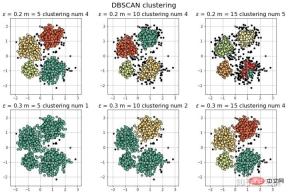
data, y = ds.make_blobs(N, n_features=2, centers=centers, cluster_std=[0.5, 0.25, 0.7, 0.5], random_state=0)
data = StandardScaler().fit_transform(data)
# 数据1的参数:(epsilon, min_sample)
params = ((0.2, 5), (0.2, 10), (0.2, 15), (0.3, 5), (0.3, 10), (0.3, 15))
plt.figure(figsize=(12, 8), facecolor='w')
plt.suptitle(u'DBSCAN clustering', fontsize=20)
for i in range(6):
eps, min_samples = params[i]
#参数含义:
#eps:半径,表示以给定点P为中心的圆形邻域的范围
#min_samples:以点P为中心的邻域内最少点的数量
#如果满足,以点P为中心,半径为EPS的邻域内点的个数不少于MinPts,则称点P为核心点
model = DBSCAN(eps=eps, min_samples=min_samples)
model.fit(data)
y_hat = model.labels_
core_indices = np.zeros_like(y_hat, dtype=bool) # 生成数据类型和数据shape和指定array一致的变量
core_indices[model.core_sample_indices_] = True # model.core_sample_indices_ border point位于y_hat中的下标
# 统计总共有积累,其中为-1的为未分类样本
y_unique = np.unique(y_hat)
n_clusters = y_unique.size - (1 if -1 in y_hat else 0)
print (y_unique, '聚类簇的个数为:', n_clusters)
plt.subplot(2, 3, i+1) # 对第几个图绘制,2行3列,绘制第i+1个图
# plt.cm.spectral https://blog.csdn.net/robin_Xu_shuai/article/details/79178857
clrs = plt.cm.Spectral(np.linspace(0, 0.8, y_unique.size)) #用于给画图灰色
for k, clr in zip(y_unique, clrs):
cur = (y_hat == k)
if k == -1:
# 用于绘制未分类样本
plt.scatter(data[cur, 0], data[cur, 1], s=20, c='k')
continue
# 绘制正常节点
plt.scatter(data[cur, 0], data[cur, 1], s=30, c=clr, edgecolors='k')
# 绘制边缘点
plt.scatter(data[cur & core_indices][:, 0], data[cur & core_indices][:, 1], s=60, c=clr, marker='o', edgecolors='k')
x1_min, x2_min = np.min(data, axis=0)
x1_max, x2_max = np.max(data, axis=0)
x1_min, x1_max = expand(x1_min, x1_max)
x2_min, x2_max = expand(x2_min, x2_max)
plt.xlim((x1_min, x1_max))
plt.ylim((x2_min, x2_max))
plt.grid(True)
plt.title(u'$epsilon$ = %.1f m = %d clustering num %d'%(eps, min_samples, n_clusters), fontsize=16)
plt.tight_layout()
plt.subplots_adjust(top=0.9)
plt.show()
[-1 0 1 2 3] 聚类簇的个数为: 4
[-1 0 1 2 3] 聚类簇的个数为: 4
[-1 0 1 2 3 4] 聚类簇的个数为: 5
[-1 0] 聚类簇的个数为: 1
[-1 0 1] 聚类簇的个数为: 2
[-1 0 1 2 3] 聚类簇的个数为: 4
#
# 参考https://blog.csdn.net/hb707934728/article/details/71515160
#
# 官方示例 https://scikit-learn.org/stable/auto_examples/cluster/plot_dbscan.html#sphx-glr-auto-examples-cluster-plot-dbscan-py
import numpy as np
import matplotlib.pyplot as plt
import matplotlib.colors
import sklearn.datasets as ds
from sklearn.cluster import DBSCAN
from sklearn.preprocessing import StandardScaler
def expand(a, b):
d = (b - a) * 0.1
return a-d, b+d
if __name__ == "__main__":
N = 1000
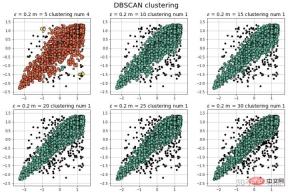
data = X_train_demo.values
# 数据1的参数:(epsilon, min_sample)
params = ((0.2, 5), (0.2, 10), (0.2, 15), (0.2, 20), (0.2, 25), (0.2, 30))
plt.figure(figsize=(12, 8), facecolor='w')
plt.suptitle(u'DBSCAN clustering', fontsize=20)
for i in range(6):
eps, min_samples = params[i]
#参数含义:
#eps:半径,表示以给定点P为中心的圆形邻域的范围
#min_samples:以点P为中心的邻域内最少点的数量
#如果满足,以点P为中心,半径为EPS的邻域内点的个数不少于MinPts,则称点P为核心点
model = DBSCAN(eps=eps, min_samples=min_samples)
model.fit(data)
y_hat = model.labels_
core_indices = np.zeros_like(y_hat, dtype=bool) # 生成数据类型和数据shape和指定array一致的变量
core_indices[model.core_sample_indices_] = True # model.core_sample_indices_ border point位于y_hat中的下标
# 统计总共有积累,其中为-1的为未分类样本
y_unique = np.unique(y_hat)
n_clusters = y_unique.size - (1 if -1 in y_hat else 0)
print (y_unique, '聚类簇的个数为:', n_clusters)
plt.subplot(2, 3, i+1) # 对第几个图绘制,2行3列,绘制第i+1个图
# plt.cm.spectral https://blog.csdn.net/robin_Xu_shuai/article/details/79178857
clrs = plt.cm.Spectral(np.linspace(0, 0.8, y_unique.size)) #用于给画图灰色
for k, clr in zip(y_unique, clrs):
cur = (y_hat == k)
if k == -1:
# 用于绘制未分类样本
plt.scatter(data[cur, 0], data[cur, 1], s=20, c='k')
continue
# 绘制正常节点
plt.scatter(data[cur, 0], data[cur, 1], s=30, c=clr, edgecolors='k')
# 绘制边缘点
plt.scatter(data[cur & core_indices][:, 0], data[cur & core_indices][:, 1], s=60, c=clr, marker='o', edgecolors='k')
x1_min, x2_min = np.min(data, axis=0)
x1_max, x2_max = np.max(data, axis=0)
x1_min, x1_max = expand(x1_min, x1_max)
x2_min, x2_max = expand(x2_min, x2_max)
plt.xlim((x1_min, x1_max))
plt.ylim((x2_min, x2_max))
plt.grid(True)
plt.title(u'$epsilon$ = %.1f m = %d clustering num %d'%(eps, min_samples, n_clusters), fontsize=14)
plt.tight_layout()
plt.subplots_adjust(top=0.9)
plt.show()
from sklearn.cluster import DBSCAN
from sklearn import metrics
data = X_train_demo.values
eps, min_samples = 0.2, 10
# eps为领域的大小,min_samples为领域内最小点的个数
model = DBSCAN(eps=eps, min_samples=min_samples) # 构造分类器
model.fit(data) # 拟合
labels = model.labels_ # 获取类别标签,-1表示未分类
# 获取其中的core points
core_indices = np.zeros_like(labels, dtype=bool)  # 生成数据类型和数据shape和指定array一致的变量
core_indices[model.core_sample_indices_] = True  # model.core_sample_indices_ border point位于labels中的下标
core_point = data[core_indices]
# 获取非异常点
normal_point = data[labels>=0]
# 绘制剔除了异常值后的图
plt.scatter(normal_point[:,0],normal_point[:,1],edgecolors='k')
plt.show()
def filter_data(data0, params):
    from sklearn.cluster import DBSCAN
    from sklearn import metrics
    scaler = StandardScaler()
    scaler.fit(data0)
    data = scaler.transform(data0)

    eps, min_samples = params
    # eps为领域的大小,min_samples为领域内最小点的个数
    model = DBSCAN(eps=eps, min_samples=min_samples) # 构造分类器
    model.fit(data) # 拟合
    labels = model.labels_ # 获取类别标签,-1表示未分类
    # 获取其中的core points
    core_indices = np.zeros_like(labels, dtype=bool)  # 生成数据类型和数据shape和指定array一致的变量
    core_indices[model.core_sample_indices_] = True  # model.core_sample_indices_ border point位于labels中的下标
    core_point = data[core_indices]
    # 获取非异常点
    normal_point = data0[labels>=0]
    return normal_point
2.4.2 分類結果の測定(I'マークダウン形式を変換するのが面倒なので、スクリーンショットを撮りました::>_<::>
# 轮廓系数
metrics.silhouette_score(data, labels, metric='euclidean')
[out]0.13250260550638607
# Calinski-Harabaz Index 系数
metrics.calinski_harabaz_score(data, labels,)
[out]16.414158842632794
3. OneClassSVM
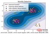
# reference:https://scikit-learn.org/stable/auto_examples/svm/plot_oneclass.html#sphx-glr-auto-examples-svm-plot-oneclass-py

import numpy as np
import matplotlib.pyplot as plt
import matplotlib.font_manager
from sklearn import svm

xx, yy = np.meshgrid(np.linspace(-5, 5, 500), np.linspace(-5, 5, 500))
# Generate train data
X = 0.3 * np.random.randn(100, 2)
X_train = np.r_[X + 2, X - 2]
# Generate some regular novel observations
X = 0.3 * np.random.randn(20, 2)
X_test = np.r_[X + 2, X - 2]
# Generate some abnormal novel observations
X_outliers = np.random.uniform(low=-4, high=4, size=(20, 2))

# fit the model
clf = svm.OneClassSVM(nu=0.1, kernel="rbf", gamma=0.1)
clf.fit(X_train)
y_pred_train = clf.predict(X_train)
y_pred_test = clf.predict(X_test)
y_pred_outliers = clf.predict(X_outliers)
n_error_train = y_pred_train[y_pred_train == -1].size
n_error_test = y_pred_test[y_pred_test == -1].size
n_error_outliers = y_pred_outliers[y_pred_outliers == 1].size

# plot the line, the points, and the nearest vectors to the plane
Z = clf.decision_function(np.c_[xx.ravel(), yy.ravel()])
Z = Z.reshape(xx.shape)

plt.title("Novelty Detection")
plt.contourf(xx, yy, Z, levels=np.linspace(Z.min(), 0, 7), cmap=plt.cm.PuBu)
a = plt.contour(xx, yy, Z, levels=[0], linewidths=2, colors='darkred')
plt.contourf(xx, yy, Z, levels=[0, Z.max()], colors='palevioletred')

s = 40
b1 = plt.scatter(X_train[:, 0], X_train[:, 1], c='white', s=s, edgecolors='k')
b2 = plt.scatter(X_test[:, 0], X_test[:, 1], c='blueviolet', s=s,
                 edgecolors='k')
c = plt.scatter(X_outliers[:, 0], X_outliers[:, 1], c='gold', s=s,
                edgecolors='k')
plt.axis('tight')
plt.xlim((-5, 5))
plt.ylim((-5, 5))
plt.legend([a.collections[0], b1, b2, c],
           ["learned frontier", "training observations",
            "new regular observations", "new abnormal observations"],
           loc="upper left",
           prop=matplotlib.font_manager.FontProperties(size=11))
plt.xlabel(
    "error train: %d/200 ; errors novel regular: %d/40 ; "
    "errors novel abnormal: %d/40"
    % (n_error_train, n_error_test, n_error_outliers))
plt.show()
from sklearn import svm
X_train = X_train_demo.values
# 构造分类器
clf = svm.OneClassSVM(nu=0.2, kernel="rbf", gamma=0.2)
clf.fit(X_train)
# 预测,结果为-1或者1
labels = clf.predict(X_train)
# 分类分数
score = clf.decision_function(X_train) # 获取置信度
# 获取正常点
X_train_normal = X_train[labels>0]
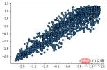
異常箇所除去前
##異常箇所除去後##plt.scatter(X_train_normal[:,0],X_train_normal[:,1]) plt.show()
 サンプル ポイントの周囲のサンプル ポイントの平均密度は、サンプル ポイントの密度よりも高くなります。比率が 1 より大きいほど、その点の位置の密度は周囲のサンプルの位置の密度より小さくなります。
#
# 参考https://blog.csdn.net/hb707934728/article/details/71515160
#
# 官方示例 https://scikit-learn.org/stable/auto_examples/cluster/plot_dbscan.html#sphx-glr-auto-examples-cluster-plot-dbscan-py
import numpy as np
import matplotlib.pyplot as plt
import matplotlib.colors
from sklearn.neighbors import LocalOutlierFactor
def expand(a, b):
d = (b - a) * 0.1
return a-d, b+d
if __name__ == "__main__":
N = 1000
data = X_train_demo.values
# 数据1的参数:(epsilon, min_sample)
params = ((0.01, 5), (0.05, 10), (0.1, 15), (0.15, 20), (0.2, 25), (0.25, 30))
plt.figure(figsize=(12, 8), facecolor='w')
plt.suptitle(u'DBSCAN clustering', fontsize=20)
for i in range(6):
outliers_fraction, min_samples = params[i]
#参数含义:
#eps:半径,表示以给定点P为中心的圆形邻域的范围
#min_samples:以点P为中心的邻域内最少点的数量
#如果满足,以点P为中心,半径为EPS的邻域内点的个数不少于MinPts,则称点P为核心点
model = LocalOutlierFactor(n_neighbors=min_samples, contamination=outliers_fraction)
y_hat = model.fit_predict(X_train)
# 统计总共有积累,其中为-1的为未分类样本
y_unique = np.unique(y_hat)
# clrs = []
# for c in np.linspace(16711680, 255, y_unique.size):
# clrs.append('#%06x' % c)
plt.subplot(2, 3, i+1) # 对第几个图绘制,2行3列,绘制第i+1个图
# plt.cm.spectral https://blog.csdn.net/robin_Xu_shuai/article/details/79178857
clrs = plt.cm.Spectral(np.linspace(0, 0.8, y_unique.size)) #用于给画图灰色
for k, clr in zip(y_unique, clrs):
cur = (y_hat == k)
if k == -1:
# 用于绘制未分类样本
plt.scatter(data[cur, 0], data[cur, 1], s=20, c='k')
continue
# 绘制正常节点
plt.scatter(data[cur, 0], data[cur, 1], s=30, c=clr, edgecolors='k')
x1_max, x2_max = np.max(data, axis=0)
x1_min, x2_min = np.min(data, axis=0)
x1_min, x1_max = expand(x1_min, x1_max)
x2_min, x2_max = expand(x2_min, x2_max)
plt.xlim((x1_min, x1_max))
plt.ylim((x2_min, x2_max))
plt.grid(True)
plt.title(u'outliers_fraction = %.1f min_samples = %d'%(outliers_fraction, min_samples), fontsize=12)
plt.tight_layout()
plt.subplots_adjust(top=0.9)
plt.show()
4.1 コアコードfrom sklearn.neighbors import LocalOutlierFactor X_train = X_train_demo.values # 构造分类器 ## 25个样本点为一组,异常值点比例为0.2 clf = LocalOutlierFactor(n_neighbors=25, contamination=0.2) # 预测,结果为-1或者1 labels = clf.fit_predict(X_train) # 获取正常点 X_train_normal = X_train[labels>0]異常箇所除去前
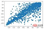
plt.scatter(X_train[:,0],X_train[:,1]) plt.show()
 異常箇所除去後
plt.scatter(X_train_normal[:,0],X_train_normal[:,1])
plt.show()
FAQ
列をご覧ください。以上が異常データを排除する4つの方法とは?の詳細内容です。詳細については、PHP 中国語 Web サイトの他の関連記事を参照してください。

ホットAIツール

Undresser.AI Undress
リアルなヌード写真を作成する AI 搭載アプリ

AI Clothes Remover
写真から衣服を削除するオンライン AI ツール。

Undress AI Tool
脱衣画像を無料で

Clothoff.io
AI衣類リムーバー

AI Hentai Generator
AIヘンタイを無料で生成します。

人気の記事
ホットツール

AtomエディタMac版ダウンロード
最も人気のあるオープンソースエディター

SAP NetWeaver Server Adapter for Eclipse
Eclipse を SAP NetWeaver アプリケーション サーバーと統合します。

PhpStorm Mac バージョン
最新(2018.2.1)のプロフェッショナル向けPHP統合開発ツール

ドリームウィーバー CS6
ビジュアル Web 開発ツール

mPDF
mPDF は、UTF-8 でエンコードされた HTML から PDF ファイルを生成できる PHP ライブラリです。オリジナルの作者である Ian Back は、Web サイトから「オンザフライ」で PDF ファイルを出力し、さまざまな言語を処理するために mPDF を作成しました。 HTML2FPDF などのオリジナルのスクリプトよりも遅く、Unicode フォントを使用すると生成されるファイルが大きくなりますが、CSS スタイルなどをサポートし、多くの機能強化が施されています。 RTL (アラビア語とヘブライ語) や CJK (中国語、日本語、韓国語) を含むほぼすべての言語をサポートします。ネストされたブロックレベル要素 (P、DIV など) をサポートします。

