


1. 構造解析
Bootstrap フレームワークのモーダル ポップアップ ボックスはそれぞれ「modal」、「modal-dialog」、「modal-content」スタイルを使用し、ポップアップ ウィンドウの実際のコンテンツは「modal-content」に配置されます。そのメインには次の 3 つの部分も含まれています:
☑ 一般に「modal-header」で表されるポップアップボックスのヘッダーには、主にタイトルと閉じるボタンが含まれます
☑ ポップアップ ボックスの本体。通常は「modal-body」で表され、ポップアップ ボックスのメイン コンテンツです。
☑ ポップアップボックスのフット部分は通常「modal-footer」で表され、主に操作ボタンが配置されます
<div class="modal" id="mymodal"> <div class="modal-dialog"> <div class="modal-content"> <div class="modal-header"> <button type="button" class="close" data-dismiss="modal"><span aria-hidden="true">×</span><span class="sr-only">Close</span></button> <h4 id="模态弹出窗标题">模态弹出窗标题</h4> </div> <div class="modal-body"> <p>模态弹出窗主体内容</p> </div> <div class="modal-footer"> <button type="button" class="btn btn-default" data-dismiss="modal">关闭</button> <button type="button" class="btn btn-primary">保存</button> </div> </div><!-- /.modal-content --> </div><!-- /.modal-dialog --> </div><!-- /.modal -->
2. データ切り替えクラスはポップアップ ウィンドウをトリガーします (JS を記述する必要はありません)
1. モーダル ポップアップ ウィンドウ宣言 。カスタマイズする必要があるのは、data-toggle と data-target の 2 つの属性のみです。
<!-- data-target触发模态弹出窗元素 --> <button class="btn btn-primary" data-toggle="modal" data-target="#mymodal-data" type="button">通过data-target触发</button> <!-- 模态弹出窗内容 --> <div class="modal" id="mymodal-data" tabindex="-1" role="dialog" aria-labelledby="mySmallModalLabel" aria-hidden="true"> <div class="modal-dialog"> <div class="modal-content"> <div class="modal-header"> <button type="button" class="close" data-dismiss="modal"><span aria-hidden="true">×</span><span class="sr-only">Close</span></button> <h4 id="模态弹出窗标题">模态弹出窗标题</h4> </div> <div class="modal-body"> <p>模态弹出窗主体内容</p> </div> <div class="modal-footer"> <button type="button" class="btn btn-default" data-dismiss="modal">关闭</button> <button type="button" class="btn btn-primary">保存</button> </div> </div> </div> </div>

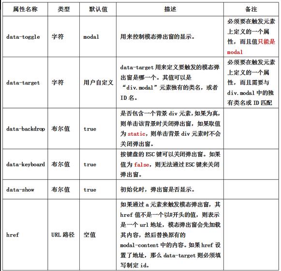
2. データパラメータの説明
データトグルとデータターゲットによるモーダル ポップアップ ウィンドウの制御に加えて、ブートストラップ フレームワークは、モーダル ポップアップ ウィンドウを制御するためのモーダル ポップアップ ボックス用の他のカスタム データ属性も提供します。
3. JSトリガーポップアップウィンドウ(JSの記述が必要)
1. カスタム属性を使用してモーダル ポップアップ ボックスをトリガーすることに加えて、JavaScript メソッドを通じてモーダル ポップアップ ウィンドウをトリガーすることもできます。要素にイベントを与えることでトリガーされます。たとえば、ボタンにクリック イベントを与えて、モーダル ポップアップ ウィンドウをトリガーします。HTML:
<div class="modal" id="mymodal"> <div class="modal-dialog"> <div class="modal-content"> <div class="modal-header"> <button type="button" class="close" data-dismiss="modal"><span aria-hidden="true">×</span><span class="sr-only">Close</span></button> <h4 id="模态弹出窗标题">模态弹出窗标题</h4> </div> <div class="modal-body"> <p>模态弹出窗主体内容</p> </div> <div class="modal-footer"> <button type="button" class="btn btn-default" data-dismiss="modal">关闭</button> <button type="button" class="btn btn-primary">保存</button> </div> </div><!-- /.modal-content --> </div><!-- /.modal-dialog --> </div><!-- /.modal -->
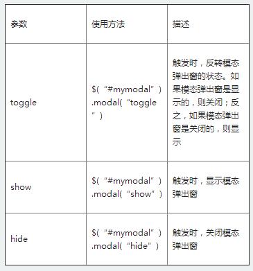
 $(function(){
 $(".btn").click(function(){
 $("#mymodal").modal("toggle");
 });
 });
を含むいくつかの設定を提供します。
プロパティ設定:
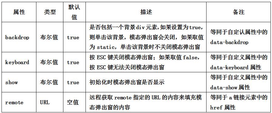
$(function(){
 $(".btn").click(function(){
 $("#mymodal").modal({
  keyboard:false
 });
 });
});
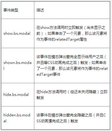
$('#myModal').on('hidden.bs.modal', function (e) {
 // 处理代码...
})
4. ポップアップウィンドウのサイズ
Bootstrap フレームワークでは、モーダル ポップアップのさまざまなサイズも提供されます。1 つは、大きいサイズのスタイル
「modal-lg」です。
<divclass="modal-dialog modal-lg">
 <divclass="modal-content"> ... </div>
</div>
modal-sm」です。
<divclass="modal-dialog modal-sm">
 <divclass="modal-content"> ... </div>
</div>

 JavaScriptエンジンの理解:実装の詳細Apr 17, 2025 am 12:05 AM
JavaScriptエンジンが内部的にどのように機能するかを理解することは、開発者にとってより効率的なコードの作成とパフォーマンスのボトルネックと最適化戦略の理解に役立つためです。 1)エンジンのワークフローには、3つの段階が含まれます。解析、コンパイル、実行。 2)実行プロセス中、エンジンはインラインキャッシュや非表示クラスなどの動的最適化を実行します。 3)ベストプラクティスには、グローバル変数の避け、ループの最適化、constとletsの使用、閉鎖の過度の使用の回避が含まれます。
 Python vs. JavaScript:学習曲線と使いやすさApr 16, 2025 am 12:12 AM
Pythonは、スムーズな学習曲線と簡潔な構文を備えた初心者により適しています。 JavaScriptは、急な学習曲線と柔軟な構文を備えたフロントエンド開発に適しています。 1。Python構文は直感的で、データサイエンスやバックエンド開発に適しています。 2。JavaScriptは柔軟で、フロントエンドおよびサーバー側のプログラミングで広く使用されています。
 Python vs. JavaScript:コミュニティ、ライブラリ、リソースApr 15, 2025 am 12:16 AM
PythonとJavaScriptには、コミュニティ、ライブラリ、リソースの観点から、独自の利点と短所があります。 1)Pythonコミュニティはフレンドリーで初心者に適していますが、フロントエンドの開発リソースはJavaScriptほど豊富ではありません。 2)Pythonはデータサイエンスおよび機械学習ライブラリで強力ですが、JavaScriptはフロントエンド開発ライブラリとフレームワークで優れています。 3)どちらも豊富な学習リソースを持っていますが、Pythonは公式文書から始めるのに適していますが、JavaScriptはMDNWebDocsにより優れています。選択は、プロジェクトのニーズと個人的な関心に基づいている必要があります。
 C/CからJavaScriptへ:すべてがどのように機能するかApr 14, 2025 am 12:05 AM
C/CからJavaScriptへのシフトには、動的なタイピング、ゴミ収集、非同期プログラミングへの適応が必要です。 1)C/Cは、手動メモリ管理を必要とする静的に型付けられた言語であり、JavaScriptは動的に型付けされ、ごみ収集が自動的に処理されます。 2)C/Cはマシンコードにコンパイルする必要がありますが、JavaScriptは解釈言語です。 3)JavaScriptは、閉鎖、プロトタイプチェーン、約束などの概念を導入します。これにより、柔軟性と非同期プログラミング機能が向上します。
 JavaScriptエンジン:実装の比較Apr 13, 2025 am 12:05 AM
さまざまなJavaScriptエンジンは、各エンジンの実装原則と最適化戦略が異なるため、JavaScriptコードを解析および実行するときに異なる効果をもたらします。 1。語彙分析:ソースコードを語彙ユニットに変換します。 2。文法分析:抽象的な構文ツリーを生成します。 3。最適化とコンパイル:JITコンパイラを介してマシンコードを生成します。 4。実行:マシンコードを実行します。 V8エンジンはインスタントコンピレーションと非表示クラスを通じて最適化され、Spidermonkeyはタイプ推論システムを使用して、同じコードで異なるパフォーマンスパフォーマンスをもたらします。
 ブラウザを超えて:現実世界のJavaScriptApr 12, 2025 am 12:06 AM
現実世界におけるJavaScriptのアプリケーションには、サーバー側のプログラミング、モバイルアプリケーション開発、モノのインターネット制御が含まれます。 2。モバイルアプリケーションの開発は、ReactNativeを通じて実行され、クロスプラットフォームの展開をサポートします。 3.ハードウェアの相互作用に適したJohnny-Fiveライブラリを介したIoTデバイス制御に使用されます。
 next.jsを使用してマルチテナントSaaSアプリケーションを構築する(バックエンド統合)Apr 11, 2025 am 08:23 AM
私はあなたの日常的な技術ツールを使用して機能的なマルチテナントSaaSアプリケーション(EDTECHアプリ)を作成しましたが、あなたは同じことをすることができます。 まず、マルチテナントSaaSアプリケーションとは何ですか? マルチテナントSaaSアプリケーションを使用すると、Singの複数の顧客にサービスを提供できます
 next.jsを使用してマルチテナントSaaSアプリケーションを構築する方法(フロントエンド統合)Apr 11, 2025 am 08:22 AM
この記事では、許可によって保護されたバックエンドとのフロントエンド統合を示し、next.jsを使用して機能的なedtech SaaSアプリケーションを構築します。 FrontEndはユーザーのアクセス許可を取得してUIの可視性を制御し、APIリクエストがロールベースに付着することを保証します


ホットAIツール

Undresser.AI Undress
リアルなヌード写真を作成する AI 搭載アプリ

AI Clothes Remover
写真から衣服を削除するオンライン AI ツール。

Undress AI Tool
脱衣画像を無料で

Clothoff.io
AI衣類リムーバー

AI Hentai Generator
AIヘンタイを無料で生成します。

人気の記事
ホットツール

AtomエディタMac版ダウンロード
最も人気のあるオープンソースエディター

PhpStorm Mac バージョン
最新(2018.2.1)のプロフェッショナル向けPHP統合開発ツール

ゼンドスタジオ 13.0.1
強力な PHP 統合開発環境

WebStorm Mac版
便利なJavaScript開発ツール

SublimeText3 Mac版
神レベルのコード編集ソフト(SublimeText3)

