
ホームページ >ウェブフロントエンド >htmlチュートリアル >HTMLモバイル端末での固定フローティング半透明検索ボックスの実装方法の紹介
HTMLモバイル端末での固定フローティング半透明検索ボックスの実装方法の紹介

- 黄舟オリジナル
- 2017-10-20 10:45:091843ブラウズ
質問。質問
モバイル モール システムでは、このタイプの検索ボックスがページの上部に固定され、半透明で保留されていることがよくあります。 、部分的にメリーゴーランドの形で見えます。
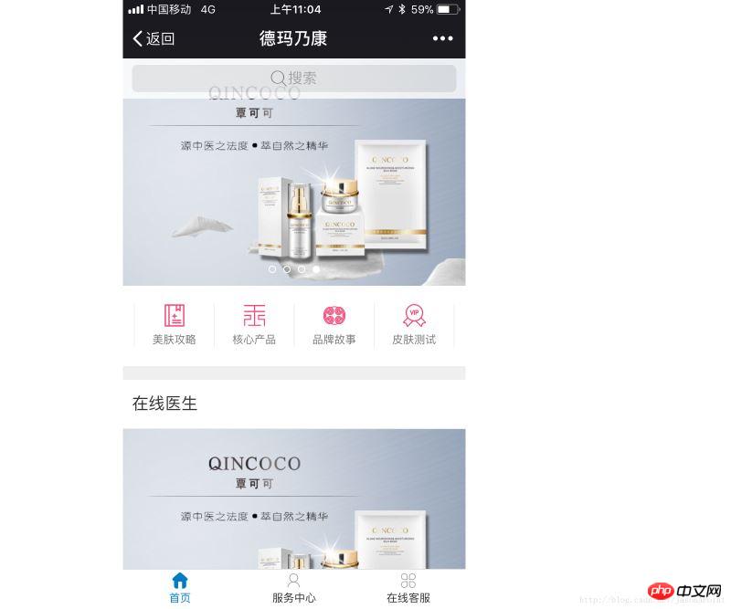
このような検索ボックスを作成するには、技術的なキーは次のとおりです:
検索ボックスの位置を固定する
不透明度を設定する
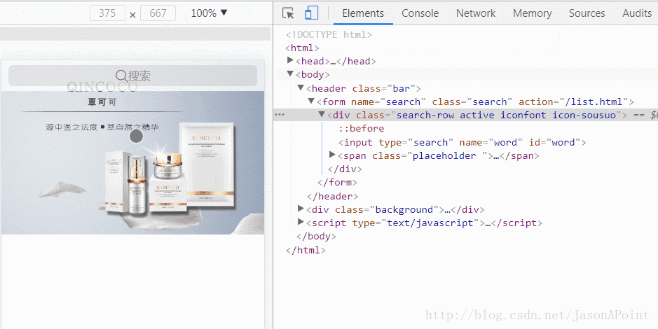
まず、HTML フラグメントを定義します。
<!-- 搜索框 -->
<header class="bar">
  <form name="search" class="search" id="search" action="">
    <p class="search-row">
      <input type="search" name="word" id="word">
      <span class="placeholder "><span class="iconfont icon-sousuo"></span><span class="text">搜索</span></span>
    </p>
  </form>
</header>
<!-- 一个背景图 实际上这里往往是轮播图 -->
<p class="background">
  <img src="bg.jpg">
</p>
ヘッダーのラベルは検索ボックス、下のpは背景画像です。
添付の CSS スタイル:
<style type="text/css">
body {
margin: 0; padding: 0;
font-size: 14px; font-family: "microsoft yahei",'Arial', 'Verdana','Helvetica', sans-serif;
}
.bar {
position: fixed; top: 0; left: 0; right: 0; /* 决定了搜索框置顶 */
height: 44px; padding: 0 10px;
background-color: #fff; opacity: 0.8; /* 搜索框半透明效果 */
z-index: 10;
}
.bar form {
display: block; padding: 0;margin: 0;
}
.search-row {
position: relative;
height: 30px; padding: 7px 0;
}
.search-row input[type=search] {
position: absolute; top: 7px;
height: 30px; line-height: 21px; width: 100%; padding: 10px 15px 10px 30px;
border: 0; border-radius: 6px; outline: 0; background-color: rgba(0,0,0,0.1);
font-size: 16px; text-align: center;
z-index: 100;
}
.search-row .placeholder {
position: absolute; top: 2px; left: 0; right: 0;
display: inline-block; height: 34px; line-height: 34px;
border: 0; border-radius: 6px;
font-size: 16px; text-align: center; color: #999;
z-index: 1;
}
.search-row .placeholder .iconfont {
display: inline-block; width: 19px; line-height: 24px; padding: 10px 0;
font-size: 21px; color: #666;
}
.search-row .placeholder .text {
line-height: 40px;
vertical-align: top;
}
.background img {
width: 100%;
}
.active:before {
position: absolute; top: 11px; left: 5px; right: auto;
display: block; margin-right: 0;
font-size: 21px;
}
.active input[type=search] {
text-align: left
}
.active .placeholder{
display: none
}
</style>非常に長い CSS スタイルですが、その中心は 2 つの文です: /* 上部の検索ボックスを決定します*/ と、背景色: #fff; : 0.8; /* 検索ボックスの半透明効果*/、その他のスタイルはページ レイアウト用であり、レイアウトの詳細を読者が記述して理解する必要があり、プロセスに時間がかかる場合があります。
このようにして、静的検索ボックスが完成しました:
注: ここの検索アイコンは iconfont を使用しており、読者は iconfont ベクトル アイコン ライブラリからダウンロードできます。
この時点では、JS を介していくつかのアニメーション効果を実装する必要があります。
は、ユーザーが入力を切り替えるときに「検索」位置アイコンを切り替えるために使用されます。原理は非常に簡単です。これらのクラスはスタイルを定義します。
.active:before {
  position: absolute; top: 11px; left: 5px; right: auto;
  display: block; margin-right: 0;
  font-size: 21px;
}
.active input[type=search] {
  text-align: left
}
.active .placeholder{
  display: none
}
<script type="text/javascript">
/* 输入框获取到焦点 表示用户正在输入 */
$("#word").focusin(function() {
  $(".search-row").addClass("active iconfont icon-sousuo");
});
/* 输入框失去焦点 表示用户输入完毕 */
$("#word").focusout(function() {
  /* 判断用户是否有内容输入 */
  if ($(this).val()=="") {
    /* 没有内容输入 改变样式 */
    $(".search-row").removeClass("active iconfont icon-sousuo");
  } else {
    /* 有内容输入 保持样式 并提交表单 */
    $("#search").submit();
  }
});
</script>
注: ここでは jQuery を導入する必要があります。忘れないでください。
完全なHTMLコード:
<style type="text/css"> body { margin: 0; padding: 0; font-size: 14px; font-family: "microsoft yahei",'Arial', 'Verdana','Helvetica', sans-serif; } .bar { position: fixed; top: 0; left: 0; right: 0; /* 决定了搜索框置顶 */ height: 44px; padding: 0 10px; background-color: #fff; opacity: 0.8; /* 搜索框半透明效果 */ z-index: 10; } .bar form { display: block; padding: 0;margin: 0; } .search-row { position: relative; height: 30px; padding: 7px 0; } .search-row input[type=search] { position: absolute; top: 7px; height: 30px; line-height: 21px; width: 100%; padding: 10px 15px 10px 30px; border: 0; border-radius: 6px; outline: 0; background-color: rgba(0,0,0,0.1); font-size: 16px; text-align: center; z-index: 100; } .search-row .placeholder { position: absolute; top: 2px; left: 0; right: 0; display: inline-block; height: 34px; line-height: 34px; border: 0; border-radius: 6px; font-size: 16px; text-align: center; color: #999; z-index: 1; } .search-row .placeholder .iconfont { display: inline-block; width: 19px; line-height: 24px; padding: 10px 0; font-size: 21px; color: #666; } .search-row .placeholder .text { line-height: 40px; vertical-align: top; } .background img { width: 100%; } .active:before { position: absolute; top: 11px; left: 5px; right: auto; display: block; margin-right: 0; font-size: 21px; } .active input[type=search] { text-align: left } .active .placeholder{ display: none } </style> <!-- 搜索框 --> <header class="bar"> <form name="search" class="search" id="search" action=""> <p class="search-row"> <input type="search" name="word" id="word"> <span class="placeholder "><span class="iconfont icon-sousuo"></span><span class="text">搜索</span></span> </p> </form> </header> <!-- 一个背景图 实际上这里往往是轮播图 --> <p class="background"> <img src="bg.jpg"> </p>
以上がHTMLモバイル端末での固定フローティング半透明検索ボックスの実装方法の紹介の詳細内容です。詳細については、PHP 中国語 Web サイトの他の関連記事を参照してください。