
ホームページ >ウェブフロントエンド >CSSチュートリアル >純粋な CSS3 を使用して 26 個の英字を描画する方法の詳細な例
純粋な CSS3 を使用して 26 個の英字を描画する方法の詳細な例

- 黄舟オリジナル
- 2017-07-22 10:03:462369ブラウズ
ここで見られる 26 個の標準的な英語の文字は、普通のフォントではありませんそれらは純粋な CSS 作業を使用して空白のページに描画されます。主にCSS3の新しい変換機能を複数使用しているため、閲覧には最新のブラウザが必要です。
Webページのコード(34467b06d1ac5f22a860050ddb417637 5394c6c8e809abcc537d01446c269fb2)およびpマージンの設定とフローティングで使用されます。 (
マージン:20px) 5px 10px 80px; フロート: 左;)。マージンの 4 つのピクセルは、上、右、下、左を表します。 以下は26文字をアルファベット順に描画するCSSの一覧です。
   .A{
      position:relative;
      margin:10px 30px 10px 5px;  /*上右下左 */
      float: left;
      left:30px;
      width:60px;
      height:91px;
      border-bottom:solid 14px #0feee2;
    }
    .A:before{
      transform:skew(-19deg,0);
      position:absolute;
      content:'';
      top:12.5px;
      left:0;
      width:16px;
      height:125px;
      background-color:#0feee2;
    }
    .A:after{
      transform:skew(19deg,0);
      position:absolute;
      content:'';
      top:12.5px;
      left:45px;
      width:16px;
      height:125px;
      background-color:#0feee2;
    }
  .B{
      position:relative;
      margin:10px 20px 10px 30px;
      float: left;
      top:12.5px;
      left:10px;
      width:60px;
      height:125px;
      border-left:solid 16px #2056cd;
    }
    .B:before{
      position:absolute;
      content:'';
      width:52px;
      height:39px;
      border-width:15px 15px 10px 0;
      border-color:#2056cd;
      border-style:solid;
      border-radius:0 240%180%0 /0 180%180%0;
   }
   .B:after{
      position:absolute;
      content:'';
      bottom:0;
      width:58px;
      height:43px;
      border-width:10px 15px 15px 0;
      border-color:#2056cd;
      border-style:solid;
      border-radius:0 180%220%0 /0 180%180%0;
     }
.C{
position:relative;
margin:10px 5px 10px 10px;
float: left;
top:12.5px;
left:10px;
width:84px;
height:95px;
border-width:15px 12px 15px 16px;
border-color:#87adef;
border-style:solid;
border-radius:50%;
}
.C:before{
transform:rotate(45deg);
position:absolute;
content:'';
top:2px;
left:49px;
width:90px;
height:90px;
background-color:#ffffff;
}
  .D{
       position:relative;
       margin:10px 20px 10px 5px;
       float: left;
       top:12.5px;
       left:10px;
       border-left:solid 15px #ade081;
       height:125px;
     }
     .D:before{
       position:absolute;
       content:'';
       top:0;
       left:0;
       width:60px;
       height:95px;
       border-width:15px 15px 15px 0;
       border-color:#ade081;
       border-style:solid;
       border-radius:0 300%300%0 /0 180%180%0;
} 
   .E{
        position:relative;
        margin:10px 10px 10px 60px;
        float: left;
        top:12.5px;
        left:10px;
        width:63px;
        height:95px;
        border-width:15px 0 15px 16px;
        border-color:#cd2388;
        border-style:solid;
      }
      .E:before{
        position:absolute;
        content:'';
        top:38px;
        left:0px;
        width:53px;
        height:15px;
        background-color:#cd2388;
      }

  .V{
     position:relative;
     margin:10px 5px 10px 5px;
     float: left;
     top:12.5px;
     left:30px;
     width:59px;
    }
    .V:before{
     transform:skew(18deg,0);
     position:absolute;
     content:'';
     top:0;
     left:0;
     height:125px;
     border-left:solid 16px #008800;
   }
   .V:after{
     transform:skew(-18deg,0);
     position:absolute;
     content:'';
     top:0;
     right:0;
     height:125px;
     border-left:solid 16px #008800;
   }

   .W{
     position:relative;
     margin:10px 5px 10px 40px;
     float: left;
     top:12.5px;
     left:25px;
     width:100px;
    }
    .W:before{
     transform:skew(11deg,0);
     position:absolute;
     content:'';
     top:0;
     left:0;
     width:42px;
     height:125px;
     border-width:0 13px 0 15px;
     border-color:#000000;
     border-style:solid;
    }
    .W:after{
     transform:skew(-11deg,0);
     position:absolute;
     content:'';
     top:0;
     right:0;
     width:42px;
     height:125px;
     border-width:0 15px 0 13px;
     border-color:#000000;
     border-style:solid;
    }

  .X{
     position:relative;
     margin:10px 5px 10px 25px;
     float: left;
     top:12.5px;
     left:50px;
     width:16px;
     height:125px;
    }
    .X:before{
     transform:skew(32deg,0);
     position:absolute;
     content:'';
     top:0;
     left:0;
     width:16px;
     height:125px;
     background-color:#0066ff;
    }
    .X:after{
     transform:skew(-32deg,0);
     position:absolute;
     content:'';
     top:0;
     right:0;
     width:16px;
     height:125px;
     background-color:#0066ff;
} 
  .Y{
     position:relative;
     margin:10px 5px 10px 80px;
     float: left;
     top:92.5px;
     left:52px;
     width:16px;
     height:50px;
     background-color:#22ff55;
    }
    .Y:before{
     transform:skew(28deg,0);
     position:absolute;
     content:'';
     top:-80px;
     left:-21px;
     width:16px;
     height:80px;
     background-color:#22ff55;
    }
    .Y:after{
     transform:skew(-28deg,0);
     position:absolute;
     content:'';
     top:-80px;
     right:-21px;
     width:16px;
     height:80px;
     background-color:#22ff55;
} 
  .Z{
     position:relative;
     margin:20px 5px 10px 80px;
     float: left;
     top:12.5px;
     left:10px;
     width:90px;
     height:95px;
     border-width:15px 0 15px 0;
     border-color:#336699;
     border-style:solid;
    }
    .Z:before{
     transform:skew(-37deg,0);
     position:absolute;
     content:'';
     top:0;
     left:36px;
     width:18px;
     height:95px;
     background-color:#336699;
    }
完整的HTML5+CSS3版Demo。
效果截图:
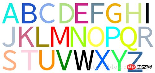
CSS3绘制26个字母
以上が純粋な CSS3 を使用して 26 個の英字を描画する方法の詳細な例の詳細内容です。詳細については、PHP 中国語 Web サイトの他の関連記事を参照してください。