
ホームページ >ウェブフロントエンド >htmlチュートリアル >HTMLでアニメーション画像を実装 - ドラえもん
HTMLでアニメーション画像を実装 - ドラえもん

- 零下一度オリジナル
- 2017-06-24 11:39:245817ブラウズ
誰もが子供の頃、小さなお腹に素晴らしいドラえもんが詰まっていて、無力で悲しいときにそばにいてくれるドラえもん、無力で悲しいときに一緒にいてくれるドラえもんを持っていると思います。いっぱい考えて、どら焼きを一緒に食べましょう〜 今日は心の中にドラえもんを描きます〜
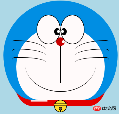
ドラえもんを定義するコンテナ
-
まず、ドラえもんを描くための大きなコンテナを定義し、そのサイズを決定しますそして位置。
<!-- 哆啦A梦大容器 --><div class="doa"></div>
/*哆啦A梦*/
  .doa{position: relative;top: 100px;}
ドラえもんの頭を描きます (顔を含む、顔には目と鼻が含まれます)
頭にはいくつかの部分が含まれています: ドラえもんの顔と鼻、顔には目が 2 つあり、中には目玉と白目がありますもちろん、基本的なグラフィックスはすべて div+border-radius で構成されます。
描画されたアイテムのさまざまな部分を、対応する位置に配置するだけです。
-
私が以前に描いたいくつかの絵を見れば、border-radius が非常に一般的に使用される属性であることがわかるでしょう。実際、border-radius の本当の顔は
border-radius: 300px 300px 300px 300px/300px 300px 300px 300px;であるはずです。紫 通常、スラッシュ以降の内容が書かれていない場合、スラッシュ部分は横の長さ、スラッシュ部分は縦の高さになります。 デフォルトでは、前部のスラッシュの後に何も書かれていない場合、横と縦のサイズは同じになります。 。私の言ったことは十分に詳しくないことは承知しています。Xinshen のブログ「When Will Autumn Moon Come?」を参照してください。CSS3 ボーダー半径についてどれくらい知っていますか?経験豊富なドライバーの指導により、数分で境界半径を完全に理解できるようになります。すぐにバスに乗ってはいかがでしょうか。<!-- 头 --> <div class="head"> <!-- 存放脸部的容器 --> <div class="face"> <!-- 左眼大圈儿 --> <div> <!-- 左眼眼珠(黑色部分) --> <div> <!-- 左眼眼白,黑色里面的白色部分 --> <div></div> </div> </div> <!-- 右眼大圈儿 --> <div> <!--右眼眼珠(黑色部分) --> <div> <!-- 右眼眼白,黑色里面的白色部分 --> <div></div> </div> </div> </div> <!-- 红鼻子部分 --> <div class="nose"> <!-- 红鼻子里面的白圈儿 --> <div></div> </div> <!-- 红鼻子下面的那根黑线,也属于鼻子部分 --> <div class="nose1"></div> </div> .head{ margin: 0 auto; /*头部定义大小并居中显示*/ width: 400px; height: 350px; background: #008ee3; /*头部定义背景颜色*/ position: relative; border-radius: 50% 50% 25% 25% / 55% 55% 45% 45%; /*头部定义四个方向圆角大小*/ } .face{ width: 310px; /*脸部定义大小*/ height: 260px; background: snow; /*脸部定义背景颜色*/ border-radius: 50% 50% 25% 25% / 55% 55% 45% 45%; /*脸部定义四个方向的圆角大小*/ position: relative; /*脸部定义位置,是相对于head的位置*/ top: 90px; left: 45px; } /*左眼眶*/ .face>div:first-child{ width: 80px; /*左眼框定义大小*/ height: 100px; border-radius: 50%; /*左眼框定义与圆角大小*/ border:2px #000 solid; /*定义外边框*/ background: snow; float: left; /*为了使左右两个眼睛能在一排显示*/ position: relative; /*位置是相对于face的位置*/ top:-40px; left: 71px; z-index: 50; } /*右眼眶,画法跟左眼一样*/ .face>div:last-child{ width: 80px; height: 100px; border-radius: 50%; border:2px #000 solid; background: snow; float: left; position: relative; top:-40px; left: 71px; z-index: 50; } /*左眼珠1*/ .face>div:first-child div{ width: 20px; /*定义眼珠的大小*/ height: 25px; background: #000; border-radius: 50%; position: absolute; /*定义眼珠的位置,相对于眼眶的位置*/ top: 45px; left: 60px; } /*左瞳孔*/ .face>div:first-child div div{ width: 10px; /*定义黑色瞳孔的大小*/ height: 10px; background: #ffffff; border-radius: 50%; position: absolute; /*定义黑色瞳孔的位置,相对于眼珠的位置*/ top: 7px; left: 10px; } /*右眼珠和左眼珠画法一样*/ .face>div:last-child div{ width: 20px; height: 25px; background: #000; border-radius: 50%; position: absolute; top: 45px; } /*右瞳孔和左瞳孔的画法一样*/ .face>div:last-child div div{ width: 10px; height: 10px; background: #ffffff; border-radius: 50%; position: absolute; top: 7px; } .nose{ width: 30px; /*定义红鼻子的大小*/ height: 30px; border-radius: 50%; background: #c70000; position: absolute; top: 130px; left: 50%; margin-left: -15px; z-index: 10; } .nose div{ width: 10px; /*定义红鼻子里面白色圈圈的大小*/ height: 10px; border-radius: 50%; position: absolute; background: #ffffff; top: 10px; margin-left: 20px; z-index: 10; } .nose1{ width: 2px; /*定义红鼻子下面的那一条黑线*/ height: 130px; background: #000; position: absolute; top: 160px; left: 50%; margin-left: -1px; z-index: 10; }
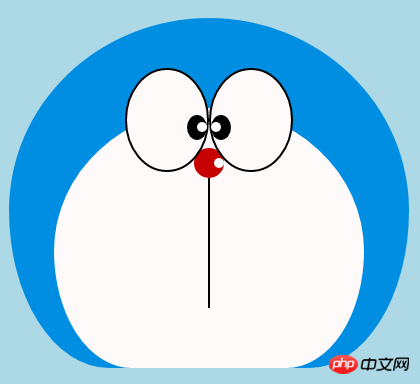 ドラえもんの頭.png
ドラえもんの口を描きます
-
口は、border+border-radius を使用して実装されていることが一目でわかります。
<div class="mouth"></div>
.mouth{      width: 250px;   /*定义嘴巴的大小*/      height: 200px;      border-radius: 50%;      background: snow;      border-bottom: 2px #000 solid;      margin: -230px auto;      position: relative;  /*定义嘴巴的位置*/
  }
ドラえもんの口.png
ドラえもんのひげ部分を描く
-
前回の記事で実際にアニメーションを作成するためのHTMLを描いてみました【連載3】 - 子猫 ひげの描き方はすでに紹介済みですスマイリーアニメーションでひげを描くときと同じなので、ここでは詳しく説明しません。基本的な考え方は同じです。
<!-- 胡须 -->
  <div class="beard">
  <!-- 左边胡须部分 -->
      <div class="left">
      <!-- 第一根胡须 -->
          <div></div>
          <!-- 第二根胡须 -->
          <div></div>
          <!-- 第三根胡须 -->
          <div></div>
      </div>
      <div class="right">
          <div></div>
          <div></div>
          <div></div>
      </div>
      <!-- 脖子部分的小白条部分 -->
      <span></span>
  </div>/*胡须样式*/.beard .left div:first-child{      width: 120px;      height: 40px;      border-top: 2px #000 solid;      border-radius: 10% 90% 10% 90% / 10% 90% 10% 90%;      position: absolute;      left: 50%;      top: 140px;      margin-left: -170px;      z-index: 100;
  }  .beard .left div:nth-child(2){      width: 120px;      height: 40px;      border-top: 2px #000 solid;      border-radius: 10% 90% 10% 90% / 30% 70% 40% 60%;      position: absolute;      left: 50%;      top: 170px;      margin-left: -170px;      z-index: 100;
  }  .beard .left div:last-child{      width: 120px;      height: 40px;      border-top: 2px #000 solid;      border-radius: 10% 90% 10% 90% / 40% 60% 10% 90%;      position: absolute;      left: 50%;      top: 200px;      margin-left: -170px;      z-index: 100;
  }  .beard .right div:first-child{      width: 120px;      height: 40px;      border-top: 2px #000 solid;      border-radius: 90% 10% 90% 10% / 90% 10% 90% 10%;      position: absolute;      left: 50%;      top: 140px;      margin-left: 50px;      z-index: 100;
  }  .beard .right div:nth-child(2){      width: 120px;      height: 40px;      border-top: 2px #000 solid;      border-radius: 90% 10% 90% 10% / 70% 30% 60% 40%;      position: absolute;      left: 50%;      top: 170px;      margin-left: 50px;      z-index: 100;
  }  .beard .right div:last-child{      width: 120px;      height: 40px;      border-top: 2px #000 solid;      border-radius: 90% 10% 90% 10% / 60% 40% 90% 10%;      position: absolute;      left: 50%;      top: 200px;      margin-left: 50px;      z-index: 100;
  }  .beard span{      display: block;      width: 60px;      height: 3.5px;      background: #ffffff;      border-radius: 4px;      position: absolute;      top: 352px;      left: 50%;      margin-left: -105px;
  }
ドラえもんのひげ.png
ドラえもんの首の部分を描きます(首の部分には鈴も含まれています)
首は基本的なdiv変形後の形で、余分な部分は隠しています。頭の下に。
-
ベル部分は非常にシンプルな基本グラフィックで構成されています。
<!-- 脖 -->
  <div class="neck">
  <!-- 铃铛的圆形 -->
      <div></div>
      <!-- 铃铛的小圆角矩形 -->
      <div></div>
      <!-- 铃铛的小圆形 -->
      <div></div>
      <!-- 铃铛的小竖线 -->
      <div></div>
  </div>
.neck{      width: 330px;      height: 200px;      border-radius: 50% 50% 20% 20% / 50% 50% 50% 50%;      background: #e30000;      margin: 80px auto;      z-index: 100;
  }  .neck div:first-child{      border: 2px #000 solid;      border-radius: 50%;      width: 40px;      height: 40px;      background: #ffdd2e;      position: absolute;      top: 350px;      left: 50%;      margin-left: -22px;      transition: all 1s;
  }  .neck div:nth-child(2){      border: 2px #000 solid;      width: 44px;      height: 5px;      background: #ffdd2e;      position: absolute;      left: 50%;      margin-left: -24px;      top: 363px;      border-radius: 5px;      transition: all 1s;
  }  .neck div:nth-child(3){      width: 8px;      height: 8px;      border: 2px #000 solid;      position: absolute;      background: #6c5844;      border-radius: 50%;      left: 50%;      margin-left: -6px;      top: 375px;      transition: all 1s;
  }  .neck div:nth-child(4){      width: 2px;      height: 8px;      background: #000;      position: absolute;      left: 50%;      margin-left: -1px;      top: 385px;      transition: all 1s;
  }
ドラえもんの首.png
ドラえもんのダイナミックなエフェクトを完成させましょう
ドラえもんは動くともっとかわいいですよね、それなら動かしましょう 動きましょう(遷移属性)。
マウスを目の領域に移動し、左の眼球を左に移動します。
マウスを口に動かすと表情が変わります。
-
マウスをベル部分に移動すると、ベルが大きくなります。
/*眼睛动效*/.head:hover .face>div:first-child div{      left: 0px;      transition: all 1s;
  }  .head:hover .face>div:first-child div div{      left: 0px;      transition: all 1s;
  }/*嘴巴动效,嘴巴的dom容器下面要加了个空的div容器*/.mouth div:first-child{      width: 82px;      height: 2px;      background: #000;      position: absolute;      z-index: 1000;      top: -25px;      left: 6px;      display: none;
  }  .mouth div:nth-child(2){      width: 82px;      height: 2px;      background: #000;      position: absolute;      z-index: 1000;      top: -25px;      left: 90px;      display: none;
  }  .mouth:hover{      border-radius: 0;      width: 180px;      height: 200px;
  }  .mouth:hover div:first-child,.mouth:hover div:nth-child(2){      display: block;
  }/*铃铛动效*/.neck:hover div:first-child{      width: 60px;      height: 60px;      left: 50%;      margin-left: -30px;
  }  .neck:hover div:nth-child(2){      width: 66px;      height: 7.5px;      left: 50%;      margin-left: -33px;
  }  .neck:hover div:nth-child(3){      width: 12px;      height: 12px;      left: 50%;      margin-left: -6px;      top: 385px;
  }  .neck:hover div:nth-child(4){      width: 2px;      height: 12px;      left: 50%;      margin-left: 1px;      top: 400px;
  }
ドラえもんanimation.gif
以上がHTMLでアニメーション画像を実装 - ドラえもんの詳細内容です。詳細については、PHP 中国語 Web サイトの他の関連記事を参照してください。