
ホームページ >バックエンド開発 >Python チュートリアル >Python'のMatplotlibライブラリの紹介
Python'のMatplotlibライブラリの紹介

- Joseph Gordon-Levittオリジナル
- 2025-02-27 09:26:10430ブラウズ
出版対象のグラフの作成は、研究者にとって重要です。 さまざまなツールが存在しますが、視覚的に魅力的な結果を達成することは困難です。 このチュートリアルでは、Pythonのmatplotlib
matplotlibWebサイトが次のように述べているように、「matplotlibは、プラットフォーム全体でさまざまな形式で出版物質の数値を生成するPython 2Dプロットライブラリです。」 汎用性が高く、スクリプト、シェル、Webアプリケーション、およびさまざまなGUIツールキットで使用可能です。
このガイドは、
matplotlibインストール
matplotlibインストールは簡単です。 を使用して(他の方法が存在します。詳細については、
pip
matplotlib
<code class="language-bash">curl -O https://bootstrap.pypa.io/get-pip.py
python get-pip.py
pip install matplotlib</code>
を使用して、Matlabのようなインターフェイスを提供します
1。ラインプロット
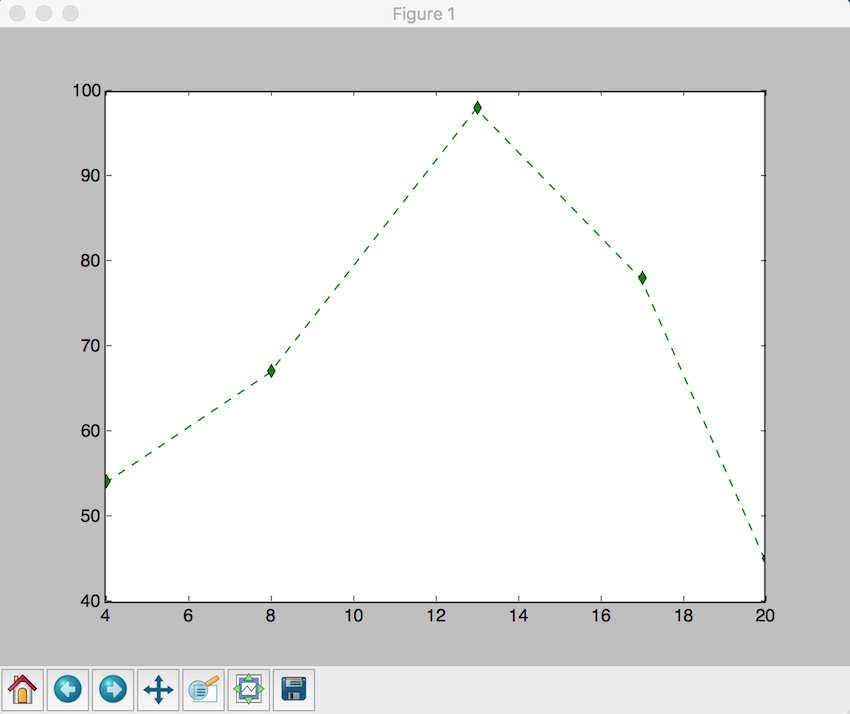
ポイントをプロットすることを検討してください:matplotlib.pyplot、
x = (4, 8, 13, 17, 20)ニューヨーク市の平均降雨量を視覚化しましょう:y = (54, 67, 98, 78, 45)
<code class="language-python">import matplotlib.pyplot as plt
plt.plot([4, 8, 13, 17, 20], [54, 67, 98, 78, 45], 'g--d') # Green dashed line with diamond markers
plt.show()</code>
2。散布図
<code class="language-python">month = ["Jan", "Feb", "Mar", "Apr", "May", "Jun", "Jul", "Aug", "Sep", "Oct", "Nov", "Dec"]
rainfall = [83, 81, 97, 104, 107, 91, 102, 102, 102, 79, 102, 91]
plt.plot(month, rainfall)
plt.xlabel("Month")
plt.ylabel("Rainfall (mm)")
plt.title("Average Rainfall in New York City")
plt.show()</code>
2つのデータセット間の関係を説明するには、

3。ヒストグラム
<code class="language-python">x = [2, 4, 6, 7, 9, 13, 19, 26, 29, 31, 36, 40, 48, 51, 57, 67, 69, 71, 78, 88]
y = [54, 72, 43, 2, 8, 98, 109, 5, 35, 28, 48, 83, 94, 84, 73, 11, 464, 75, 200, 54]
plt.xlabel('x-axis')
plt.ylabel('y-axis')
plt.title('Scatter Plot')
plt.grid(True)
plt.scatter(x, y, c='green')
plt.show()</code>
ヒストグラムはデータの頻度分布を視覚化します:

結論
<code class="language-python">x = [2, 4, 6, 5, 42, 543, 5, 3, 73, 64, 42, 97, 63, 76, 63, 8, 73, 97, 23, 45, 56, 89, 45, 3, 23, 2, 5, 78, 23, 56, 67, 78, 8, 3, 78, 34, 67, 23, 324, 234, 43, 544, 54, 33, 223, 443, 444, 234, 76, 432, 233, 23, 232, 243, 222, 221, 254, 222, 276, 300, 353, 354, 387, 364, 309]
num_bins = 6
n, bins, patches = plt.hist(x, num_bins, facecolor='green')
plt.xlabel('X-Axis')
plt.ylabel('Y-Axis')
plt.title('Histogram')
plt.show()</code>
研究者は、視覚的に魅力的で出版対象のグラフを効率的に作成できるようにします。使いやすさと広範なカスタマイズオプションにより、データの視覚化のための貴重なツールになります。 さらなる機能については、 ドキュメントと例を調べてください。
以上がPython&#39;のMatplotlibライブラリの紹介の詳細内容です。詳細については、PHP 中国語 Web サイトの他の関連記事を参照してください。
声明:
この記事の内容はネチズンが自主的に寄稿したものであり、著作権は原著者に帰属します。このサイトは、それに相当する法的責任を負いません。盗作または侵害の疑いのあるコンテンツを見つけた場合は、admin@php.cn までご連絡ください。
前の記事:Pythonのヒストグラム均等化次の記事:Pythonのヒストグラム均等化