
ホームページ >ウェブフロントエンド >CSSチュートリアル >CSS @starting-style を使用してダイアログとポップオーバー要素をアニメーション化する
CSS @starting-style を使用してダイアログとポップオーバー要素をアニメーション化する

- WBOYWBOYWBOYWBOYWBOYWBOYWBOYWBOYWBOYWBOYWBOYWBOYWBオリジナル
- 2024-07-31 02:28:13935ブラウズ
Rahul Chodde 著✏️
ネイティブ ダイアログとポップオーバー要素には、現代のフロントエンド Web 開発において明確に定義された独自の役割があります。ダイアログ要素はユーザーと通信してユーザーの入力を収集することが知られていますが、ポップオーバーは優先度の低い二次情報をユーザーに提供することに適しています。
ダイアログとポップオーバーに関する前回の記事では、これらの要素の両方に専用の JavaScript API があり、これら 2 つの要素を最大限に活用できることについて説明しました。
これらの要素にアニメーションやインタラクティブ性を追加する場合は、CSS よりも JavaScript ライブラリが優先されます。通常、このような要素には最小限のアニメーションが必要ですが、単純な効果をいくつか追加するためだけに巨大なアニメーション ライブラリを使用すると、アプリの不必要な負荷が大幅に増加する可能性があります。
この問題を解決するために、この記事は純粋な CSS テクニックを使用してダイアログやポップオーバーにアニメーション効果をコーディングするのに役立ちます。 CSS キーフレームと新しく導入された @starting-style at-rule について説明します。どちらも、パフォーマンスを向上させて微妙なアニメーションを作成するために使用できます。
オーバーレイ要素のアニメーション化に関する問題
ダイアログとポップオーバーはオーバーレイ要素です。つまり、ブラウザによってレンダリングされる最上位のレイヤーで動作します。前述したように、これらの要素は、表示やモダリティを管理するために専用の API にも依存します。
従来の CSS トランジション技術を使用してダイアログとポップオーバーをアニメーション化するときに直面する課題を見てみましょう。
表示プロパティへの依存
CSS では一般に、表示のような個別のプロパティをある値から別の値に移行することはできません。これは、表示プロパティでは、トランジションが完了するまでの値の切り替え間の遅延が許可されていないため、トランジションを作成するための標準的な不透明度 0 ~ 100 パーセントのアプローチも機能しないことを意味します。
ダイアログ要素とポップオーバー要素の計算された表示プロパティを調べると、それぞれの要素の API によって提供されるメソッドを使用することを除いて、ブラウザが追加の作業を行わなくても、ブラウザがどのようにインテリジェントにプロパティを管理しているかがわかります。
注: DevTools のポップオーバー要素の計算された表示は、何らかの理由で自動的に更新されません。更新された値を確認するには、別のノードを選択してからポップオーバー ノードを再選択する必要があります。
上に示したように、ダイアログとポップオーバー要素の画面上の表示/非表示は、CSS 表示プロパティを使用してブラウザによって内部的に処理されます。
次のデモは、表示プロパティに対するダイアログ要素とポップオーバー要素の依存関係により、標準の CSS 遷移アプローチがどのように無効になるかを示しています。
CodePen の Rahul (@_rahul) による「ペンの不透明度/可視性トランジションがダイアログとポップオーバーで機能しない」を参照してください。
トランジションを作成するために不透明度と変換に集中する前に、関連する要素が画面上にどのように表示されるかを制御する表示プロパティを最初に考慮する必要があります。
レンダリング前の初期スタイルの欠如
オーバーレイ要素に関するもう 1 つの問題は、初期スタイルが欠如していることです。これは、DOM に動的に追加される要素、または表示プロパティで動的に可視性を制御する要素の適切な移行を保証するために重要です。
要素が Web ページ上でレンダリングされるときにフェードインする必要があるとします。この場合、要素の初期不透明度をゼロに設定し、ページ上で完全にレンダリングされたら 100% に移行する必要があります。通常利用できる唯一の初期状態は要素の現在の状態であり、不透明度がゼロの場合、要素は画面上で消えます。
これを機能的な効果に変えるには、JavaScript を使用してプログラムによる遅延、クラス切り替え、または CSS キーフレーム アニメーションを追加してトランジションのような効果をエミュレートします。
今後のセクションでは、表示プロパティがトランジションをサポートできないことと、レンダリング前の初期要素スタイルが欠如していることに対処する方法を検討します。
個別の CSS プロパティの移行
上で説明したように、ダイアログ要素とポップオーバー要素は画面上での表示プロパティに依存しているため、CSS トランジションを使用してアニメーション化することはほぼ不可能です。
表示プロパティは離散的な性質を持っており、値の間で急激に変化します。たとえば、transition-duration で定義された遅延を考慮せずに、ブロックからなしに変更される可能性があります。これは、不透明度、幅、高さなどの追加値を受け入れるプロパティで見られるように、そのような値の間には論理的な中間状態が存在しないためです。
離散プロパティを CSS トランジションと互換性を持たせるために、transition-behavior と呼ばれる新しいトランジション プロパティが導入されました。これにより、特に数値形式で加算値を持たない離散要素に対して、トランジションを特定の方法で動作させることができます。ピクセル、またはパーセンテージ。
allow-discrete 動作では、値間をスムーズに遷移するのではなく、指定された遷移期間が経過するまで、ある離散値から別の値への変更を延期します。
.dynamic-display {
  transition: opacity 0.5s, translate ..., display 0.5s allow-discrete;
  ...
}
上記のスニペットでは、allow-discrete 動作により、表示値が突然切り替わるのではなく、transition-duration で指定されたとおりに 0.5 秒待機することが保証されます。
離散値の切り替えにかかる遅延により、加算値を持つ他のプロパティの遷移がジョブを完了するのに十分な時間をかけることができます。
CodePen で Rahul (@_rahul) による動作中のペンの許可離散遷移動作を参照してください。
許可離散遷移の動作により、レンダリングまたは表示が動的に管理される要素に終了遷移を追加する方法がわかりました。ただし、プリレンダー スタイルが存在しない場合、エントリ トランジションは機能しません。次のいくつかのセクションでは、エントリ トランジションを追加するためのいくつかのテクニックを説明します。
CSS キーフレームを使用したダイアログとポップオーバーのアニメーション化
これまで、動的に追加および管理される要素に終了遷移を組み込む方法を学習しました。次に、同じ手法をダイアログとポップオーバーに適用します。
開始アニメーションと終了アニメーションの両方を宣言することから始めて、表示に関係なく、任意の要素にトランジションのエントリ ポイントの一部を追加する場合に CSS キーフレームがどのように効果的であるかを調べてみましょう。
CSSキーフレームを使用したエントリアニメーションの追加
CSS キーフレームを使用して要素の開始スタイルを模倣するのは簡単です。まず、要素とダイアログ要素の背景の両方に開始アニメーションと終了アニメーションを追加します。
いくつかの CSS キーフレームを追加して、要素の微妙なフェードインおよびフェードアウト アニメーションを作成しましょう。要素のキーフレームとそれぞれの背景 (疑似要素) を個別に定義する必要があることに注意してください。
/* Keyframes for dialog and popover elements */
@keyframes fadeIn {
  from { opacity: 0 }
  to { opacity: 1 }
}
@keyframes fadeOut {
  from { opacity: 1 }
  to { opacity: 0 }
}

/* Keyframes for the backdrop pseudo-element */
@keyframes backdropFadeIn {
  from { background: hsl(0 0% 0% / 0%) }
  to { background: hsl(0 0% 0% / 50%) }
}
@keyframes backdropFadeOut {
  from { background: hsl(0 0% 0% / 50%) }
  to { background: hsl(0 0% 0% / 0%) }
}
要素のさまざまな部分で上記のアニメーション キーフレームを使用できるようになりました。次のコード スニペットに示すように、[open] 属性と :popover-open 疑似クラスを使用して、ダイアログとポップオーバーの開いた状態をターゲットにすることもできます。
.my-dialog {
  animation: fadeOut 0.5s forwards;
  &::backdrop {
    animation: backdropFadeOut 0.5s forwards;
  }
  &[open] {
    animation: fadeIn 0.5s forwards;
    &::backdrop {
      animation: backdropFadeIn 0.5s forwards;
    }
  }
}

.my-popover {
  animation: fadeOut 0.5s forwards;
  &:popover-open {
    animation: fadeIn 0.5s forwards;
  }
}
上記のコード スニペットを組み合わせてダイアログとポップオーバー要素で使用すると、結果は以下に共有するデモのようになります。このテクニックは開始アニメーションには最適ですが、終了アニメーション部分を完全にスキップします:
CodePen の Rahul (@_rahul) による CSS キーフレームを使用したペン HTML5 ダイアログとポップオーバー エントリ アニメーションを参照してください。
マイクロインタラクションに目がある人なら、ダイアログ ボックスを開くときはフェードインの開始アニメーションがうまく機能することに気づくでしょうが、ダイアログ ボックスを閉じるかキャンセルすると、フェードアウトで終了するアニメーションが機能しないようです。仕事。次のセクションでその理由を学びましょう。
ダイアログとポップオーバーに終了アニメーションを追加する
上記のデモで終了アニメーションが機能しない理由は、ポップオーバー API とダイアログ API によって要素の計算された表示が突然変化するためです。以前、transition-behavior プロパティがトランジションとともに個別の CSS プロパティを管理するのにどのように役立つかについて説明しました。このシナリオでtransition-behaviorプロパティを使用して、問題が解決されるかどうかを確認してみましょう。
CodePen の Rahul (@_rahul) によるペン HTML5 ダイアログと、CSS キーフレームを使用したポップオーバーの入力および終了アニメーションを参照してください。
幸いなことに、allow-discrete 動作を表示プロパティとオーバーレイ プロパティに追加することで、終了アニメーションの問題は解決されました。開始アニメーションと終了アニメーションの両方が正しく動作するようになりました。
運用環境では、このアプローチは、アニメーション宣言のブロックごとに 2 ~ 3 つのベンダー固有のバリエーションを含む、はるかに大きなコードになります。ここで実装した効果はそれほど複雑ではなく、ダイアログとポップオーバー要素がなければ CSS トランジションを使用して実現できたはずです。
CSS キーフレームは、キーフレーム アニメーションの作成を目的としていますが、プリレンダリングの最適化は、そうであるように見えても提供しません。ただし、新しく導入された @starting-style at-rule を使用すると、CSS キーフレーム アニメーションを使用せずにトランジションベースの効果を実現できます。
CSS の @starting-style at-rule とは何ですか?
以前、DOM 依存要素が初期スタイルの移行元となる開始点を必要とする方法について説明しました。それはまさに、新しい @starting-style CSS at-rule が提供するものです。
@starting-style at-rule は、最初のスタイル更新から開始して、遷移要素のプロパティの開始値を宣言するために使用される CSS Transition Level 2 機能です。
The following syntax allows you to specify a starting point for the styles of a given element from which the transition will pick up and operate. The properties included within the selectors of this at-rule should be the ones that will be involved in the associated transitions:
@starting-style {
  .selector {
    opacity: 0;
    ...
  }
}
Try re-rendering the element dynamically in the below demo by pressing the trigger button, and see how straightforward it is to create an entry point for the transitions with @starting-style before the associated elements are rendered:
See the Pen HTML5 Dialog and popover entry & exit animations w/ CSS keyframes by Rahul (@_rahul) on CodePen.
The @starting-style feature is expected to gain solid support across major web browsers, and currently, it is well-supported on Chromium and Webkit-based browsers. See the latest support here.
Dialog and popover transitions using @starting-style
Following the pattern above, we can add subtle animations to dialog and popover elements using the allow-discrete transition behavior and @starting-style.
Before moving ahead, let’s first ensure that we use the allow-discrete behavior for the transition of display and overlay properties. This can be done explicitly by defining the transition-behavior property inside the selectors, or you can combine it in the transition property alongside other transitions as shown below:
.my-dialog,
.my-popover {
  transition: opacity 0.5s, translate 0.5s,
              overlay 0.5s allow-discrete,
              display 0.5s allow-discrete;
  &::backdrop {
    transition: background 0.5s,
                overlay 0.5s allow-discrete,
                display 0.5s allow-discrete;
  }
}
To handle the initial styles for the open state, we should add a @starting-style block and add the properties that are responsible for our transition effect. You don't need to include the display and overlay properties here, as those are already managed by the dialog and popover APIs behind the scenes:
@starting-style {
  .my-dialog[open],
  .my-popover:popover-open {
    opacity: 0;
    transform: translateY(-1em);
  }

  .my-dialog[open]::backdrop {
    background-color: hsl(0 0 0 / 0%);
  }
}
With dialogs and popovers, we have the API advantage to ourselves, which means we can use certain attributes and pseudo-classes like dialog[open] and :popover-open to target the open states:
.my-dialog[open],
.my-popover:popover-open {
  opacity: 1;
  transform: translateY(0);
}

.my-dialog[open]::backdrop {
  background-color: hsl(0 0 0 / 10%);
}
Lastly, you can give the original elements styles that correspond to a closing transition, which is basically the closing state. In other words, keep the dialog element faded out and slid up by default:
.my-dialog,
.my-popover {
  opacity: 0;
  translate: 0 -1em;
}

.my-dialog {
  &::backdrop {
    background-color: transparent;
  }
}
The following demo reflects the outcomes of applying allow-discrete behavior to transitions, defining initial styles with @starting-style, and styling for both open and closed states. Now both the entry and exit animations work smoothly with our dialog and popover elements, and we used less code compared to CSS keyframes:
See the Pen HTML5 Dialog and popover entry & exit animations w/ @starting-style by Rahul (@_rahul) on CodePen.
If you want to remember this sequence of states we covered when constructing the above example, refer to the below graphic which visually illustrates the changes and communication between states: 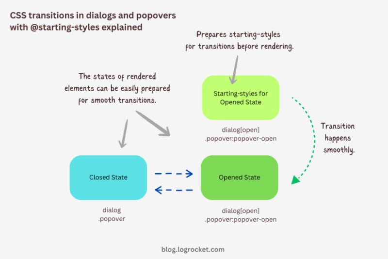
Advanced dialog animations with @starting-style
Let’s take it one step further by implementing different animations for dialog elements. The baseline remains the same: only the properties related to transformations and transitions will change.
Rotating-in-out dialogs
The idea behind creating a stylish rotating dialog box involves playing with the opacity and a couple of CSS transformation properties:
.my-dialog {
  transition: opacity 0.5s, translate 0.5s, rotate 0.5s,
              overlay 0.5s allow-discrete,
              display 0.5s allow-discrete;
}
The starting styles for the open state of the dialog include the following:
- Zero percent opacity to make it initially transparent
- A translation of -50 percent along the x-axis to shift the dialog from the center to the left
- A translation of -100 percent along the y-axis to move the dialog outside the visible viewport
- A rotation of -180 degrees to prepare it for positive rotation when opened
Here’s the code:
@starting-style {
  .my-dialog[open] {
    opacity: 0;
    translate: -50% -100%;
    rotate: -180deg;
  }
}
The closed state resembles the starting styles but with altered translations and rotations to reflect an opposite movement when exiting the dialog element:
.my-dialog {
  /* Previous styles */
  opacity: 0;
  translate: 50% 100%;
  rotate: 180deg;
}
The dialog element in the open state has 100 percent opacity, no translation on either axis, and no rotation, effectively positioning it at the center of the screen:
.my-dialog[open] {
  opacity: 1;
  translate: 0 0;
  rotate: 0deg;
}
The final output looks something like below:
See the Pen HTML5 Dialog and popover rotating animation by Rahul (@_rahul) on CodePen.
Bouncing in-out dialogs
To create a bouncing effect without using CSS keyframe animations, we can utilize a Bezier curve as the transition-timing function for the transformation and opacity transitions of our dialog. We’ll use the scale transformation for this effect.
Feel free to experiment with different x1, y1, x2, and y2 values for the Bezier curve, and implement them in your animation projects:
.my-dialog {
  transition: opacity 0.4s cubic-bezier(0.4, 1.6, 0.4, 0.8),
              scale 0.4s cubic-bezier(0.4, 1.6, 0.4, 0.8),
              overlay 0.4s allow-discrete,
              display 0.4s allow-discrete;
}
Now we can easily determine the starting styles and the open and closed states. The initial styles for the open and closed states will be the same — the dialog box will be scaled down to zero and completely transparent.
In the open state, the dialog box will have 100 percent opacity and be scaled to one. The rest of the transition effects will be handled by the Bezier curve-powered transitions:
@starting-style {
  .my-dialog[open] {
    opacity: 0;
    scale: 0;
  }
}

.my-dialog {
  opacity: 0;
  scale: 0;

  &[open] {
    opacity: 1;
    scale: 1;
  }
}
Here’s how this looks in action:
See the Pen HTML5 Dialog and popover bouncing animation by Rahul (@_rahul) on CodePen.
Sliding and bouncing dialogs
We will use the same Bezier curve in this animation to keep things simple, but the effect will be different compared to the previous one. The idea is to translate the dialogue along the y-axis instead of scaling it, as we did with the last effect:
.my-dialog {
  transition:
    opacity 0.5s cubic-bezier(0.4, 1.6, 0.4, 0.8),
    translate 0.5s cubic-bezier(0.4, 1.6, 0.4, 0.8),
    overlay 0.5s allow-discrete,
    display 0.5s allow-discrete;
}
The idea is to keep the dialog way up the viewport on the y-axis initially. Then, we will transform the dialog to zero when it is opened and finally translate it down the axis:
@starting-style {
  .my-dialog[open] {
    opacity: 0;
    translate: 0 -200%;
  }
}

.my-dialog {
  opacity: 0;
  translate: 0 200%;

  &[open] {
    opacity: 1;
    translate: 0 0;
  }
}
Instead of applying a 100 percent positive or negative translation, I doubled it to create the impression of urgency in the dialog box. See it in action below:
See the Pen HTML5 Dialog and popover slide-up-down bouncing animation by Rahul (@_rahul) on CodePen.
Subtle popover animations with @starting-style
The above effects suit the dialog elements well, but they won’t look great with the popover elements. This section is dedicated to some nice popover animation effects, which make the popover look like popovers and nothing more.
Rising-sinking popover
This effect resembles the popover effect we created initially. In that example, the popover appeared from the top and slide-fading down the y-axis, which isn’t what you’d expect from a popup in the bottom-right corner of the viewport.
Let’s rectify that by adding the same translation on the y-axis for the starting styles and the close state. Everything else remains unchanged:
See the Pen Rising up and down popover animation by Rahul (@_rahul) on CodePen.
Growing and shrinking popover
The process of creating a growing and shrinking effect is simple and involves the use of scale transformation with a twist.
By setting the transformation origin to the absolute bottom-right, we can ensure that the popover expands from the right, aligning with its current position at the bottom-right.
See the Pen Growing and shrinking popover animation by Rahul (@_rahul) on CodePen.
The toast popover
This technique is commonly used to create animations for notification toasts. To achieve this effect, you simply need to translate the popover element 100 percent to the right, putting it out of the viewport. Then, in the open state, you can translate it back to zero to complete the effect.
See the Pen Slide in out from right popover animation by Rahul (@_rahul) on CodePen.
Conclusion
We learned about incorporating CSS transition-based animations in dialog and popover elements using pure CSS. We discussed the complexities and issues of traditional transitioning with overlay elements, and then we addressed these problems one by one using CSS keyframes and, more importantly, the @starting-style at-rule, which is specially developed for transitions.
However, the @starting-style feature is fairly new and not yet available globally. Consequently, using CSS keyframes and the Web Animation API is an option that makes sense in production and provides more granular control over adding animation effects.
Having said that, I recommend the @starting-style approach once it gets adopted widely to keep things simple and lightweight with CSS transition applications.
Is your frontend hogging your users' CPU?
As web frontends get increasingly complex, resource-greedy features demand more and more from the browser. If you’re interested in monitoring and tracking client-side CPU usage, memory usage, and more for all of your users in production, try LogRocket.

LogRocket is like a DVR for web and mobile apps, recording everything that happens in your web app, mobile app, or website. Instead of guessing why problems happen, you can aggregate and report on key frontend performance metrics, replay user sessions along with application state, log network requests, and automatically surface all errors.
Modernize how you debug web and mobile apps — start monitoring for free.
以上がCSS @starting-style を使用してダイアログとポップオーバー要素をアニメーション化するの詳細内容です。詳細については、PHP 中国語 Web サイトの他の関連記事を参照してください。