
ホームページ >ウェブフロントエンド >jsチュートリアル >クリックに応答できる jquery ベースの見事なアニメーション ナビゲーション メニュー events_jquery
クリックに応答できる jquery ベースの見事なアニメーション ナビゲーション メニュー events_jquery

- WBOYWBOYWBOYWBOYWBOYWBOYWBOYWBOYWBOYWBOYWBOYWBOYWBオリジナル
- 2016-05-16 16:32:221368ブラウズ
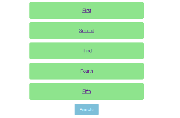
今日は、jquery をベースにした素晴らしいアニメーション ナビゲーション メニューを共有します。このナビゲーション メニューには、最初はページの中央にボタンがあります。ボタンをクリックすると、メニューが左からページに移動します。ボタンをもう一度クリックすると、ナビゲーションが左側のメッセージに移動します。アニメーション効果がとてもクールです。レンダリングを見てみましょう:
HTML コード:
<ul>
<li><a href="http://www.w2bc.com">First</a></li>
<li><a href="http://www.w2bc.com">Second</a></li>
<li><a href="http://www.w2bc.com">Third</a></li>
<li><a href="http://www.w2bc.com">Fourth</a></li>
<li><a href="http://www.w2bc.com">Fifth</a></li>
</ul>
<button>
Animate</button>
<script src='jquery.js'></script>
<script> $('button').on('click', function () {
$('ul').toggleClass('animate');
}); //@ sourceURL=pen.js
</script>
CSSコード:
body
{
text-align: center;
}

ul
{
width: 400px;
padding: 0;
margin: 0 auto;
}
ul.animate li
{
transform: translate(0);
}
ul.animate li:nth-of-type(1)
{
transition-delay: 0.05s;
}
ul.animate li:nth-of-type(2)
{
transition-delay: 0.1s;
}
ul.animate li:nth-of-type(3)
{
transition-delay: 0.15s;
}
ul.animate li:nth-of-type(4)
{
transition-delay: 0.2s;
}
ul.animate li:nth-of-type(5)
{
transition-delay: 0.25s;
}

li
{
list-style: none;
display: block;
padding: 20px;
margin: 12px 0;
border-radius: 5px;
font-family: Helvetica, sans-serif;
color: #fff;
background: #8DE48D;
transform: translate(-500%);
transition: transform 0.75s cubic-bezier(0.175, 0.885, 0.32, 1.08);
}
li:nth-of-type(5)
{
transition-delay: 0.15s;
}
li:nth-of-type(4)
{
transition-delay: 0.3s;
}
li:nth-of-type(3)
{
transition-delay: 0.45s;
}
li:nth-of-type(2)
{
transition-delay: 0.6s;
}
li:nth-of-type(1)
{
transition-delay: 0.75s;
}

button
{
padding: 12px 18px;
border: none;
border-radius: 3px;
color: #fff;
background: #7DBED8;
}
button:focus
{
outline: none;
}
声明:
この記事の内容はネチズンが自主的に寄稿したものであり、著作権は原著者に帰属します。このサイトは、それに相当する法的責任を負いません。盗作または侵害の疑いのあるコンテンツを見つけた場合は、admin@php.cn までご連絡ください。