CSS画像の透明/不透明
CSS画像の透明/不透明
CSSを使用して透明な画像を簡単に作成します。
注: CSS Opacity プロパティは、W3C の CSS3 推奨事項の一部です。
その他の例
透明な画像の作成 - ホバー効果
インスタンス
<!DOCTYPE html>
<html>
<meta charset="utf-8">
<title>php中文网(php.cn)</title>
<head>
<style>
img
{
	opacity:0.4;
	filter:alpha(opacity=40); /* 适用 IE8 及其更早版本 */
}
img:hover
{
	opacity:1.0;
	filter:alpha(opacity=100); /* 适用 IE8 及其更早版本 */
}
</style>
</head>
<body>

<h1>图片透明度</h1>
<p>opacity 属性通常与 :hover 选择器一起使用,在鼠标移动到图片上后改变图片的透明度:</p>
<img src="https://img.php.cn/upload/article/000/000/015/5c6a756568f26867.jpg" width="150" height="113" alt="klematis">
<img src="https://img.php.cn/upload/article/000/000/015/5c6a757f738b2492.jpg" width="150" height="113" alt="klematis">

<p><b>注意:</b>在 IE 中必须声明 <!DOCTYPE> 才能保证 :hover 选择器能够有效。</p>
</body>
</html>
インスタンスの実行 »
オンラインインスタンスを表示するには、[インスタンスの実行]ボタンをクリックしてください
テキストを含む所有物を作成する背景画像用の透明なボックス
例
<!DOCTYPE html>
<html>
<head>
<meta charset="utf-8">
<title>php中文网(php.cn)</title>
<style>
div.background
{
  width: 500px;
  height: 250px;
  background: url(https://img.php.cn/upload/article/000/000/015/5c6a756568f26867.jpg) repeat;
  border: 2px solid black;
}
div.transbox
{
  width: 400px;
  height: 180px;
  margin: 30px 50px;
  background-color: #ffffff;
  border: 1px solid black;
  opacity:0.6;
  filter:alpha(opacity=60); /* For IE8 and earlier */
}
div.transbox p
{
  margin: 30px 40px;
  font-weight: bold;
  color: #000000;
}
</style>
</head>
<body><div class="background">
<div class="transbox">
<p>This is some text that is placed in the transparent box.
This is some text that is placed in the transparent box.
This is some text that is placed in the transparent box.
This is some text that is placed in the transparent box.
This is some text that is placed in the transparent box.
</p>
</div>
</div>
</body>
</html>
例の実行»
オンライン例を表示するには、「例の実行」ボタンをクリックしてください
例 1 - 透明な画像を作成します
プロパティの透明度CSS3ではopacityです。
まず、CSSで透明な画像を作成する方法を紹介します。
通常の画像:

透明度のある同じ画像:

以下のCSSを見てください:
{
opacity:0.4;
filter:alpha(opacity=40); /* IE8 以前 */
}
IE9、Firefox、Chrome、Opera、Safari ブラウザーは、透明度属性を使用して画像を不透明にします。不透明度属性の値の範囲は 0.0 ~ 1.0 です。値が小さいほど要素の透明度が高くなります。
IE8 以前のバージョンではフィルター: alpha (opacity=x) を使用します。 x が取り得る値は 0 ~ 100 です。値を低くすると、要素の透明度が高くなります。
例 2 - 画像の透明度 - ホバー効果
画像の上にマウスを移動します:

CSS スタイル:
{
opacity:0.4;
filter:alpha(opacity = 40) ; /* IE8 以前の場合 */
}
img:hover
{
opacity:1.0;
filter:alpha(opacity=100); /* IE8 以前の場合 */
}
最初の CSS ブロックは例 1 のコードに似ています。さらに、ユーザーがいずれかの画像の上にマウスを移動したときに何が起こるかを追加しました。この場合、ユーザーが画像の上にマウスを置いたときに画像が鮮明になるようにします。
この CSS は次のとおりです: opacity=1.
IE8 以前の使用: filter:alpha(opacity=100).
マウス ポインターが画像から離れると、画像は透明度を取り戻します。 exember 3-透明なボックス内のテキストソースコードは次のとおりです。 {
幅:500ピクセル; 高さ:250px;
背景:url(../style/images/klematis.jpg) 繰り返し;
ボーダー:2px ソリッドブラック;
{
幅:400ピクセル;
幅:400ピクセル;
ボーダー:1 ピクセル黒一色;
不透明度:0.6;div.transbox p
{
マージン:30px 40px;
フォントの太さ:太字;
色:#000000;
}
</style>
</head>
<body>
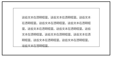
<div class = "background" 透明ボックスに配置されるテキスト。
これは、透明ボックスに配置されるテキストです。
これは、透明なボックスに配置されるテキストです。
これは、透明なボックスに配置されるテキストです。
これは、背景画像を持つ固定の高さと幅の div 要素です。そして国境。次に、最初の div 内に小さな div 要素を作成します。 この div には固定幅、背景色、境界線もあり、透明です。透明な div 内の P 要素内にテキストを追加します。


