javascript - 两张宽度不同高度相同的图片,如何自适应左右布局呢?
有两张宽度不同高度相同的图片,需要自适应左右布局,若是设百分比width,左45%,右55%,两张图片的高度就不同了,怎么通过css实现呢
Maison > Questions et réponses > le corps du texte
有两张宽度不同高度相同的图片,需要自适应左右布局,若是设百分比width,左45%,右55%,两张图片的高度就不同了,怎么通过css实现呢

ringa_lee2017-04-11 12:43:51

<!DOCTYPE html>
<html>
    <head>
        <meta charset="UTF-8">
        <title></title>
    </head>
    <body>
        <p>
            <p class="container_left">
                    <img src="small.png" alt="" />
            </p>
            <p class="container_right">
                    <img src="common.png" alt="" />
                </p>
            </p>
        </p>
    </body>
    <style type="text/css">
        .container_left{
            display: inline-block;
            float: left;
            width: 45%;

        }
        .container_right{
            display: inline-block;
            float: left;
            width: 55%;
        }

        img{
            width: 100%;
        }

    </style>
</html>
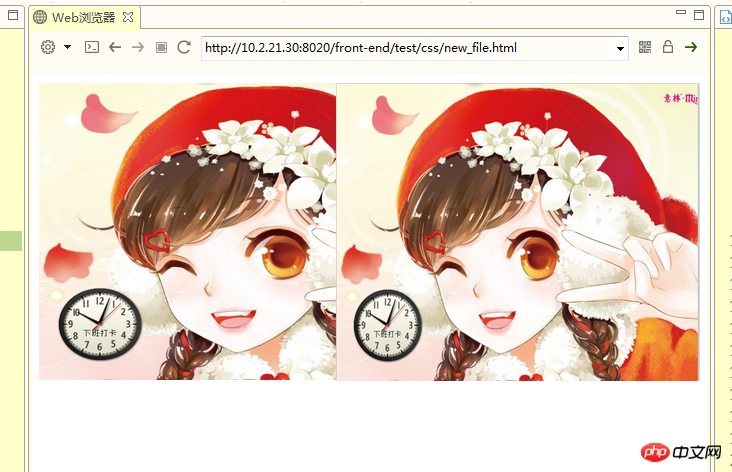
实现思路:利用pading-top比例值和width比例值都基于父亲,在外层包裹一层p(.img_box),占位,让子元素(img)绝对定位填充满。
调整后:等高
<!DOCTYPE html>
<html>
    <head>
        <meta charset="UTF-8">
        <title></title>
    </head>
    <body>
        <p>
            <p class="container_left">
                <p class="img_box">
                    <img src="small.png" alt="" />
                </p>
            </p>
            <p class="container_right">
                <p class="img_box">
                    <img src="common.png" alt="" />
                </p>
            </p>
        </p>
    </body>
    <style type="text/css">
        .container_left{
            display: inline-block;
            float: left;
            width: 45%;

        }
        .container_right{
            display: inline-block;
            float: left;
            width: 55%;
        }

        .container_left .img_box{
            width: 100%;
            padding-top:100% ;
            position: relative;
        }

        .container_right .img_box{
            width: 100%;
            padding-top: 82%;
            position: relative;
        }


        .img_box img{
            position: absolute;
            top: 0;
            left: 0;
            width: 100%;
            height: 100%;
        }

    </style>
</html>