
Maison >développement back-end >Tutoriel Python >Explication détaillée d'exemples de dessin de graphiques avec python
Explication détaillée d'exemples de dessin de graphiques avec python

- PHP中文网original
- 2017-06-20 15:55:325526parcourir
1. Environnement
Système : windows10
version python : python3.6.1
Bibliothèques utilisées : matplotlib, numpy
2. Plusieurs façons pour la bibliothèque numpy de générer des nombres aléatoires
3. >import numpy as npnumpy.random
rand(d0, d1, ..., dn) Dans [2] : x=np.random.rand(2,5)
rand(d0, d1, ..., dn) In [2]: x=np.random.rand(2,5)
In [3]: x
Out[3]:
array([[ 0.84286554, 0.50007593, 0.66500549, 0.97387807, 0.03993009],
[ 0.46391661, 0.50717355, 0.21527461, 0.92692517, 0.2567891 ]])randn(d0, d1, ..., dn)查询结果为标准正态分布
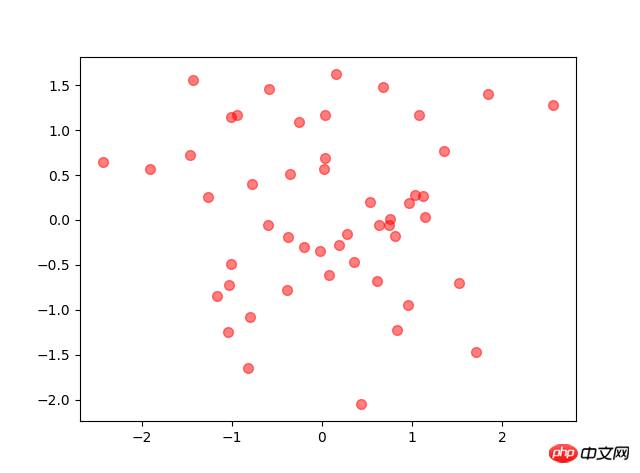
In [4]: x=np.random.randn(2,5)
In [5]: x
Out[5]:
array([[-0.77195196, 0.26651203, -0.35045793, -0.0210377 , 0.89749635],
[-0.20229338, 1.44852833, -0.10858996, -1.65034606, -0.39793635]])randint(low,high,size) 生成low到high之间(半开区间 [low, high)),size个数据
In [6]: x=np.random.randint(1,8,4)
In [7]: x
Out[7]: array([4, 4, 2, 7])random_integers(low,high,size) 生成low到high之间(闭区间 [low, high)),size个数据
In [10]: x=np.random.random_integers(2,10,5)
In [11]: x
Out[11]: array([7, 4, 5, 4, 2])Entrée [3] : x
Sortie[3] :
array([[ 0.84286554, 0.50007593, 0.66500549, 0.97387807, 0.03993009],
[ 0.46391661, 0. 50717355, 1527461 , 0.92692517, 0.2567891 ]])le résultat de la requête randn(d0, d1, ..., dn) est une distribution normale standard td>
Sortie[5] :
tableau( [[-0.77195196, 0.26651203, -0.35045793, -0.0210377, 0.89749635],
[-0.20229338, 1.44852833, -0.10858996, -1.650346 06, -0. 39793635]])randint(low,high,size) Générer entre bas et haut (intervalle semi-ouvert [bas, haut)), taille des donnéesDans [ 6] : x=np.random.randint(1,8,4)
Dans [7] : x
Out[7] : array([4, 4, 2 , 7])random_integers(low,high,size) Générer entre bas et haut (intervalle fermé [low, high)) , données de taille <code class="language-python hljs"># 来源:百度网盘搜索 <br/>x=np.linspace(<span class="hljs-number">-10000,<span class="hljs-number">10000,<span class="hljs-number">100) <span class="hljs-comment">#将-10到10等区间分成100份 y=x**<span class="hljs-number">2+x**<span class="hljs-number">3+x**<span class="hljs-number">7 plt.plot(x,y) plt.show()</span></span></span></span></span></span></span></code>Dans [10] : x=np.random.random_integers(2,10,5)Dans [11] : x
Out[11 ] : array([7, 4, 5, 4, 2])
 Générer entre bas et haut (intervalle semi-ouvert [bas, haut)), taille des donnéesDans [ 6] : x=np.random.randint(1,8,4)
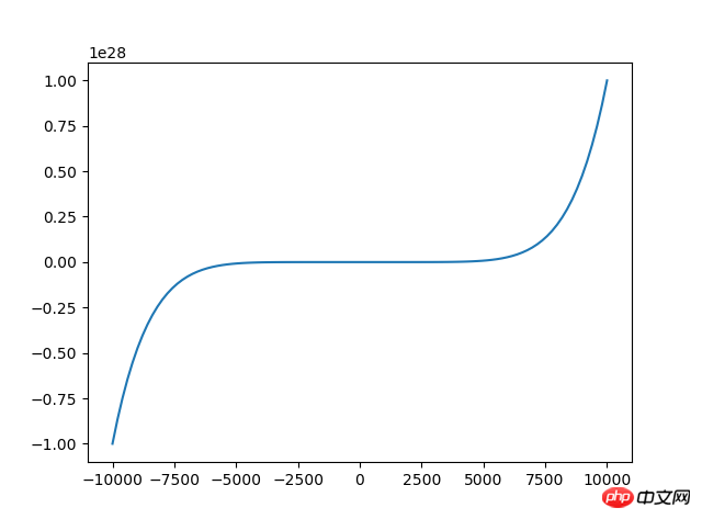
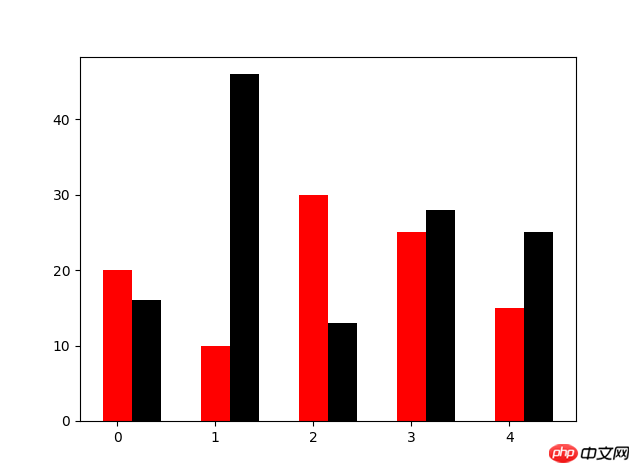
N=5
y=[20,10,30,25,15]
y1=np.random.randint(10,50,5)
x=np.random.randint(10,1000,N)
index=np.arange(N)
plt.bar(left=index,height=y,color='red',width=0.3)
plt.bar(left=index+0.3,height=y1,color='black',width=0.3)
plt.show()
4. Graphique linéaire
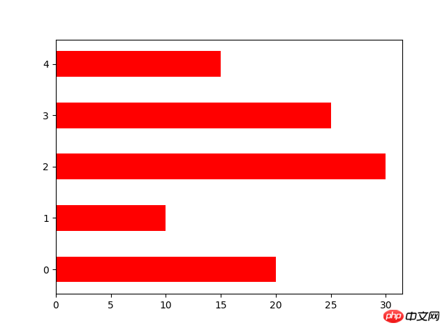
N=5
y=[20,10,30,25,15]
y1=np.random.randint(10,50,5)
x=np.random.randint(10,1000,N)
index=np.arange(N)# plt.bar(left=index,height=y,color='red',width=0.3)# plt.bar(left=index+0.3,height=y1,color='black',width=0.3)#plt.barh() 加了h就是横向的条形图,不用设置orientation
plt.bar(left=0,bottom=index,width=y,color='red',height=0.5,orientation='horizontal')
plt.show()
Graphique linéaire Le graphique utilise la fonction de tracé
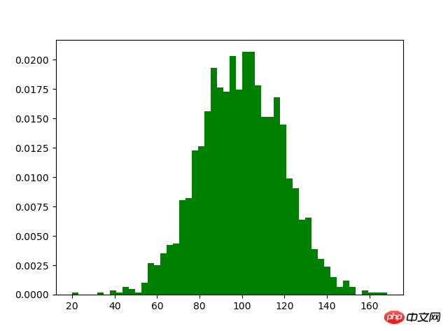
m1=100
sigma=20
x=m1+sigma*np.random.randn(2000)
plt.hist(x,bins=50,color="green",normed=True)
plt.show()
5. Graphique à barres
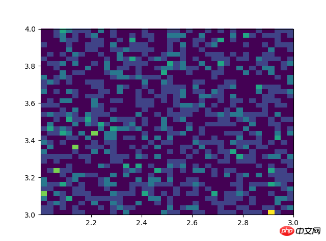
# #双变量的直方图# #颜色越深频率越高# #研究双变量的联合分布#双变量的直方图#颜色越深频率越高#研究双变量的联合分布 x=np.random.rand(1000)+2 y=np.random.rand(1000)+3 plt.hist2d(x,y,bins=40) plt.show()l'orientation définit un graphique à barres horizontales
#设置x,y轴比例为1:1,从而达到一个正的圆#labels标签参数,x是对应的数据列表,autopct显示每一个区域占的比例,explode突出显示某一块,shadow阴影Histogrammelabes=['A','B','C','D'] fracs=[15,30,45,10] explode=[0,0.1,0.05,0]#设置x,y轴比例为1:1,从而达到一个正的圆 plt.axes(aspect=1)#labels标签参数,x是对应的数据列表,autopct显示每一个区域占的比例,explode突出显示某一块,shadow阴影 plt.pie(x=fracs,labels=labes,autopct="%.0f%%",explode=explode,shadow=True) plt.show()

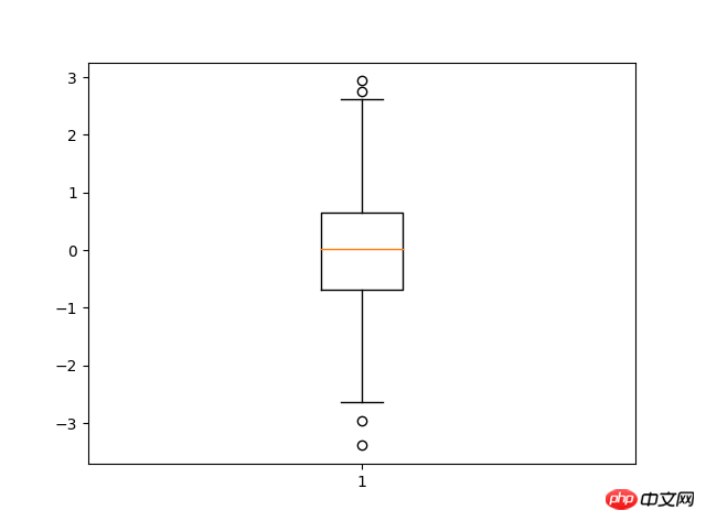
8. Box plotimport matplotlib.pyplot as pltimport numpy as npdata=np.random.normal(loc=0,scale=1,size=1000)#sym 点的形状,whis虚线的长度plt.boxplot(data,sym="o",whis=1.5)plt.show()#sym 点的形状,whis虚线的长度7.
Ce qui précède est le contenu détaillé de. pour plus d'informations, suivez d'autres articles connexes sur le site Web de PHP en chinois!