
Maison >interface Web >tutoriel CSS >HTML pour créer des personnages d'anime - Doraemon
HTML pour créer des personnages d'anime - Doraemon

- 零下一度original
- 2017-06-17 14:56:364201parcourir
Je crois que tout le monde a un Doraemon dans son enfance, un petit ventre plein de Doraemon incroyable, un Doraemon qui reste avec toi quand tu es impuissant et triste, un Doraemon qui t'accompagne avec tes pensées aléatoires et mange du Dorayaki~ Aujourd'hui. nous allons dessiner un Doraemon dans nos cœurs~

Définir le conteneur de Doraemon
-
Définissez d'abord un grand. conteneur pour Doraemon et déterminer sa taille et sa position.
<!-- 哆啦A梦大容器 --><p class="doa"></p>
/*哆啦A梦*/
  .doa{position: relative;top: 100px;}
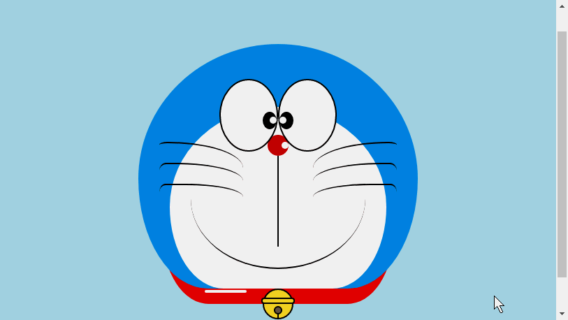
Dessinez la tête de Doraemon (y compris le visage, le visage comprend les yeux et le nez)
La tête est bien incluse Plusieurs parties : Le visage et le nez de Doraemon. Le visage comprend également deux yeux. Il y a des globes oculaires et du blanc des yeux dans les deux yeux, il y aura donc plusieurs couches d'imbrication de dom. Bien sûr, les graphiques de base sont tous constitués de p + border-radius assemblés. .
Placez simplement les différentes parties des éléments dessinés dans les positions correspondantes.
-
Regardez les quelques images que j'ai dessinées auparavant et vous saurez que le rayon-bordure est un attribut très couramment utilisé. Presque toutes les déformations de p en sont indissociables. face of border-radius Il doit être
border-radius: 300px 300px 300px 300px/300px 300px 300px 300px;violet. Nous n'écrivons généralement pas le contenu après la barre oblique. La section barre oblique est la longueur horizontale et la barre oblique est la hauteur verticale. Par défaut, s'il n'y a pas d'écriture après. la barre avant, les dimensions horizontales et verticales sont les mêmes. Je sais que ce que j'ai dit n'est pas assez détaillé. Vous pouvez vous référer au blog de mon Xinshen When Will Autumn Moon Come ? Que savez-vous du rayon de bordure CSS3 ? , garantissant que vous comprendrez parfaitement le rayon frontalier sous la direction d'un chauffeur expérimenté en quelques minutes. Pourquoi ne montez-vous pas rapidement dans le bus ?<!-- 头 --> <p class="head"> <!-- 存放脸部的容器 --> <p class="face"> <!-- 左眼大圈儿 --> <p> <!-- 左眼眼珠(黑色部分) --> <p> <!-- 左眼眼白,黑色里面的白色部分 --> <p></p> </p> </p> <!-- 右眼大圈儿 --> <p> <!--右眼眼珠(黑色部分) --> <p> <!-- 右眼眼白,黑色里面的白色部分 --> <p></p> </p> </p> </p> <!-- 红鼻子部分 --> <p class="nose"> <!-- 红鼻子里面的白圈儿 --> <p></p> </p> <!-- 红鼻子下面的那根黑线,也属于鼻子部分 --> <p class="nose1"></p> </p> .head{ margin: 0 auto; /*头部定义大小并居中显示*/ width: 400px; height: 350px; background: #008ee3; /*头部定义背景颜色*/ position: relative; border-radius: 50% 50% 25% 25% / 55% 55% 45% 45%; /*头部定义四个方向圆角大小*/ } .face{ width: 310px; /*脸部定义大小*/ height: 260px; background: snow; /*脸部定义背景颜色*/ border-radius: 50% 50% 25% 25% / 55% 55% 45% 45%; /*脸部定义四个方向的圆角大小*/ position: relative; /*脸部定义位置,是相对于head的位置*/ top: 90px; left: 45px; } /*左眼眶*/ .face>p:first-child{ width: 80px; /*左眼框定义大小*/ height: 100px; border-radius: 50%; /*左眼框定义与圆角大小*/ border:2px #000 solid; /*定义外边框*/ background: snow; float: left; /*为了使左右两个眼睛能在一排显示*/ position: relative; /*位置是相对于face的位置*/ top:-40px; left: 71px; z-index: 50; } /*右眼眶,画法跟左眼一样*/ .face>p:last-child{ width: 80px; height: 100px; border-radius: 50%; border:2px #000 solid; background: snow; float: left; position: relative; top:-40px; left: 71px; z-index: 50; } /*左眼珠1*/ .face>p:first-child p{ width: 20px; /*定义眼珠的大小*/ height: 25px; background: #000; border-radius: 50%; position: absolute; /*定义眼珠的位置,相对于眼眶的位置*/ top: 45px; left: 60px; } /*左瞳孔*/ .face>p:first-child p p{ width: 10px; /*定义黑色瞳孔的大小*/ height: 10px; background: #ffffff; border-radius: 50%; position: absolute; /*定义黑色瞳孔的位置,相对于眼珠的位置*/ top: 7px; left: 10px; } /*右眼珠和左眼珠画法一样*/ .face>p:last-child p{ width: 20px; height: 25px; background: #000; border-radius: 50%; position: absolute; top: 45px; } /*右瞳孔和左瞳孔的画法一样*/ .face>p:last-child p p{ width: 10px; height: 10px; background: #ffffff; border-radius: 50%; position: absolute; top: 7px; } .nose{ width: 30px; /*定义红鼻子的大小*/ height: 30px; border-radius: 50%; background: #c70000; position: absolute; top: 130px; left: 50%; margin-left: -15px; z-index: 10; } .nose p{ width: 10px; /*定义红鼻子里面白色圈圈的大小*/ height: 10px; border-radius: 50%; position: absolute; background: #ffffff; top: 10px; margin-left: 20px; z-index: 10; } .nose1{ width: 2px; /*定义红鼻子下面的那一条黑线*/ height: 130px; background: #000; position: absolute; top: 160px; left: 50%; margin-left: -1px; z-index: 10; }
-

Tête de Doraemon.png

Dessin La bouche de Doraemon
-
La bouche doit être très simple. En un coup d'œil, vous pouvez dire qu'elle est réalisée avec bordure + bordure-radius.
<p class="mouth"></p>
.mouth{      width: 250px;   /*定义嘴巴的大小*/      height: 200px;      border-radius: 50%;      background: snow;      border-bottom: 2px #000 solid;      margin: -230px auto;      position: relative;  /*定义嘴巴的位置*/
  }
La bouche de Doraemon.png

Dessine la partie de la barbe de Doraemon
-
En ce qui concerne la partie barbe, j'ai en fait introduit la méthode de dessin de barbe lorsque j'ai dessiné du HTML pour créer une animation dans l'article précédent [Série 3] -Kitten Smiley Animation, donc je ne le ferai pas ici. entrer dans les détails, mais l'idée de base est la même.
<!-- 胡须 -->
  <p class="beard">
  <!-- 左边胡须部分 -->
      <p class="left">
      <!-- 第一根胡须 -->
          <p></p>
          <!-- 第二根胡须 -->
          <p></p>
          <!-- 第三根胡须 -->
          <p></p>
      </p>
      <p class="right">
          <p></p>
          <p></p>
          <p></p>
      </p>
      <!-- 脖子部分的小白条部分 -->
      <span></span>
  </p>/*胡须样式*/.beard .left p:first-child{      width: 120px;      height: 40px;      border-top: 2px #000 solid;      border-radius: 10% 90% 10% 90% / 10% 90% 10% 90%;      position: absolute;      left: 50%;      top: 140px;      margin-left: -170px;      z-index: 100;
  }  .beard .left p:nth-child(2){      width: 120px;      height: 40px;      border-top: 2px #000 solid;      border-radius: 10% 90% 10% 90% / 30% 70% 40% 60%;      position: absolute;      left: 50%;      top: 170px;      margin-left: -170px;      z-index: 100;
  }  .beard .left p:last-child{      width: 120px;      height: 40px;      border-top: 2px #000 solid;      border-radius: 10% 90% 10% 90% / 40% 60% 10% 90%;      position: absolute;      left: 50%;      top: 200px;      margin-left: -170px;      z-index: 100;
  }  .beard .right p:first-child{      width: 120px;      height: 40px;      border-top: 2px #000 solid;      border-radius: 90% 10% 90% 10% / 90% 10% 90% 10%;      position: absolute;      left: 50%;      top: 140px;      margin-left: 50px;      z-index: 100;
  }  .beard .right p:nth-child(2){      width: 120px;      height: 40px;      border-top: 2px #000 solid;      border-radius: 90% 10% 90% 10% / 70% 30% 60% 40%;      position: absolute;      left: 50%;      top: 170px;      margin-left: 50px;      z-index: 100;
  }  .beard .right p:last-child{      width: 120px;      height: 40px;      border-top: 2px #000 solid;      border-radius: 90% 10% 90% 10% / 60% 40% 90% 10%;      position: absolute;      left: 50%;      top: 200px;      margin-left: 50px;      z-index: 100;
  }  .beard span{      display: block;      width: 60px;      height: 3.5px;      background: #ffffff;      border-radius: 4px;      position: absolute;      top: 352px;      left: 50%;      margin-left: -105px;
  }
Barbe de Doraemon.png

Dessinez la partie du cou de Doraemon (la partie du cou comprend la cloche)
Le cou a la forme après déformation basique, et la partie excédentaire peut être cachée sous la tête.
-
La partie cloche est composée de graphiques de base très simples.
<!-- 脖 -->
  <p class="neck">
  <!-- 铃铛的圆形 -->
      <p></p>
      <!-- 铃铛的小圆角矩形 -->
      <p></p>
      <!-- 铃铛的小圆形 -->
      <p></p>
      <!-- 铃铛的小竖线 -->
      <p></p>
  </p>
.neck{      width: 330px;      height: 200px;      border-radius: 50% 50% 20% 20% / 50% 50% 50% 50%;      background: #e30000;      margin: 80px auto;      z-index: 100;
  }  .neck p:first-child{      border: 2px #000 solid;      border-radius: 50%;      width: 40px;      height: 40px;      background: #ffdd2e;      position: absolute;      top: 350px;      left: 50%;      margin-left: -22px;      transition: all 1s;
  }  .neck p:nth-child(2){      border: 2px #000 solid;      width: 44px;      height: 5px;      background: #ffdd2e;      position: absolute;      left: 50%;      margin-left: -24px;      top: 363px;      border-radius: 5px;      transition: all 1s;
  }  .neck p:nth-child(3){      width: 8px;      height: 8px;      border: 2px #000 solid;      position: absolute;      background: #6c5844;      border-radius: 50%;      left: 50%;      margin-left: -6px;      top: 375px;      transition: all 1s;
  }  .neck p:nth-child(4){      width: 2px;      height: 8px;      background: #000;      position: absolute;      left: 50%;      margin-left: -1px;      top: 385px;      transition: all 1s;
  }
Le cou de Doraemon.png

Complétez l'effet dynamique de Doraemon
Doraemon est plus mignon quand il bouge, non ? Alors faisons-le bouger (attribut de transition).
Déplacez la souris vers le contour des yeux et déplacez le globe oculaire gauche vers la gauche.
Déplacez la souris vers la bouche et l'expression du visage change.
-
Déplacez la souris vers la partie cloche et la cloche deviendra plus grande.
/*眼睛动效*/.head:hover .face>p:first-child p{      left: 0px;      transition: all 1s;
  }  .head:hover .face>p:first-child p p{      left: 0px;      transition: all 1s;
  }/*嘴巴动效,嘴巴的dom容器下面要加了个空的p容器*/.mouth p:first-child{      width: 82px;      height: 2px;      background: #000;      position: absolute;      z-index: 1000;      top: -25px;      left: 6px;      display: none;
  }  .mouth p:nth-child(2){      width: 82px;      height: 2px;      background: #000;      position: absolute;      z-index: 1000;      top: -25px;      left: 90px;      display: none;
  }  .mouth:hover{      border-radius: 0;      width: 180px;      height: 200px;
  }  .mouth:hover p:first-child,.mouth:hover p:nth-child(2){      display: block;
  }/*铃铛动效*/.neck:hover p:first-child{      width: 60px;      height: 60px;      left: 50%;      margin-left: -30px;
  }  .neck:hover p:nth-child(2){      width: 66px;      height: 7.5px;      left: 50%;      margin-left: -33px;
  }  .neck:hover p:nth-child(3){      width: 12px;      height: 12px;      left: 50%;      margin-left: -6px;      top: 385px;
  }  .neck:hover p:nth-child(4){      width: 2px;      height: 12px;      left: 50%;      margin-left: 1px;      top: 400px;
  }
Doraemon animation.gif
Ce qui précède est le contenu détaillé de. pour plus d'informations, suivez d'autres articles connexes sur le site Web de PHP en chinois!
Articles Liés
Voir plus- L'utilisation de la disposition en pourcentage de largeur dans la disposition CSS
- Comment étirer un élément à la hauteur de la fenêtre
- Comment masquer la bordure d'une zone de texte en CSS
- Vous guidez étape par étape pour implémenter une disposition d'échiquier complexe à l'aide d'une seule balise + CSS
- Définir la hauteur d'une ligne de texte en utilisant CSS