
Maison >interface Web >tutoriel HTML >Introduction détaillée à un exemple de code qui utilise html+css pour implémenter Jingle Cat
Introduction détaillée à un exemple de code qui utilise html+css pour implémenter Jingle Cat

- 零下一度original
- 2017-05-18 17:04:484264parcourir
C'est en effet la première fois que j'utilise du HTML pour dessiner, donc je suis heureux de l'essayer. Pour un novice comme moi, c'est vraiment utile. Au moins, je sais comment dessiner un personnage simple, plus quelques animations. c'est qu'il est vivant, ce qui est encore plus amusant ! OK, avant de commencer, laissez-moi vous montrer les rendus :
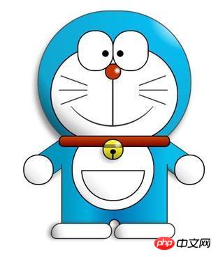
Rendu finaux
PS : Pour être honnête, je trouve que c'est plutôt mignon . Je regardais beaucoup Doraemon quand j'étais enfant, et tout d'un coup, c'était très amical et enfantin, et je me suis senti beaucoup plus jeune instantanément, haha !
Tout d'abord, configurez la structure HTML :
<p class="wrapper">
    <!--叮当猫整体-->
    <p class="doraemon">
        <!--头部-->
        <p class="head">
            <!--眼睛-->
            <p class="eyes">
                <p class="eye left">
                    <!--眼珠-->
                    <p class="black bleft"></p>
                </p>
                <p class="eye right">
                    <p class="black bright"></p>
                </p>
            </p>
            <!--脸部-->
            <p class="face">
                <!--白色脸底-->
                <p class="white"></p>
                <!--鼻子-->
                <p class="nose">
                    <!--鼻子高光部分-->
                    <p class="light"></p>
                </p>
                <!--鼻子的竖线-->
                <p class="nose_line"></p>
                <!--嘴巴-->
                <p class="mouth"></p>
                <!--胡须-->
                <p class="whiskers">
                    <p class="whisker rTop r160"></p>
                    <p class="whisker rMiddle"></p>
                    <p class="whisker rBottom r20"></p>
                    <p class="whisker lTop r20"></p>
                    <p class="whisker lMiddle"></p>
                    <p class="whisker lBottom r160"></p>
                </p>
            </p>
        </p>
        <!--脖子和铃铛-->
        <p class="choker">
            <!--铃铛-->
            <p class="bell">
                <p class="bell_line"></p>
                <p class="bell_circle"></p>
                <p class="bell_under"></p>
                <p class="bell_light"></p>
            </p>
        </p>
        <!--身体-->
        <p class="bodys">
            <!--肚子-->
            <p class="body"></p>
            <!--肚兜-->
            <p class="wraps"></p>
            <!--口袋-->
            <p class="pocket"></p>
            <!--遮住一半口袋,使其呈现半圆-->
            <p class="pocket_mask"></p>
        </p>
        <!--右手-->
        <p class="hand_right">
            <!--手臂-->
            <p class="arm"></p>
            <!--手掌-->
            <p class="circle"></p>
            <!--遮住手臂和身子交接处的线-->
            <p class="arm_rewrite"></p>
        </p>
        <!--左手-->
        <p class="hand_left">
            <p class="arm"></p>
            <p class="circle"></p>
            <p class="arm_rewrite"></p>
        </p>
        <!--脚-->
        <p class="foot">
            <p class="left"></p>
            <p class="right"></p>
             <!--双脚之间的缝隙-->
            <p class="foot_rewrite"></p>
        </p>
    </p>
</p>
Il est préférable d'étudier attentivement la structure globale de Jingle Cat. Cela sera très utile pour dessiner vous-même d'autres personnages. l’avenir. Si cela aide, la réflexion sera plus claire.
Ensuite, nous ferons une démonstration basée sur la tête, le cou, le corps et les pieds. Tout d'abord, créez quelques styles de base pour le wrapper du conteneur et Doraemon dans son ensemble. Doraemon définit la position sur relative, principalement pour faciliter le positionnement des éléments enfants/descendants.
.wrapper{
margin: 50px 0 0 500px;
}
.doraemon{
position: relative;
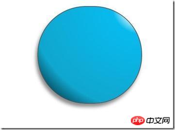
}Le style de la tête, car la tête de Jingle Cat n'est pas un cercle parfait, donc la largeur et la hauteur sont un peu décalées, puis utilisez border-radius pour changer la tête d'un rectangle à un ovale, puis utilisez Dégradé radial pour donner à l'arrière-plan un dégradé radial à partir du coin supérieur droit, puis ajoute une ombre pour le rendre plus tridimensionnel. Arrière-plan : #07bbee ; est destiné à la compatibilité avec les versions inférieures des navigateurs :
<.>.doraemon .head {
position:relative;
width: 320px;
height: 300px;
border-radius: 150px;
background: #07bbee;
background: -webkit-radial-gradient(right top,#fff 10%,#07bbee 20%,#10a6ce 75%,#000);
background: -moz-radial-gradient(right top,#fff 10%,#07bbee 20%,#10a6ce 75%,#000);
background: -ms-radial-gradient(right top,#fff 10%,#07bbee 20%,#10a6ce 75%,#000);
border:2px solid #555;
box-shadow:-5px 10px 15px rgba(0,0,0,0.45);
} Jetez un oeil Quel est l'effet :
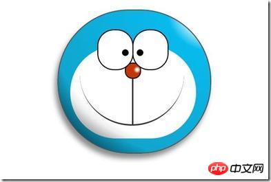
/*脸部*/
         .doraemon .face {
             position: relative; /*让所有脸部元素可自由定位*/
             z-index: 2;    /*脸在头部背景上面*/
         }
        /*白色脸底*/
        .doraemon .face .white {
            width: 265px;       /*设置宽高*/
            height: 195px;
            border-radius: 150px;
            position: absolute; /*进行绝对定位*/
            top: 75px;
            left: 25px;
            background: #fff;
            /*此放射渐变也是使脸的左下角暗一些,看上去更真实*/
            background: -webkit-radial-gradient(right top,#fff 75%,#eee 80%,#999 90%,#444);
            background: -moz-radial-gradient(right top,#fff 75%,#eee 80%,#999 90%,#444);
            background: –ms-radial-gradient(right top,#fff 75%,#eee 80%,#999 90%,#444);
         }
        /*鼻子*/
         .doraemon .face .nose{
             width:30px;
             height:30px;
             border-radius:15px;
             background:#c93300;
             border:2px solid #000;
             position:absolute;
             top:110px;
             left:140px;
             z-index:3;   /*鼻子在白色脸底下面*/
         }
        /*鼻子上的高光*/
        .doraemon .face .nose .light {
            width:10px;
            height:10px;
            border-radius: 5px;
            box-shadow: 19px 8px 5px #fff;  /*通过阴影实现高光*/
        }
         /*鼻子下的线*/
         .doraemon .face .nose_line{
             width:3px;
             height:100px;
             background:#333;
             position:absolute;
             top:143px;
             left:155px;
             z-index:3;
         }
         /*嘴巴*/
         .doraemon .face .mouth{
             width:220px;
             height:400px;
             /*通过底边框加上圆角模拟微笑嘴巴*/
             border-bottom:3px solid #333;
             border-radius:120px;
             position:absolute;
             top:-160px;
             left:45px;
         }
         /*眼睛*/
        .doraemon .eyes {
            position: relative;
            z-index: 3; /*眼睛在白色脸底下面*/
        }
        /*眼睛共同的样式*/
        .doraemon .eyes .eye{
            width:72px;
            height:82px;
            background:#fff;
            border:2px solid #000;
            border-radius:35px 35px;
            position:absolute;
            top:40px;
        }
        /*眼珠*/
        .doraemon .eyes .eye .black{
            width:14px;
            height:14px;
            background:#000;
            border-radius:7px;
            position:absolute;
            top:40px;
        }
        .doraemon .eyes .left{
            left:82px;
        }
        .doraemon .eyes .right {
            left: 156px;
        }
        .doraemon .eyes .eye .bleft {
            left: 50px;
        }

        .doraemon .eyes .eye .bright {
            left: 7px;
        }
Après avoir écrit autant de styles, quel est le résultat, je me sens mal à l'aise, oh ! Il nous reste encore besoin de la barbe et de la bordure blanche sur le bas du visage, ajoutons les :
Ça y est Oui, ça a l'air si confortable ! Frappez pendant que le fer est chaud et faites le cou et le corps :
/*胡须背景,主要用于挡住嘴巴的一部分,不要显得太长*/
        .doraemon .whiskers{
            width:220px;
            height:80px;
            background:#fff;
            border-radius:15px;
            position:absolute;
            top:120px;
            left:45px;
            z-index:2;   /*在鼻子和眼睛下面*/
        }
        /*所有胡子的公用样式*/
        .doraemon .whiskers .whisker {
            width: 60px;
            height: 2px;
            background: #333;
            position: absolute;
            z-index: 2;
        }
        /*右上胡子*/
        .doraemon .whiskers .rTop {
            left: 165px;
            top: 25px;
        }
        /*右中胡子*/
        .doraemon .whiskers .rMiddle {
            left: 167px;
            top: 45px;
        }
        /*右下胡子*/
        .doraemon .whiskers .rBottom {
            left: 165px;
            top: 65px;
        }
        /*左上胡子*/
        .doraemon .whiskers .lTop {
            left: 0;
            top: 25px;
        }
        /*左中胡子*/
        .doraemon .whiskers .lMiddle {
            left: -2px;
            top: 45px;
        }
        /*左下胡子*/
        .doraemon .whiskers .lBottom {
            left: 0;
            top: 65px;
        }
        /*胡子旋转角度*/
        .doraemon .whiskers .r160 {
            -webkit-transform: rotate(160deg);
            -moz-transform: rotate(160deg);
            -ms-transform: rotate(160deg);
            -o-transform: rotate(160deg);
            transform: rotate(160deg);
        }
        .doraemon .whiskers .r20 {
            -webkit-transform: rotate(200deg);
            -moz-transform: rotate(200deg);
            -ms-transform: rotate(200deg);
            -o-transform: rotate(200deg);
            transform: rotate(200deg);
        }
D'accord, vous avez le cou et le corps ! Sur la photo ci-dessus : 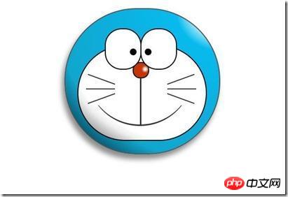
/*围脖*/
        .doraemon .choker {
            width: 230px;
            height: 20px;
            background: #c40;
            /*线性渐变 让围巾看上去更自然*/
            background: -webkit-gradient(linear,left top,left bottom,from(#c40),to(#800400));
            background: -moz-linear-gradient(center top,#c40,#800400);
            background: -ms-linear-gradient(center top,#c40,#800400);
            border: 2px solid #000;
            border-radius: 10px;
            position: relative;
            top: -40px;
            left: 45px;
            z-index: 4;
        }
        /*铃铛*/
        .doraemon .choker .bell {
            width: 40px;
            height: 40px;
            _overflow: hidden; /*IE6 hack*/
            border: 2px solid #000;
            border-radius: 50px;
            background: #f9f12a;
            background: -webkit-gradient(linear, left top, left bottom, from(#f9f12a),color-stop(0.5, #e9e11a), to(#a9a100));
            background: -moz-linear-gradient(top, #f9f12a, #e9e11a 75%,#a9a100);
            background: -ms-linear-gradient(top, #f9f12a, #e9e11a 75%,#a9a100);
            box-shadow: -5px 5px 10px rgba(0,0,0,0.25);
            position: absolute;
            top: 5px;
            left: 90px;
        }
        /*双横线*/
        .doraemon .choker .bell_line {
            width: 36px;
            height: 2px;
            background: #f9f12a;
            border: 2px solid #333;
            border-radius: 3px 3px 0 0;
            position: absolute;
            top: 10px;
        }
        /*黑点*/
        .doraemon .choker .bell_circle{
            width:12px;
            height:10px;
            background:#000;
            border-radius:5px;
            position:absolute;
            top:20px;
            left:14px;
        }
        /*黑点下的线*/
        .doraemon .choker .bell_under{
            width: 3px;
            height:15px;
            background:#000;
            position:absolute;
            left: 18px;
            top:27px;
        }
        /*铃铛高光*/
        .doraemon .choker .bell_light{
            width:12px;
            height:12px;
            border-radius:10px;
            box-shadow:19px 8px 5px #fff;
            position:absolute;
            top:-5px;
            left:5px;
            opacity:0.7;
        }
        /*身子*/
        .doraemon .bodys {
            position: relative;
            top: -310px;
        }
        /*肚子*/
        .doraemon .bodys .body {
            width: 220px;
            height: 165px;
            background: #07beea;
            background: -webkit-gradient(linear,right top,left top,from(#07beea),color-stop(0.5, #0073b3),color-stop(0.75,#00b0e0), to(#0096be));
            background: -moz-linear-gradient(right center,#07beea,#0073b3 50%,#00b0e0 75%,#0096be 100%);
            background: -ms-linear-gradient(right center,#07beea,#0073b3 50%,#00b0e0 75%,#0096be 100%);
            border:2px solid #333;
            position:absolute;
            top:265px;
            left:50px;
        }
        /*白色肚兜*/
            .doraemon .bodys .wraps {
                width: 170px;
                height: 170px;
                background: #fff;
                background: -webkit-gradient(linear, right top, left bottom, from(#fff),color-stop(0.75,#fff),color-stop(0.83,#eee),color-stop(0.90,#999),color-stop(0.95,#444), to(#000));
                background: -moz-linear-gradient(right top,#fff,#fff 75%,#eee 83%,#999 90%,#444 95%,#000);
                background: -ms-linear-gradient(right top,#fff,#fff 75%,#eee 83%,#999 90%,#444 95%,#000);
                border: 2px solid #000;
                border-radius: 85px;
                position: absolute;
                left: 72px;
                top: 230px;
            }
            /*口袋*/
            .doraemon .bodys .pocket {
                width: 130px;
                height: 130px;
                border-radius: 65px;
                background: #fff;
                background: -webkit-gradient(linear, right top, left bottom, from(#fff),color-stop(0.70,#fff),color-stop(0.75,#f8f8f8),color-stop(0.80,#eee),color-stop(0.88,#ddd), to(#fff));
                background: -moz-linear-gradient(right top, #fff, #fff 70%,#f8f8f8 75%,#eee 80%,#ddd 88%, #fff);
                background: -ms-linear-gradient(right top, #fff, #fff 70%,#f8f8f8 75%,#eee 80%,#ddd 88%, #fff);
                border: 2px solid #000;
                position:absolute;
                top: 250px;
                left: 92px;
            }
            /*挡住口袋一半*/
            .doraemon .bodys .pocket_mask {
                width: 134px;
                height: 60px;
                background:#fff;
                border-bottom: 2px solid #000;
                position:absolute;
                top: 259px;
                left: 92px;
           }
Maintenant, ça ressemble un peu à une décoration, mais le sourire est toujours aussi innocent, d'accord, dépêche-toi levez-vous et faites vos mains et vos pieds Réalisé :
Bon, le résultat final complet : 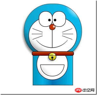
/*左右手*/
            .doraemon .hand_right, .doraemon .hand_left {
                height: 100px;
                width: 100px;
                position: absolute;
                top: 272px;
                left: 248px;
            }
            /*左手*/
            .doraemon .hand_left {
                left: -10px;
            }
            /*手臂公共部分*/
            .doraemon .arm {
                width:80px;
                height:50px;
                background: #07beea;
                background: -webkit-gradient(linear, left top, left bottom, from(#07beea),color-stop(0.85,#07beea), to(#555));
                background: -moz-linear-gradient(center top, #07BEEA, #07BEEA 85%, #555);
                background: -ms-linear-gradient(center top, #07BEEA, #07BEEA 85%, #555);
                border: 1px solid #000000;
                box-shadow: -10px 7px 10px rgba(0, 0, 0, 0.35);
                z-index: -1;
                position: relative;
            }
            /*右手手臂*/
            .doraemon .hand_right .arm {
                top: 17px;
                -webkit-transform: rotate(35deg);
                -moz-transform: rotate(35deg);
                -ms-transform: rotate(35deg);
                -o-transform: rotate(35deg);
                transform: rotate(35deg);
            }
            /*左手手臂*/
            .doraemon .hand_left .arm {
                top: 17px;
                background: #0096be;   /*背光一面使用纯色,使其有立体感*/
                box-shadow: 5px -7px 10px rgba(0, 0, 0, 0.25);
                -webkit-transform: rotate(145deg);
                -moz-transform: rotate(145deg);
                -ms-transform: rotate(145deg);
                -o-transform: rotate(145deg);
                transform: rotate(145deg);
            }
            /*圆形手掌公共部分*/
            .doraemon .circle {
                width: 60px;
                height: 60px;
                border-radius: 30px;
                border: 2px solid #000;
                background: #fff;
                background: -webkit-gradient(linear, right top, left bottom, from(#fff),color-stop(0.5,#fff),color-stop(0.70,#eee),color-stop(0.8,#ddd), to(#999));
                background: -moz-linear-gradient(right top, #fff, #fff 50%, #eee 70%, #ddd 80%,#999);
                background: -ms-linear-gradient(right top, #fff, #fff 50%, #eee 70%, #ddd 80%,#999);
                position: absolute;
            }
            /*右手手掌*/
            .doraemon .hand_right .circle {
                left: 40px;
                top: 32px;
            }
            /*左手手掌*/
            .doraemon .hand_left .circle {
                left: -20px;
                top: 32px;
            }
            /*手臂和身体结合处,使用背景遮住边框*/
            .doraemon .arm_rewrite {
                height: 45px;
                width: 5px;
                background: #07beea;
                position: relative;
            }
            /*右手结合处*/
            .doraemon .hand_right .arm_rewrite {
                top: -45px;
                left: 22px;
            }
            /*左手结合处*/
            .doraemon .hand_left .arm_rewrite {
                top: -45px;
                left: 60px;
                background: #0096be; /*同理,背光一面使用纯色,使其有立体感*/
            }
            /*脚部*/
            .doraemon .foot {
                width: 280px;
                height: 40px;
                position: relative;
                top: 55px;
                left: 20px;
            }
            /*左右脚共同样式*/
            .doraemon .foot .left, .doraemon .foot .right {
                width: 125px;
                height: 30px;
                background: #fff;
                background: -webkit-gradient(linear, right top, left bottom, from(#fff),color-stop(0.75,#fff),color-stop(0.85,#eee), to(#999));
                background: -moz-linear-gradient(right top, #fff, #fff 75%, #eee 85%, #999);
                background: -ms-linear-gradient(right top, #fff, #fff 75%, #eee 85%, #999);
                border: 2px solid #333;
                border-radius: 80px 60px 60px 40px;
                box-shadow: -6px 0 10px rgba(0, 0, 0, 0.35);
                position: relative;
            }
            .doraemon .foot .left {
                left: 8px;
                top: 65px;
            }

            .doraemon .foot .right {
                top: 31px;
                left: 141px;
            }
            /*双脚之间的缝隙,加阴影使用立体感*/
            .doraemon .foot .foot_rewrite {
                width: 20px;
                height: 10px;
                background: #fff;
                background: -webkit-gradient(linear, right top, left bottom, from(#666),color-stop(0.83,#fff), to(#fff));
                background: -moz-linear-gradient(right top, #666, #fff 83%, #fff);
                background: -ms-linear-gradient(right top, #666, #fff 83%, #fff);
                /*制作半圆效果*/
                border: 2px solid #000;
                border-bottom: none;
                border-radius: 40px 40px 0 0;
                position: relative;
                top: -11px;
                left: 130px;
                _left: 127px;
            }
Regardez l'effet Est-ce le même que celui du début ? Bien que ce soit fait, on peut quand même le faire bouger, comme les yeux. On peut y ajouter un effet d'animation pour faire bouger les yeux :
OK, de cette façon, les yeux bougeront. Si vous êtes intéressé, vous pouvez l'essayer, mais il ne peut pas être affiché ici. Mais si vous pouvez essayer de meilleurs effets d’animation, alors cette affaire est terminée. 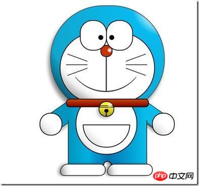
【Recommandations associées】
1.
Recommandation spéciale
/*眼珠*/
        .doraemon .eyes .eye .black {
            width: 14px;
            height: 14px;
            background: #000;
            border-radius: 7px;
            position: absolute;
            top: 40px;
            -webkit-animation: eyemove 3s linear infinite;
            -moz-animation: eyemove 3s linear infinite;
            -ms-animation: eyemove 3s linear infinite;
            -o-animation: eyemove 3s linear infinite;
            animation: eyemove 3s linear infinite;
        }

        /*让眼睛动起来*/
        @-webkit-keyframes eyemove {
            70%{
                margin:0 0 0 0;
            }
            80% {
                margin: -22px 0 0 0;
            }

            85% {
                margin: -22px 0 0 5px;
            }

            90% {
                margin: -22px 10px 0 0;
            }

            93% {
                margin: -22px 0 0 0;
            }

            96% {
                margin: 0 0 0 0;
            }
        }

        @-moz-keyframes eyemove {
            70% {
                margin: 0 0 0 0;
            }

            80% {
                margin: -22px 0 0 0;
            }

            85% {
                margin: -22px 0 0 5px;
            }

            90% {
                margin: -22px 10px 0 0;
            }

            93% {
                margin: -22px 0 0 0;
            }

            96% {
                margin: 0 0 0 0;
            }
        }

        @-o-keyframes eyemove {
            70% {
                margin: 0 0 0 0;
            }

            80% {
                margin: -22px 0 0 0;
            }

            85% {
                margin: -22px 0 0 5px;
            }

            90% {
                margin: -22px 10px 0 0;
            }

            93% {
                margin: -22px 0 0 0;
            }

            96% {
                margin: 0 0 0 0;
            }
        }
        @keyframes eyemove {
            70% {
                margin: 0 0 0 0;
            }

            80% {
                margin: -22px 0 0 0;
            }

            85% {
                margin: -22px 0 0 5px;
            }

            90% {
                margin: -22px 10px 0 0;
            }

            93% {
                margin: -22px 0 0 0;
            }

            96% {
                margin: 0 0 0 0;
            }
        }
: "php Programmer Toolbox" version V0.1 Télécharger
2.
Ce qui précède est le contenu détaillé de. pour plus d'informations, suivez d'autres articles connexes sur le site Web de PHP en chinois!