


本教程制作的非常精美,不管是颜色,创意及一些其装饰效果,都表现的非常形象。
来源:PS真功夫原创翻译 作者:不详
本教程制作的非常精美,不管是颜色,创意及一些其装饰效果,都表现的非常形象。
视觉效果是非常绝美。不愧为顶尖设计师的作品。由于教程没有提供现成的素材,在制作教程之前需要自己去网上下载一些素材(小提琴,玫瑰花,树叶,液滴及花纹笔刷等)。
最终效果 
1、新建一个工作文档,首先呢,新建一个1000×1000像素的文档,白色做背景。如下图: 
2、抠出小提琴,绕着小提琴做一个选区,小提琴背景基本上是单一的,所以最后的方法就是用魔术棒工具来选出小提琴。设置如下图: 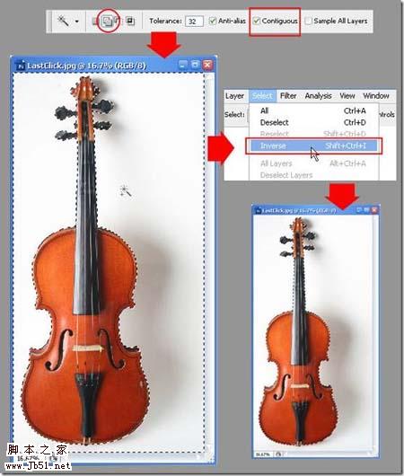 3、把小提琴选出来后,ctrl+J 复制抠出的小提琴,然后拉进我们刚才准备好的文档,在ctrl+T自由变换,调整一下大小。如下图:
4、添加叶子,打开玫瑰花的图片,用多边形套索工具围绕着我们要的叶子做一个选区,把叶子抠出来,如下图: 
5、当我们做好选区了,想刚才一样, ctrl+J把叶子单独一层,然后拉进我们的工作文档里去。拉进去后,我们再用魔术棒工具在叶子周围的白色区域选中,删了它就得到叶子。如下图:  6、接着把叶子拖到小提琴那层下面。Ctrl+T用自由变换工具调整大小并向右旋转一点,调好就按 回车 ,如下图:
7、调整颜色,还是老调重弹,有关每个图层命名问题,如果你都把每个图层按它的内容命好名字(至少你要自己知道是哪层),那样的话管理起来就很方便了。言归正传,我们现在把第一层命名为“小提琴”,第二层为“叶子”。 选中“小提琴”那层,然后ctrl+L 跳出 色阶 对话框,如下图设置,设置好按确定:
8、激活“叶子”图层,用色阶工具增加叶子的对比度。然后用“色相—饱和度”工具(ctrl+U)来调整叶子的颜色,使得滤色更艳丽,富有活力。如下图:  9、叶子的排版,Ctrl+J复制一层叶子,然后ctrl+T自由变化工具把叶子放在合适的地方,如下图:
10、照这种方法继续再处理5片叶子。继续调整每片叶子的大小,角度,位置,直到你得到一个不错的排列方式。 
11、高光和阴影,回到第一片叶子的那层(一般情况下,那应该在叶子中的最底下那层)。选择 “加深”工具。再选一款软笔刷,photoshop笔刷半径大概在30到40像素间,把曝光度调整到 25%。现在我们就用这个笔刷来增加阴影,如下图:  12、对所有叶子的图层重复那些步骤,最后你就能得到一张层次感比较强的图片。如下图:
13、复制叶子图层 像这种图案的图层数量一般都会有比较多,所以,把它们归类成一个图层组是一个不错的方法。下面就要告诉你怎么把它们放到一个组里面去。如下图:
14、现在,我们在钢琴的右边也同样放一些叶子,这样整个图看起来才感觉平衡。方法很简单,直接把左边那些叶子复制到右边就可以了。选中在刚才建立的组,单击右键,在跳出的选项中选择“复制组”。 把图层组命名为:左边的叶子。选中该组,单击—编辑—自由变换—水平翻转。这样复制的叶子组就全部“水平翻转了一下”,点选选择工具,把该组移到小提琴左边, 如下图:
15、叶子的排版 第二部分 再复制一组叶子图层组,并命名为:leaf-FL ,并把这组放到小提琴的上面,如下图:
16、用移动工具和自由变换工具重新给这组排版,如下图: 
17、注意:你也许很容易忽略这点,这组的叶子的高光和阴影的部分和原来的不同的,所以你要整体去重新定义这组叶子的高光和阴影,当然,工具还是“加深”,“减淡”工具。 继续复制这一组,重命名:leaf—FR。 通过 编辑—自由变换—水平旋转。把这组叶子放到如下图:
18、叶子的排版,第三部分 继续复制 leaf-FL这组,重命名为 leaf—BL。放置到如下图:
19、还是用 移动工具 和 自由变换工具 把这组的叶子重新排布一下。还需提醒的是:别忘了注意叶子高光和阴影的地方。再复制这组,在小提琴左右各排布一些叶子,如下图: 
20、添加玫瑰花 打开玫瑰花的图片,用你自己擅长的选择工具把玫瑰花瓣选出来,最快的方法就是用快速选择工具(这个工具只在CS3和CS4里面有)。但你也可以用魔术棒和套索工具也可以啦!
选好以后,复制并粘贴玫瑰花瓣,这层放在leaf—FR图层组上面,调整好大小,然后在把花放到小提琴下面,如下图:
21、把这图层命名为:rose。打开色阶工具(ctrl+L),用色阶工具把花的颜色调的更生动一些,如下图。如果你对调解后的颜色不满意,你还可以用加深和减淡工具来给花增加阴影和高光效果,让它看上去更完美。  22、增加液滴效果 在这里,我想在玫瑰花上加上几滴血。打开血滴的照片,用你自己擅长的工具把液滴选取出来,然后拷贝到玫瑰花图层上面。如下图:
23、还是老规矩,重命名这层为:blood。OK,调解一下液滴的大小并放到玫瑰花图层下面,放到如下位置: 
24、增加画布大小 选择剪切工具(C),做一个矩形选区,如下图。然后调整选区的节点使选区超出画布,做好后按回车就OK (只有CS以上的版本有这功能),如果你的不是CS版本以上的,可以选择 图像—画布大小 来改变画布的尺寸,如下图:
25、阴影图层 在小提琴上新建一层。命名为:“阴影”, 如下图:
26、选择“笔刷”工具。挑一支柔软的圆笔刷,大小65像素。设置笔刷的模式为:正常。不透明度为:25%。OK,开始添加阴影吧。(记得你的笔刷颜色是黑色的啊)。如下图: 
27、使用“花纹”笔刷 新建一层放在小提琴下面,命名为:floral 。 可以从这下载花纹笔刷。记得你笔刷的不透明度是100%。如下图:
28、使用笔刷工具在小提琴的周围添加漂亮的装饰。在画的过程中,自己要把握好笔刷的大小和形状,直到自己满意为止。如下图: 
29、给花纹添加漂亮的颜色。 继续新建一层,放在floral和小提琴之间。并重命名为:floral color。设置前景色为红色,背景色为黑色。然后选择 滤镜—渲染—云彩 。如下图: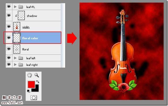
30、一个很简单的方法把云彩的颜色叠加到花纹上去,只要按快捷键:Alt+Ctrl+G。你试试就知道了。现在,你会得到如下的效果: 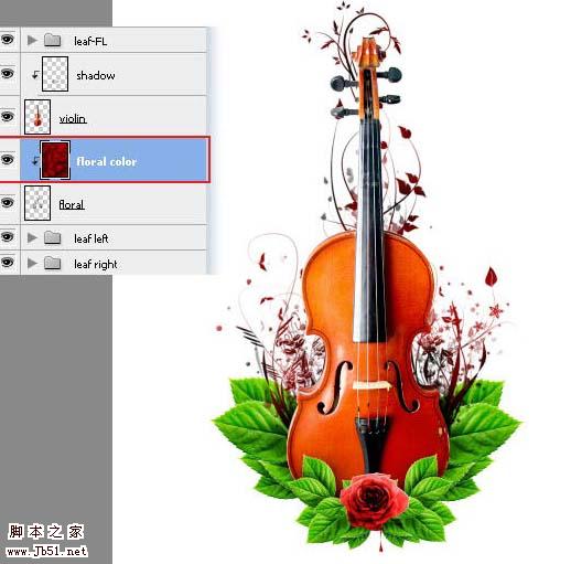
31、添加一些小碎屑 可以从这里下载碎屑笔刷。下载好了后,回到PS,新建一层并放在花纹图层的上面(你可能也把这层和那云彩一层一样叠加在花纹图层上了,没关系,再按一下快捷键Alt+Ctrl+G,就可以了)。重命名这层为:debris 。 用下载好的碎屑笔刷在叶子和小提琴的周围不客气的画上去吧。来个即兴创作。还是要提醒你自己要控制笔刷的大小和角度等问题。要画好看可不是那么容易的。如下图: 32、制作背景颜色 从供给栏选择 渐变工具 ,选择从 前景到背景 模式并确保你点击了 线性渐变 按钮。把前景色设置为:#C4DF9C,背景色为白色。 设置好后,回到背景图层,用渐变工具添加背景颜色去吧。如下图:
32、添加纹理 从这下载纸张笔刷, 笔刷颜色设置:pure pea green(#8dc63f(不知道是什么绿,翻译不来))。如下图:
33、按F5打开笔刷面板。继续打开 笔刷形状设定 选项。调整直径大小为 1400PX,角度调为90。用设置好的笔刷给这层添加纸张纹理。(确保是在背景图层上操作)。如下图: 
34、添加烟雾 可以从这下载烟雾笔刷。选择白色作为笔刷的颜色。现在,用烟雾笔刷在小提琴周围添加一些烟雾。如果 烟雾 太亮了,Ctrl+Z返回,并降低笔刷的不透明度在你继续画之前。如下图:
35、添加花纹 可以从这里下载花的纹身笔刷。 OK,用下好的笔刷继续添加花纹装饰。还是老样子,自己调整好尺寸大小和角度,也可以变换笔刷的颜色。如下图:
最后打上文字,排好版,完成最终效果:

 Advanced Photoshop Tutorial: Master Retouching & CompositingApr 17, 2025 am 12:10 AM
Photoshop's advanced photo editing and synthesis technologies include: 1. Use layers, masks and adjustment layers for basic operations; 2. Use image pixel values to achieve photo editing effects; 3. Use multiple layers and masks for complex synthesis; 4. Use "liquefaction" tools to adjust facial features; 5. Use "frequency separation" technology to perform delicate photo editing, these technologies can improve image processing level and achieve professional-level effects.
 Using Photoshop for Graphic Design: Branding and MoreApr 16, 2025 am 12:02 AM
The steps to using Photoshop for brand design include: 1. Use the Pen tool to draw basic shapes, 2. Add shadows and highlights through layer styles, 3. Adjust colors and details, 4. Use smart objects and actions to automatically generate different versions of the design. Photoshop helps designers create and optimize brand elements with the flexibility of layers and masks, ensuring consistency and professionalism of designs, from simple logos to complex branding guides.
 Photoshop's Subscription Model: What You Get for Your MoneyApr 15, 2025 am 12:17 AM
Photoshop's subscription model is worth buying. 1) Users can access the latest version and use across devices at any time. 2) The subscription fee is low, and continuous updates and technical support are provided. 3) Advanced functions such as neural filters can be used for complex image processing. Despite the high long-term costs, its convenience and feature updates are valuable to professional users.
 Photoshop: Investigating Free Trials and Discount OptionsApr 14, 2025 am 12:06 AM
You can get the access to Photoshop in the most economical way: 1. Experience the software features with a 7-day free trial; 2. Find student or teacher discounts, as well as seasonal promotions; 3. Use coupons on third-party websites; 4. Subscribe to Adobe CreativeCloud's monthly or annual plan.
 Photoshop for Designers: Creating Visual ConceptsApr 13, 2025 am 12:09 AM
Creating visual concepts in Photoshop can be achieved through the following steps: 1. Create a new document, 2. Add a background layer, 3. Use the brush tool to draw basic shapes, 4. Adjust colors and brightness, 5. Add text and graphics, 6. Use masks for local editing, 7. Apply filter effects, these steps help designers build a complete visual work from scratch.
 Is Photoshop Free? Understanding Subscription PlansApr 12, 2025 am 12:11 AM
Photoshop is not free, but there are several ways to use it at low cost or free: 1. The free trial period is 7 days, and you can experience all functions during this period; 2. Student and teacher discounts can cut costs by half, and school proof is required; 3. The CreativeCloud package is suitable for professional users and includes a variety of Adobe tools; 4. PhotoshopElements and Lightroom are low-cost alternatives, with fewer functions but lower prices.
 Photoshop's Value: Weighing the Cost Against Its FeaturesApr 11, 2025 am 12:02 AM
Photoshop is worth the investment because it provides powerful features and a wide range of application scenarios. 1) Core functions include image editing, layer management, special effects production and color adjustment. 2) Suitable for professional designers and photographers, but amateurs may consider alternatives such as GIMP. 3) Subscribe to AdobeCreativeCloud can be used as needed to avoid high one-time spending.
 The Core Purpose of Photoshop: Creative Image DesignApr 10, 2025 am 09:29 AM
Photoshop’s core use in creative image design is its powerful functionality and flexibility. 1) It allows designers to transform creativity into visual reality through layers, masks and filters. 2) Basic usages include cropping, resizing and color correction. 3) Advanced usages such as layer styles, blend modes and smart objects can create complex effects. 4) Common mistakes include improper layer management and excessive use of filters, which can be solved by organizing layers and using filters reasonably. 5) Performance optimization and best practices include rational use of layers, regular saving of files, and using shortcut keys.


Hot AI Tools

Undresser.AI Undress
AI-powered app for creating realistic nude photos

AI Clothes Remover
Online AI tool for removing clothes from photos.

Undress AI Tool
Undress images for free

Clothoff.io
AI clothes remover

AI Hentai Generator
Generate AI Hentai for free.

Hot Article
Hot Tools

PhpStorm Mac version
The latest (2018.2.1) professional PHP integrated development tool

Zend Studio 13.0.1
Powerful PHP integrated development environment

EditPlus Chinese cracked version
Small size, syntax highlighting, does not support code prompt function

SublimeText3 English version
Recommended: Win version, supports code prompts!

SAP NetWeaver Server Adapter for Eclipse
Integrate Eclipse with SAP NetWeaver application server.

