
 Software TutorialOffice SoftwareSpecific steps for using color blocks to splice fake charts in PPT
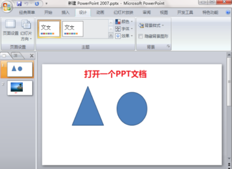
php editor Apple teaches you how to use color blocks to splice fake charts. First, open PPT and insert a rectangular shape, adjust the size and color, and then copy and paste multiple rectangles to represent different data. Next, add text to describe what each rectangle means, and finally arrange the rectangles into a chart-like shape to create a fake chart effect.
1. Create a new blank document.

2. Select the shape, [Pie Shape].

3. Hold down the shift key to draw a pie shape. Do you see the yellow endpoint? By moving it, you can adjust the pie shape to any desired shape.

4. Change to gray and set the shape color and border.

5. Ctrl D copy one, change it to another color you like, and adjust the size.

6. Merge the two together, adjust the size and position, enlarge the blue part and make the gray part smaller to create a highlighted effect.

7. Finally, add the data, and a fake pie chart is ready. Make several more according to the data you want.

The above is the detailed content of Specific steps for using color blocks to splice fake charts in PPT. For more information, please follow other related articles on the PHP Chinese website!

 ppt保存时提示某些字体无法保存怎么办May 25, 2021 pm 02:42 PM
提示无法保存是因为开启了“嵌入字体”功能。解决方法:1、打开PPT文档,点击菜单栏上的“文件”选项;2、进入文件菜单后,选择最底下的“选项”;3、在“PowerPoint 选项”窗口中,点击“保存”选项卡,取消勾选“将字体嵌入文件”,点击“确定”回到编辑界面;4、完成内容的编辑之后,保存文档即可。
 ppt怎么全屏放映?ppt一键全屏快捷键Mar 16, 2024 pm 06:16 PM
在办公、学习的时候,经常用到ppt进行演示,为了进一步提高观感,我们通常需要将ppt全屏演示。那么ppt一键全屏快捷键是什么?ppt如何全屏放映?下面就来看看具体教程。 ppt快捷键快捷键是最便捷的全屏操作方式之一。只需打开要全屏显示的PPT文件,按下键盘上的“F5”键即可让幻灯片全屏展示。这种一键全屏的方式非常简单,无需浪费时间在菜单选项上,通过简单的键盘操作即可轻松完成。 2、此外,还可以使用其他快捷键。例如,按下“Shift+F5”键,可以从当前幻灯片开始放映;按下&
 ppt文本框内容无法编辑怎么办Jul 06, 2023 pm 04:00 PM
ppt文本框内容无法编辑解决方法:1、检查文本框是否被锁定,点击文本框,在格式中找到保护文本框或解锁文本框取消即可;2、检查是否使用了预设模板,在菜单栏点击插入选择文本框,在幻灯片上绘制所需文本框即可;3、检查文本框的格式设置,点击文本框然后检查文本框是否被加锁或隐藏;4、检查PPT软件的版本和更新,更新软件到最新版本重启电脑即可。
 能否用PowerPoint打开XML文件Feb 19, 2024 pm 09:06 PM
XML文件可以用PPT打开吗?XML,即可扩展标记语言(ExtensibleMarkupLanguage),是一种被广泛应用于数据交换和数据存储的通用标记语言。与HTML相比,XML更加灵活,能够定义自己的标签和数据结构,使得数据的存储和交换更加方便和统一。而PPT,即PowerPoint,是微软公司开发的一种用于创建演示文稿的软件。它提供了图文并茂的方
 ppt与pptx有哪些区别Aug 30, 2023 pm 03:18 PM
ppt与pptx的区别是:1、PPT是PowerPoint的旧文件格式,在2003年之前的版本中使用的,PPTX是PowerPoint的新文件格式,从2007年开始使用;2、PPT文件的最大大小限制为2GB,而PPTX文件的最大大小限制为1TB;3、PPTX文件格式比PPT支持更多的高级功能和效果;4、PPTX文件格式比PPT具有更好的兼容性;5、PPTX文件格式更加稳定等等。
 ppt如何关闭背景音乐?删除ppt背景音的方法Mar 14, 2024 am 08:55 AM
有些用户为了让自己的ppt内容看起来更加丰富,会选择在幻灯片中加入背景音乐,那么不需要背景音乐时要怎么关闭呢?可以直接将其静音,还可以从动画删除背景音来解决问题,下面就来看看具体的操作。 方法一:关闭音量 点击音乐按钮 在ppt中,找到背景音乐按钮,单击鼠标左键选择它。 点击音量 选择背景音乐后,在界面上方找到“音量”选项,点击展开它。 点击静音 在展开的下拉菜单中,点击“静音”选项,即可关闭背景音乐。 方法二:删除动画 点击动画 在
 ppt为什么会自动跳到下一页Jun 21, 2023 am 10:12 AM
ppt自动跳到下一页的原因有:1、点击了鼠标或者键盘上的“下一页”按钮导致PPT跳到下一页;2、设置了动画效果,在演示时自动播放并在播放完毕后自动跳到下一页;3、设置了自动切换,即在演示PPT时自动跳转到下一页;4、使用了幻灯片母板,所有的幻灯片都会按照这个设置自动跳转到下一页。
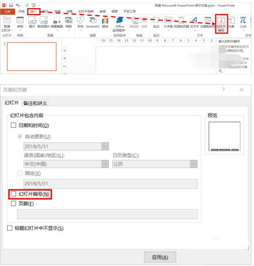 PPT页码怎么从第4页开始为1?PPT页码自定义教程Mar 13, 2024 pm 05:52 PM
如果PPT有很多页,可以给PPT添加页码,看起来更加有条理。那么PPT可以自定义页码吗?PPT可以从某页开始设置页码吗?如果你也不清楚具体的操作,可以看看下面的教程方法。 ppt设置编号从第四页开始的方法: 1、点击“插入”菜单下的“幻灯片编号”。 进入页眉页脚设置页面,我们可以看到幻灯片编号默认是没有勾选的。 2、点击勾选“幻灯片编号”,然后点击“全部应用”完成插入编号。 3、下图中可以看到插入


Hot AI Tools

Undresser.AI Undress
AI-powered app for creating realistic nude photos

AI Clothes Remover
Online AI tool for removing clothes from photos.

Undress AI Tool
Undress images for free

Clothoff.io
AI clothes remover

AI Hentai Generator
Generate AI Hentai for free.

Hot Article
Hot Tools

WebStorm Mac version
Useful JavaScript development tools

SublimeText3 Mac version
God-level code editing software (SublimeText3)

SublimeText3 Chinese version
Chinese version, very easy to use

Safe Exam Browser
Safe Exam Browser is a secure browser environment for taking online exams securely. This software turns any computer into a secure workstation. It controls access to any utility and prevents students from using unauthorized resources.

Dreamweaver Mac version
Visual web development tools

