


In the era of data analysis, it is crucial to produce high-quality data analysis charts in PPT. This article will comprehensively explain how to make chart data analysis charts in PPT, covering many aspects such as data preparation, chart selection, design and beautification, and adding dynamic effects. By following the steps in this article, readers will master the skills to create clear, beautiful, and engaging PPT chart data analysis diagrams, improving the effectiveness of presentations and reports.

1. Introduction
In the modern business and information age, data analysis has become the basis for decision-making and problem-solving. Important tool. As PPT is the main carrier of presentations and reports, it is particularly important to produce high-quality data analysis charts. An excellent PPT data analysis chart can not only visually display data, but also effectively convey information and opinions, improving the persuasiveness and influence of the report. This article will elaborate on how to make chart data analysis charts in PPT, including data preparation, chart selection, design beautification, and dynamic effect addition, to help readers improve their PPT chart production skills.
2. Data preparation
Clear the purpose of analysis: Before making PPT charts, you must first clarify the purpose of data analysis in order to choose the appropriate chart type and presentation method.
Collect and organize data: According to the purpose of analysis, collect relevant data and organize it to ensure the accuracy and completeness of the data.
Data preprocessing: Clean, transform and format the collected data to make it suitable for display in charts.
3. Choose the appropriate chart type
According to the type of data and the purpose of display, choosing the appropriate chart type is key. Common chart types include bar charts, line charts, pie charts, scatter charts, etc.
Bar chart: suitable for comparing the size relationship of different categories of data, such as sales comparison, etc.
Line chart: Suitable for displaying the changing trend of data, such as time series data, etc.
Pie chart: suitable for displaying the components of data, such as market share, etc.
Scatter plot: suitable for showing the relationship between two variables, such as correlation analysis, etc.
4. Make charts
Insert charts: In PPT, click the "Insert" tab, select the "Chart" function, and then select the desired chart type.
Edit data: In the inserted chart, there will be an Excel table associated with it for editing data. Fill in the prepared data into the form, and PPT will automatically generate charts based on the data.
Adjust chart style: As needed, you can adjust the color, font, line style, etc. of the chart to make it clearer and easier to read.
Add labels and annotations: Add horizontal and vertical axis labels, data labels, legends, etc. to the chart so that the audience can better understand the data.
5. Design and beautification
Layout design: Reasonably lay out charts and text descriptions to make the overall layout concise and clear, and highlight key points.
Color matching: Choose a color matching that suits the theme to enhance the visual effect and appeal of the chart.
Font selection: Use clear and easy-to-read fonts to ensure your audience can easily read and understand.
6. Add dynamic effects
In order to improve the attractiveness and expressiveness of PPT, you can add dynamic effects to charts. For example, you can use animation effects to show the dynamic change process of data, or use switching effects to show the switching process between different charts.
7. Notes
Concise and clear: avoid piling too much information and elements in the chart, keep it concise and clear, and highlight the key points.
Accurate data: Make sure the data in the chart is accurate to avoid misleading the audience or creating ambiguity.
Match the content: The type and style of the diagram should match the content of the presentation to promote overall consistency and coordination.
8. Summary
Creating high-quality PPT chart data analysis charts requires comprehensive consideration of data preparation, chart selection, design beautification, and addition of dynamic effects. Through the introduction of this article, I believe readers have a clearer understanding of how to create chart data analysis charts in PPT. In practical applications, it can be flexibly adjusted and optimized according to specific needs and scenarios to produce better PPT chart data analysis charts.
9. Advanced techniques
In addition to the above basic steps, there are also some advanced techniques that can help improve the quality and expressiveness of PPT chart data analysis charts.
Use Pivot Tables: In Excel, you can use Pivot Tables to quickly summarize and analyze data, and then import the results into PPT to generate charts. This can greatly improve the efficiency of data processing and chart production.
Use professional chart plug-ins: The chart types and functions provided by PPT itself may be limited, and its functions can be expanded by installing professional chart plug-ins. These plug-ins usually provide a more diverse chart type and more advanced design options to meet more complex data analysis needs.
Combine with other elements: In addition to the chart itself, you can also combine other elements such as text, pictures, shapes, etc. to enrich the content and presentation of PPT. For example, you can use text boxes to add explanations and descriptions of a diagram, or use pictures and shapes to enhance visual impact and appeal.
10. Conclusion
PPT chart data analysis chart is a powerful information display and transmission tool. Through careful production and optimization, it can effectively improve the presentation effect and report quality. I hope that the introduction and techniques in this article can help readers better master the skills of making PPT charts and bring more convenience and gains to work and study.
The above is the detailed content of How to make charts and data analysis charts in PPT. For more information, please follow other related articles on the PHP Chinese website!

 I Always Name Ranges in Excel, and You Should TooApr 19, 2025 am 12:56 AM
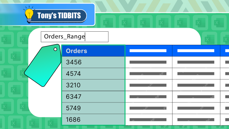
Improve Excel efficiency: Make good use of named regions By default, Microsoft Excel cells are named after column-row coordinates, such as A1 or B2. However, you can assign more specific names to a cell or cell range, improving navigation, making formulas clearer, and ultimately saving time. Why always name regions in Excel? You may be familiar with bookmarks in Microsoft Word, which are invisible signposts for the specified locations in your document, and you can jump to where you want at any time. Microsoft Excel has a bit of a unimaginative alternative to this time-saving tool called "names" and is accessible via the name box in the upper left corner of the workbook. Related content #
 Insert checkbox in Excel: create interactive checklist or to-do listApr 18, 2025 am 10:21 AM
This tutorial shows you how to create interactive Excel checklists, to-do lists, reports, and charts using checkboxes. Checkboxes, also known as tick boxes or selection boxes, are small squares you click to select or deselect options. Adding them to
 Excel Advanced Filter – how to create and useApr 18, 2025 am 10:05 AM
This tutorial unveils the power of Excel's Advanced Filter, guiding you through its use in retrieving records based on complex criteria. Unlike the standard AutoFilter, which handles simpler filtering tasks, the Advanced Filter offers precise contro
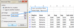 How to use Advanced Filter in Excel - criteria range examples with formulasApr 18, 2025 am 09:05 AM
The tutorial shows how to use Advanced Filter in Excel and provides a number of non-trivial criteria range examples to create a case-sensitive filter, find matches and differences between two columns, extract records that match a smaller
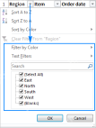 Excel Filter: How to add, use and removeApr 18, 2025 am 09:04 AM
This tutorial shows you how to effectively filter data in Excel. We'll cover filtering text, numbers, and dates, using search functions, and filtering by color or cell value. We'll also show you how to remove filters and troubleshoot common issues.
 How to Make Your Excel Spreadsheet Accessible to AllApr 18, 2025 am 01:06 AM
Improve the accessibility of Excel tables: A practical guide When creating a Microsoft Excel workbook, be sure to take the necessary steps to make sure everyone has access to it, especially if you plan to share the workbook with others. This guide will share some practical tips to help you achieve this. Use a descriptive worksheet name One way to improve accessibility of Excel workbooks is to change the name of the worksheet. By default, Excel worksheets are named Sheet1, Sheet2, Sheet3, etc. This non-descriptive numbering system will continue when you click " " to add a new worksheet. There are multiple benefits to changing the worksheet name to make it more accurate to describe the worksheet content: carry
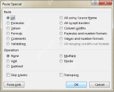 Excel Paste Special: shortcuts to copy values, comments, column width, etc.Apr 17, 2025 am 11:54 AM
This tutorial unlocks the power of Excel's Paste Special feature, showing you how to significantly boost your efficiency with paste special shortcuts. Learn to paste values, formulas, comments, formats, column widths, and more, all while avoiding co
 How to add, copy and delete multiple checkboxes in ExcelApr 17, 2025 am 11:01 AM
This tutorial shows you how to efficiently add, modify, and delete multiple checkboxes in Excel. Last week, we explored using checkboxes for checklists, conditional formatting, interactive reports, and dynamic charts. This week, we'll focus on the


Hot AI Tools

Undresser.AI Undress
AI-powered app for creating realistic nude photos

AI Clothes Remover
Online AI tool for removing clothes from photos.

Undress AI Tool
Undress images for free

Clothoff.io
AI clothes remover

AI Hentai Generator
Generate AI Hentai for free.

Hot Article
Hot Tools

ZendStudio 13.5.1 Mac
Powerful PHP integrated development environment

Notepad++7.3.1
Easy-to-use and free code editor

mPDF
mPDF is a PHP library that can generate PDF files from UTF-8 encoded HTML. The original author, Ian Back, wrote mPDF to output PDF files "on the fly" from his website and handle different languages. It is slower than original scripts like HTML2FPDF and produces larger files when using Unicode fonts, but supports CSS styles etc. and has a lot of enhancements. Supports almost all languages, including RTL (Arabic and Hebrew) and CJK (Chinese, Japanese and Korean). Supports nested block-level elements (such as P, DIV),

EditPlus Chinese cracked version
Small size, syntax highlighting, does not support code prompt function

Dreamweaver CS6
Visual web development tools

