
Home >Software Tutorial >Office Software >How to optimize the design of ppt charts
How to optimize the design of ppt charts

- WBOYWBOYWBOYWBOYWBOYWBOYWBOYWBOYWBOYWBOYWBOYWBOYWBforward
- 2024-03-20 20:40:18469browse
php Xiaobian Xigua teaches you how to optimize PPT chart design and make the chart more attractive and readable through reasonable layout, color matching and font selection. Optimizing the design of PPT charts requires considering the visual experience of the audience. A concise and clear design style can better convey information and improve the presentation effect. During the design process, pay attention to avoid excessive decoration and information piling, and maintain a concise and clear style, making it easier for the audience to understand and accept the presented data.
1. This lesson is the fifth section of our ppt course [Optimal Design of Information Charts], and then we first understand the charts.
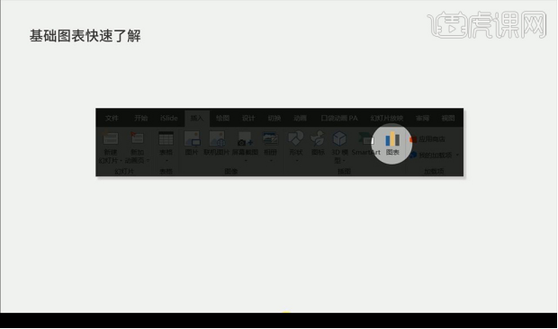
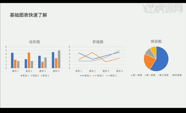
2. The chart is divided into [bar chart] [line chart] [pie chart].
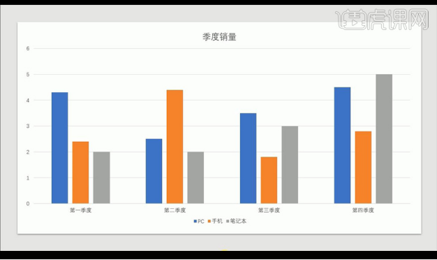
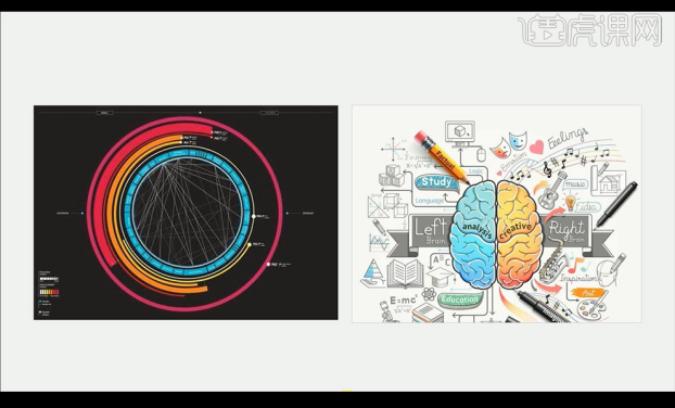
#3. Let’s take a look at bad charts. The first type is the built-in chart that belongs to general situations.
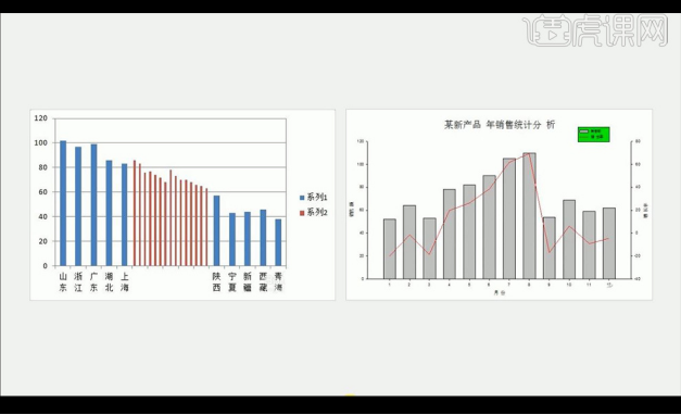
#4. The second type is screenshots taken from other charting software, which is not advisable.
#5. Then the third type of chart is too fancy and difficult to understand.
#6. Then let’s look at how to make a simple chart, and then look at example one.
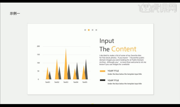
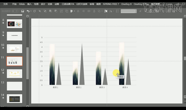
#7. Then let’s make it. First insert a column chart with a uniform style, insert a triangle color orange and copy a fill gray.
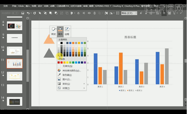
8. Select the triangle and perform [ctrl C] to copy it. Select a column bar and perform [ctrl V] to paste it. The column bar will become a triangle.
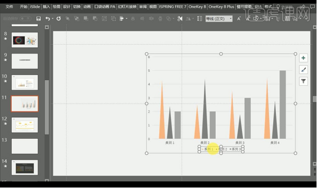
9. We can also drag in the picture and copy it with [ctrl C], then select a column bar and paste it with [ctrl V], and the column bar will become Landscape pictures.
10. Then look at the second case of pixel style ppt. First make the pixel block, then insert the line chart, select the pixel block and copy it with [ctrl C]. Select a polyline point and use [ctrl V] to paste.
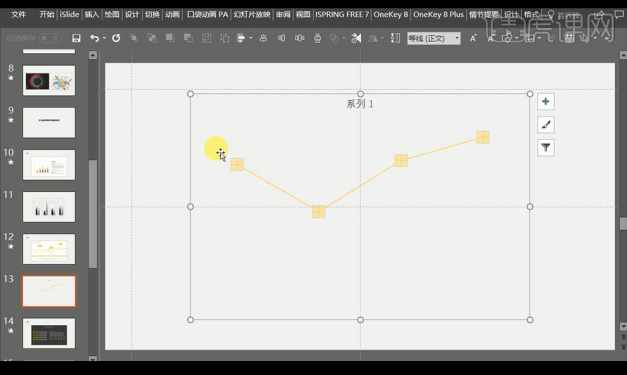
11. Then we will recreate the second type, insert a line chart, drag in the small rocket icon, [ctrl C] copy it, and select the rightmost point Use [ctrl V] to paste.
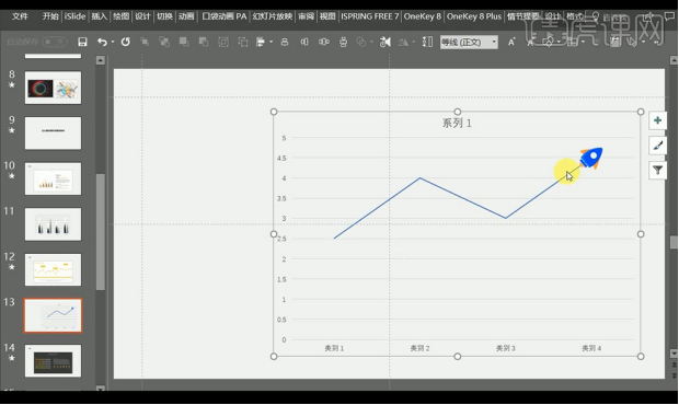
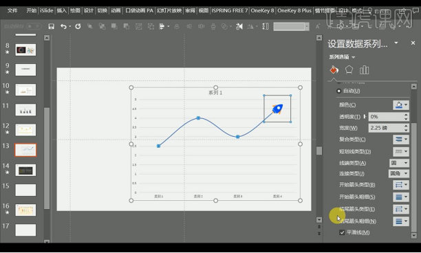
#12. Then we set the line data, and then check [Smooth Line] to adjust.
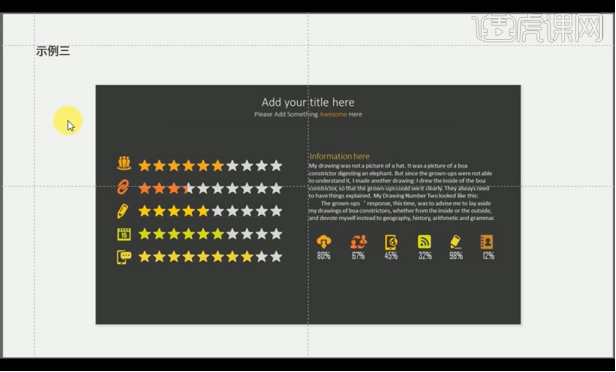
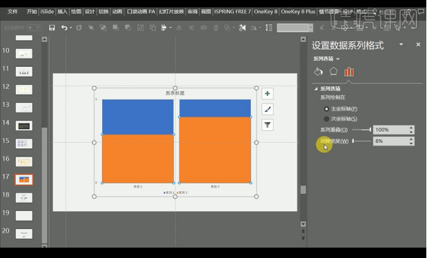
#13. Next, look at the third example, using shapes to beautify it makes it more vivid.
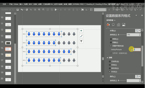
#14. Insert a clustered bar chart, right-click [Format Data Series], and adjust the data on the right.
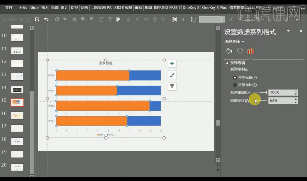
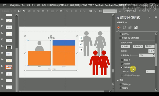
15. Drag in the shape you want to use, then copy one layer to reduce the fill, only copy one layer and paste it on the bar, set it on the right side [Picture Texture filling】.
#16. Then let’s take a look at the fourth example. The form of the human body is mainly suitable for use in medical nutrition and other aspects.
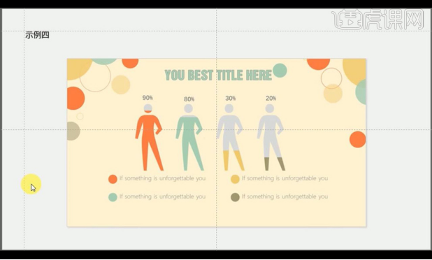
#17. First insert a column chart with a uniform style and then adjust the parameters on the right.
#18. Insert the human icon we need, copy two copies to modify different colors, copy the character icon and paste it into the column, right-click and set as shown.
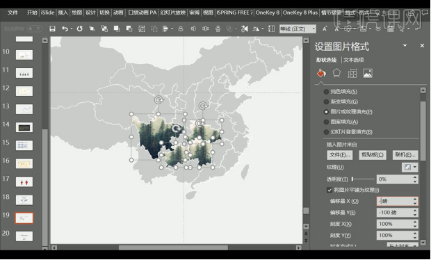
#19. Next, look at the last example, world map population and data and other information.
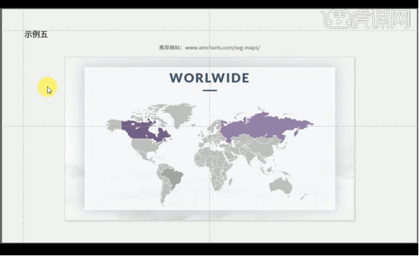
20. Drag in the vector map file, and then select the map part to fill with color.
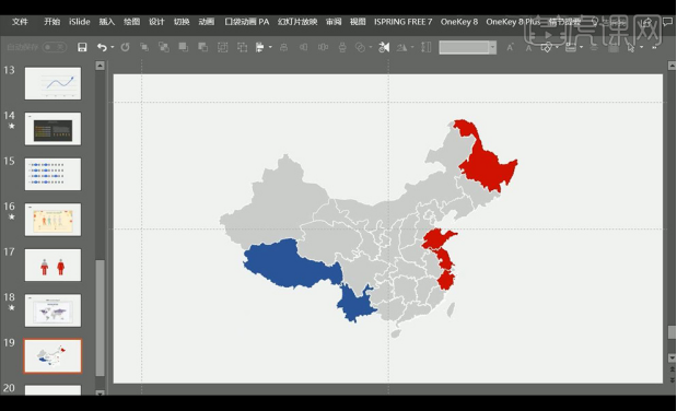
#21. Similarly, we can drag in the picture, copy and paste it into the map shape and then set the data on the right.
Regarding the optimized design of ppt charts, the editor will share it here today. Beautiful things should be shared with everyone. I hope my experience can improve your ppt chart production. Of course, if you friends have excellent experiences, we can also share them!
The above is the detailed content of How to optimize the design of ppt charts. For more information, please follow other related articles on the PHP Chinese website!