
Home >Software Tutorial >Office Software >How to make good-looking excel charts
How to make good-looking excel charts

- PHPzforward
- 2024-03-20 16:06:211375browse
php Xiaobian Yuzai teaches you how to create beautiful Excel charts. Through careful design and adjustment, your data presentation will be more intuitive and beautiful. Excel charts are an important tool for data analysis and presentation. Mastering the production skills can improve work efficiency and presentation effects. Follow the editor's tutorial and you can create professional-level Excel charts in just a few simple steps, making your data more convincing and easier to understand. Let’s learn together!
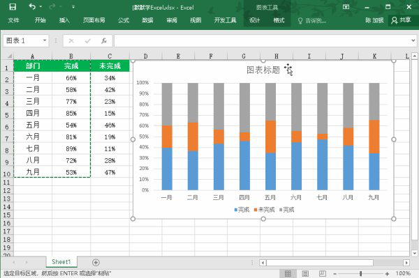
After selecting all the data, insert a "Percent Stacked Column Chart". Next, copy the data in the "Complete" column, select the entire chart, and paste it into the corresponding location.
After selecting the entire series in the chart, go to "Chart Tools" - "Design" - "Change Chart Type" - "Combination". Here, we can change the first and second items to "Percent Stacked Column Chart", change the third item to "Line Chart with Data Markers", and check the "Secondary Axis" after the third item options. Doing so will make the chart clearer and easier to understand, highlight features of the data, and make it easier for viewers to see trends and correlations.
3. At this time, we select the "Coordinate Axis" on the right and then "right click" - "Set Axis Format", in "Axis Options" - "Border "-In "Maximum value" we modify the data to "1". Then, cancel the display of "Right Axis", "Grid Lines", "Legend", etc. in turn.

4. Select the "Line Chart" in the chart individually, "right-click" - "Format Data Series" - "Fill and Line" and set the line to "Wireless" strip". Then insert the attachment and copy it, then select the dots in the line chart and paste them in.

5. Select the "Unfinished" part of the data chart in the chart, "right-click" - "Format Data Series", set the fill color to "white"; "Effect "-"Shadow"-"Inner Center" effect, and then set the color to "Dark Gray".

After all is completed, we can slightly adjust the details. Does this icon look clearer? Which month has a higher completion rate and which month has a higher completion rate? You can see it right away, so you should try it quickly!
The above is the detailed content of How to make good-looking excel charts. For more information, please follow other related articles on the PHP Chinese website!