Home >Software Tutorial >Office Software >How to make statistical tables in Excel
How to make statistical tables in Excel
- 王林forward
- 2024-03-20 10:40:221258browse
php editor Baicao introduces you how to create statistical tables in Excel. Statistical tables are an important tool for displaying data analysis results in the form of charts, which can help you intuitively understand the trends and relationships of data. With Excel's pivot table function, you can easily classify and summarize large amounts of data and generate clear statistical charts. Next, we will introduce in detail how to use the pivot table function in Excel to create statistical tables, allowing you to easily master data analysis skills.
1. First, we open the table we want to make on the computer, as shown in the figure below:
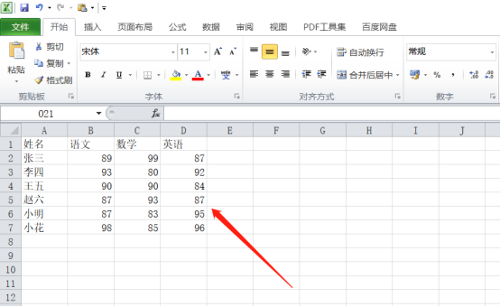
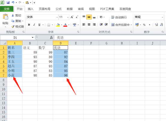
2. Then, we select it with the mouse For the data you want to create, here we take math scores as an example. Select cells A1:A7, hold down the ctrl key, and select columns D1:D7, as shown by the red arrow in the figure below:
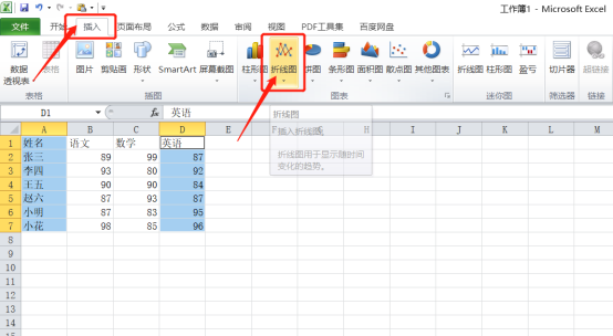
3. Next, we click the [Insert] button on the menu bar, and then click the line chart. Here you can choose according to your own preferences, as shown in the red circle in the figure below:
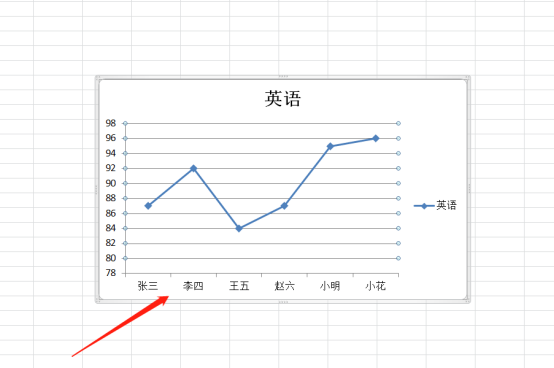
4. At this time, we will see that the line chart of English scores is ready as shown below:
5. We select For the line chart, click the [Layout] button above, select [Data Label], and then select the top. We can see that the score values are displayed above, as shown in the red circle in the figure below:
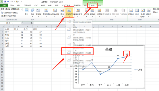
6. Finally, we can also modify the color and style of the line chart under the [Design] button above, as shown by the red arrow in the figure below:
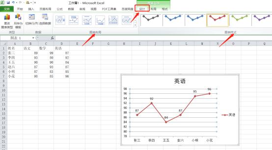
When you see the text and graphics filling the screen, the graphics are far more attractive than the text, so it is best for everyone to learn to make tables. In fact, the steps above are not difficult, and it only takes 6 steps to complete. Okay, everyone, go and make the form you like!
The above is the detailed content of How to make statistical tables in Excel. For more information, please follow other related articles on the PHP Chinese website!
Related articles
See more- How to set up the drop-down box in excel
- How to extract corresponding content from another table in excel
- Dynamic filtering and clustering optimization of Vue statistical charts
- How to use PHP and Vue.js to export and print statistical charts
- Optimization of 3D stereoscopic and rotation effects for Vue statistical charts

