 Web Front-end
 H5 Tutorial
 In just five steps, you can use HTML5/CSS3 to quickly create sticky note effects (pictures)_html5 tutorial tips
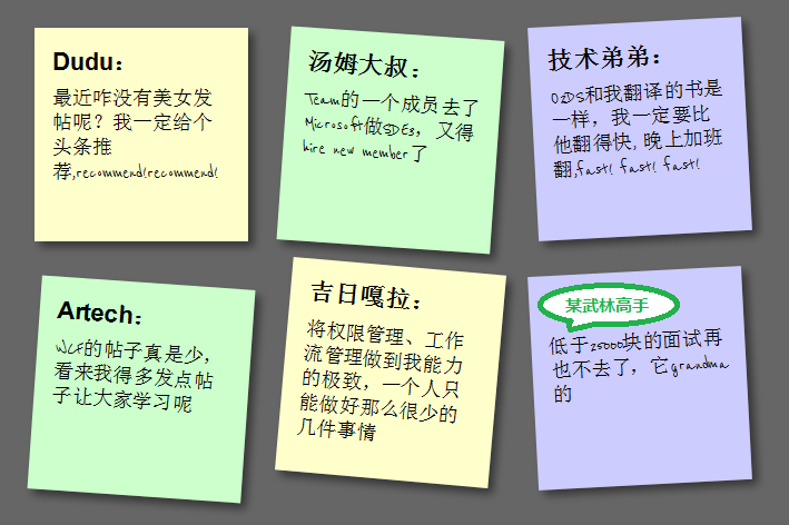
What this article will show you is how to use HTML5/CSS3 to create an HTML page with a sticky note effect in just 5 steps. The rendering is as follows:
(Note: The text in the picture is purely fabricated and is for funny purposes. , any similarity is purely coincidental, thank you! )
Note: This effect can be seen in Safari, Chrome, Firefox and Opera. Due to incomplete support for HTML5, IE No visible effect.
Step 1: Create basic HTML and squares
First add the basic HTML structure and build the basic square, the code is as follows:
-
Dudu :
Why haven’t there been any beautiful women posting recently? I will definitely recommend a headline, recommend!recommend!
-
< ;h2>Uncle Tom:A member of the Team went to Microsoft to work on SDE3, and he had to hire a new member
li>
-
Technical brother:
O2DS is the same book I translated, I must be faster than him. I will work overtime at night, fast! fast! fast!
-
Jiri Gala:
Make permission management and workflow management to the extreme of my ability. One person can only do so few things
A certain martial arts master:
I will never go to an interview for less than 25,000 yuan again, it’s grandma
Add an href connection to each note, mainly to support keyboard access , the CSS code is as follows:
}
body{
font-family:arial,sans-serif;
font-size:100%;
margin:3em ;
background:#666;
color:#fff;
}
h2,p{
font-size:100%;
font-weight:normal;
}
ul,li{
list-style:none;
}
ul{
overflow:hidden;
padding:3em;
}
ul li a {
text-decoration:none;
color:#000;
background:#ffc;
display:block;
height:10em;
width:10em;
padding:1em;
}
ul li{
margin:1em;
float:left;
}
The effect is as follows:
Step 2: Shadow and handwritten cursive
In this step, we want to achieve the shadow effect of the square and change the font to cursive (English only). Since Google provides Font API support, we It can be used directly. First add a call to the Google API:

Then set to reference this font:
font-weight: bold;
padding-bottom: 10px;
}
ul li p
{
font-family: "Reenie Beanie" ,arial,sans-serif,Microsoft Yahei;
font-size: 110%;
}
Regarding shadows, since each browser does not fully support it, it needs to be handled separately. The code is as follows:
ul li a
{
text-decoration: none;
color: #000;
background: #ffc;
display: block;
height: 10em;
width: 10em;
padding: 1em; /* Firefox */
-moz-box-shadow: 5px 5px 7px rgba(33,33,33 ,1); /* Safari Chrome */
-webkit-box-shadow: 5px 5px 7px rgba(33,33,33,.7); /* Opera */
box-shadow: 5px 5px 7px rgba(33,33,33,.7);
}
The effect is as follows:

Step 3: Tilt the square
In order to tilt the square , we need to add the following code in li->a:
ul li a{
-webkit-transform:rotate(-6deg);
-o-transform:rotate(-6deg);
-moz-transform:rotate(-6deg) ;
}
But in order to make the squares tilt randomly instead of all tilting, we need to use the new CSS3 selector to tilt the squares by 4 degrees every 2 and every 3 Each tilt has negative 3 deg, and every 6 tilts have 5 deg:
ul li:nth-child(even) a{
-o-transform:rotate(4deg);
-webkit-transform:rotate(4deg);
-moz-transform :rotate(4deg);
position:relative;
top:5px;
}
ul li:nth-child(3n) a{
-o-transform:rotate(-3deg );
-webkit-transform:rotate(-3deg);
-moz-transform:rotate(-3deg);
position:relative;
top:-5px;
}
ul li:nth-child(5n) a{
-o-transform:rotate(5deg);
-webkit-transform:rotate(5deg);
-moz-transform:rotate(5deg );
position:relative;
top:-10px;
}
The effect is as follows:

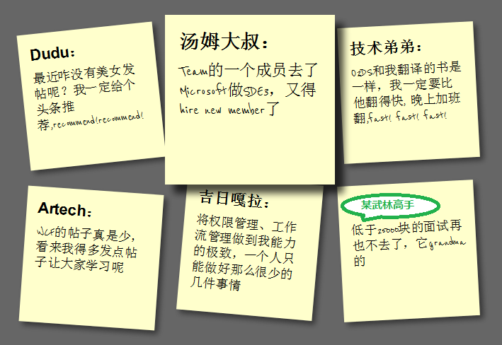
Step 4: Hover and Focus Zoom square
To achieve the zoom effect during hover and focus, we need to add the following code:
ul li a:hover,ul li a:focus{
-moz-box-shadow:10px 10px 7px rgba(0,0,0,.7 );
-webkit-box-shadow: 10px 10px 7px rgba(0,0,0,.7);
box-shadow:10px 10px 7px rgba(0,0,0,.7);
-webkit-transform: scale(1.25);
-moz-transform: scale(1.25);
-o-transform: scale(1.25);
position:relative;
z- index:5;
}

Step 5: Smooth transition and add color
The special effects in step 4 look a bit stiff. We can add Transition to achieve the effect of smooth animation. In addition, the color is relatively single. We can set different colors. First add Transition in ul->li->a:
-moz-transition:-moz-transform .15s linear;
-o-transition:-o-transform .15s linear;
-webkit-transition :-webkit-transform .15s linear;
Then define different colors in even and 3n:
ul li:nth-child(even) a{
-o-transform:rotate(4deg);
-webkit- transform:rotate(4deg);
-moz-transform:rotate(4deg);
position:relative;
top:5px;
background:#cfc;
}
ul li:nth-child(3n) a{
-o-transform:rotate(-3deg);
-webkit-transform:rotate(-3deg);
-moz-transform:rotate(-3deg );
position:relative;
top:-5px;
background:#ccf;
}

Summary
At this point, we have used the basic features of HTML5 and CSS3 to create a pretty good sticky note effect. HTML5/CSS3 is indeed very It is powerful. If you add some advanced features, such as combining it with JavaScript, you can achieve even more awesome effects. You can see this from the HTML5 Lab series of articles that Dang Knight Brick has given you.
Also: The text in the picture is purely fabricated. Any similarity is purely coincidental. Thank you!
 H5: Key Improvements in HTML5Apr 28, 2025 am 12:26 AM
HTML5 brings five key improvements: 1. Semantic tags improve code clarity and SEO effects; 2. Multimedia support simplifies video and audio embedding; 3. Form enhancement simplifies verification; 4. Offline and local storage improves user experience; 5. Canvas and graphics functions enhance the visualization of web pages.
 HTML5: The Standard and its Impact on Web DevelopmentApr 27, 2025 am 12:12 AM
The core features of HTML5 include semantic tags, multimedia support, offline storage and local storage, and form enhancement. 1. Semantic tags such as, etc. to improve code readability and SEO effect. 2. Simplify multimedia embedding with labels. 3. Offline storage and local storage such as ApplicationCache and LocalStorage support network-free operation and data storage. 4. Form enhancement introduces new input types and verification properties to simplify processing and verification.
 H5 Code Examples: Practical Applications and TutorialsApr 25, 2025 am 12:10 AM
H5 provides a variety of new features and functions, greatly enhancing the capabilities of front-end development. 1. Multimedia support: embed media through and elements, no plug-ins are required. 2. Canvas: Use elements to dynamically render 2D graphics and animations. 3. Local storage: implement persistent data storage through localStorage and sessionStorage to improve user experience.
 The Connection Between H5 and HTML5: Similarities and DifferencesApr 24, 2025 am 12:01 AM
H5 and HTML5 are different concepts: HTML5 is a version of HTML, containing new elements and APIs; H5 is a mobile application development framework based on HTML5. HTML5 parses and renders code through the browser, while H5 applications need to run containers and interact with native code through JavaScript.
 The Building Blocks of H5 Code: Key Elements and Their PurposeApr 23, 2025 am 12:09 AM
Key elements of HTML5 include,,,,,, etc., which are used to build modern web pages. 1. Define the head content, 2. Used to navigate the link, 3. Represent the content of independent articles, 4. Organize the page content, 5. Display the sidebar content, 6. Define the footer, these elements enhance the structure and functionality of the web page.
 HTML5 and H5: Understanding the Common UsageApr 22, 2025 am 12:01 AM
There is no difference between HTML5 and H5, which is the abbreviation of HTML5. 1.HTML5 is the fifth version of HTML, which enhances the multimedia and interactive functions of web pages. 2.H5 is often used to refer to HTML5-based mobile web pages or applications, and is suitable for various mobile devices.
 HTML5: The Building Blocks of the Modern Web (H5)Apr 21, 2025 am 12:05 AM
HTML5 is the latest version of the Hypertext Markup Language, standardized by W3C. HTML5 introduces new semantic tags, multimedia support and form enhancements, improving web structure, user experience and SEO effects. HTML5 introduces new semantic tags, such as, ,, etc., to make the web page structure clearer and the SEO effect better. HTML5 supports multimedia elements and no third-party plug-ins are required, improving user experience and loading speed. HTML5 enhances form functions and introduces new input types such as, etc., which improves user experience and form verification efficiency.
 H5 Code: Writing Clean and Efficient HTML5Apr 20, 2025 am 12:06 AM
How to write clean and efficient HTML5 code? The answer is to avoid common mistakes by semanticizing tags, structured code, performance optimization and avoiding common mistakes. 1. Use semantic tags such as, etc. to improve code readability and SEO effect. 2. Keep the code structured and readable, using appropriate indentation and comments. 3. Optimize performance by reducing unnecessary tags, using CDN and compressing code. 4. Avoid common mistakes, such as the tag not closed, and ensure the validity of the code.


Hot AI Tools

Undresser.AI Undress
AI-powered app for creating realistic nude photos

AI Clothes Remover
Online AI tool for removing clothes from photos.

Undress AI Tool
Undress images for free

Clothoff.io
AI clothes remover

Video Face Swap
Swap faces in any video effortlessly with our completely free AI face swap tool!

Hot Article

Hot Tools

Notepad++7.3.1
Easy-to-use and free code editor

ZendStudio 13.5.1 Mac
Powerful PHP integrated development environment

SublimeText3 Chinese version
Chinese version, very easy to use

SublimeText3 Mac version
God-level code editing software (SublimeText3)

SublimeText3 Linux new version
SublimeText3 Linux latest version


